
The Brand
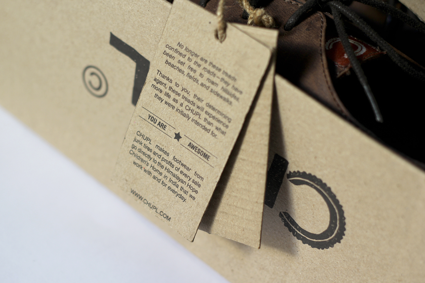
CHUPL, is not just a brand but it an initiative to take responsibility- making better future, the junk tires are repurposed to create the sole of the footwear and the revenues generated go to Himalayan Hope Children's Home project.
Responsibility
Our responsibility is to be as just as possible, as fair as possible, and as ethical as possible toward the planet, individuals, and the community in which we live. We accomplish this through our environmental and social projects.
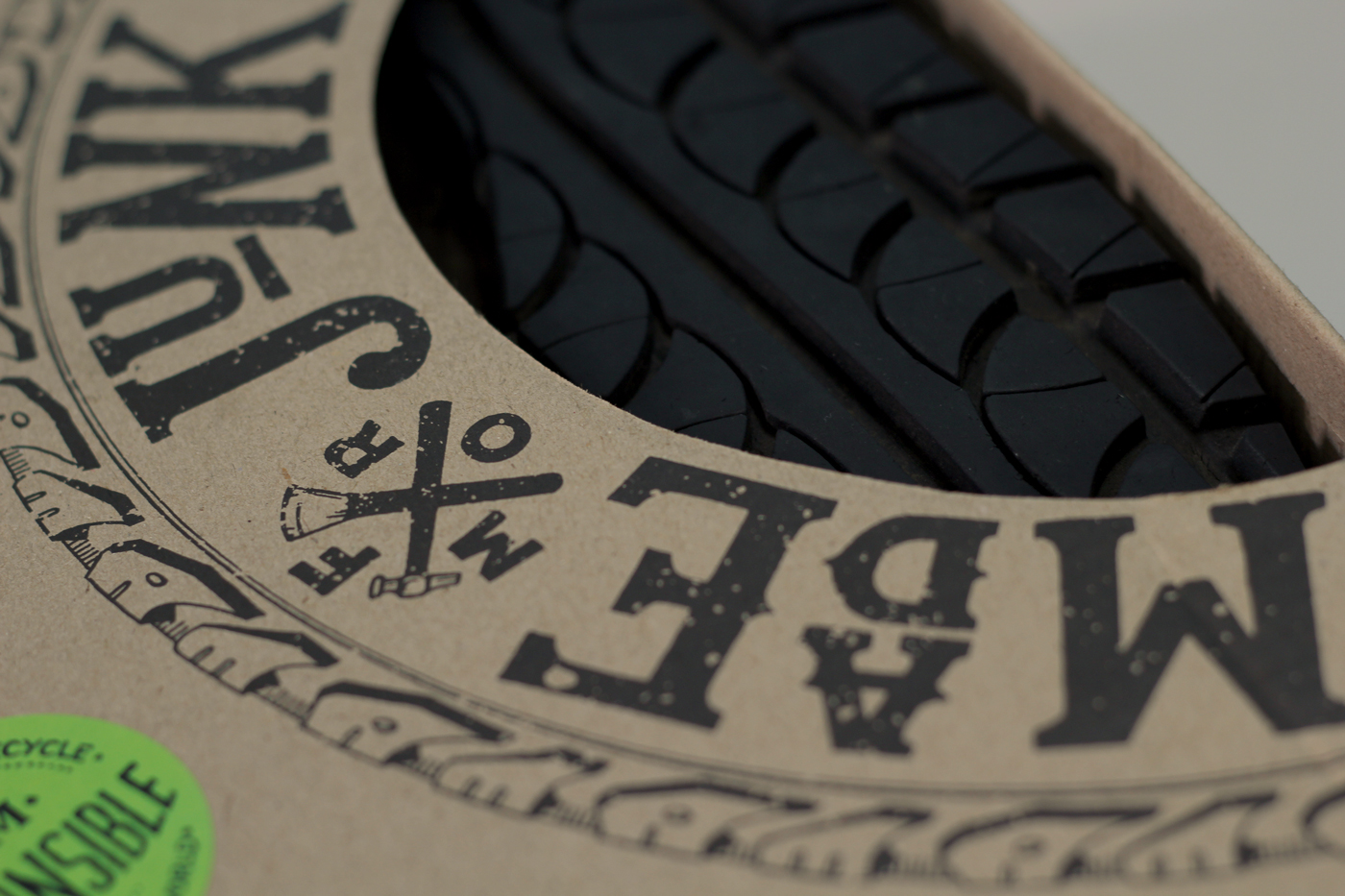
We re-purpose junk tires to be used as the soles of all of our footwear products. Our re-purposed soles not only keep junk tires out of the ground or landfills, but they also conserve raw materials and energy that would have been consumed to make soles out of new material. Additionally all of our packaging is made from recycled cardboard that is compost ready after use.
Concept
The deliverables which were mentioned in the brief were box packaging, hang tags, display stand, and posters. As a designer it was my responsibility to comply with the brief but I had something else in my mind, totally redefine the brief so that it conveys the brand message in a responsible manner- this is what CHUPL is all about, being responsible for your actions.
My solution was to zero down the whole thing into the essential elements since we were talking about sustainability and if we are ones who don't think about that then we had failed as a brand and our promise. The shoe box was the need since it is supposed to be shipped to the US so I had to make it into a packaging which is complete in itself.
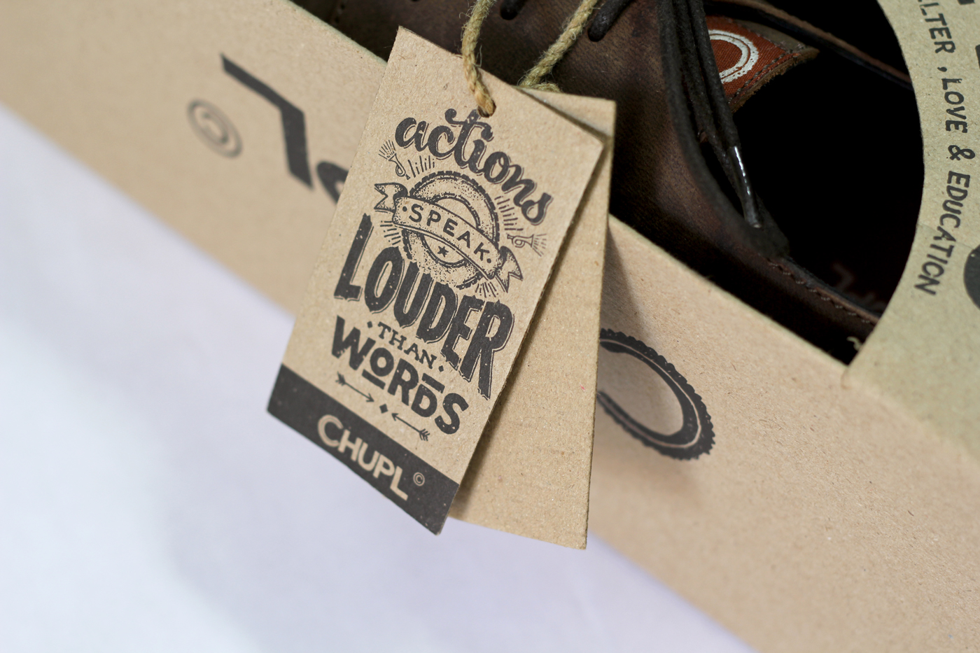
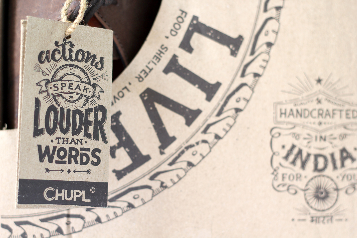
Two boxes kept together convey the story and existence of the brand, it also gives a direct access to the shoe so that the customer can look, touch and feel the product without even opening the package. The Hang tags are the part of same box piece as they are cut out from the window which is there on both sides, hence reducing the amount of material used and waste generated.

The concept behind the packaging solution which makes it different from others in the market.
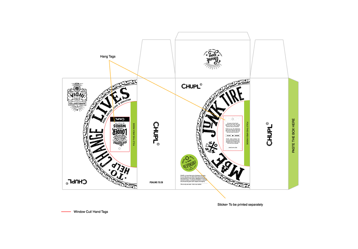
Hang tags are printed on the cut out waste thereby reducing the overall wastage of the material.

Two boxes kept together convey the brand message and the story. Acts as a display!
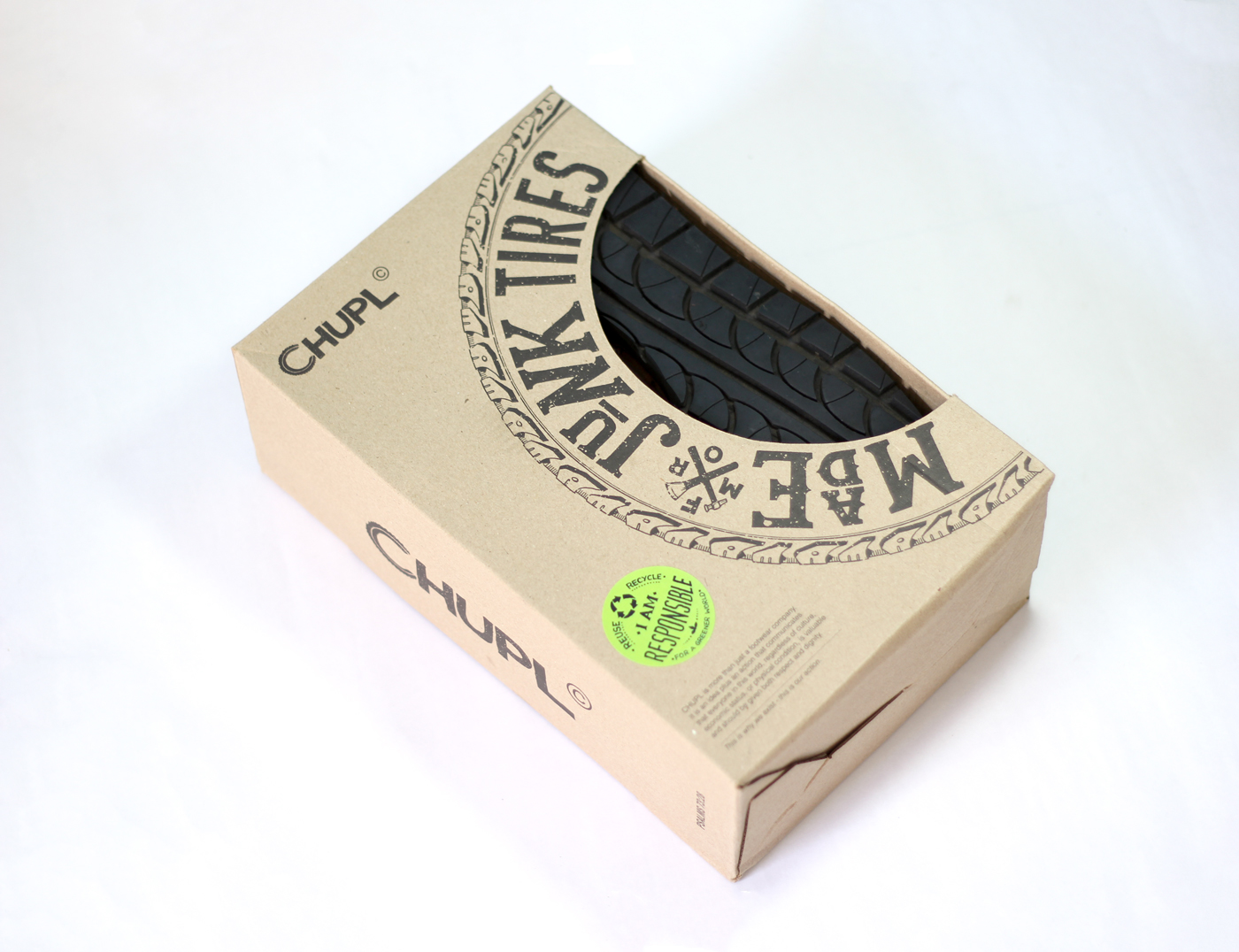
Front part of the box which lets the customer to have a look at the sole and quality of the product.
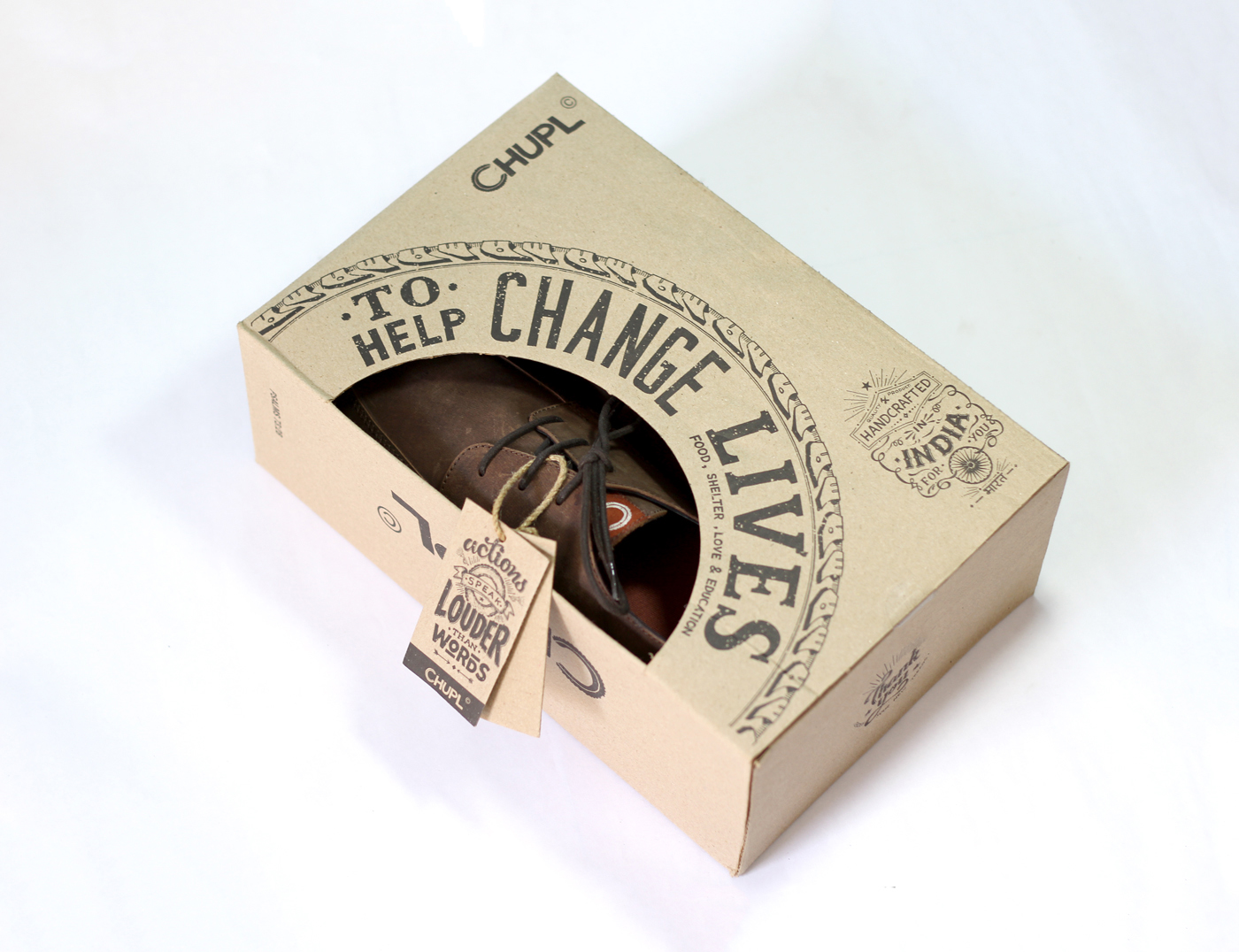
Back part of the same box which also has a window which allows the customer to have a look at the top of the shoe.
Details
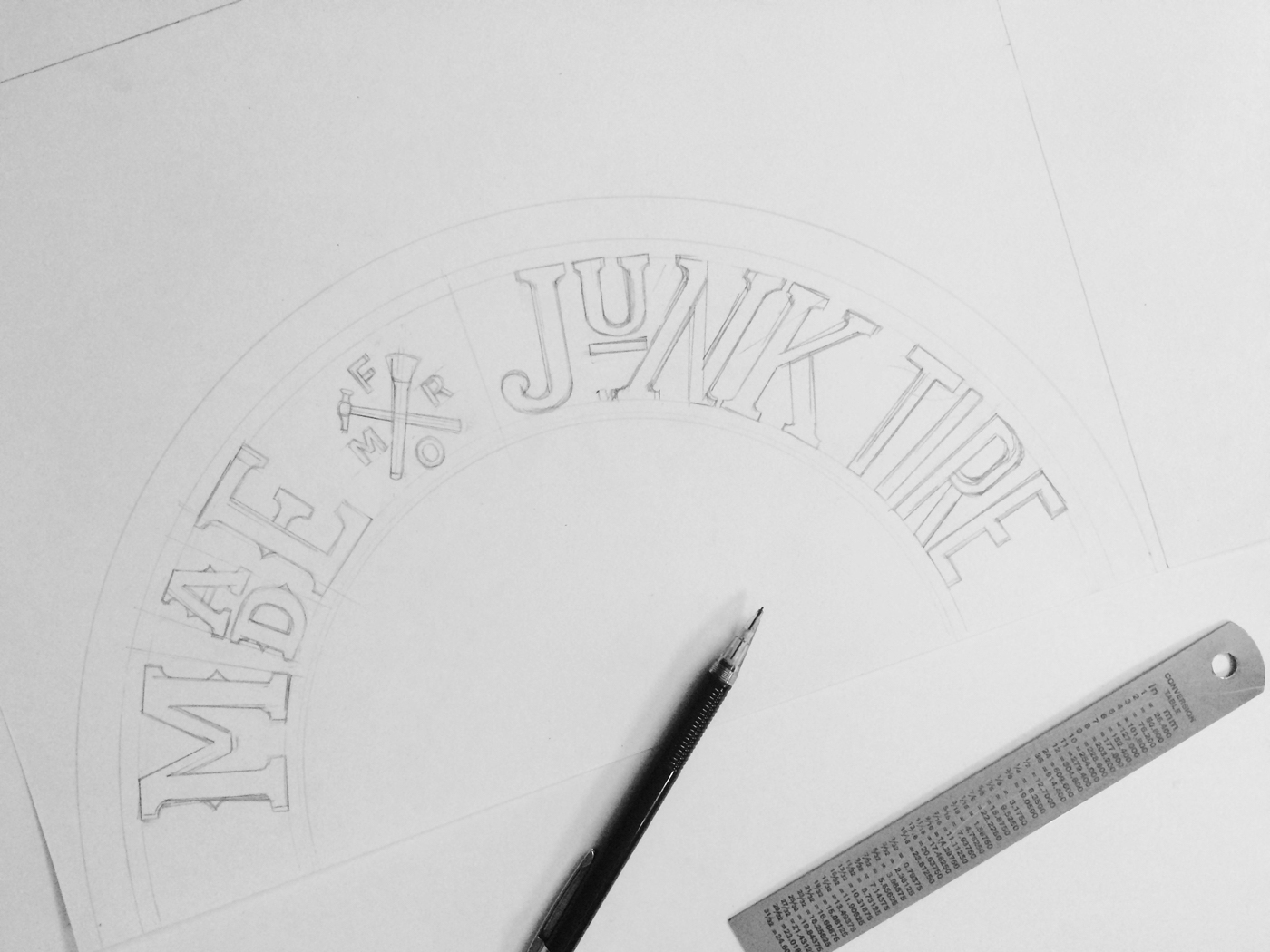
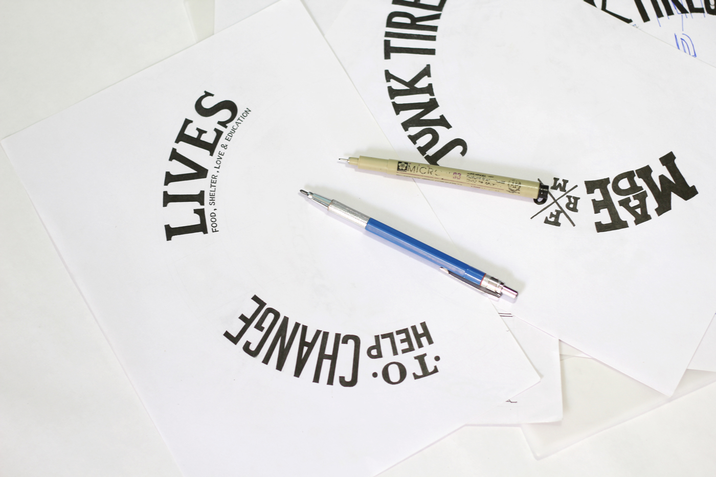
How it was made?
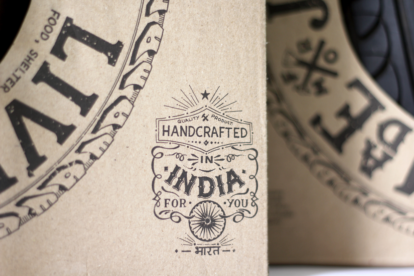
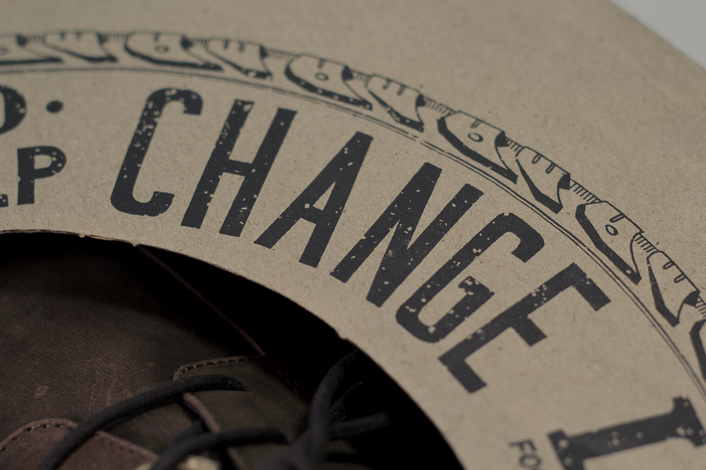
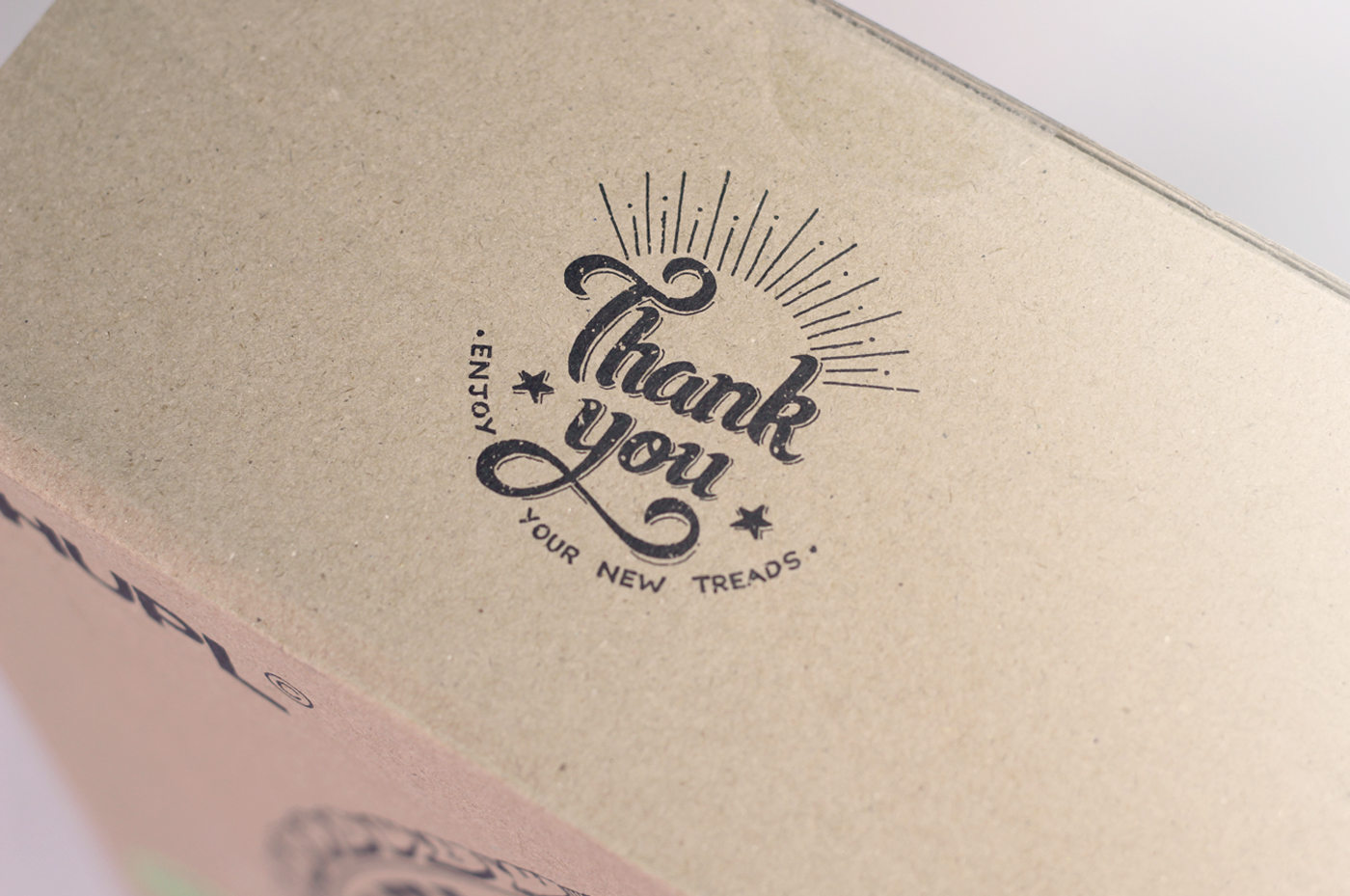
The whole design was made in a way that it send out the message of being raw and handcrafted and this was the reason why I took the approach to do hand lettering for each and every element used in the packaging.
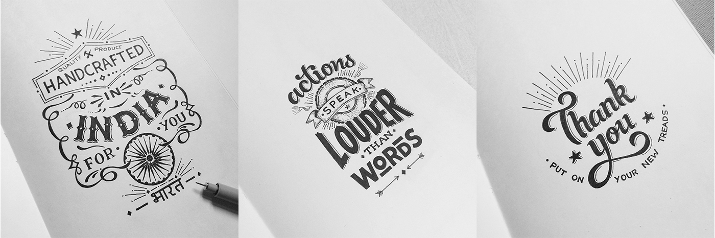
The hand-lettered version of the elements used in the packaging.
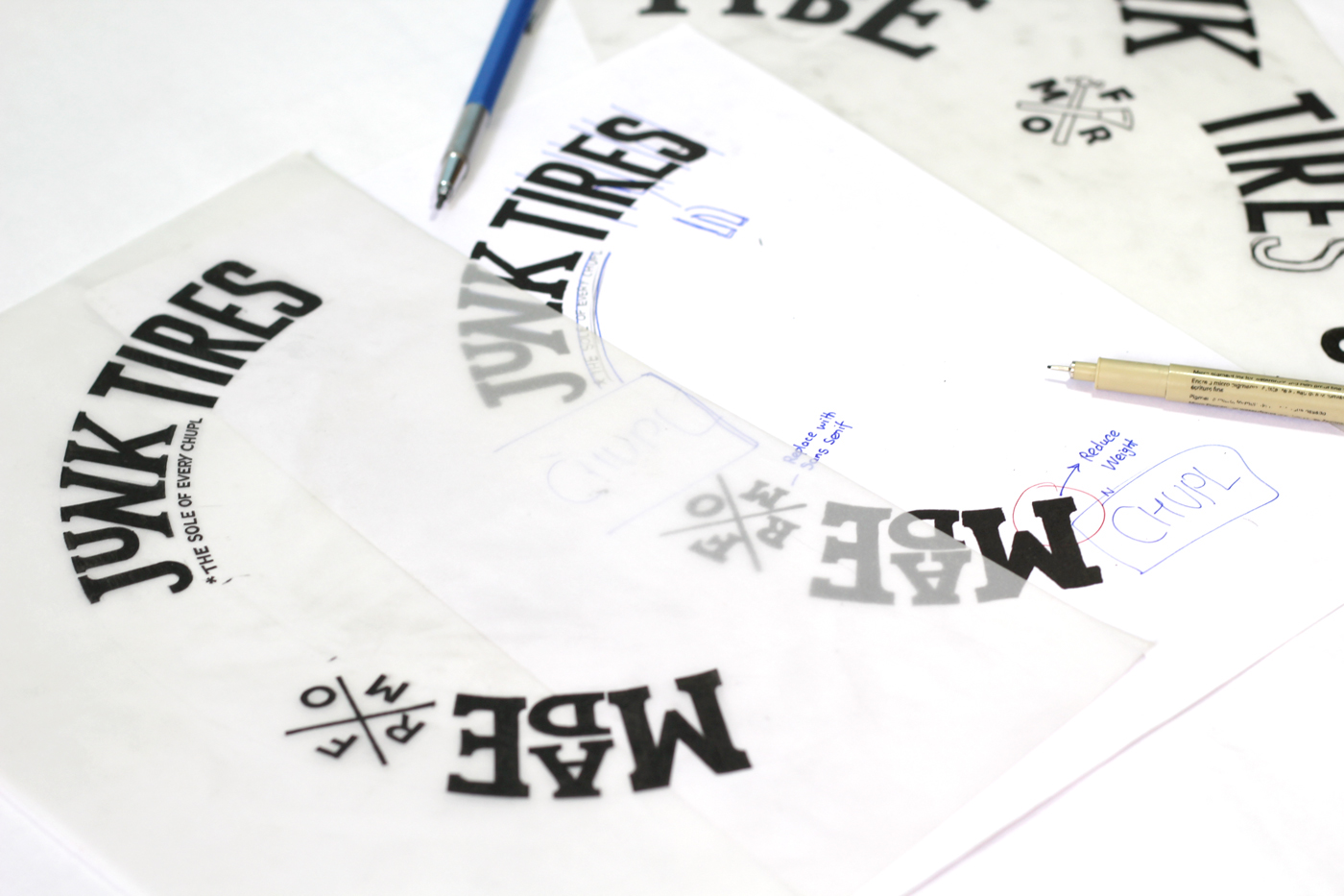

One of the many different options made.
In case you want to stay updated on design process check these:
http://instagram.com/niteeshyadav
http://dribbble.com/niteeshyadav
https://www.facebook.com/niteeshyadavdesigns
http://instagram.com/niteeshyadav
http://dribbble.com/niteeshyadav
https://www.facebook.com/niteeshyadavdesigns