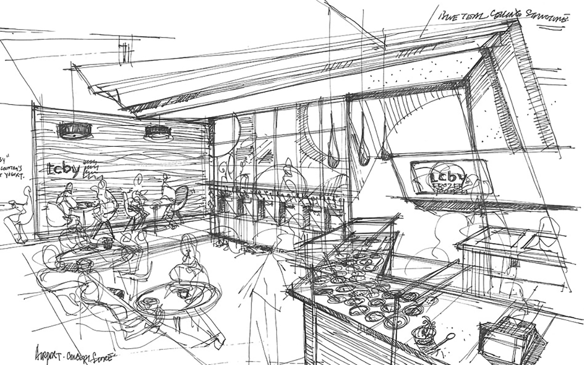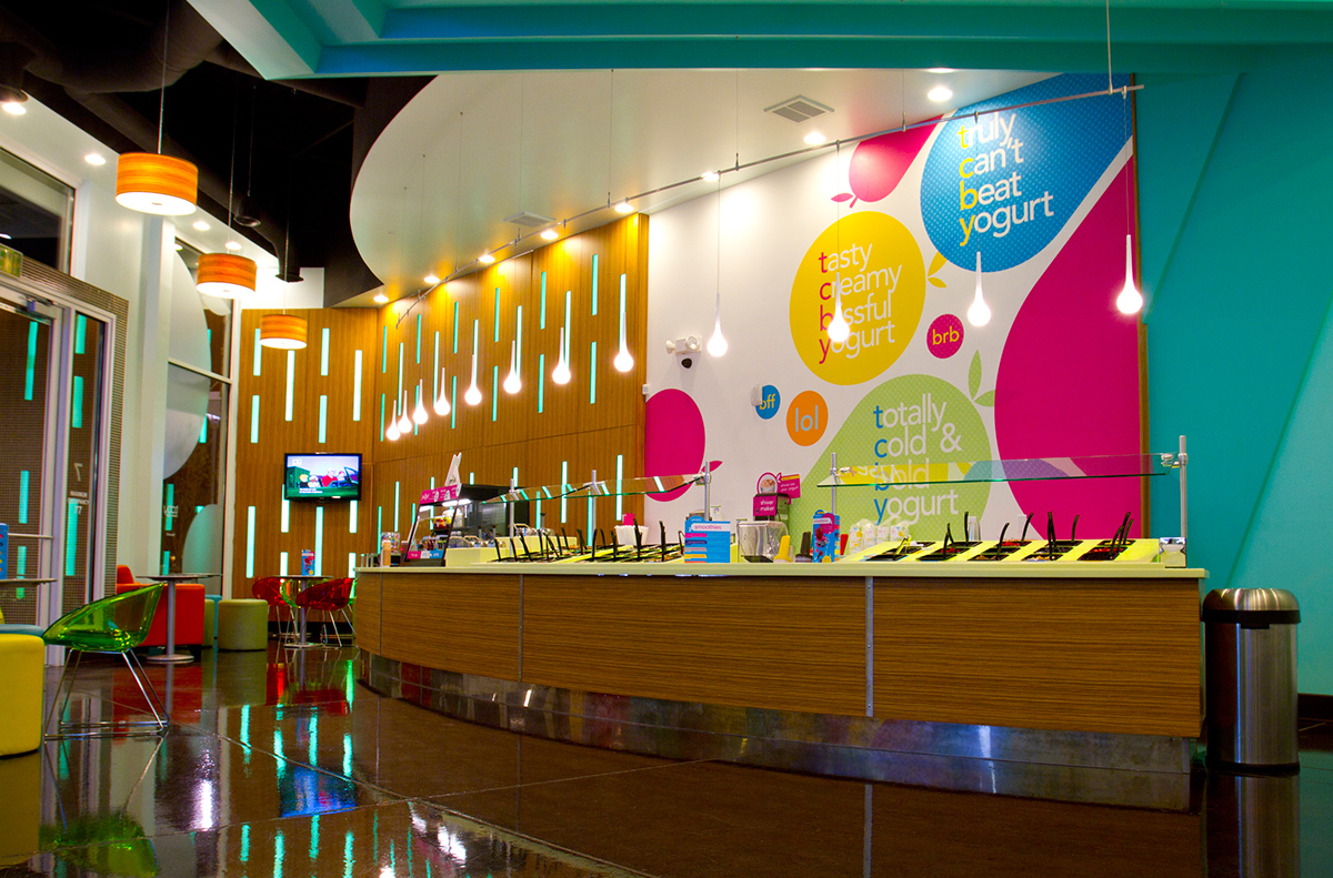


Creatively, this was an exciting challenge. We not only needed to reflect the new self-serve direction TCBY was taking, we also needed to respect the 30-year, category-creating history of the TCBY brand. We explored some throwback options, looked to Europe and Asia for emerging trends, delved into market research and consumed a lot of amazing frozen yogurt.
While several unique design directions were created, each expressed a few givens: the new brand should be friendly, suggest health, and remain simple while incorporating a memorable twist. A winner quickly emerged. The proprietary typography is simple and approachable, while the cup shape within the “Y” provides the hook. Indeed, the empty cup reflects the self-serve concept perfectly, encouraging customers to fill the cup with their own masterpiece creations using the country’s best yogurt.


