Metamorphosis explores the transformation of a 22-year old logo into a modern, enduring self-image. The main focal point was to design a logo that did not specifically relate to any one culture or nation but design a multi-dimensional logo; that possessed many facets. The main thought that aided in the logo’s development came from Comvort’s website: “Think Global, Act Local”. The strength of those words suggests that the logo must have its own voice; one that is able to transcend different organizations and create a sense of holistic belonging while maintaining one’s own identity.
The direction for the logo design came from four (4) guiding thoughts:
• Progress
• Strength
• Sophistication
• Memorable
The direction for the logo design came from four (4) guiding thoughts:
• Progress
• Strength
• Sophistication
• Memorable

Inspiration for logo
The world has become smaller not geographically but via the very technology that we utilize. Technology now enables us to connect our thoughts and ideas at greater speeds. There is no longer the limitation of space.
Similarly, Comvort acts as a bridge between creative organizations; not allowing space nor geographical location to be a hindrance to creative development and connection.
The present Comvort logo and its square were reminiscent of the Earth boxed in.
My design background reminded me of the golden ratio and the ideal proportions. The process took me from a circle in a square to a triangle in that same square and using those shapes as my template into forming my own fonts for the logo.
Eureka! I remembered the V cutout of the blue square, which would form the M for my logo and create a logo mark. Diagram on the next page maps the creative process and thought.


Multl-Dimensional Versatility
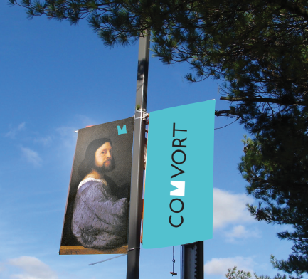
Maintaining the concept of making the logo relevant to a global market, I sought to re-use a strong characteristic of the former logo to achieve this. Its unique shape makes it memorable and can be re-used.
One method of achieving a purpose for the logo mark was to beg the question of how well integrated it is into the entire system. I loved the idea of making the logo more interactive within its environment and to its audience, giving the audience a chance to adapt the logo as their own.
This is the potential I see in this logo; as an elegant re-design, which crosses generations and multiple cultures without losing its own voice. I have drawn some examples of the logo mark and how it can be applied in the following pages.
There is a limit as to how much the logo can help in the success of the company, as the rest is dependent upon the efficiency of the organization and how effective it maintains its part in the wider whole.