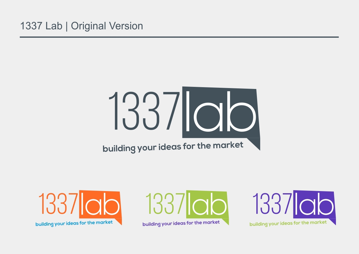
Original brand presented some consistency issues like lines, fonts families, alignment, continuity etc.
also the color variations for each office didn’t seemed very “professional” they looked somehow "childish"
also the color variations for each office didn’t seemed very “professional” they looked somehow "childish"

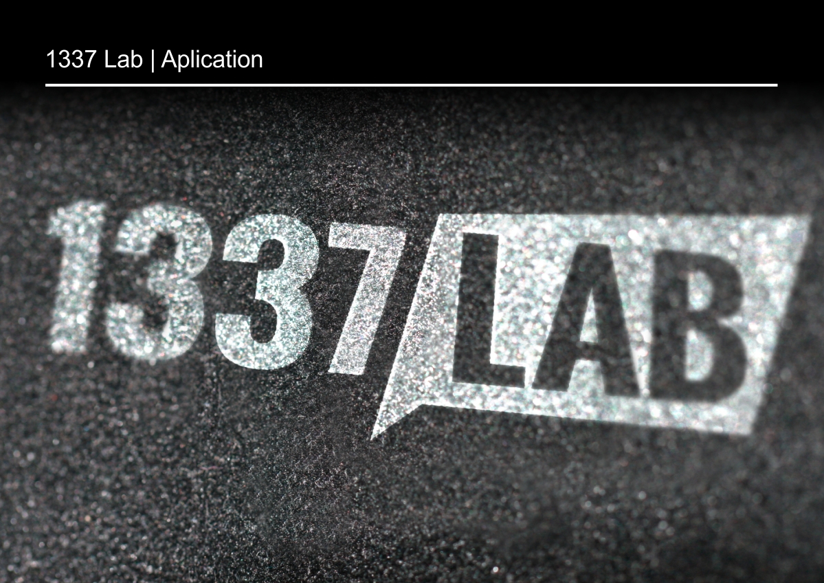
We decided to go with a strong and bold font family (oswald)
and worked on the blurb-text relationship and the blurb shape itself
and worked on the blurb-text relationship and the blurb shape itself
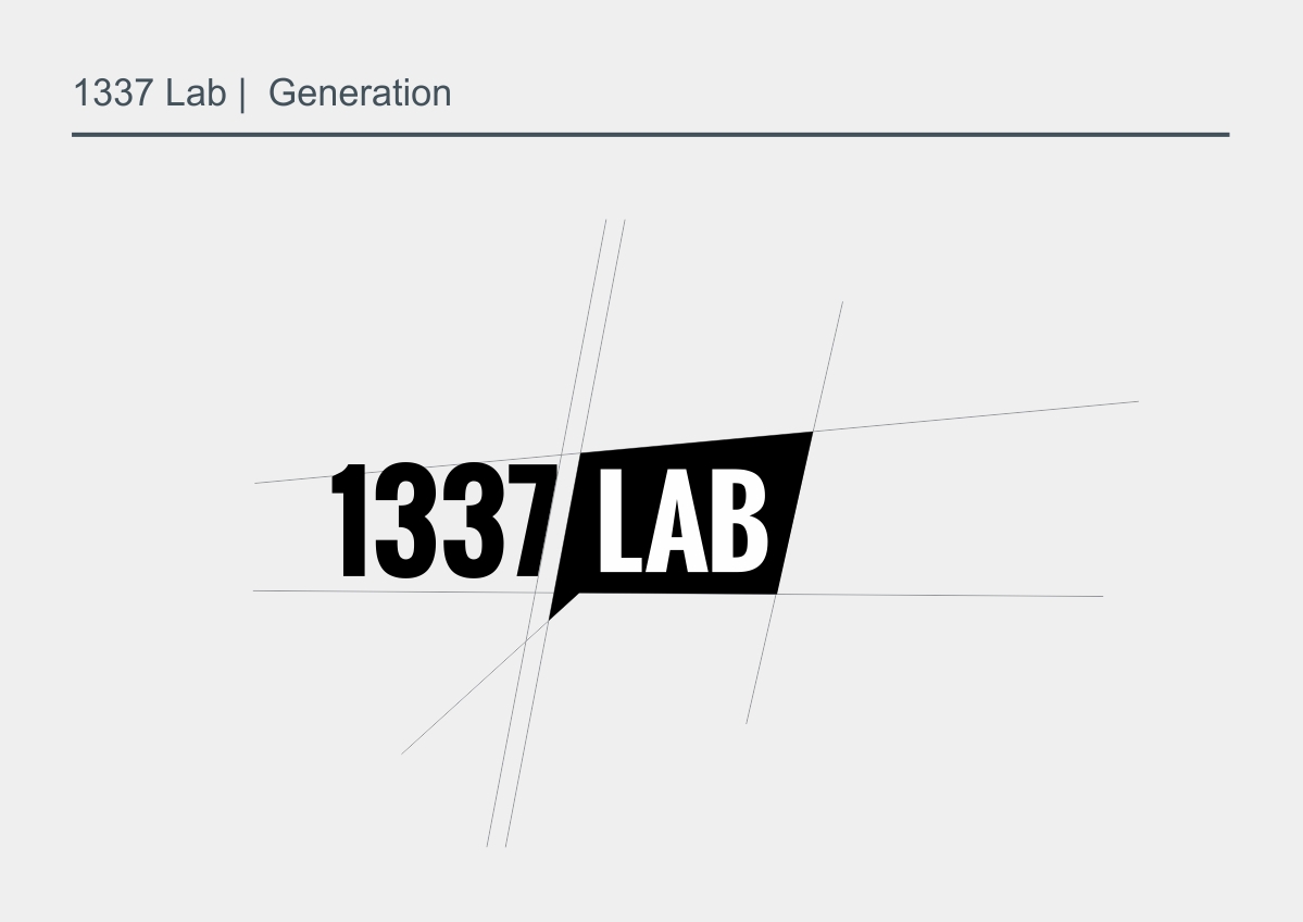
We ended up giving the blurb the golden ratio proportions
We aligned the texts so it can be read as a single line and we make parallel lines in the horizontal direction to ease the eye pasage through the two words (1337 and lab)
We aligned the texts so it can be read as a single line and we make parallel lines in the horizontal direction to ease the eye pasage through the two words (1337 and lab)
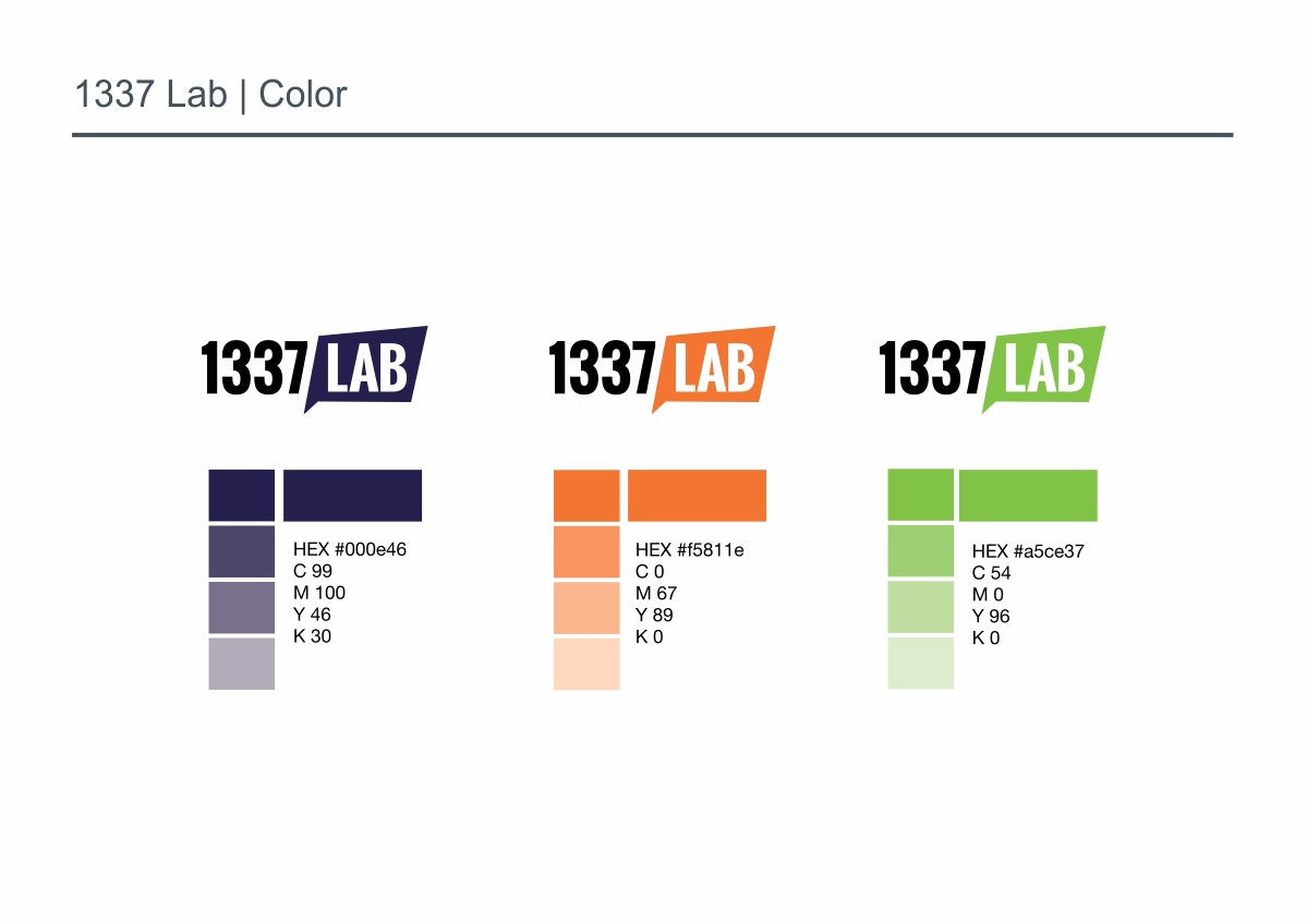
The color scheme was reduced and taken down a bit to have more serious shades (specialy the blue) and keeping only one color for each department.

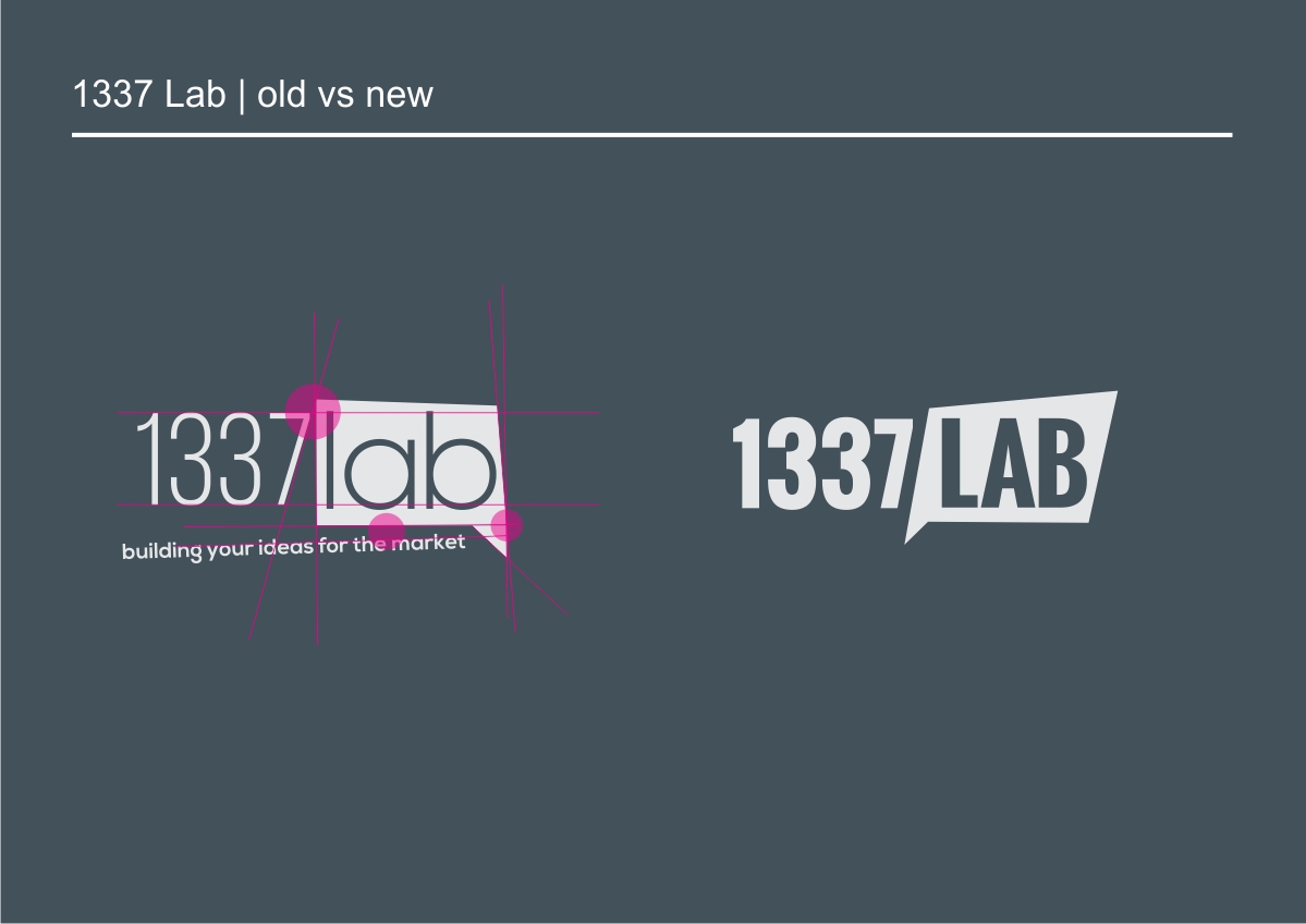
In the compared versions we can see the differences between both logos.
Balanced proportions, continuity in lines, simpler on family font, improved readability ,improved pragnanz, easy recognition,
easy memorization.
Balanced proportions, continuity in lines, simpler on family font, improved readability ,improved pragnanz, easy recognition,
easy memorization.
check the website here 1337lab.io

