“Cooperativa de Seguros DAN”, with headquarters in Tres Arroyos city, is one of the most important of Buenos Aires Insurance companies, and for its 90 anniversary commissioned us the development of the new Corporate Identity.
It took us about four months of work. From the first meeting until the final deliverable, we discover the brand’s values: Safety, Commitment, Support, Professionalism, Response speed, Proactivity (customer service) and above all: transparency. We met their clients (who are referred to as associates), most of them are agricultural producers who “reason their emotions”, clearly choose what suits them better and make the right decisions. People who are characterized by their precision, their effort and their will. And we end up defining for the new graphic brand these characteristics that we defined and agreed together, are the correct ones to transmit: Security, Tranquility, Bonanza, and Coverage.
WE PAMPER OUR CLIENTS
Throughout the design process, we worked closely with the General Manager and the final decision was made in a board meeting, where all the alternatives were presented to achieve a consensual and unanimous decision based on observation and listening, both from the professionals that we develop the brand as the members of the Board of Directors.
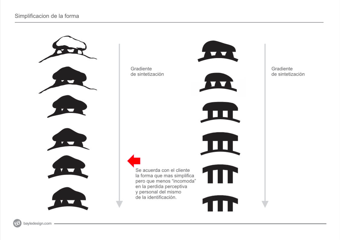
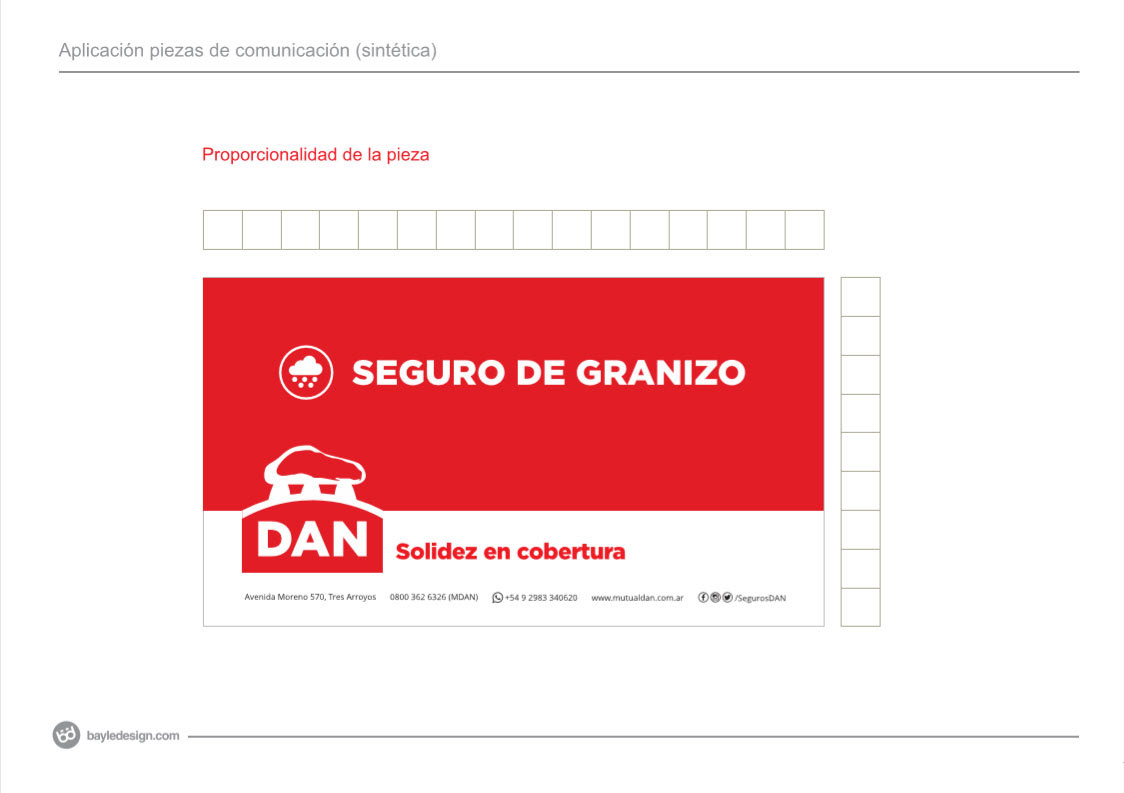
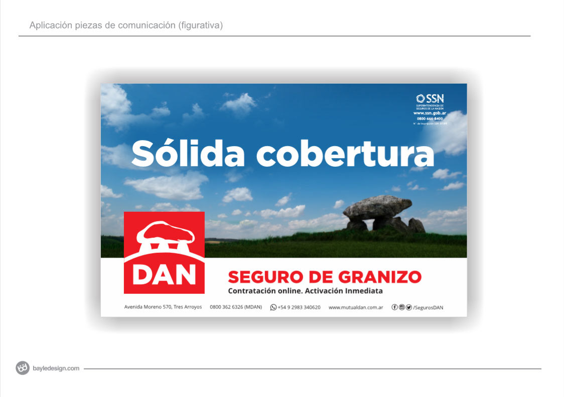
For the decision process, we developed and included as a teaching piece a “shape gradient” to explain in each case how the brand values are represented; from a quasi-pictorial image to an absolute synthesis.
For me it is very important to tag along with the client in the decision process, teaching, debating ideas and, above all, listening and interpreting their needs. The satisfaction in the final result is 100% for everyone. At the end of the day, it is the Institution that communicates, not the designers. Our job is to help them send out that message clearly, consistently, and in a highly persuasive way.
WE ARE PASSIONATE ABOUT DETAILS.
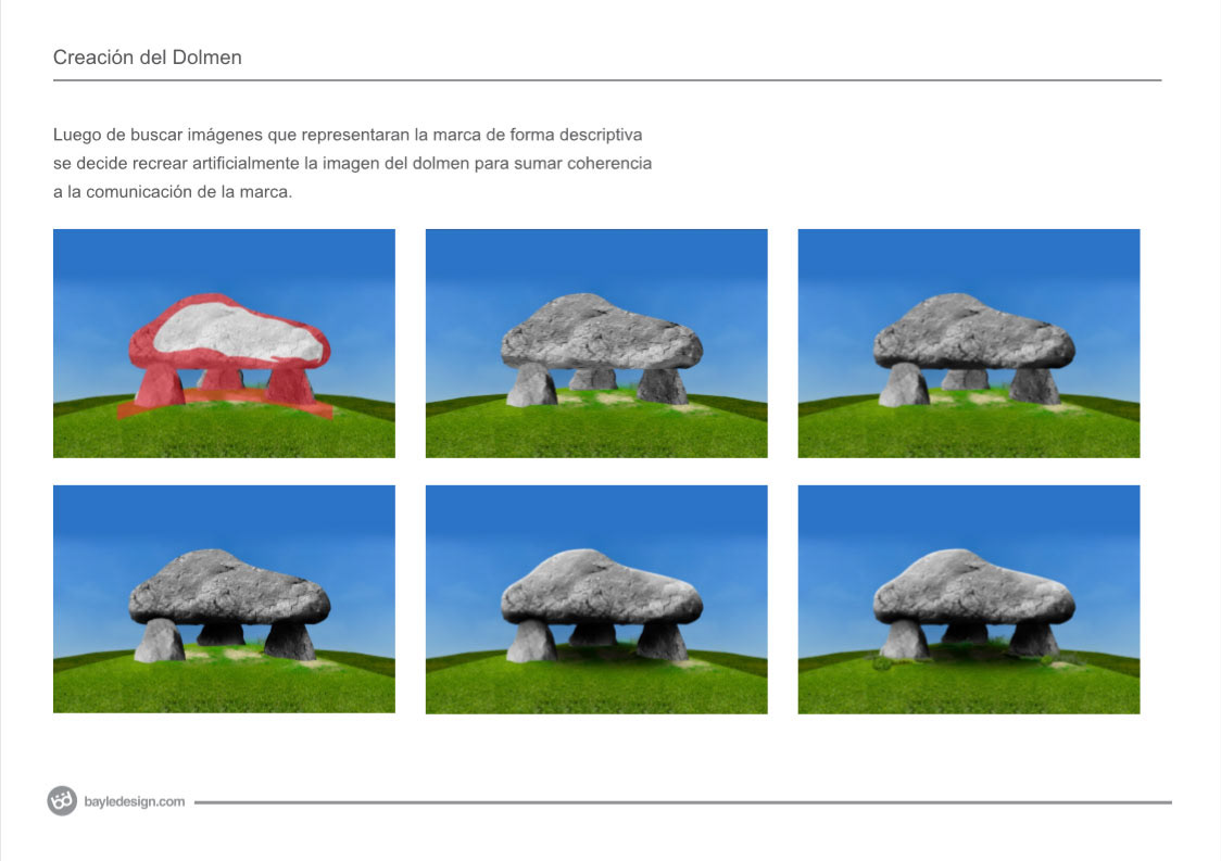
We never found the original dolmen that inspired the painting (1) which served as the brand’s icon, the images we found did not exactly fit the icon and its evolution. Since we like to pay attention to those little details, I decided that it had to be recreated digitally
(1) Dolmen in Raklev, Røsnæs is an oil painting on canvas by Danish artist Johan Thomas Lundbye made in 1839. It shows the dolmens at Raklev, on the island of Zealand, in a vast landscape. The work is in the collection of the Thorvaldsen Museum in the city of Copenhagen.
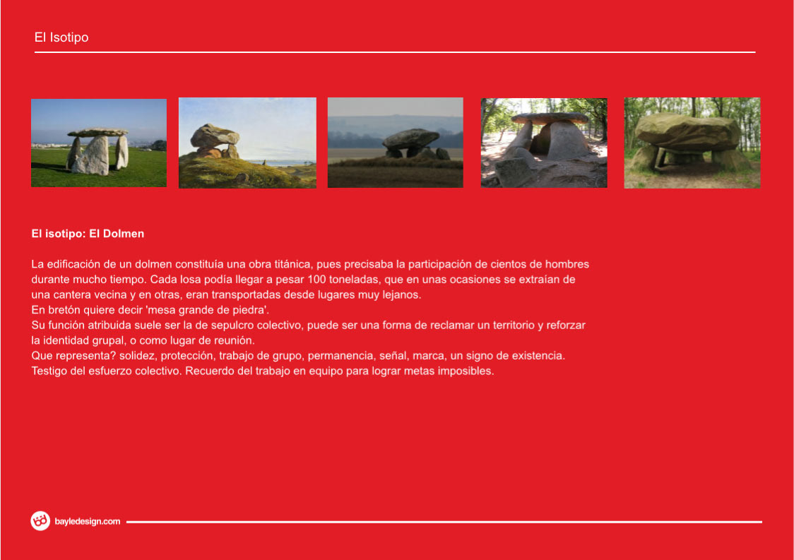
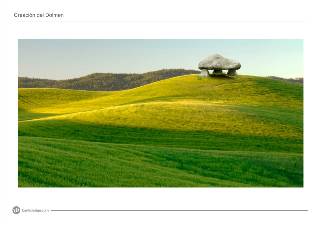
WHAT DOES THE DOLMEN REPRESENT?
A titanic work without doubts, hundreds of men involved in the construction for a long time dealing with heavy slabs, which sometimes were mined from a neighbouring quarry and sometimes needed to be transported from far away places. This constructions became a meeting place and reinforced the human group identity.
The Dolmen represents strength, solidity, protection, teamwork, permanence; it is a sign of existence. A dolmen witness the collective effort and is a perennial reminder of teamwork as the ultimate way to achieve goals that seem impossible.
The Dolmen represents strength, solidity, protection, teamwork, permanence; it is a sign of existence. A dolmen witness the collective effort and is a perennial reminder of teamwork as the ultimate way to achieve goals that seem impossible.
THE NEW NAMING
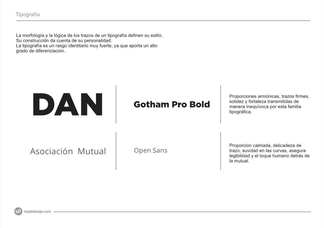
A simpler, more colloquial identification, related to the way of associates speak: “DAN” written in new typography with harmonic proportions and firm lines, that transmits solidity and strength unequivocally.
AN EVOLUTION WITHOUT REVOLUTION.
Tradition in values, but at the rhythm of today and always thinking about the future, DAN stands with its partners presenting the new communication. Tradition and modernity, united, for the benefit of the entire DAN family.