CLRS & CO was asked to deliver a corporate identity, one which would reference the existing Wecke & Voigts logos while communicating a strength equal to the all-embracing nature of The Wecke & Voigts Group.
In creating a logo for the Group it was necessary to echo the logos previously developed for the department and wholesale stores, both of which cross-bred contemporary lines with strong references to the German graphic heritage of the businesses. It was equally essential that the logo communicate the spirit of collaboration and co-operation that has enabled Wecke & Voigts to prosper over a period of 122 years.
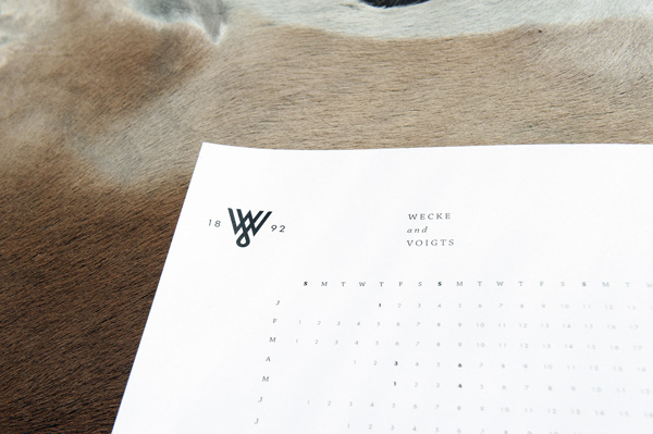
To achieve this the ‘W’ and the ‘V’ from the department logo were transposed, forming a strong symbol of slanting parallel lines, an appropriately powerful symbol for an entity which co-ordinates many established, respected businesses. To break up the angularity of the joins we extended the bottom point of the ‘V’ into a teardrop loop, a transliteration of the ampersand from the department store logo and simultaneously a visual that symbolizes the co-operative, permanently conjoined nature of the companies in The Group.
Graphic Designer/Art Director - Franco Fernandes
Senior Art Director - Claire Johnson
Creative Direction - Marcii Goosen

Wecke & Voigts Group Logo

Wecke & Voigts Group Icon
Wecke & Voigts Group Logo

Wecke & Voigts Group Stationery

Wecke & Voigts Group Stationery

Wecke & Voigts Group Stationery


