The course focused on making the complex clear and for my final I choose to redesign the Amtrak ticket, hoping to enhance its clarity.
Problem
The absence of typographic hierarchy in Amtrak Tickets leaves the viewer struggling to navigate through the ticket. This inability to quickly extract the most significant information relevant to passengers is further troubled by the language used. Abbreviated titles on the ticket are not always clear and ultimately further confuse the passenger.
Solution
Solution
Redesigning the Amtrak ticket to focus on simple functionality and user experience through typographic refinement, grid structure, plain language, and the introduction of white space.
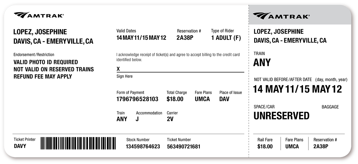
Current Amtrak Ticket

Proposed Redesign
Rational
The passenger receipt on the right is treated with larger type and a gray header to attract the user and quickly relay the most important information related to their travel.
For unreserved trains that don’t have a train number, I used plain language to say ANY. This was a common misunderstanding I found in my user testing, why is train number or time not specified? The intention of saying ANY is to communicate to passengers that an Unreserved ticket can travel to your given destination with any train at anytime during your valid dates (1 year).
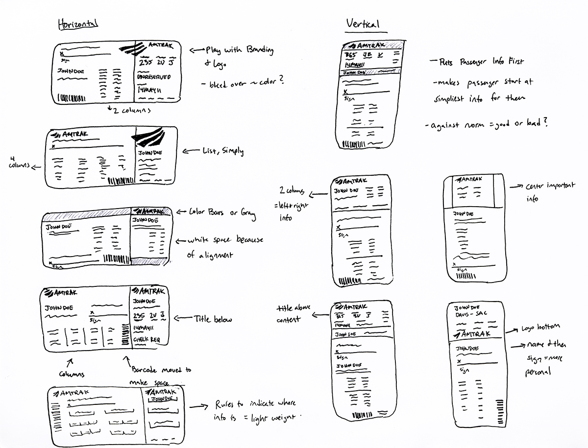
Brainstorming + Identifying the Problem

Surveys

Sketches: Thumbnails + Refined

Digital Drafts + User Testing


