Identity for Westerdals School Of Communicaion
2011 - Exam
2011 - Exam

The concept behind the new Westerdals profile plays on the school's role as a creative problem solver. Strategic communication is a common denominator for all students at Westerdals, whether you go to Exposure Design or Art Direction, the goal is to develop total communication. The road from starting point to final result consists of different phases, such as situation analysis, strategic choices and means. Such a process can be compared with production in a factory. Before the finished product comes out of the factory, it has been through several stages during production. Westerdals works with other words as a factory that creates society's creative problem solvers. From starting school as a blank sheet of paper, until you go out like a real Westerdøl.
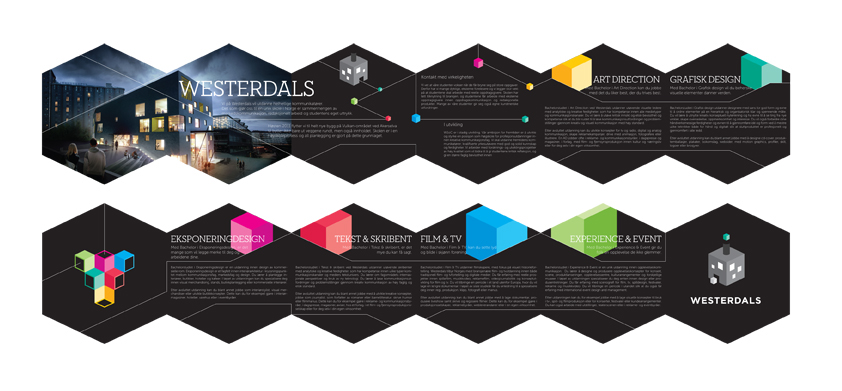
In the autumn of 2011 Westerdals moved into new premises in the old industrial area Vulcan. The logo symbol is a playful interpretation of the new school as a creative factory. The new building is characteristic with its many square windows of various sizes. These go back in the logo icon to create an association to the new building. The white cube symbolizes the starting point of a creative process (the new student who comes in as a blank sheet of paper), while the colored cube symbolizes the result (the total communicator). I have created a playful and direct expression by telling a story through the logo symbol. Simple communication. The color of the cube that comes out of the pipe varies through the profile to represent the different courses the school has to offer.
I have chosen to use Gotham Bold in capitals in the logo. Gotham is a geometric sans-serif inspired by architectural signage. It has a square and industrial expression that makes it fit well with the architecture of the new building. The bold font gives the logo gravity, placing the school as a progressive and leading university in a Nordic perspective. As a contrast to the simplicity of the logo, I use additional elements such as patterns and lines in parts of the profile. Additional elements in combination with the Neutraface font makes the profile more experimental and daring, as well as it provides the profile context and modernity.