Dyslexia Poster
This was a project I created for a typography class my junior year (2001) at UMD. The assignment was originally to create an example of concrete poetry, based on a John Cage poem. My first version of the assignment was the poem, laid out in the profile of an airplane (as the poem is about a speech that was constantly interrupted by airport noise). My professor, the renowned Robert Appleton, accepted the design, but pulled me aside after class and said "What you turned in is fine, but you could have done better." I knew it was true. I had done the minimum amount of work and thought required to fulfill the minimum requirements of the assignment, as students tend to do. Professor Appleton, with the lightest touch, inspired me to take that assignment, dive into it, and really give it everything I had, as great teachers tend to do.
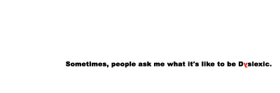
I went straight home and read the poem over and over, trying to figure out what it meant to me, and how I could visualize my response to a work I was having a lot of difficulty understanding. Then it hit me. I was having problems understanding the poem, in large part, because I was having a hard time reading it due to my dyslexia. And THAT was the insight I could share that would take this poster from an acceptable assignment, to an interesting design piece.
I designed this piece not to be a literal interpretation of what I see when I look at a page of text, but rather an exercise for non dyslexic people. It helps them better understand the difficulties and frustrations a dyslexic person faces even when trying to read something as simple as a poem. After just a few minutes of reading this text, it becomes painfully clear why reading speed and comprehension, amongst other things, are such a challenge for people suffering from this disorder.