From August 2009 to June 2014, as UX lead I was responsible for the 1&1 shop websites, first hosting, later access (broadband, mobile), including the international homepages.
Here's a couple of snapshots to illustrate the evolution of the 1&1 homepage over those five years.

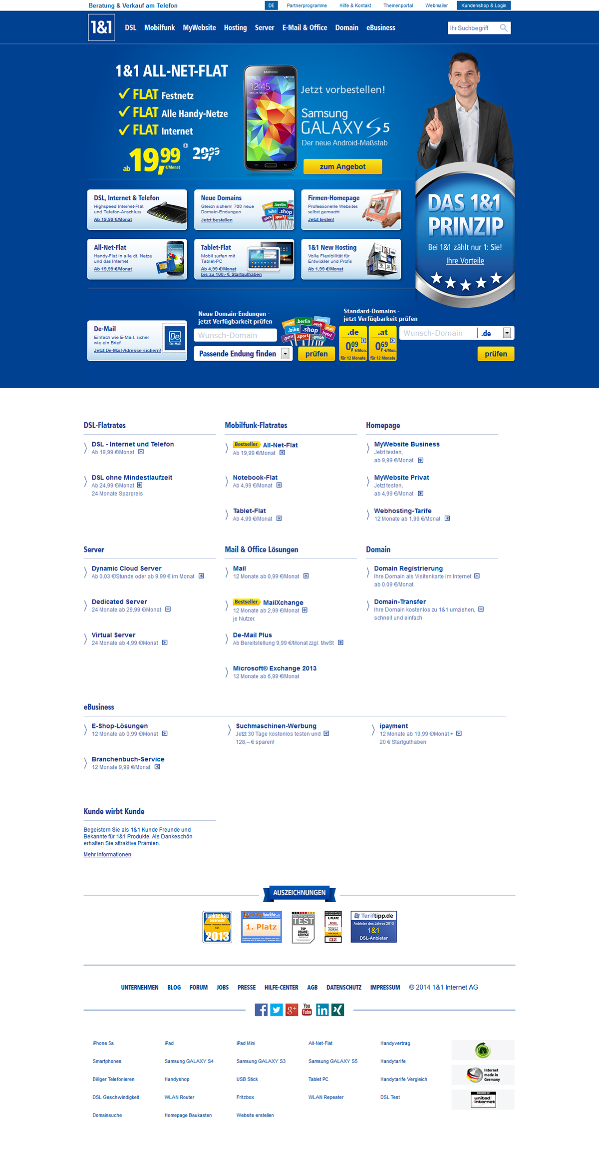
March 2014, following a re-design of the 1&1 print marketing CI led by Jung von Matt/next
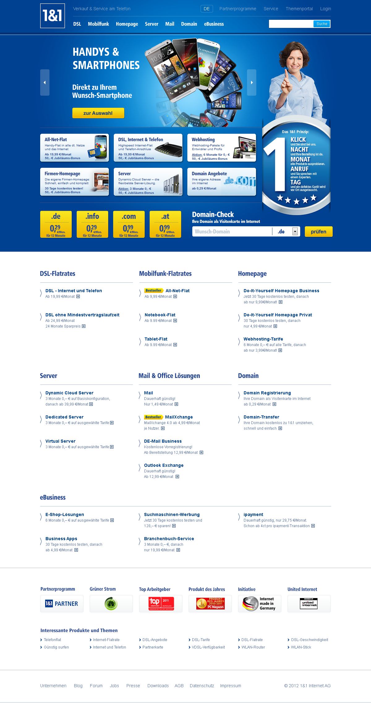
Late 2013, last incarnation of the 'classic' 1&1 homepage before the latest major re-design. I was really quite happy with this one, performed well, too.
2013. The blue background (kind of) makes it to the larger markets. No more product boxes for everybody, they were replaced by a structured list with no measurable damage. Boxes on the blue background "above the fold" for the top product lines only. Holding back on shape, color and imagery never lasts long in a sales environment, though.

2012. A smaller version of the homepage for the market entry in Italy. Smaller product range, no product boxes here, and trying out a blue background.
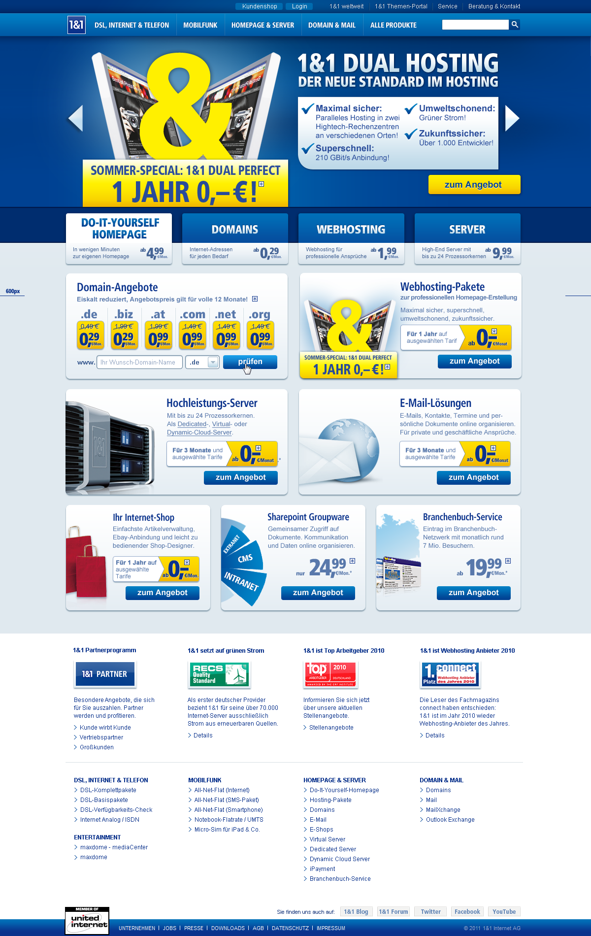
2012, the return of the box. Back by popular demand, every product range struggles for screen real estate.

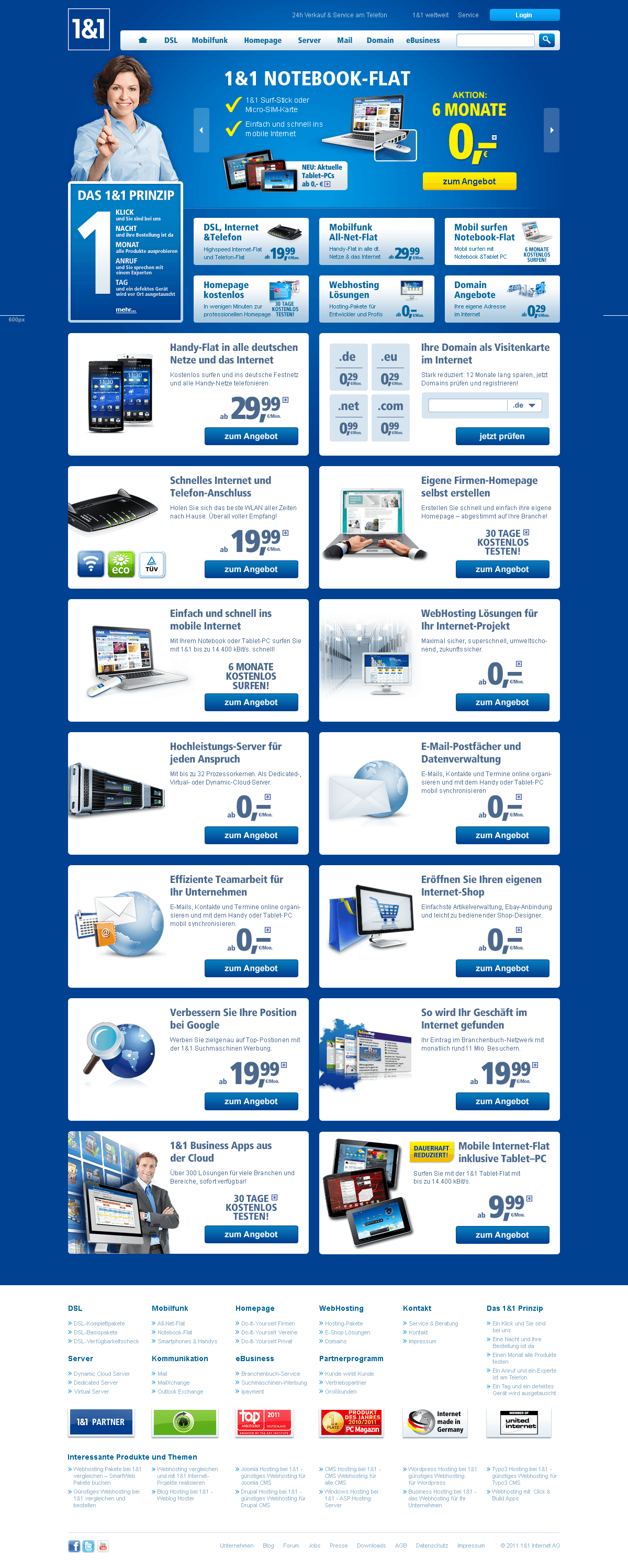
Late 2011. More billboards (every product range wants one!), lots more marketing-driven content. We tried to fight the congestion by getting rid of all those boxes and toning down the palette even more. Update on the navigation: smaller flyouts replace large doormats for the 2nd levels.
2011. Now that's what I call a proper navigation. Together with the new search (GSA), we gave the product pages quite the boost.
Four billboards for the main product ranges, all-around style update from 'retro' to 'current'.

2010. Major re-design, based on a revised print CI by Jung von Matt. Three classes of product teasers, focus on the primary 1&1 colors, tentative return of the main header navigation (only two tabs for now).
No more stock photos of people, only key testimonials remain.

2009, right before I started. The main header navigation had gotten the boot, a broader product range demanded more and more product teasers.

2008. The shops were part of a larger entity with news and shopping portals. Stock photos of people everywhere. Special offers were lovingly nicknamed "hedgehogs".


