RU TV Music channel
Rebranding concept
RUTV is the only remaining music channel in Russia at the moment. In terms of content it was reflective of what kind of music is popular across the country and the identity looked as uninspiring. We were invited to work on a new branding concept for the channel and with reassurance of repertoire changes it is going to undertake we embraced the opportunity.
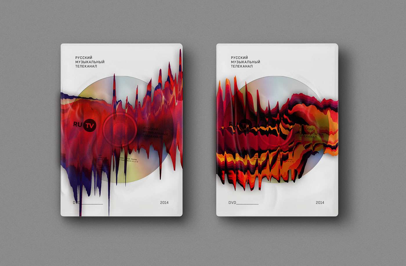
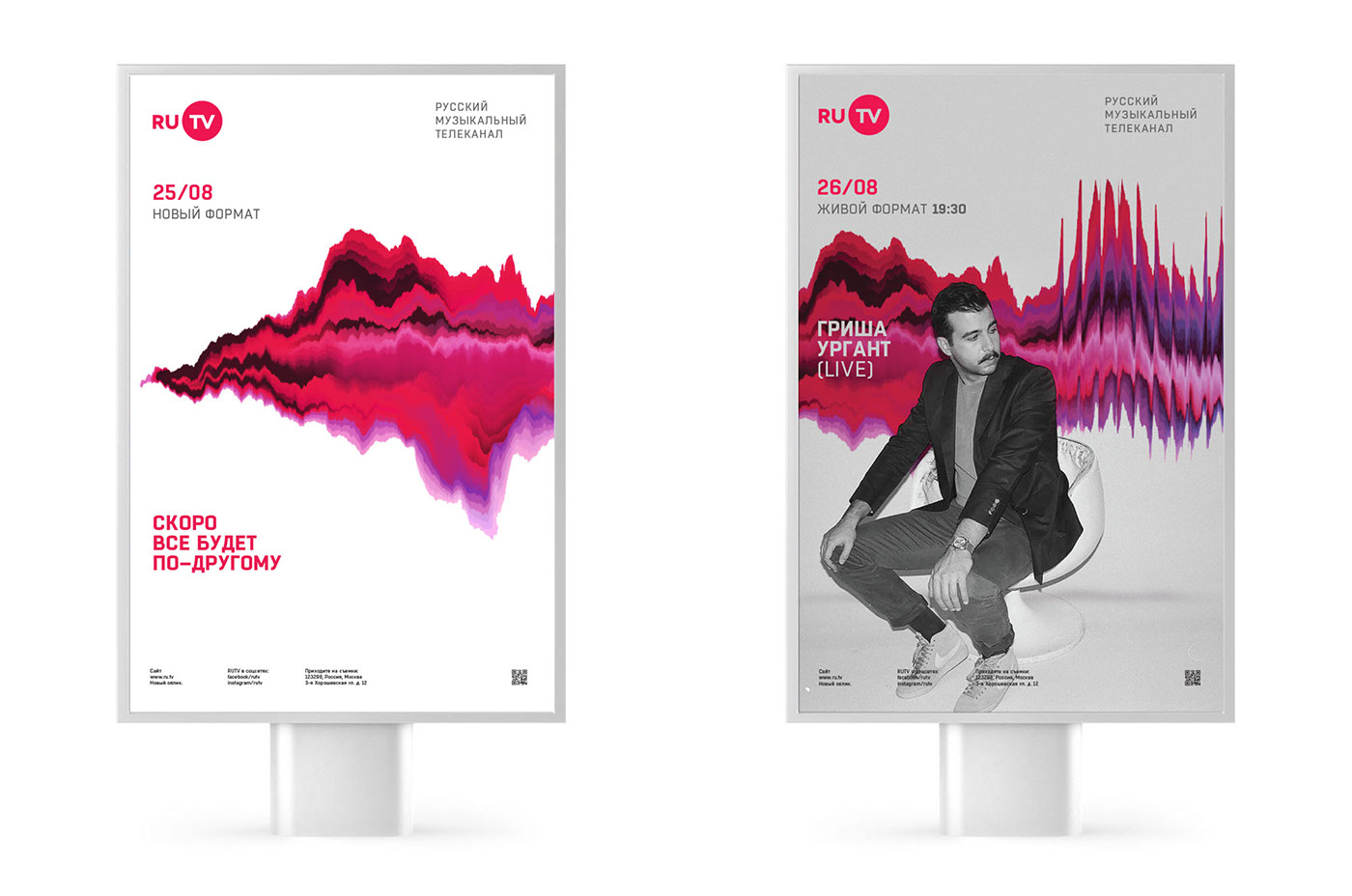
The main consideration was that after all the years the old logo was quite familiar to the public, so we had to keep the new one as close to original as possible and find a supporting feature to add value to the new identity. The Wave — a made up hybrid of a soundwave and a colorwave — became the solution. Created to represent the mix between music and video as the basic content of the channel, The Wave is able to affect and transform everything it touches much like any artistic output has an effect on us. It’s a dynamic identity as the intensity and colour of the wave depend on the music played and there are infinite numbers of the waves generated. We also proposed a special app that automates the creation of waves and distortions to be used in print. Even employees can generate an image to their liking and use on personal stationary.
Recently we’ve noticed the identity being implemented across advertising and print, so hopefully the TV idents based on The Wave would be revealed soon too.
Old logo:

New logo: