THE CLIENT:
The Canadian distributor for Dexpan, a product that breaks up rock and concrete. The client wanted an e-commerce website where customers could order online, 24/7. Their original website was not responsive and the interface was in need of reconstruction as well as a makeover.
PROBLEM:
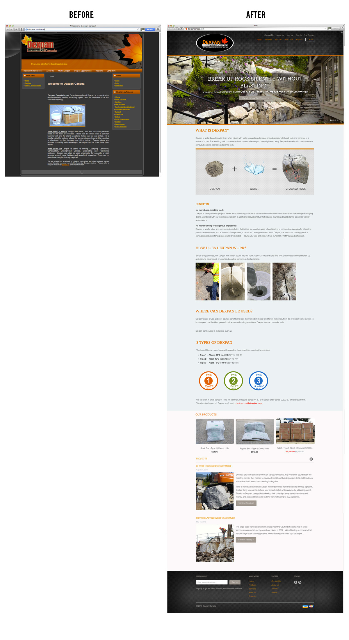
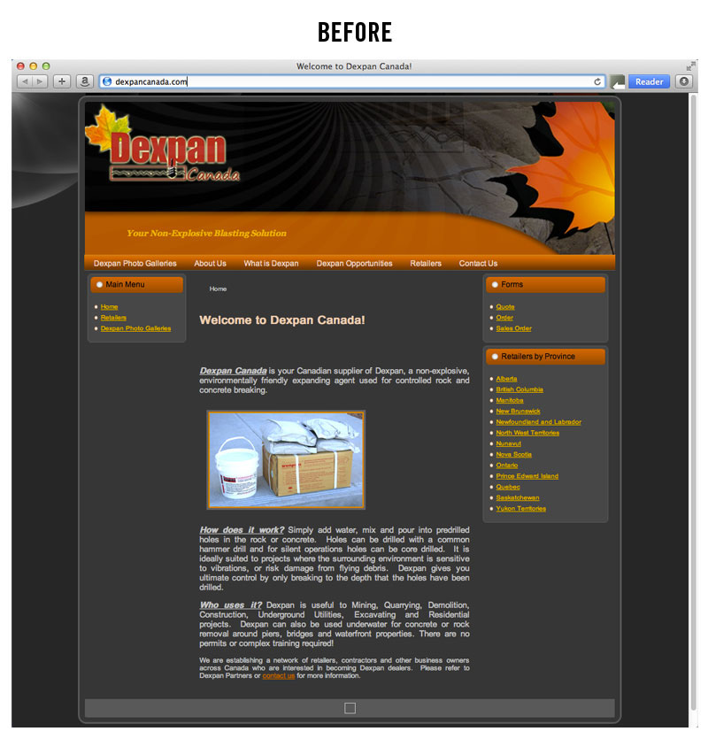
STRUCTURAL: The old website's information hierarchy is disjointed — information is hard to find; redundant menu bars make navigating the website confusing and cumbersome. It was difficult to know what the product actually looked like, and the contact information could only be found by clicking on Contact Us.
AESTHETIC: The old website only had minimal graphics, which made it uninspiring to read. The header was too tall and consumed prime "real estate". Also, it wasn't responsive, meaning that it couldn't be properly viewed across different screens for mobile phone, tablet and desktop use. People had to constantly zoom in and out and scroll endlessly to see the whole page.
MARKETING
From a marketing point of view, the website was a "static website", and was missing on the opportunity to provide educational marketing. It was in need of a content marketing strategy (blog) as well as help its search engine optimization.
SOLUTION
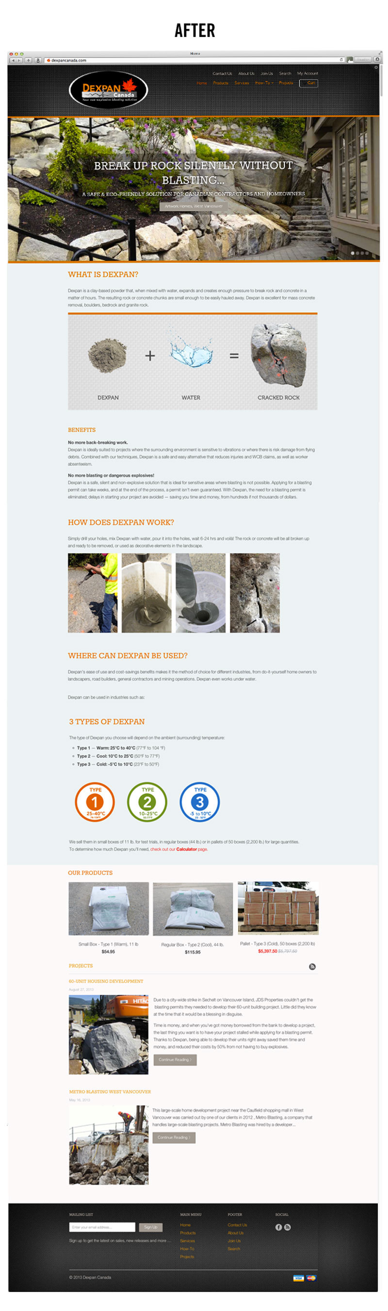
HOME PAGE: The new website not only looks more polished and professional, but contains all the elements of good Web marketing: from SEO optimization to video, newsletter sign-up, free opt-in offer, and content marketing (blog, FAQ, and 'Tips & Tricks' sections).
An large image was placed on the home page to show the end result of the product's application (outdoor landscaping). We wanted to graphically show what the product looks like and how it works, so photography was used for the "Dexpan + Water = Cracked Rock" equation.
Most importantly, the benefits of the product were explained, then a quick visual synopsis of how the product works, where it can be used, e-commerce and blog section were added at the bottom.
With abundant graphics and clean design, the new website will be much more enjoyable to read and sustain the reader's attention. The design is also responsive, so the page resizes itself for optimum ease of use across different screen sizes.
With abundant graphics and clean design, the new website will be much more enjoyable to read and sustain the reader's attention. The design is also responsive, so the page resizes itself for optimum ease of use across different screen sizes.

The 'Products' page which takes the customer to a shopping cart for checkout. Coloured "stickers" were added to easily distinguish the different product types from one another.

Their different services were listed, as well as photos showed their crew at work to give customers a visual sense of who they help and what they do.


