


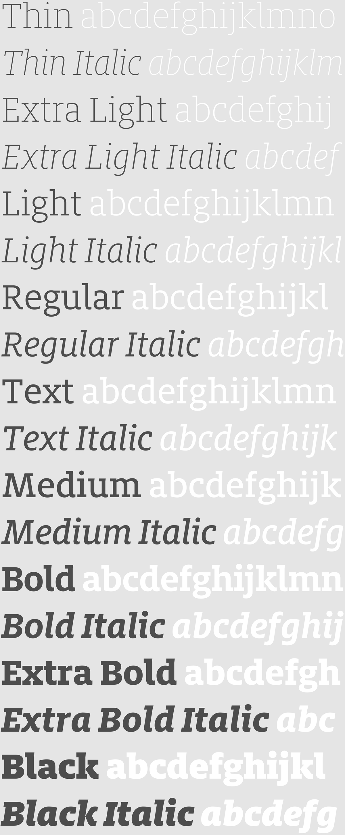


FF Milo Slab Thin & Thin Italic
FF Milo Slab Extra Light & Extra Light Italic

FF Milo Slab Light & Light Italic

FF Milo Slab Regular & Regular Italic

FF Milo Slab Text & Text Italic

FF Milo Slab Medium & Medium Italic

FF Milo Slab Bold & Bold Italic
FF Milo Slab Extra Bold & Extra Bold Italic

FF Milo Slab Black & Black Italic
The FF Milo Superfamily
Mike Abbink began work on FF Milo® typeface in 2000 with the goal of creating a compact typeface with very short ascenders and descenders. Because of its compact design FF Milo is a workhorse typeface suitable for magazine and newspaper typography. It has modern bones with a touch of detail for distinction (especially in the italics). The designer named the typeface after a resilient grain because, much like corn or grain is for many cultures, FF Milo is intended to be a solid staple of any typographic diet.
With the help of Paul van der Laan for kerning, spacing and production, Mike Abbink went on to develop FF Milo Serif as a companion to the FF Milo family.
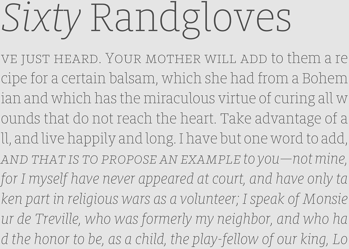
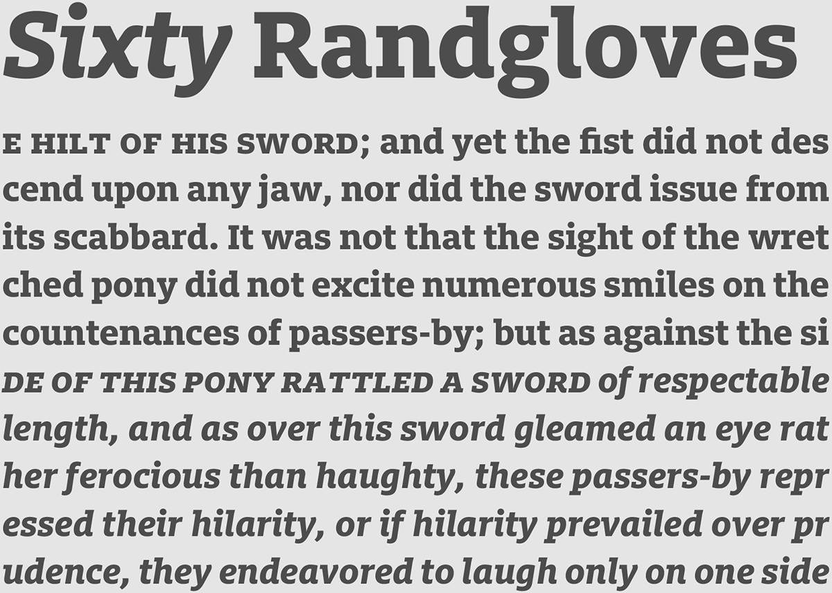
In comparison with its siblings, the slab has a more horizontal feel, due in large part to the adjustment of its terminal angles to accommodate the slabs. FF Milo Slab also takes a few cues from classic Egyptian style slabs rather than looking to the sans or serif for inspiration. You can see this in the italic ‘v’, ‘w’ and ‘y’ where slabs take the place of the flared terminals present in both the sans and serif.
All three members of this must have superfamily come with features essential for serious typographic composition: nine weights, small caps, old style figures, lining figures and tabular figures as well as some alternative glyphs to stir things up. Each member works well both united and alone.
FF Milo was selected by the ATypI as one of the best typefaces of the first decade of the 21st century during their Letter.2 competition in 2011.


FF Milo Slab

Purchase FF Milo Slab at FontFont.com

