

Thomas Ackermann and Felix Bonge equipped FF Bauer Grotesk with a large variety of alternate characters in the upright and italic weights respectively, e.g. a lower case ‘e’ with two different stroke endings, ‘t’ with a straight and a round terminal. It also comes with playful umlauts such as the dots in the bowl of the ‘Ü’.
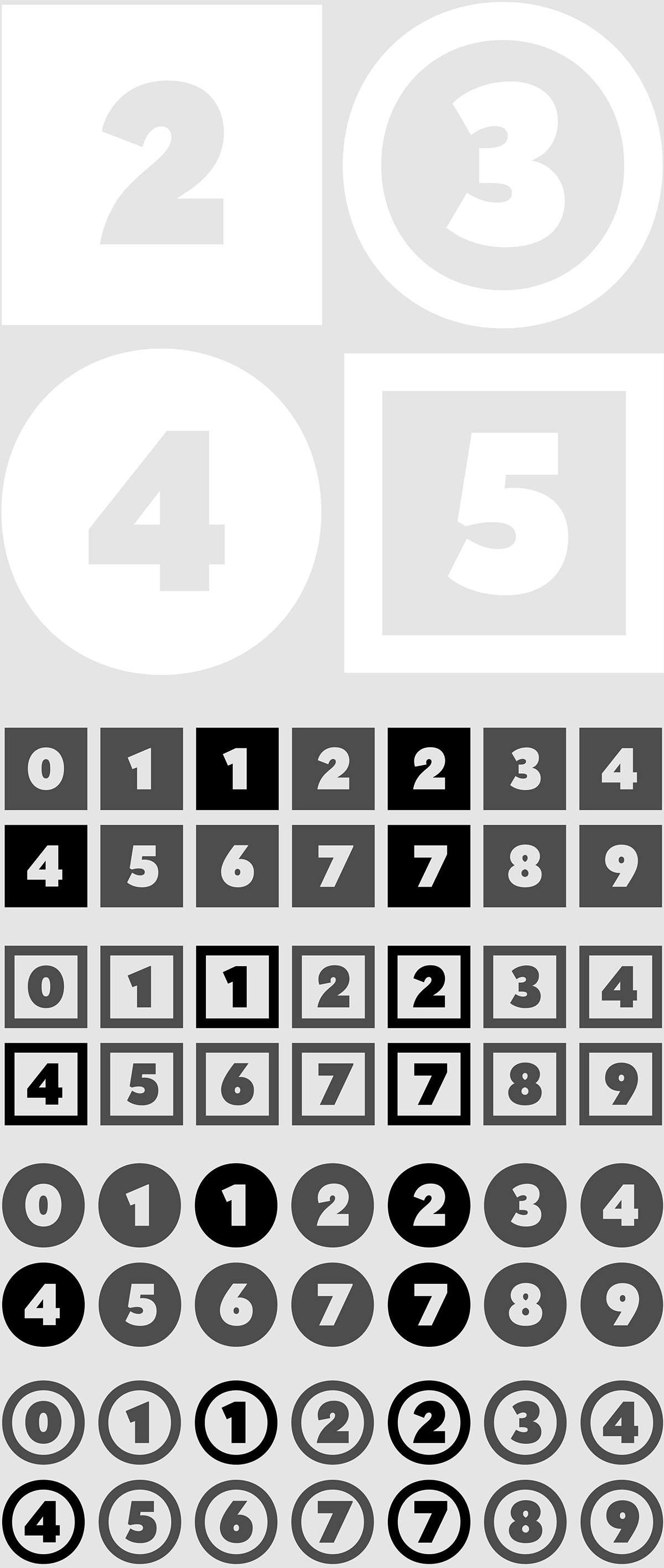
All fonts come in eight astonishing sets of figures, including playful numerals in square or circular outlines—both positive and negative. All these sets have alternative shapes for figures ‘1’, ‘2’, ‘4’ and ‘7’.

A selection of shapes, arrows and even hands (with little sleeves) round off the font. What’s more, note the selection of “Hanseatic features”: an umbrella, an anchor and the coat of arms of the city of Altona.

True to the historic examples of Friedrich-Bauer-Grotesk and Genzsch-Grotesk,
FF Bauer Grotesk is equipped with both pointing and flat climaxes in ‘A’, ‘M’, ‘N’, ‘V’, and ‘W’.
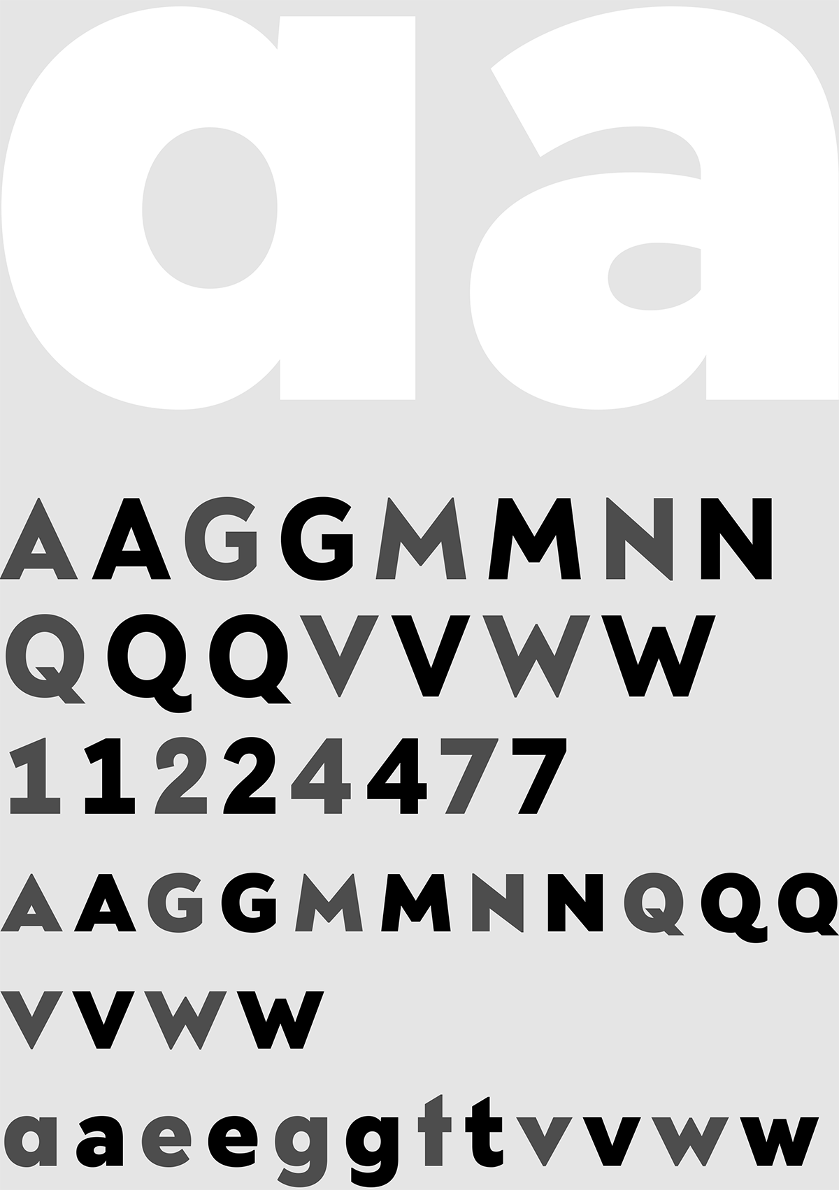
While ‘G’ and ‘R’ feature a high “art-deco-waist” in Friedrich-Bauer-Grotesk, they have been digitized in that historic model as well as in more contemporary shapes. ‘Q’ also comes in its original appearance as well as in two new alternative forms.

FF Bauer Grotesk features all ligatures in demand. Of course some of them have different sets of stroke endings. Unfortunately the ‘fff’-ligature cannot be used in German words such asSauerstoffflasche or Schifffahrt—that would be considered a typo.

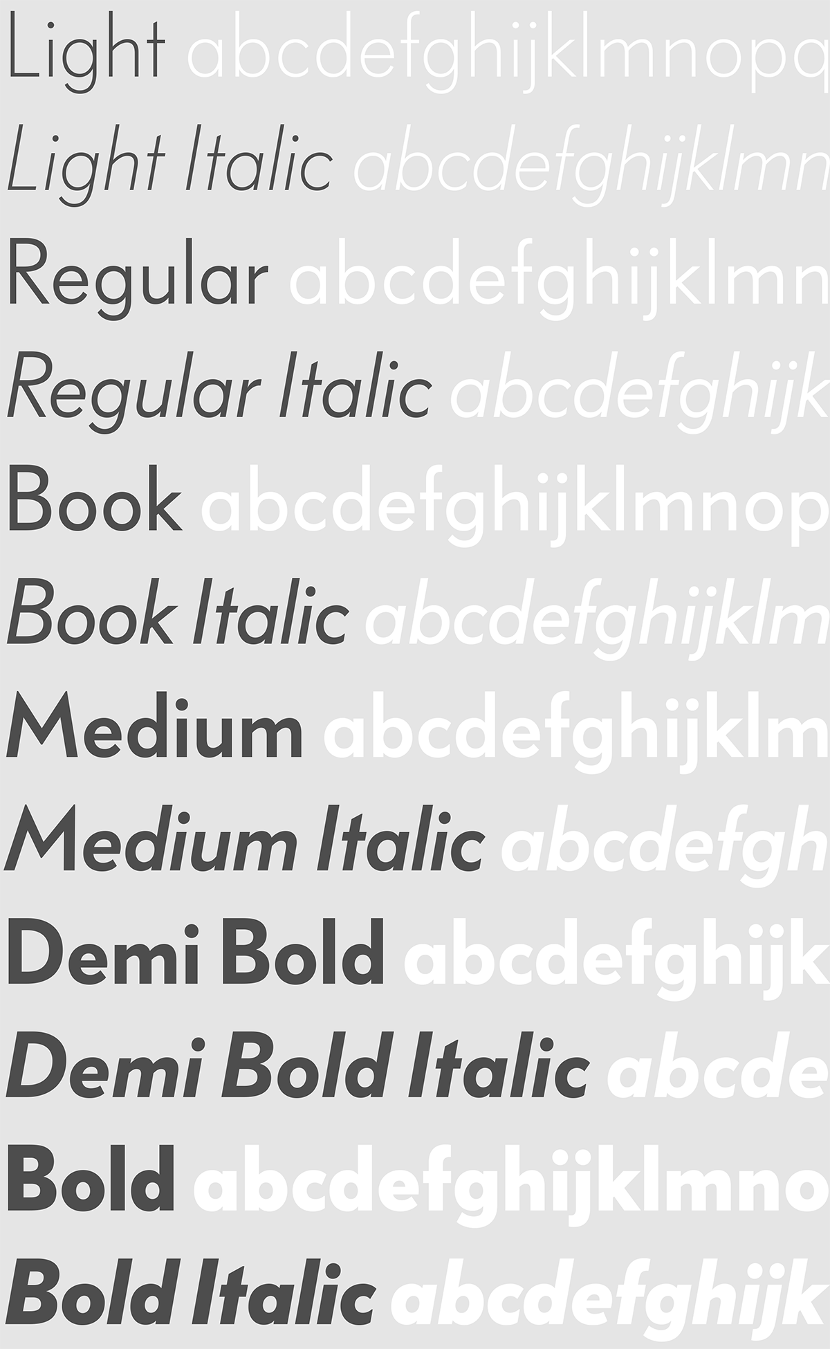
FF Bauer Grotesk Light

FF Bauer Grotesk Light Italic

FF Bauer Grotesk Regular

FF Bauer Grotesk Regular Italic

FF Bauer Grotesk Book

FF Bauer Grotesk Book Italic

FF Bauer Grotesk Medium

FF Bauer Grotesk Medium Italic

FF Bauer Grotesk Demi Bold

FF Bauer Grotesk Demi Bold Italic

FF Bauer Grotesk Bold

FF Bauer Grotesk Bold Italic
The Designers
Thomas Ackermann studied Communication Design at Hochschule für Angewandte Wissenschaften Hamburg and Shenkar School of Engineering and Design in Tel Aviv. He worked as freelance designer for blottodesign in Berlin and teaches typography at the design department of HAW Hamburg. He specializes in corporate design, typography and type design favouring big letters in architectural spaces. In 2010, he founded PBLC - Büro für Visuelle Kommunikation with three other partners in Hamburg.
Felix Bonge was born in 1982 in Hamburg, Germany. He got first in touch with typedesign in 2005, studying Communication Design at the HAW Hamburg. From the second semester on he was hooked on type, thanks to Jovica Veljović and his typedesign class. Having had some experience with calligraphy before, this was a totally new and exciting insight in the world of lettershapes. From then on he further specialized on typography and type design, leading up to his first commercial release, Levato. Since 2012 he teaches type design at the HAW Hamburg and is part of the design studio allerzeiten, where he works on everything type-related and draws new typefaces in the meantime.
Purchase FF Bauer Grotesk at FontFont.com

