


Lovemark
Identity for a family coffe house chain
The challenge for LINII was to develop the most universal and understandable identity for a family coffee house chain. Lovemark is a favorite place for a very wide audience. It is a cozy place to spend time after work or outside the home. The cafe's simple and clear menu offers dishes, pastries, coffee, tea and lemonades.
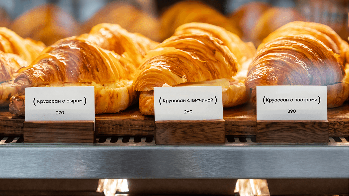
The key element of the identity is the brackets. They symbolize hugs and warm atmosphere. Brackets are present on all brand media, from the logo to the price tags.
Branded illustrations placed on coffee cups play a special role in communication.


The series of branded illustrations features urban characters of different ages interacting with the products. These emotional and memorable images add uniqueness to the brand. The concept provides for periodic changes in the style and subjects of illustrations.


The brand's signature colors are purple and beige.

Inside Lovemark coffee shops visitors enjoy friendly and cozy atmosphere.
In addition to developing the logo and the design system itself, LINII team designed the menu, table numbers, main and console signs, and stickers for packaging. All elements of the identity create a coherent brand image.


The company plans to open 30 points in Moscow and further extesion in other major cities. Lovemark strives to be not just a cafe, but a place that exceeds expectations and becomes everyone's favorite. Thus, Lovemark.


