

SIUM
WHAT
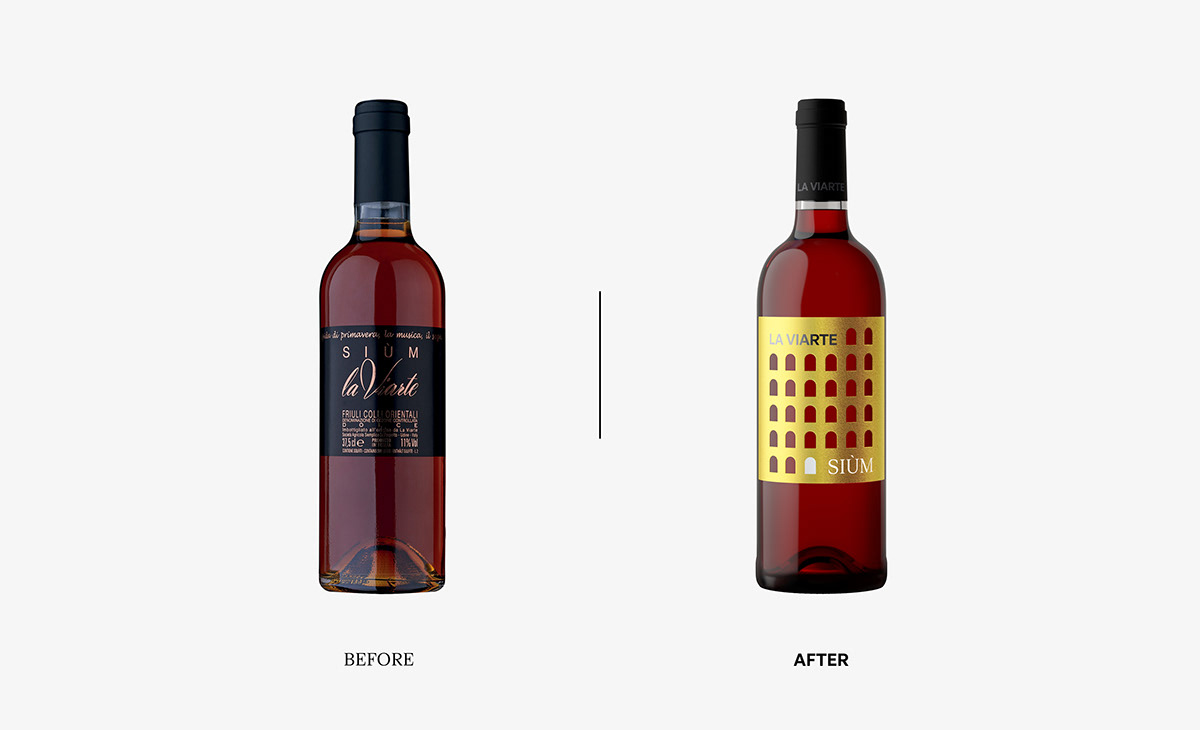
We repositioned and redesigned the La Viarte brand, a winery in the Colli Orientali region (Friuli - Italy), to increase awareness and give strength to its previously anonymous offering. The new identity communicates both the heritage and expertise of the long brand history and the contemporary vision to be an innovative reference point in the wine industry.
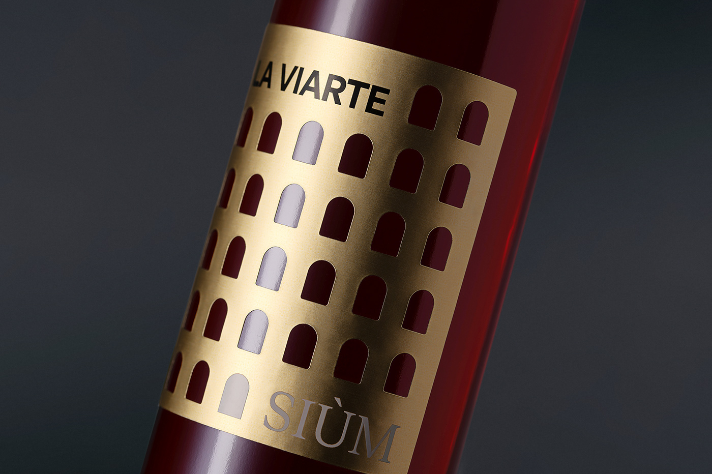
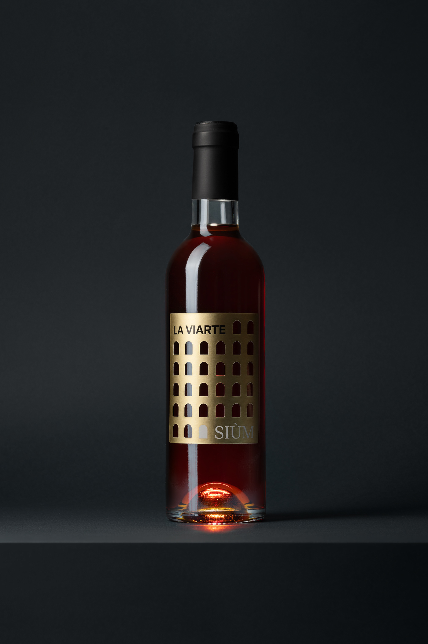
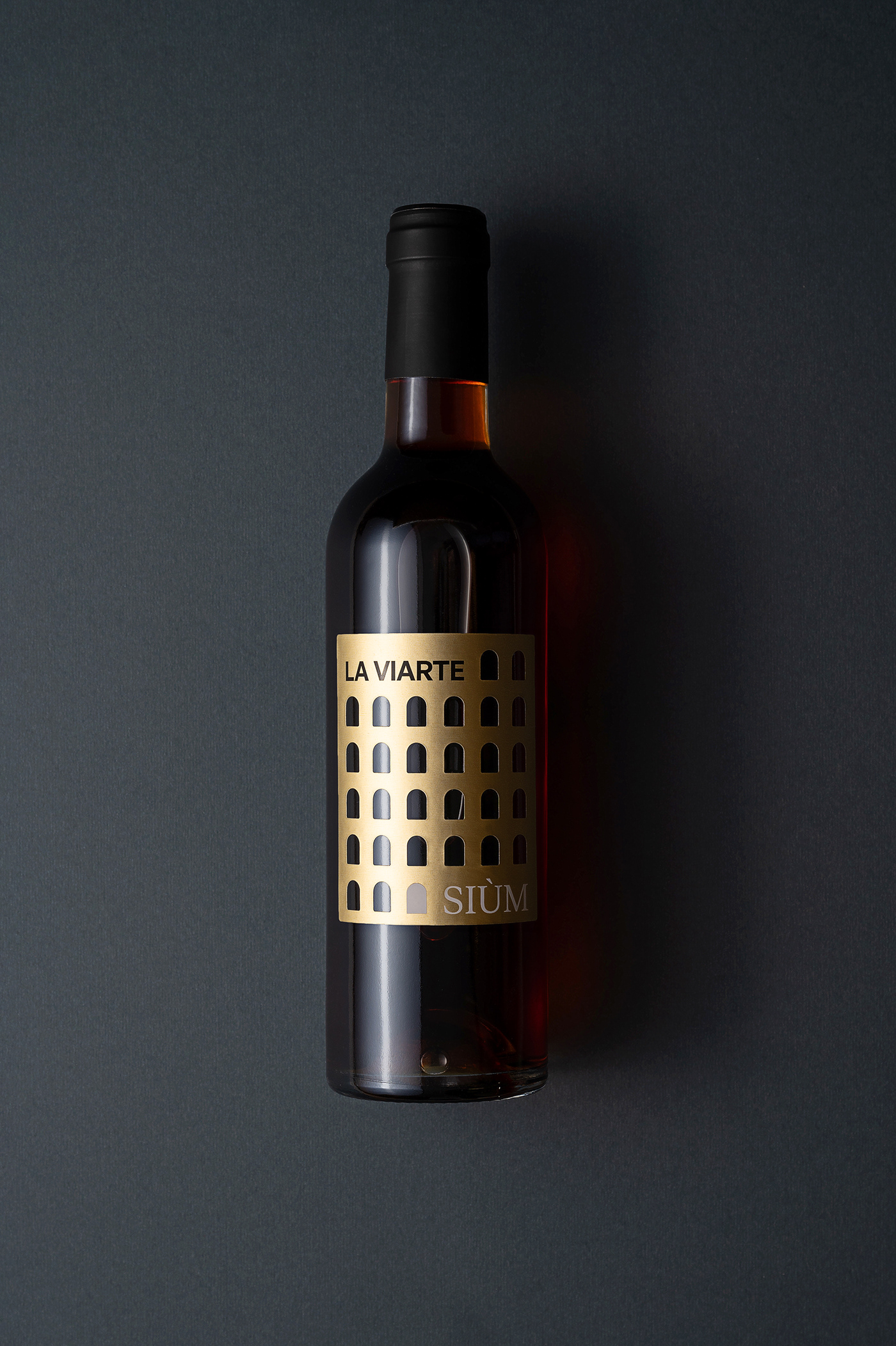
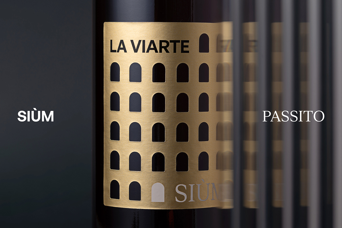
Siùm, whose name derives from the Friulian word "sogno," meaning "dream," offers an exciting and profound experience; the countless doors on the label each represent an entry into the dreamlike dimension, inviting one to lose themselves in the golden and amber reflections of the bottle.
HOW
Siùm stands out as a wine that goes beyond simple sensory pleasure, promising to evoke strong emotions. In its label, this experience is transformed into a journey through a seemingly endless succession of doors, each symbolizing a dream to fulfill, an emotion to explore. Every detail of the label - entirely made in Avery Dennison Fasson Dull Foil Gold - is carefully crafted to convey the sensation of opening up to unknown inner worlds.
Creative Direction: Paolo Vendramini
Art Direction & Graphic Design: Andrea Flemma
Brand Strategy and Creative Copywriting: Tania Loschi
Photography: Giuseppe Cannone