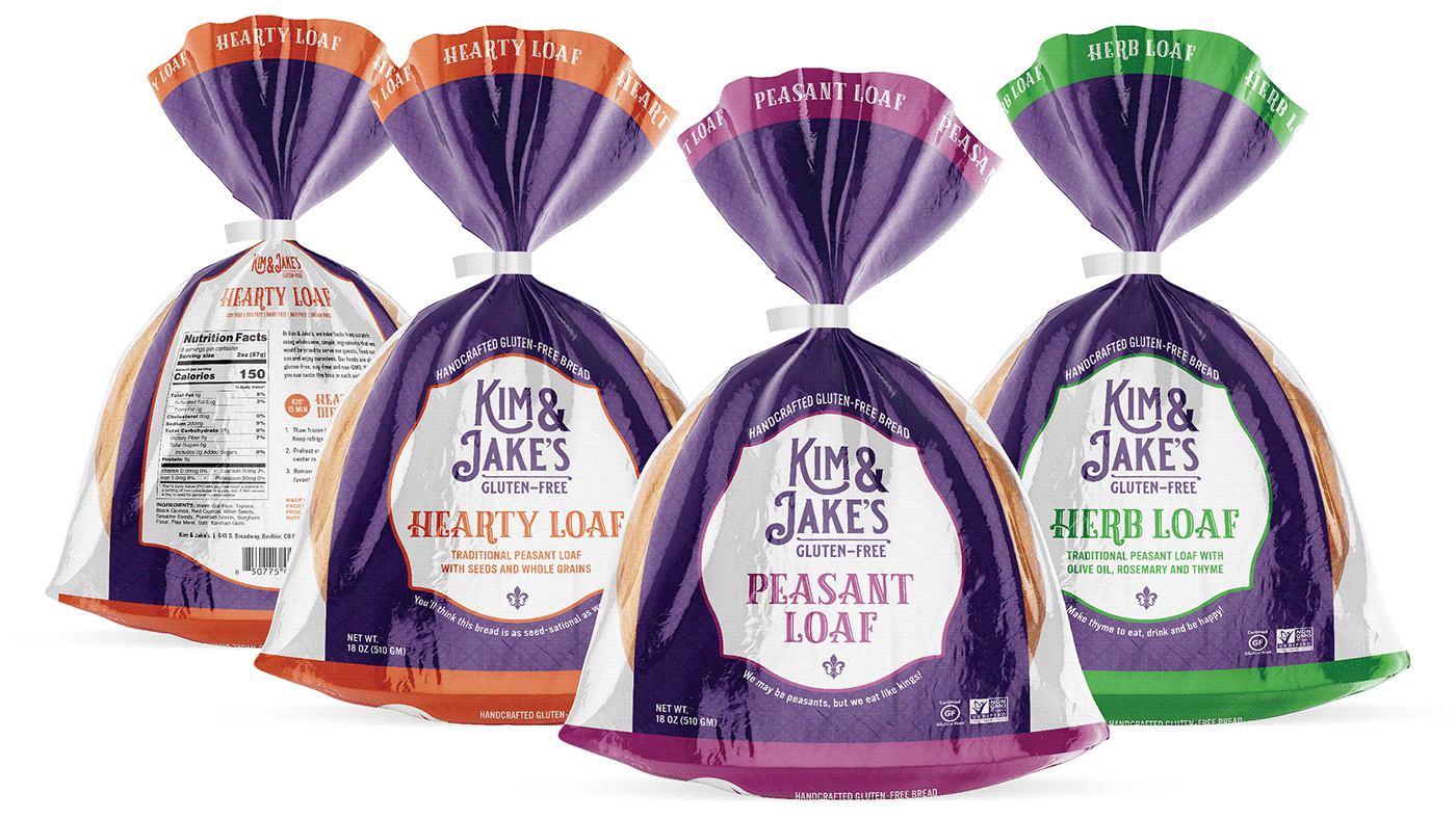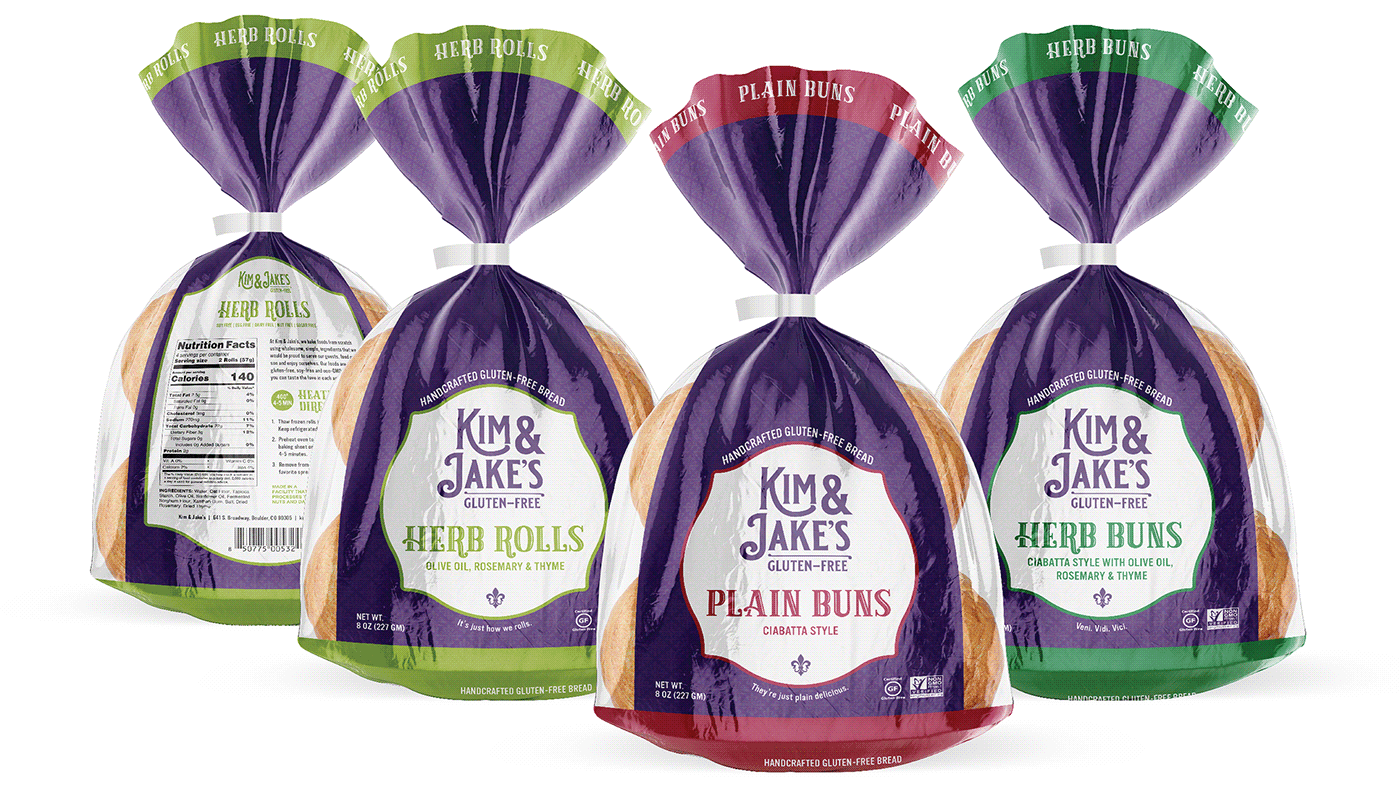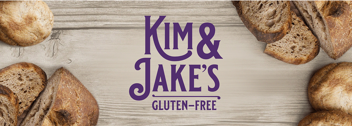
As Kim & Jake's expanded their business beyond their brick and mortar store they needed a more universal logo and package design. They also wanted to have a nod to their New Orleans roots. To do this we changed their main color from red to a rich purple that serves as a base for each flavor color to play against. We removed the pie server from the fleur-de-lis and simplified its shape. This was also used to create a subtle pattern in the background of each package. The new font is also simplified but maintains a quirky character.