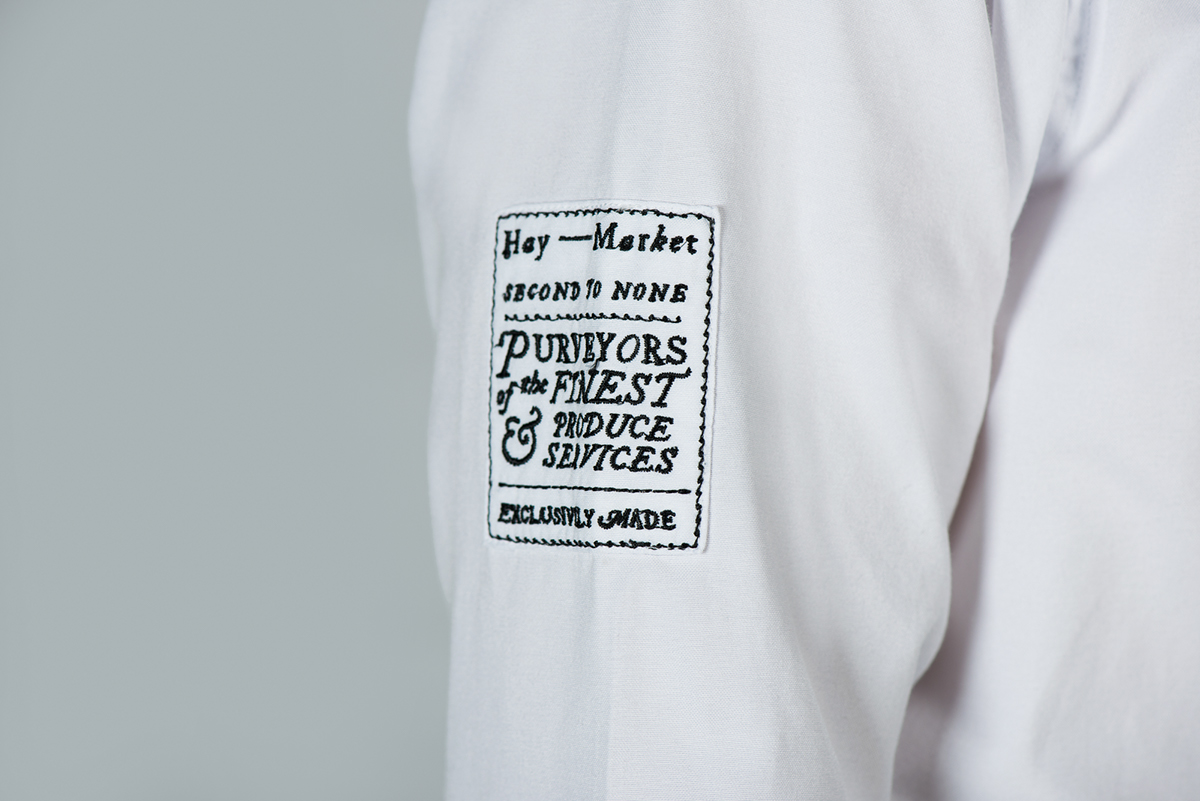
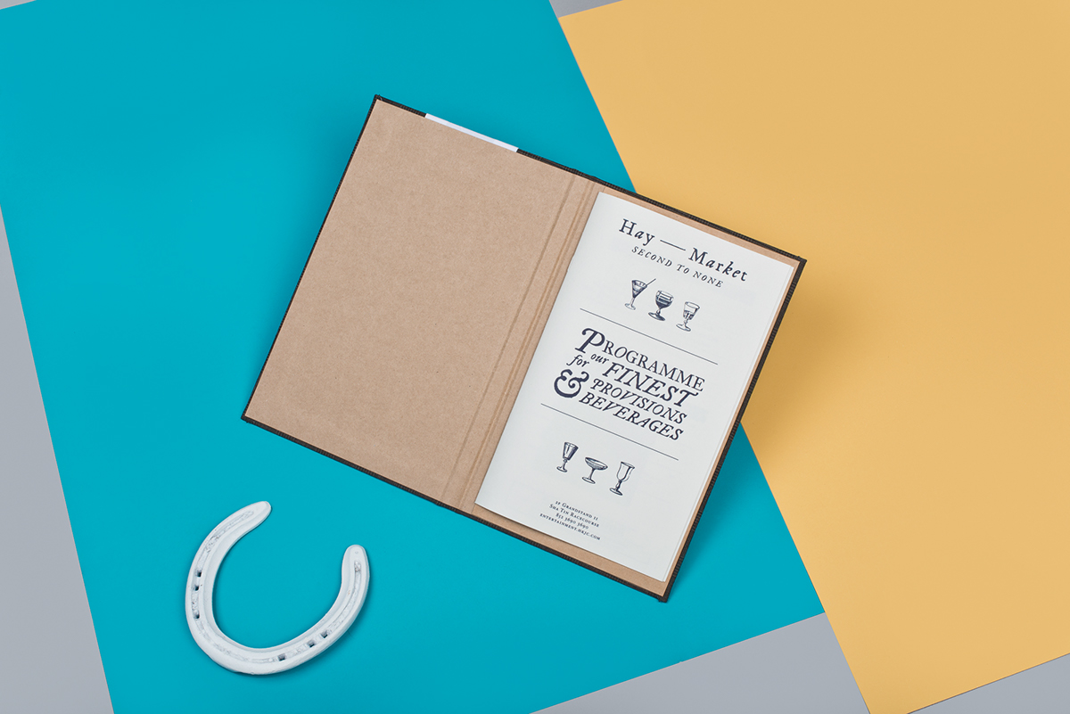
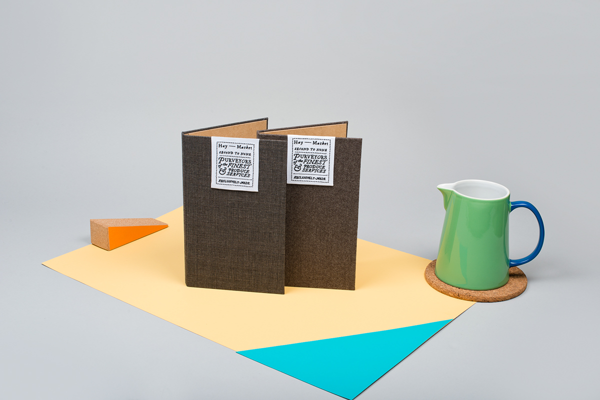
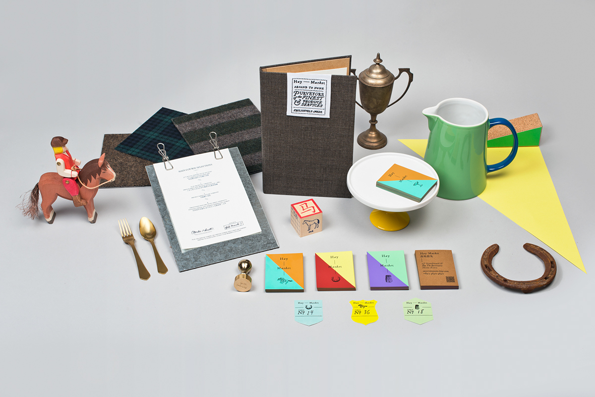
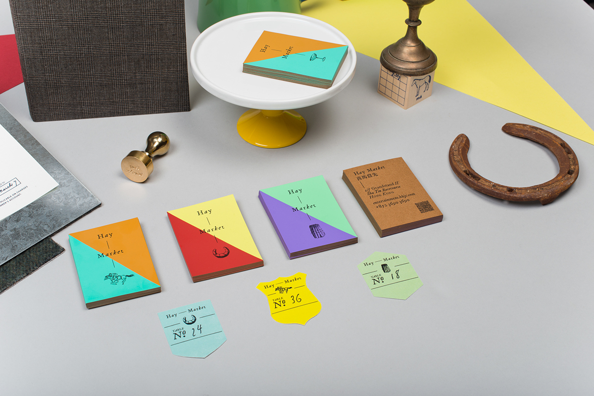
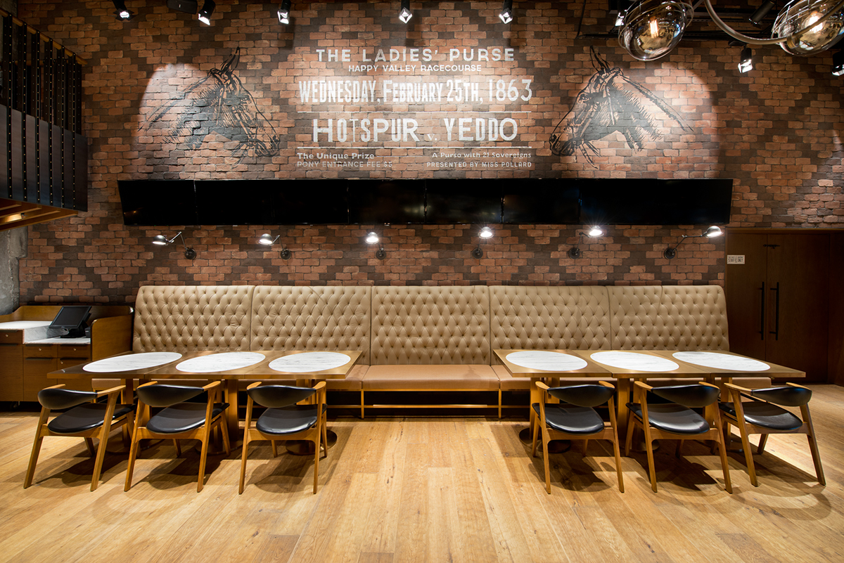
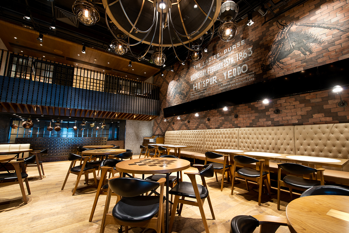
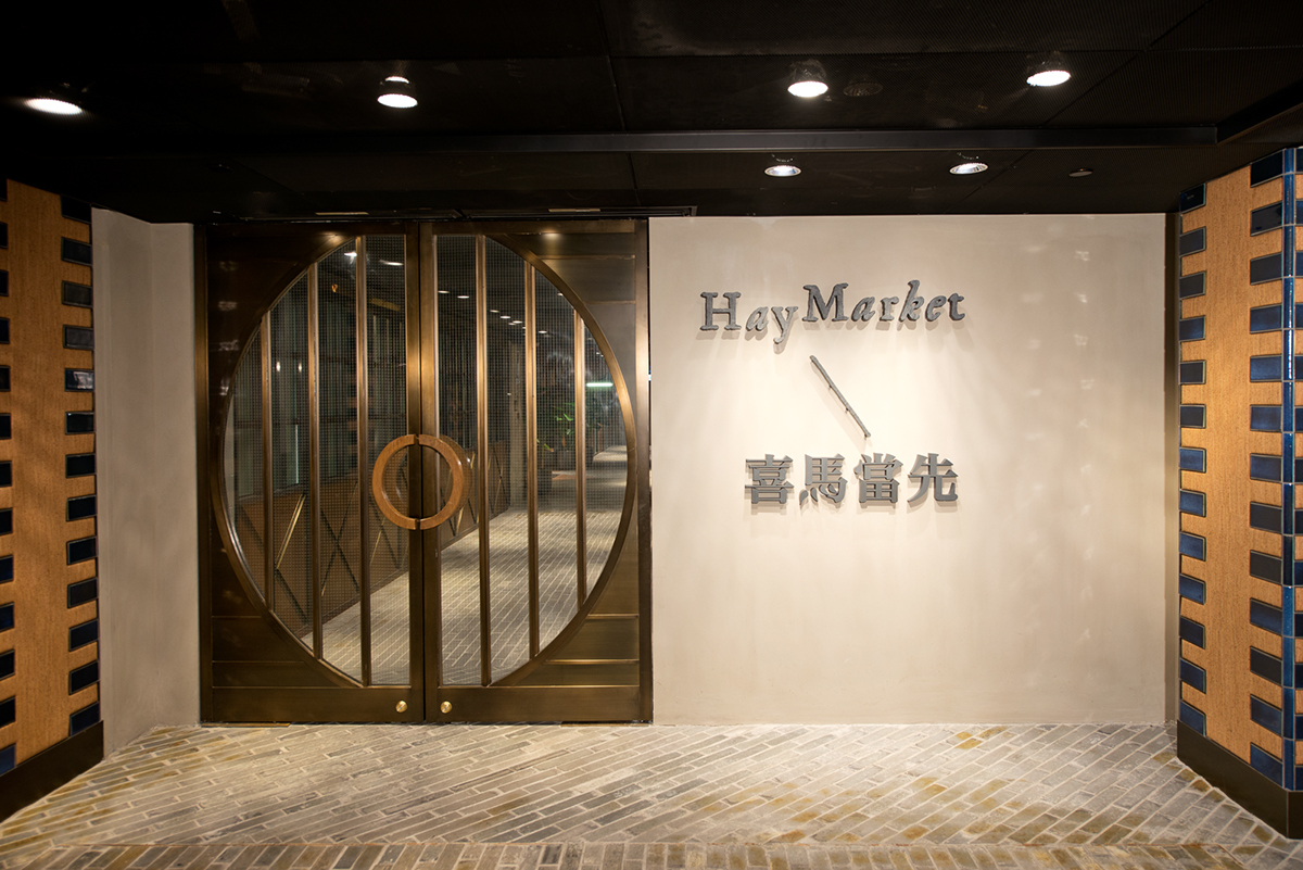
Hay Market is a restaurant set in the sprawling grounds of the Hong Kong Jockey Club. With Hong Kong Jockey Club’s pedigree as a British Colonial entity, the basis of the brand personality and language is British Eccentricity.
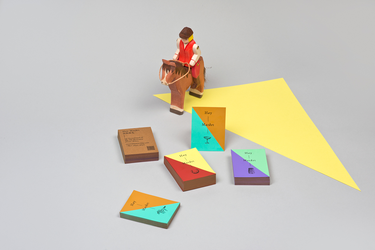
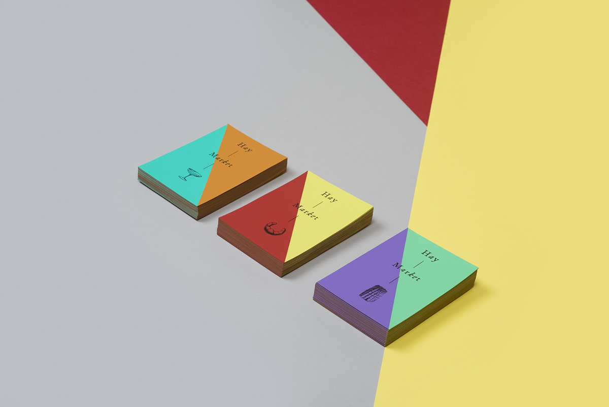
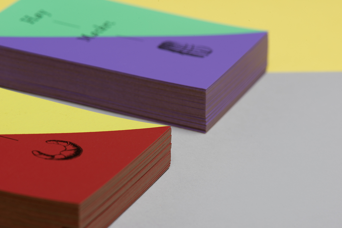
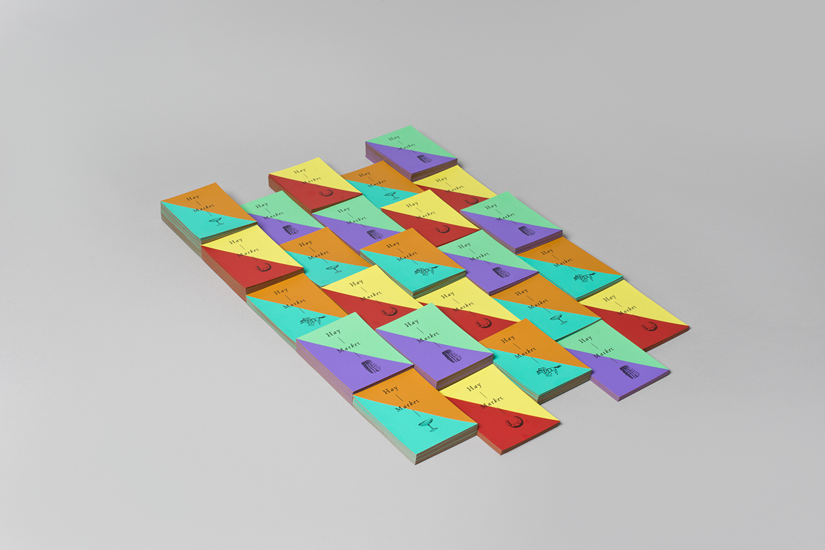
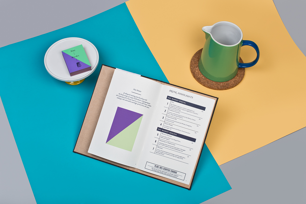
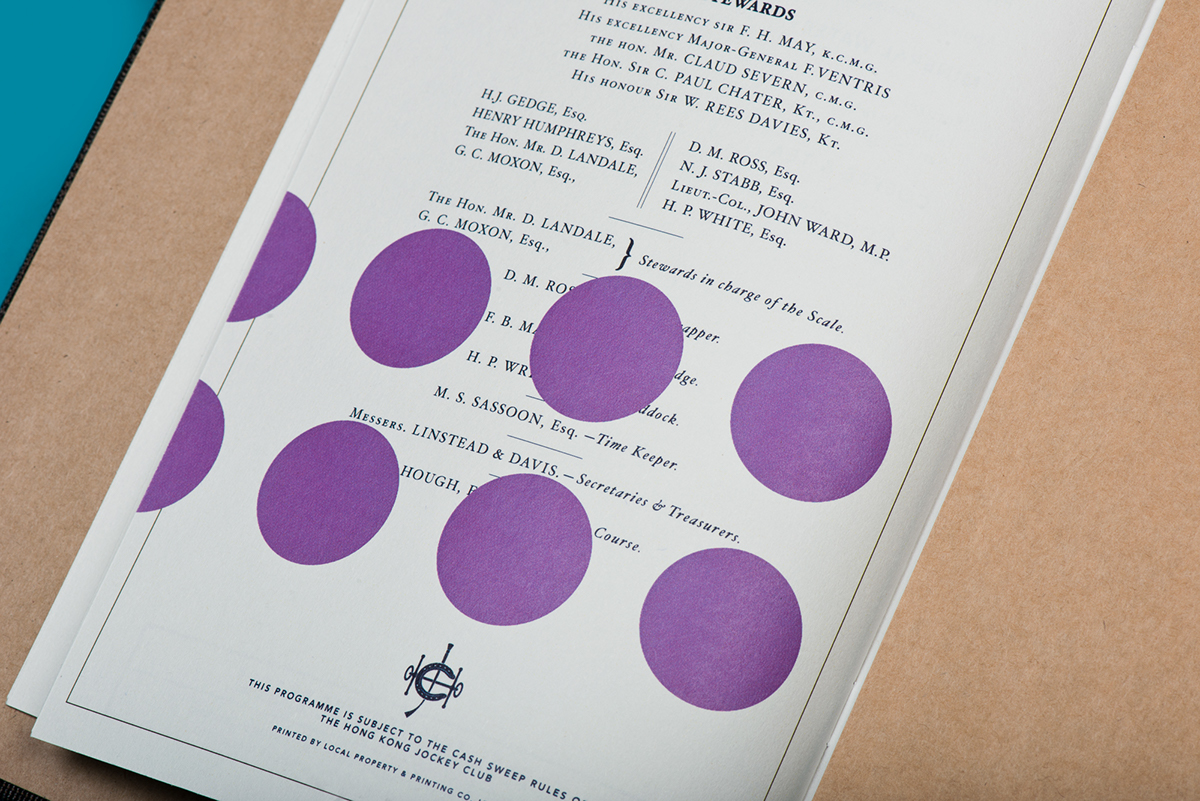
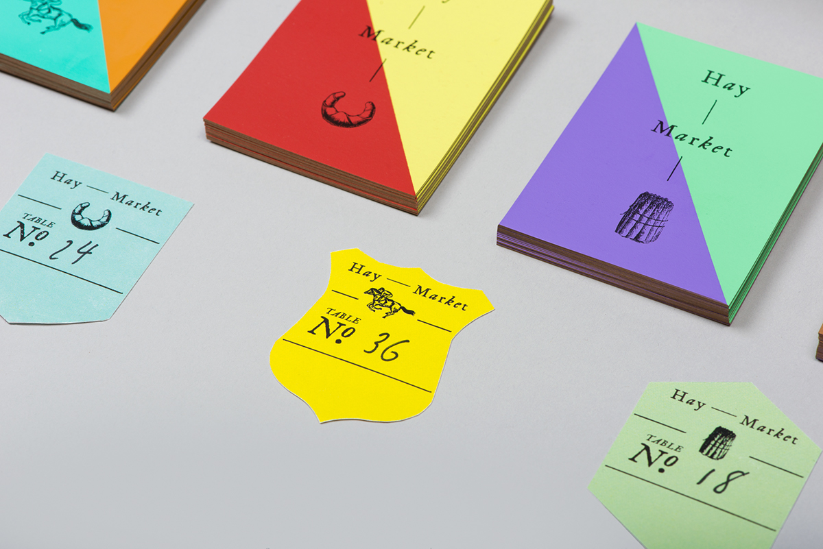
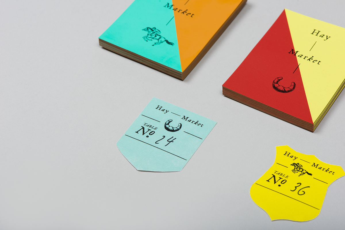
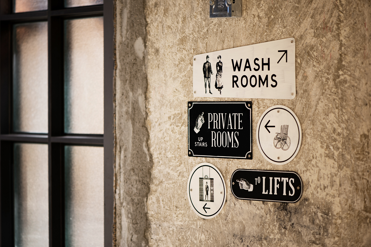
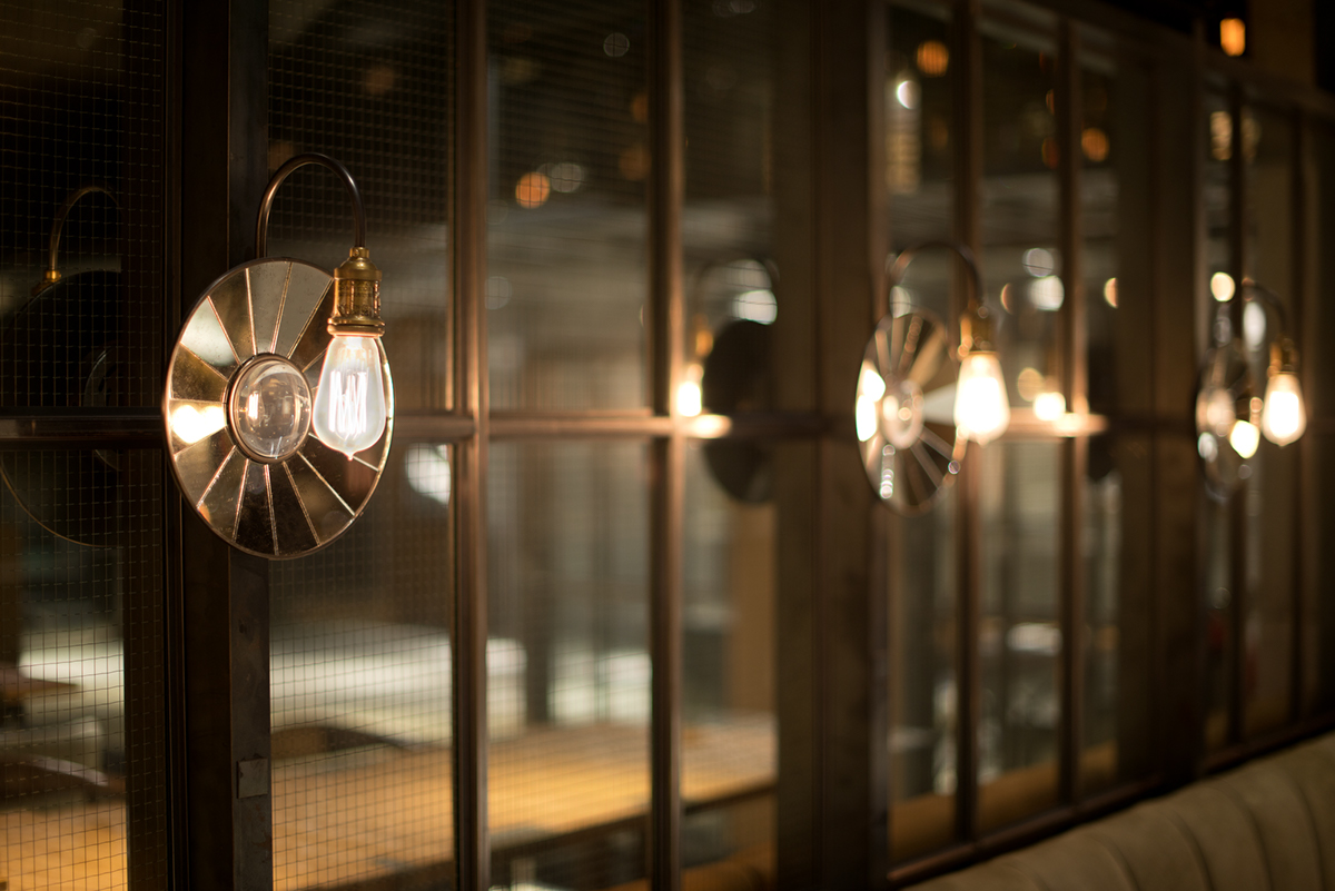
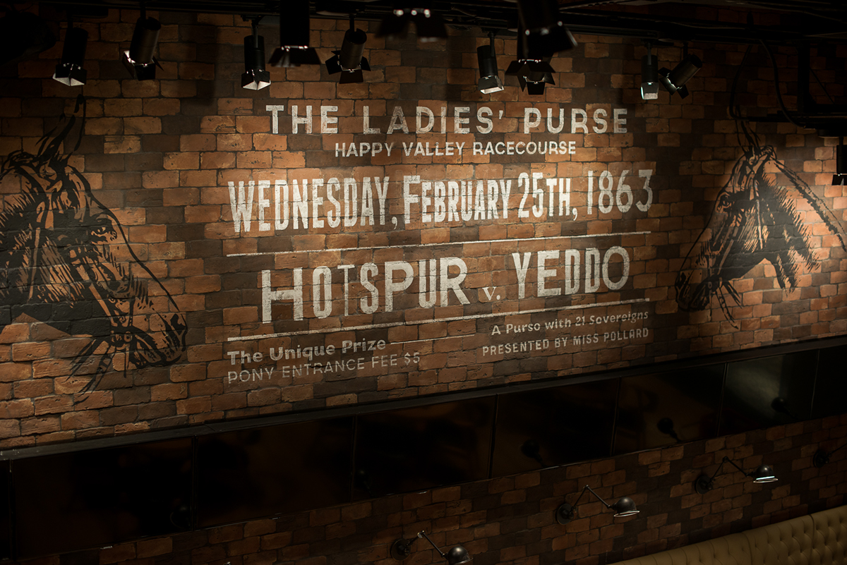
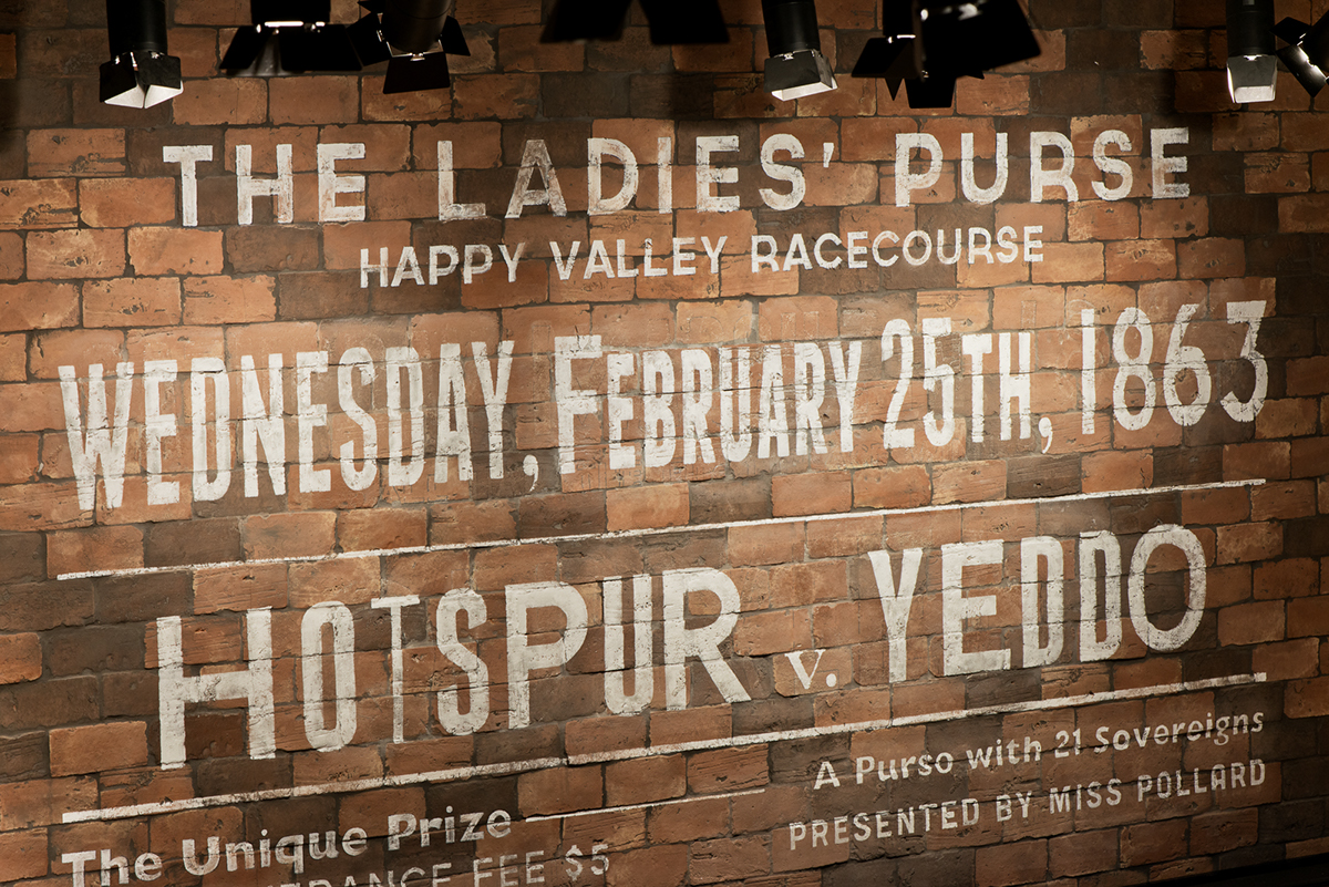
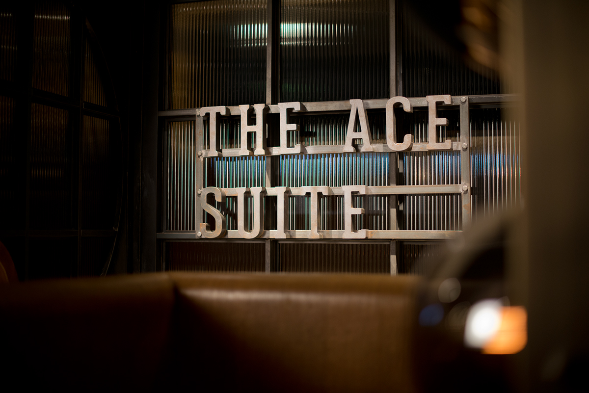
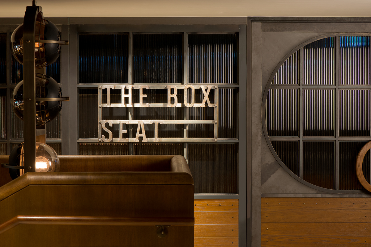
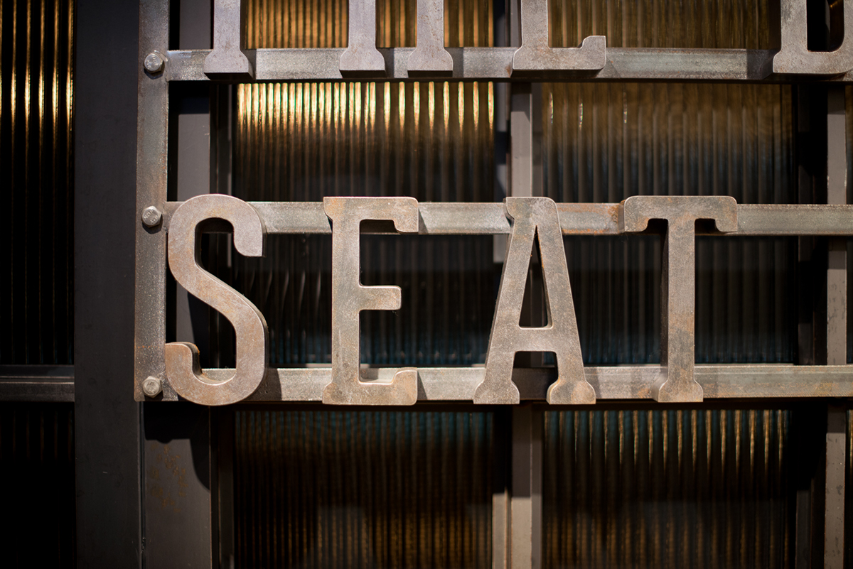
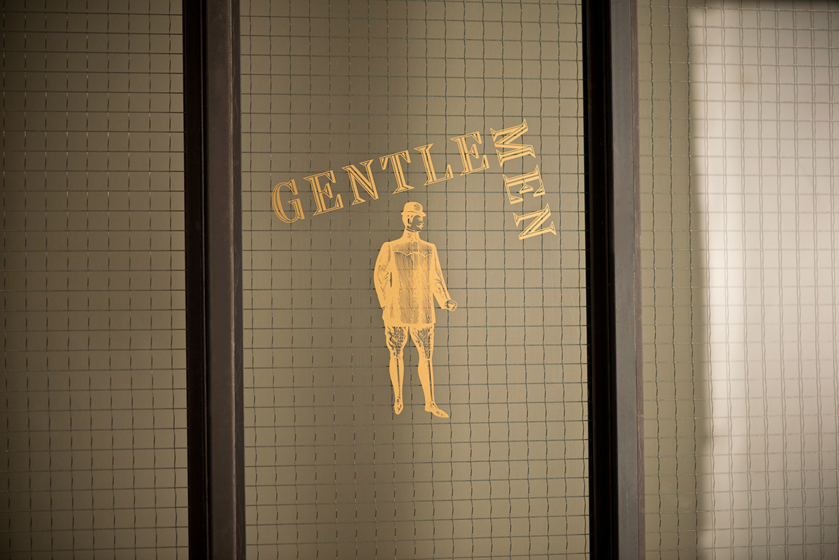
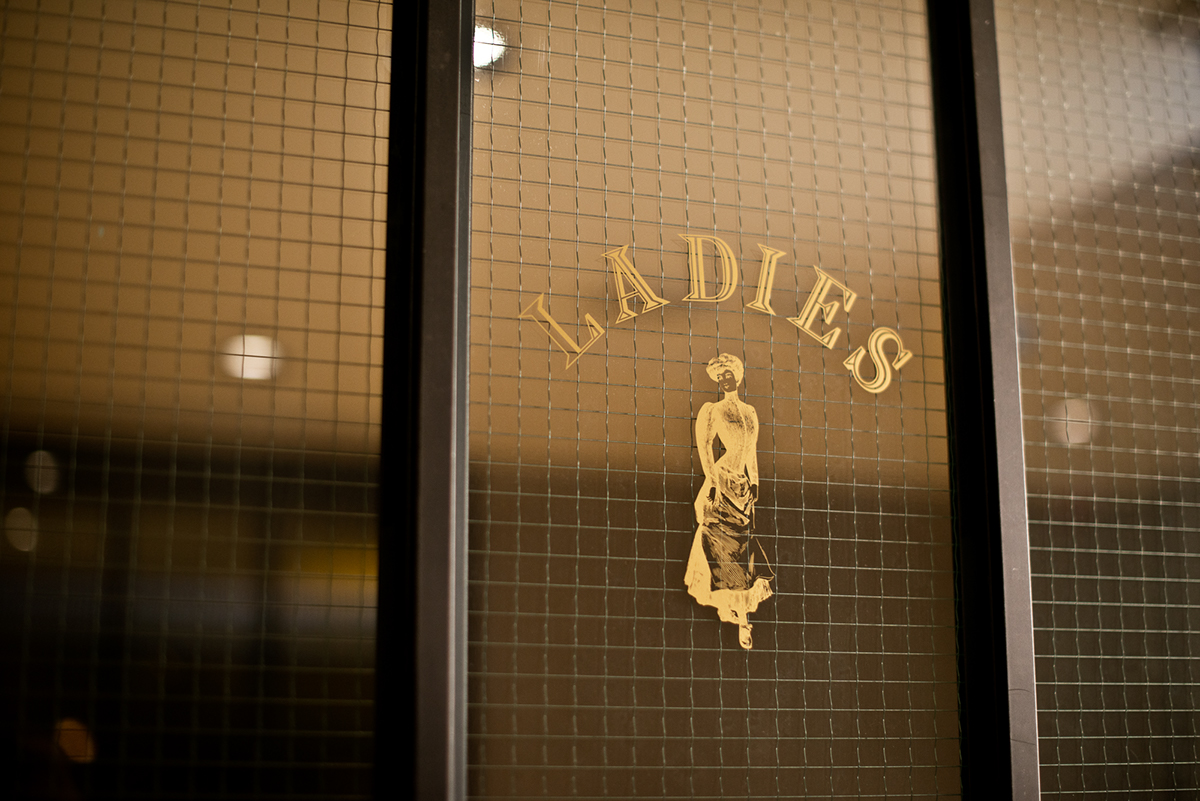
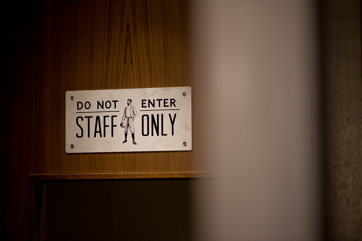
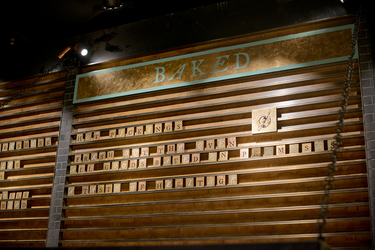
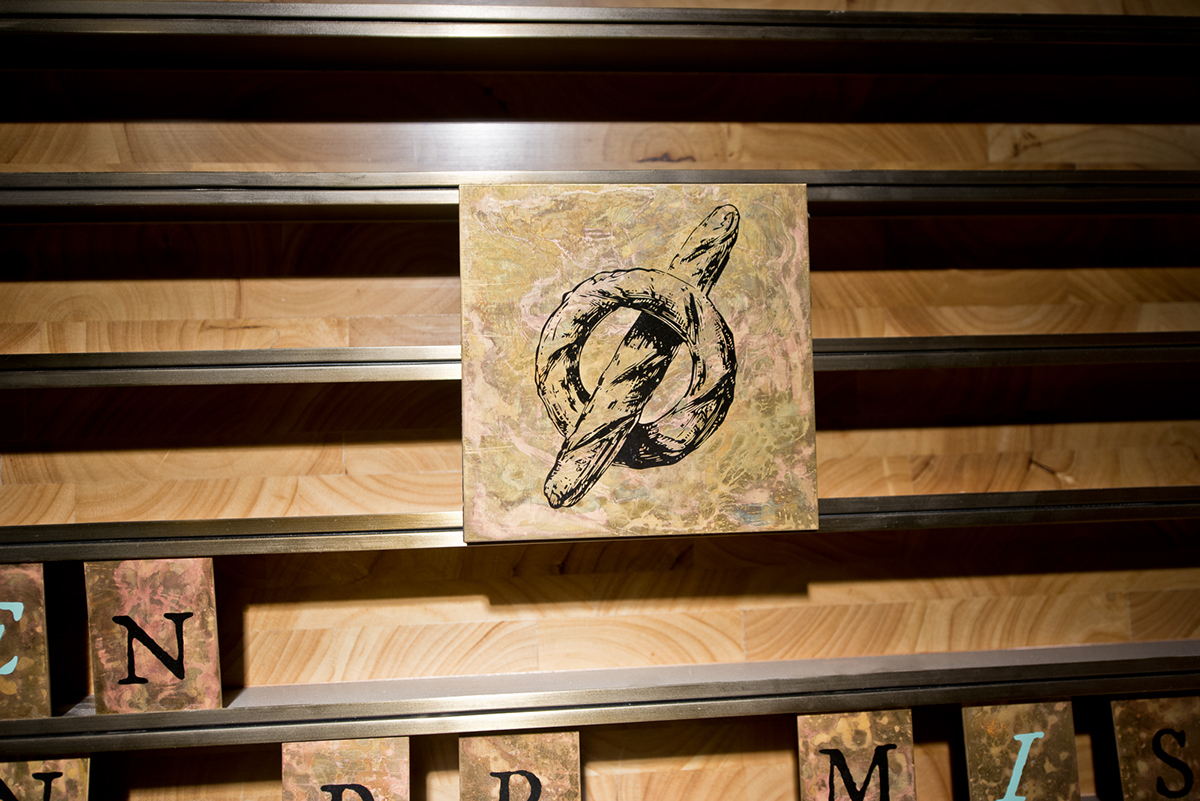
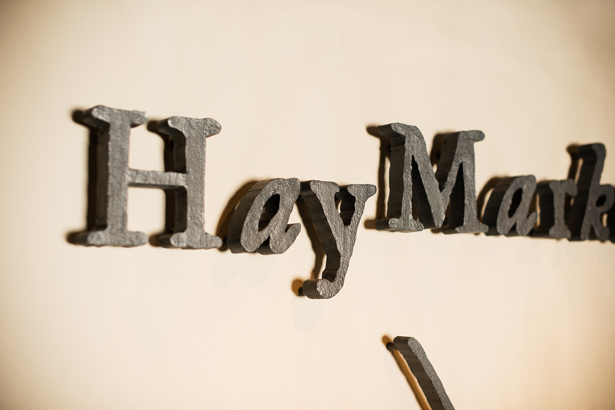
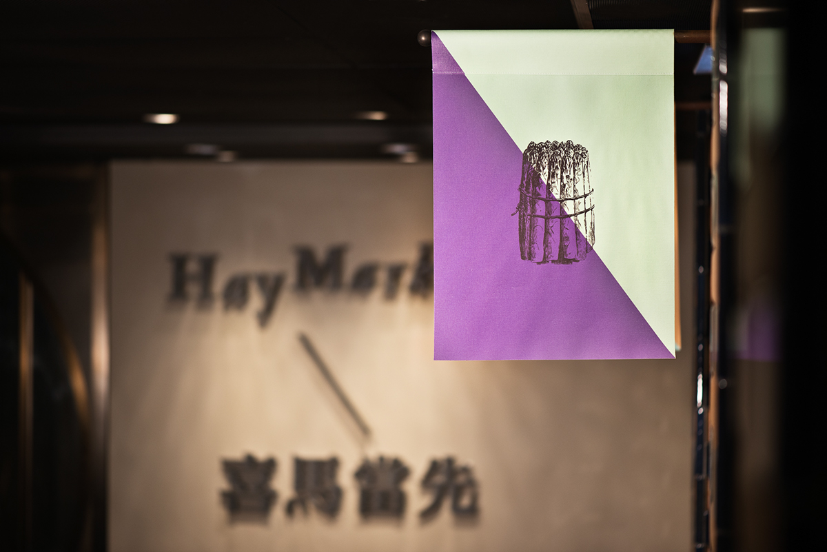
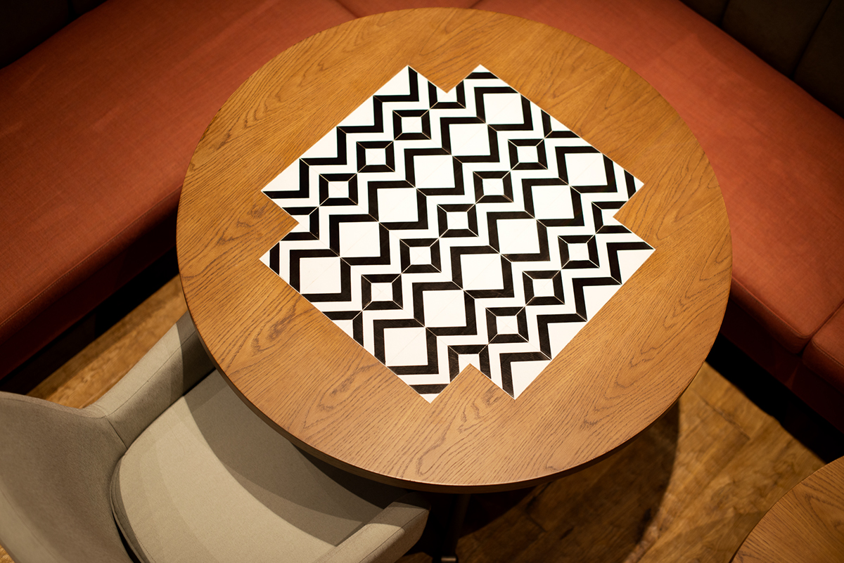
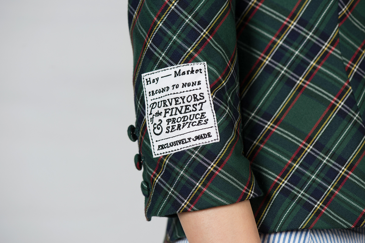
Inspired by vibrant jockey silks which are drenched in centuries of tradition and superstition, the restaurant’s visual language is an eclectic mix of bold geometric shapes juxtaposed against vintage British typography and Victorian illustrations from old advertisements.
The brand's logo is a playful update on classic letterforms and also functions as a blank canvas, allowing for quirky permutations when combined with different illustrations.
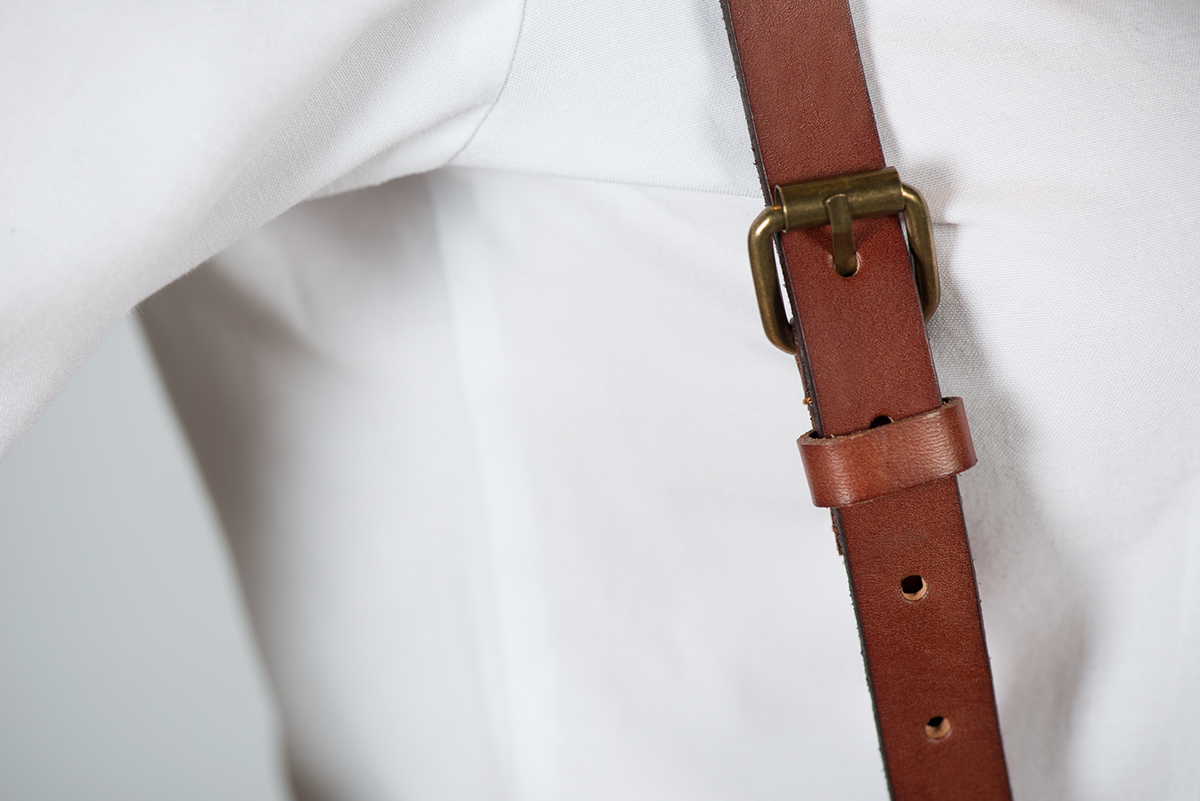
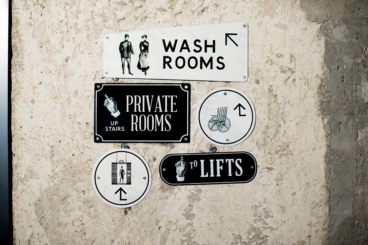
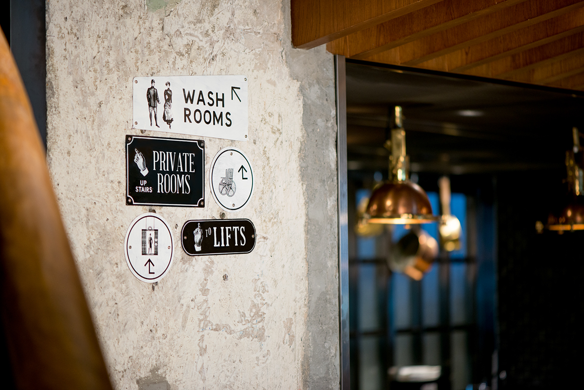
An extensive project including branding, uniform, interior graphics and wayfinding.


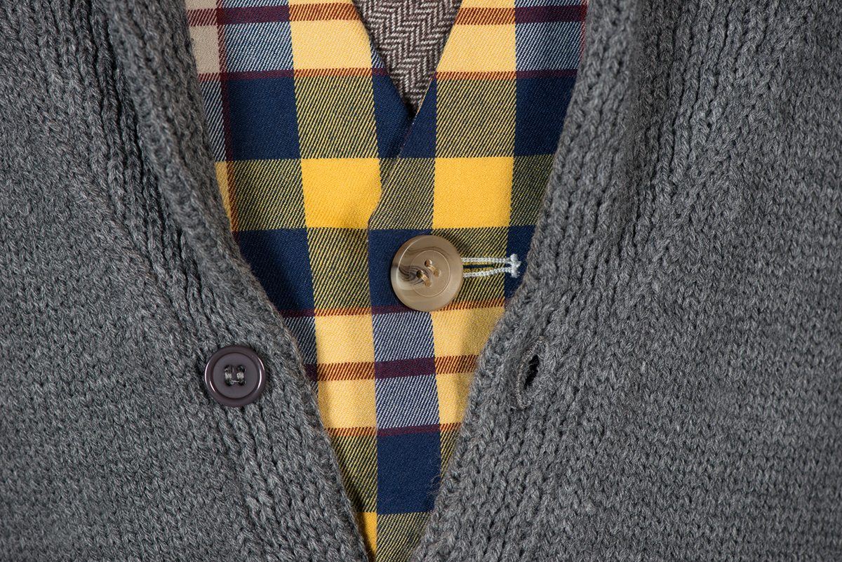
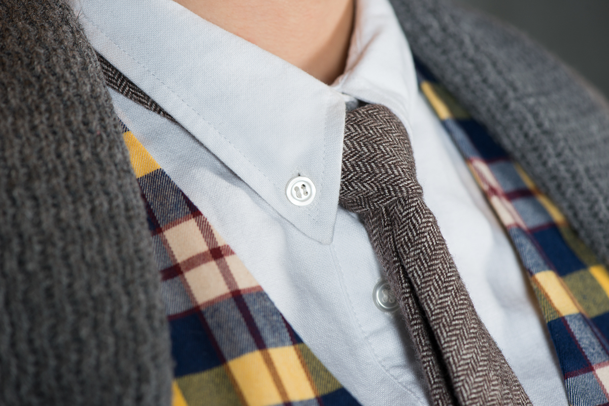
Uniforms for the Cash-Bets
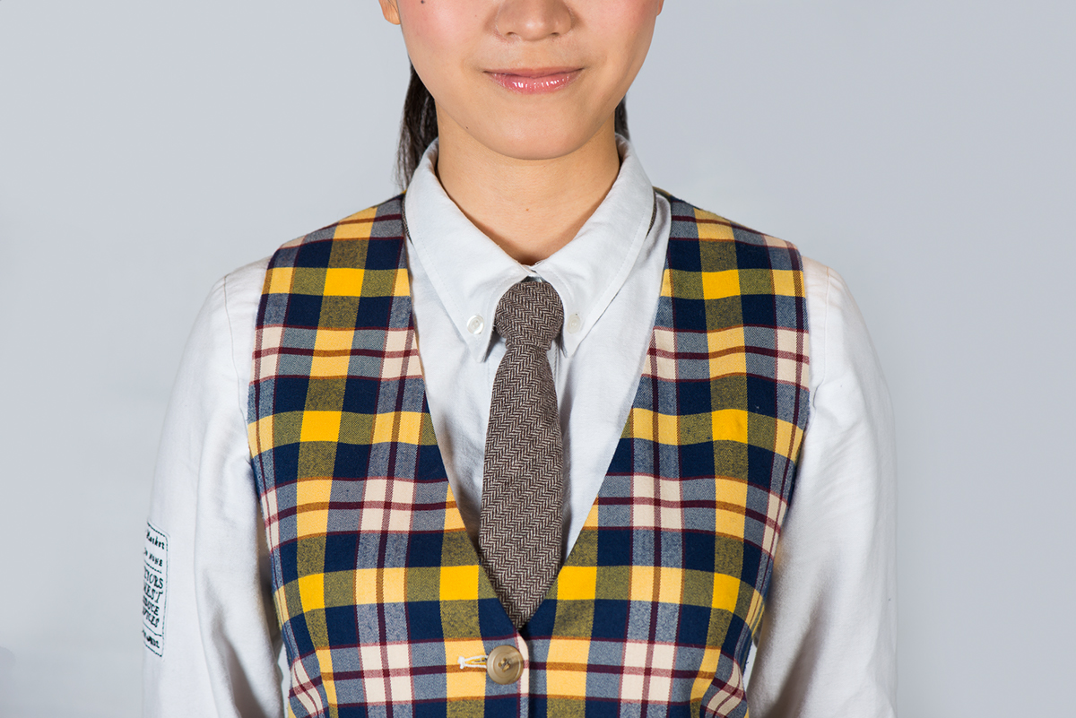
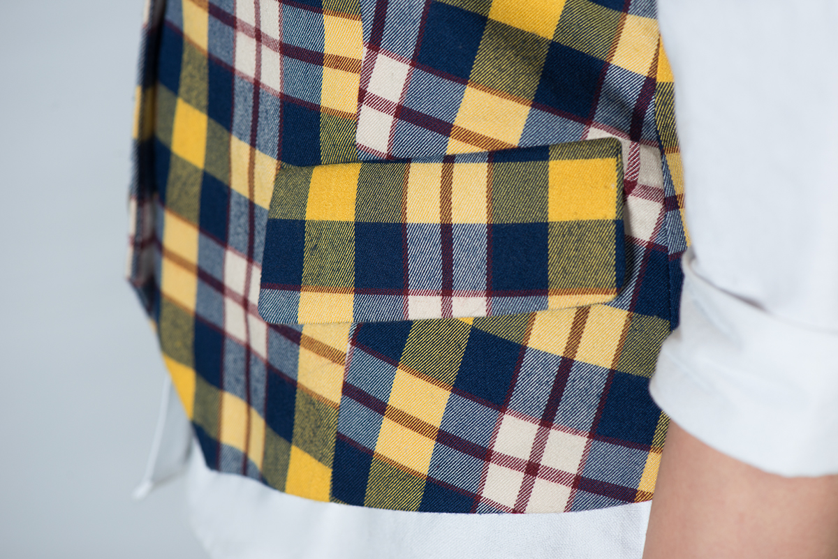
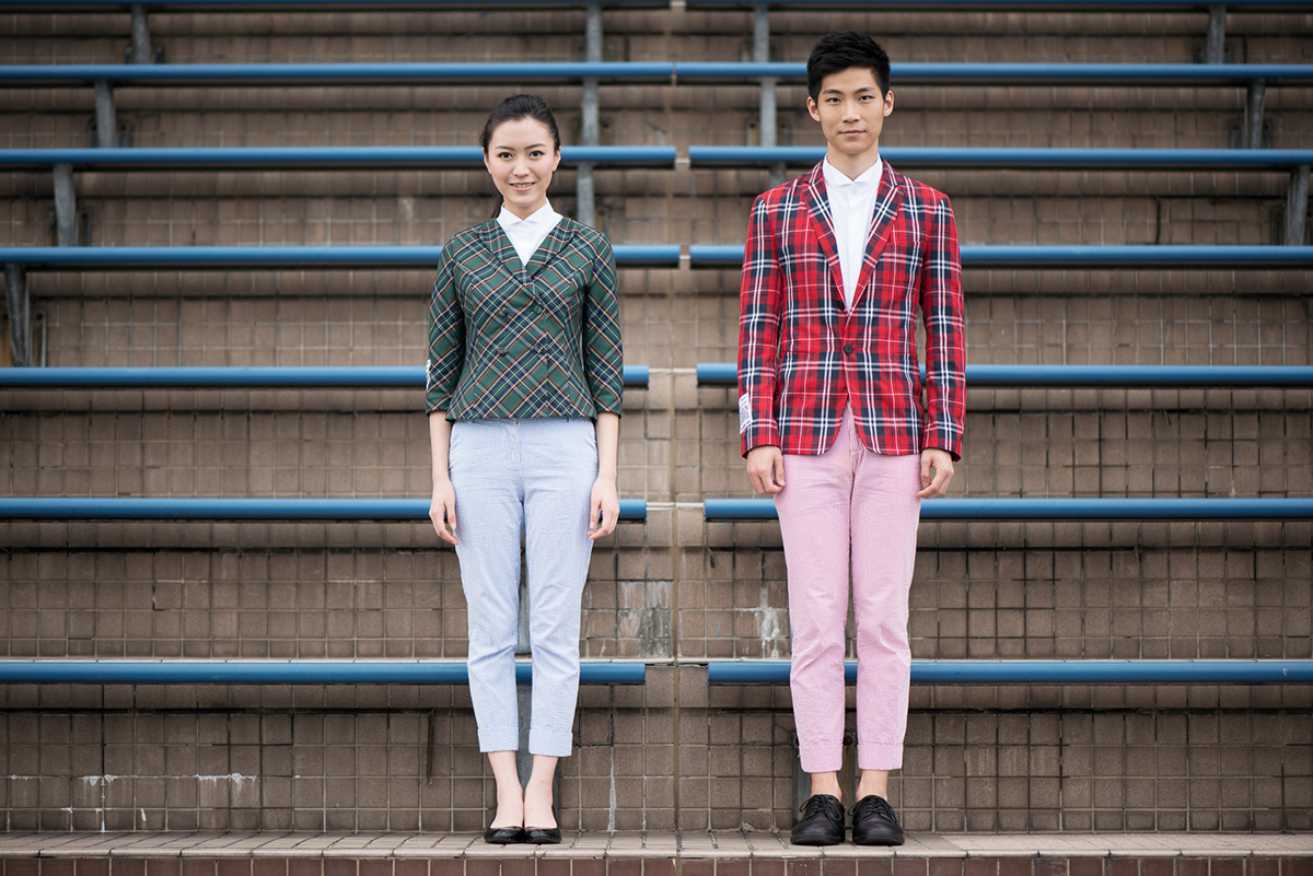
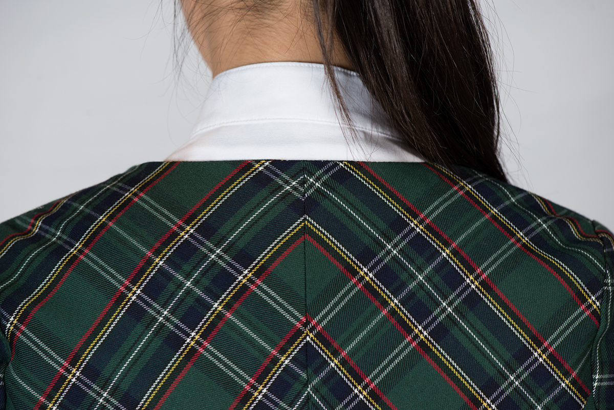
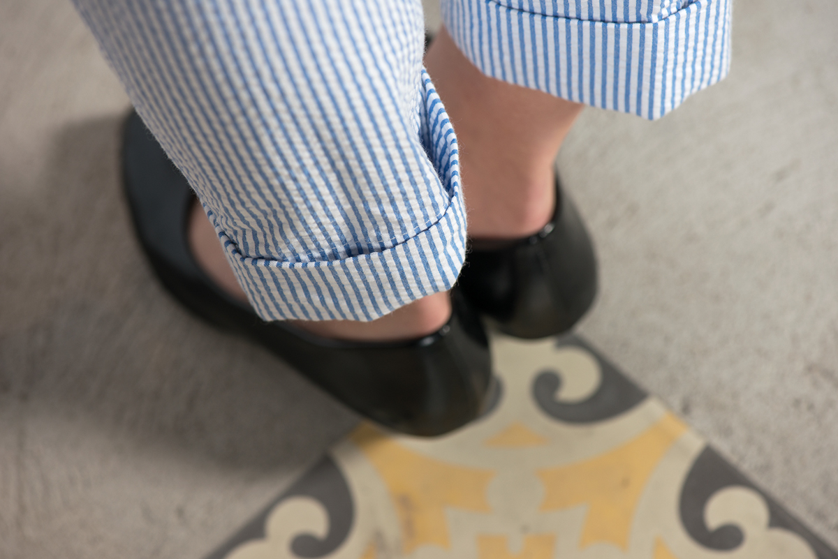
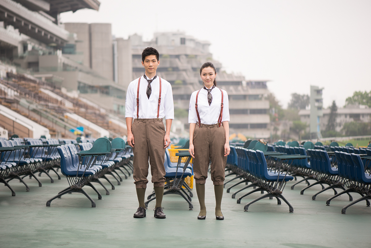
Uniform for the Customer Service Staff

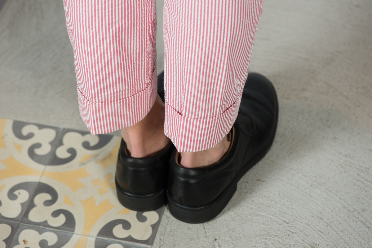
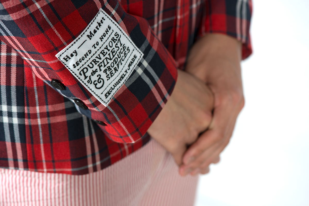
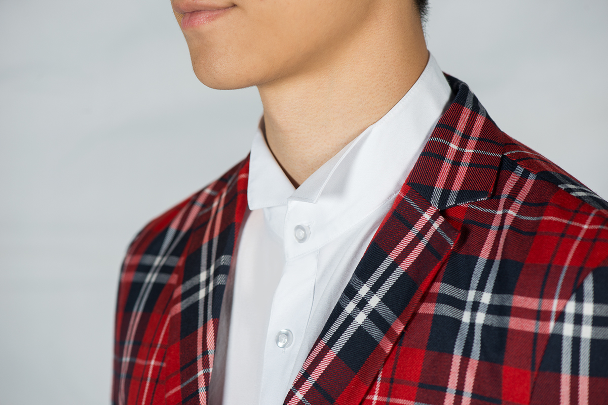
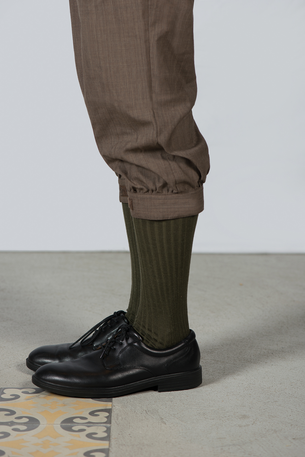
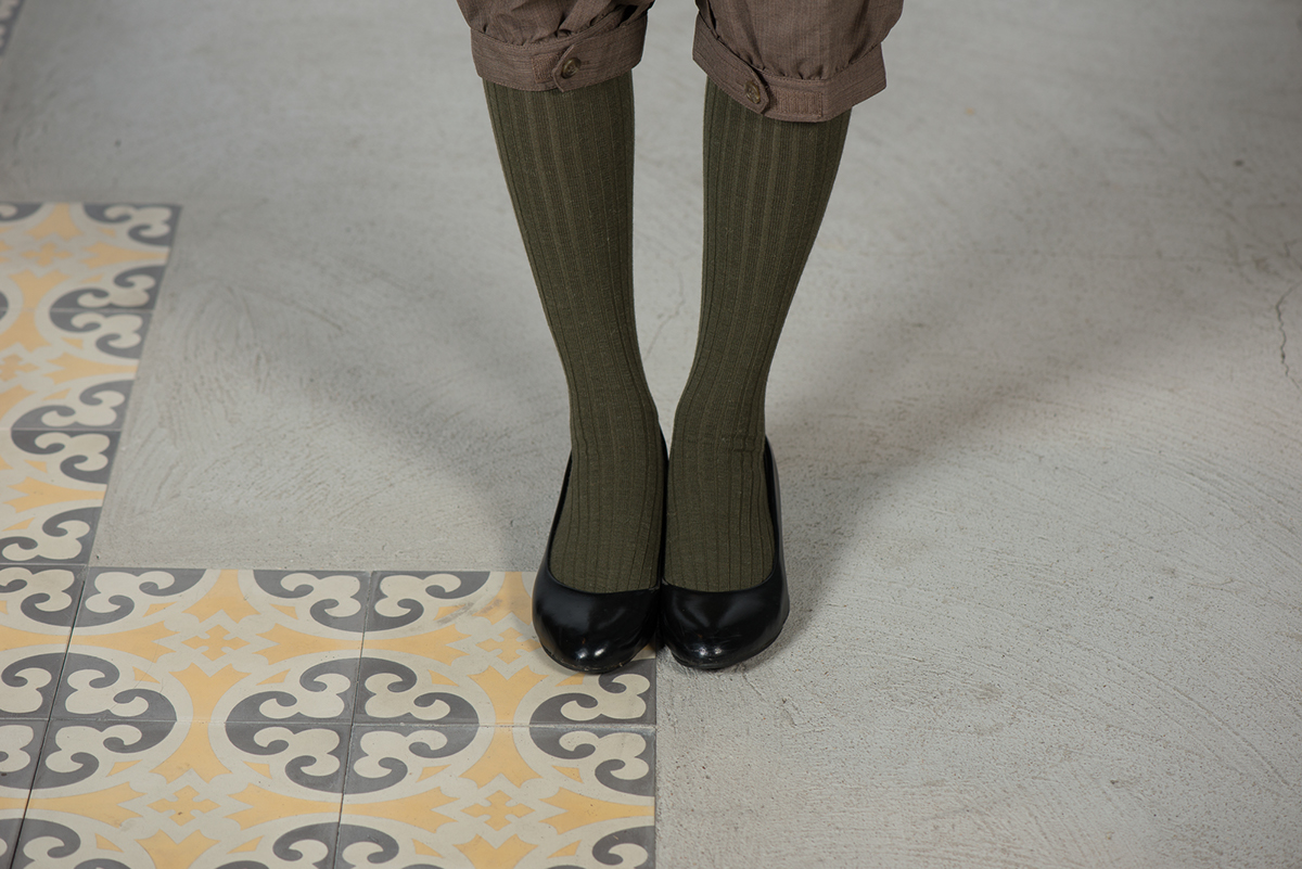
Uniform for the Wait Staff