
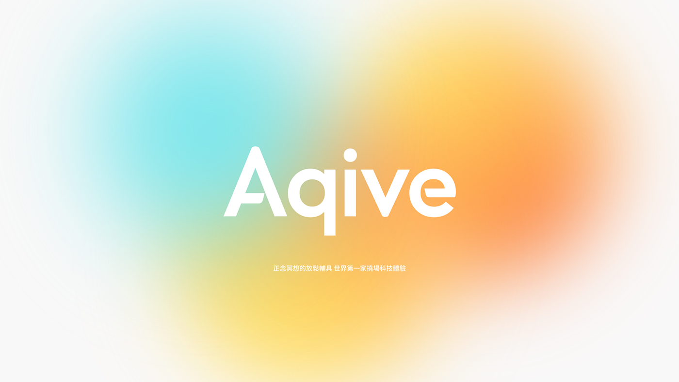

Aqive Technology Rebrand
氣機科技品牌重塑
氣機科技品牌重塑
氣機科技致力於打造撓場科技應用,目標幫助提升人類的覺察能力,透過生活化的能量輔具提供安心信任的陪伴。
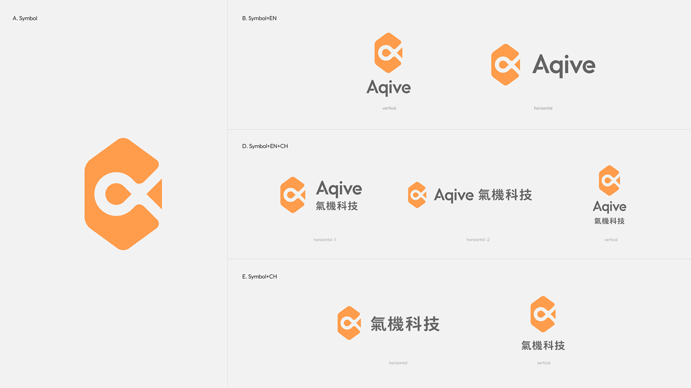
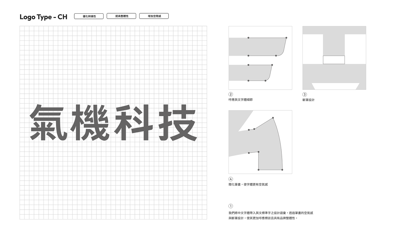
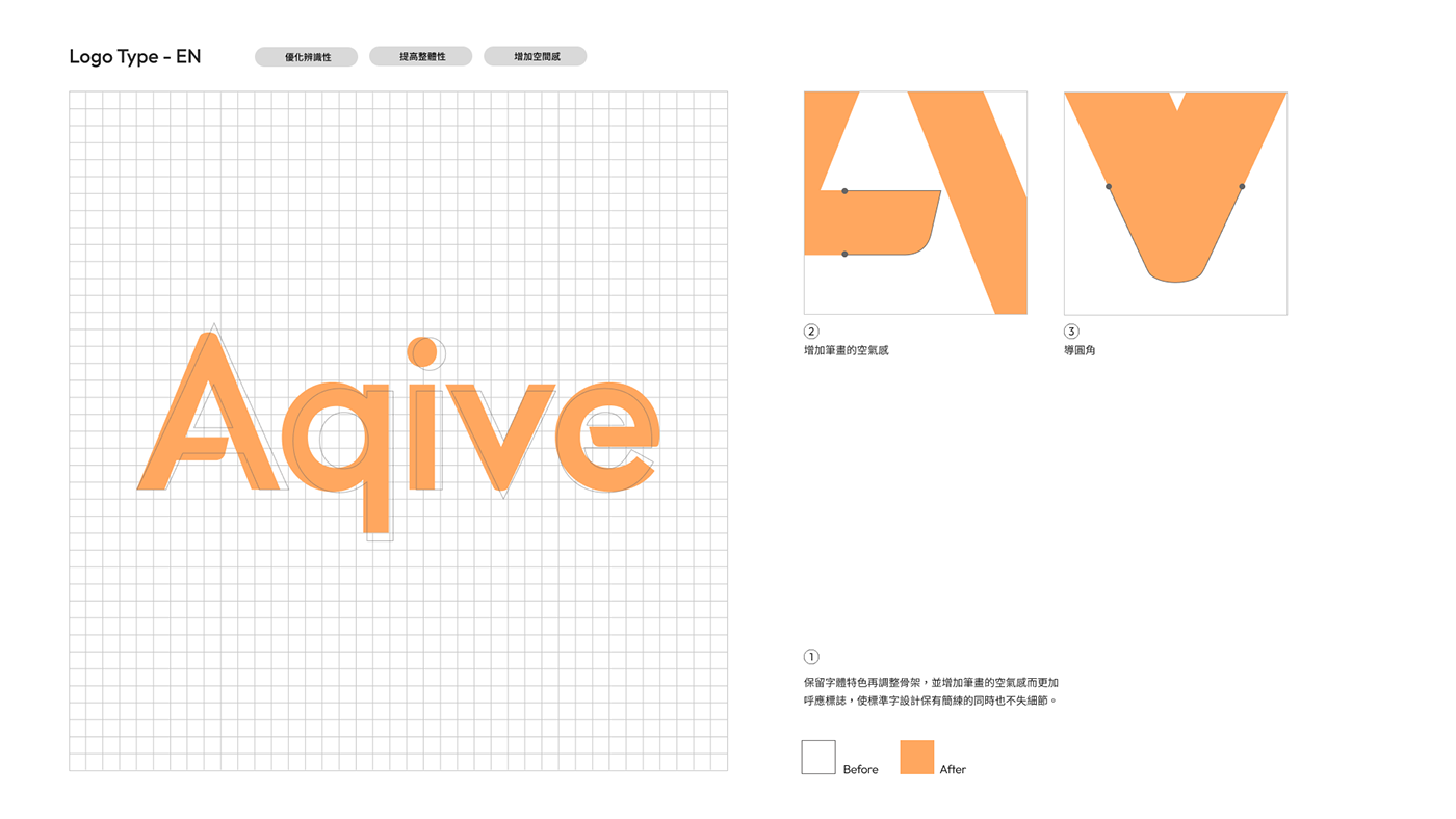
在我們與Aqive的合作專案中,我們將目標著重於品牌定位的整合、定位,以「能量流動、日常」為概念主軸概念,將原本較科學、硬理論導向的品牌形象轉化為更貼心心靈、日常生活的樣貌。同時透過品牌規範系統,重新整合了設計系統,將既有的Logo延展流動感,將能量具象化,拓展品牌系統應用性。
在我們與Aqive的合作專案中,我們將目標著重於品牌定位的整合、定位,以「能量流動、日常」為概念主軸概念,將原本較科學、硬理論導向的品牌形象轉化為更貼心心靈、日常生活的樣貌。同時透過品牌規範系統,重新整合了設計系統,將既有的Logo延展流動感,將能量具象化,拓展品牌系統應用性。
Aqive is committed to creating flexible technology applications, with the goal of enhancing human perceptual capabilities. Through the use of lifestyle-oriented energy aids, the company aims to provide reassuring and trustworthy companionship.
In the initial stages, Aqive, as a pioneer in energy and technology products, lacked a clear identification and communication path during its brand inception, leading to potential misunderstandings and challenges for consumers. In our collaboration project with Aqive, StudioPros focuses on the integration and positioning of the brand. The concept revolves around "energy flow in daily life," transforming the brand image from a more scientific and theory-oriented approach to a more intimate and everyday appearance. Simultaneously, through a brand guideline system, the design system has been re-integrated, extending the existing logo with a sense of flow, concretizing energy, and expanding the versatility of the brand system.

看見日常的能量,創造品牌流動性
我們在與不同受眾訪談過程中,發現了氣機過往形象容易造成誤會的痛點,雖然氣機的科技背景的定位,但對於身心靈消費族群而言多數人更傾向於感覺與感性訴求。
不同於其他能量產品的廠商,透過氣機的內部訪談與聚焦,我們也協助品牌參考外部聲音,重新將品牌定位於「日常的能量」,談論消費者的生活、感受與體驗,降低距離感之餘創造與競爭對手之間重要的差異化。
不同於其他能量產品的廠商,透過氣機的內部訪談與聚焦,我們也協助品牌參考外部聲音,重新將品牌定位於「日常的能量」,談論消費者的生活、感受與體驗,降低距離感之餘創造與競爭對手之間重要的差異化。
Seeing the energy in everyday life, creating brand fluidity
Through interviews with various audiences, we've identified a pain point in the past image of the Aqive, which tends to cause misunderstandings. Despite its technological background, most people in the wellness consumer group are more inclined towards feelings and emotional appeals. Unlike other energy product manufacturers, we've conducted internal interviews and focused on external voices to help the brand reposition itself as "everyday energy." By discussing consumers' lives, feelings, and experiences, we aim to not only reduce the perceived distance but also create a significant differentiation from competitors.


視覺設計策略
傳遞安心與信任,為用戶創造想像
傳遞安心與信任,為用戶創造想像
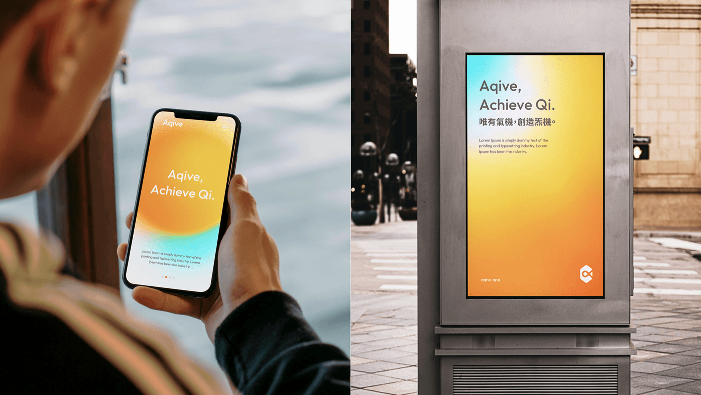
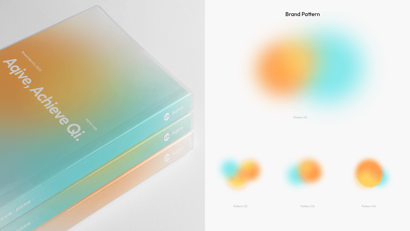
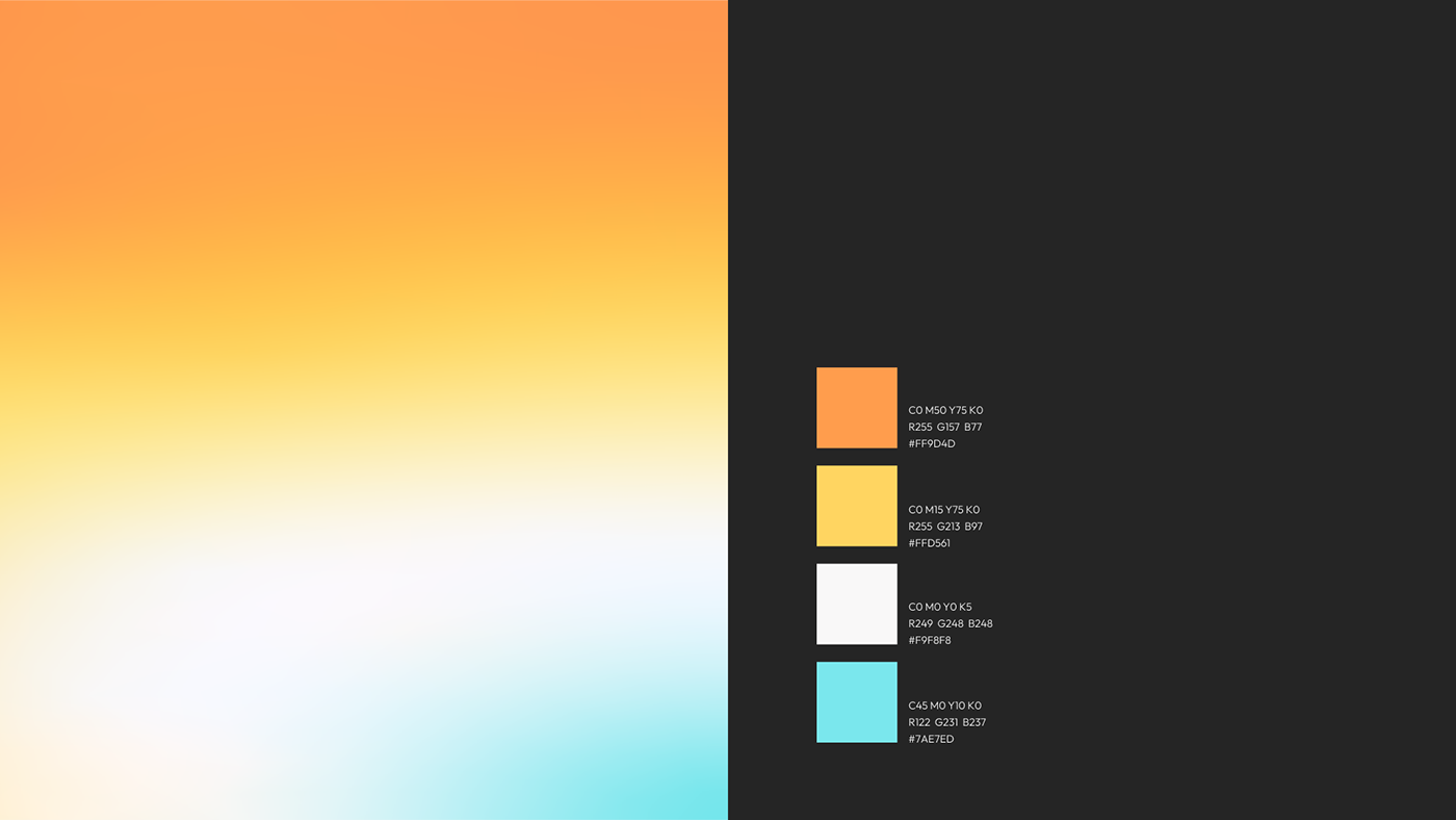
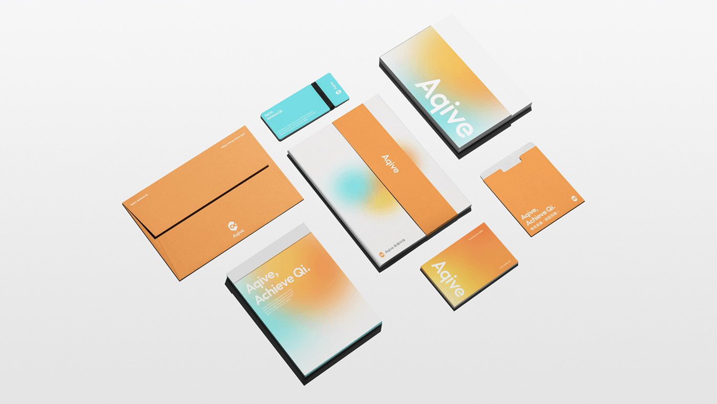
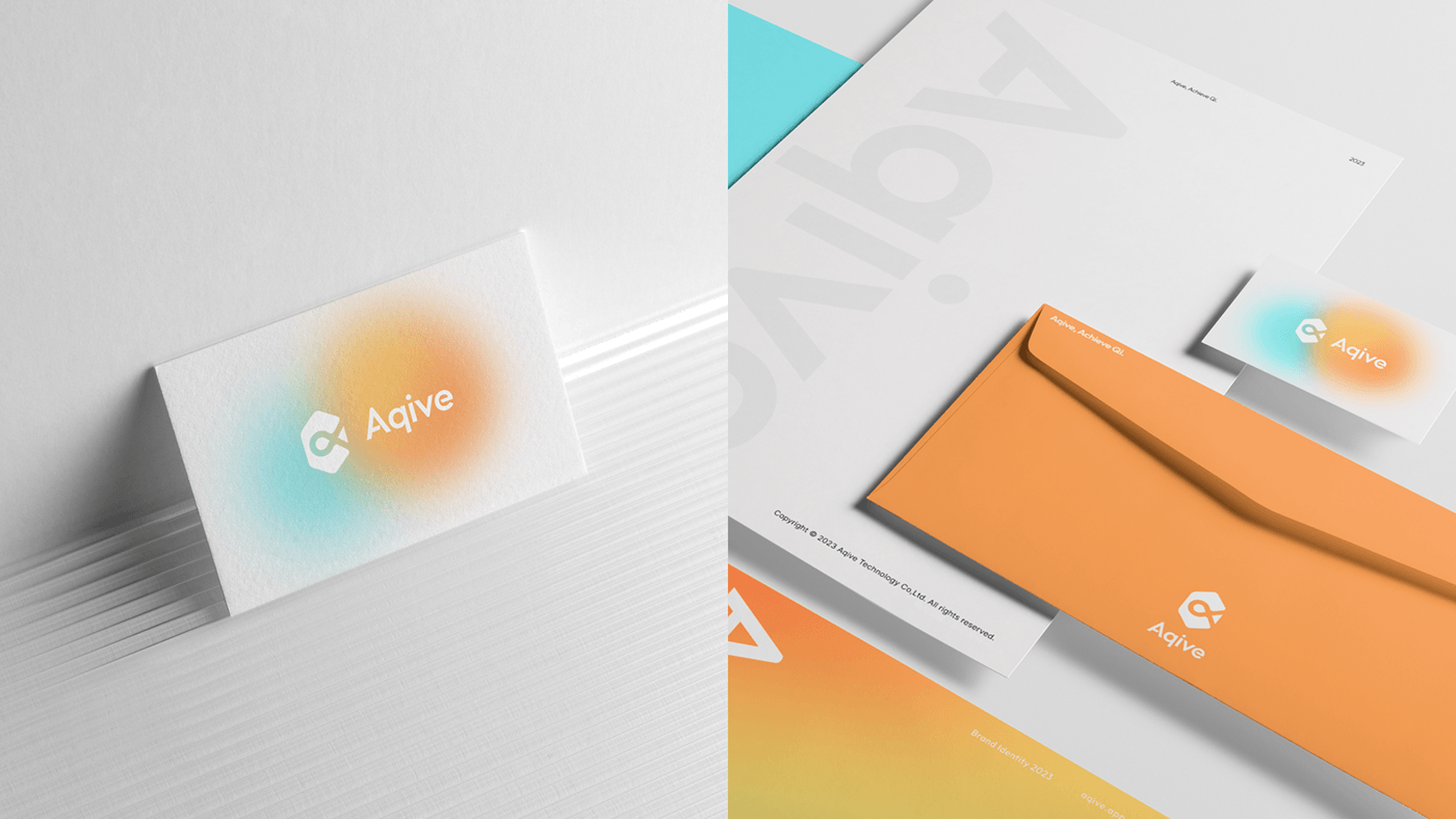
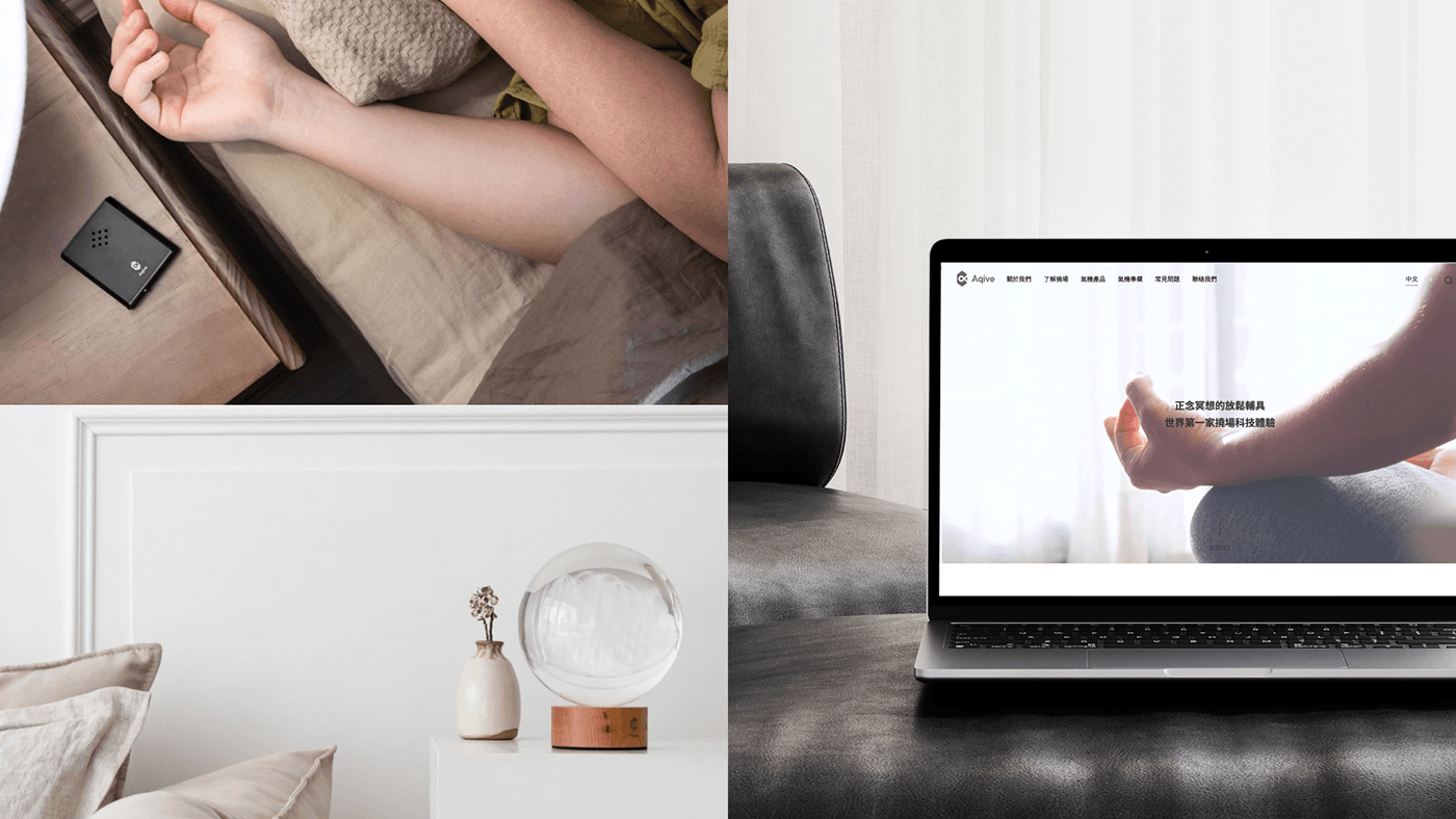
別於多數科技品牌的定位,我們將品牌色系與影像的規範以暖色、明亮,希望透過視覺持續與用戶溝通氣機的核心理念「安心信任的陪伴」,讓用戶不需要在第一時間接觸到叫生硬的內容,而是企圖透過能量的識別化與情境,創造一個有氣機陪伴的日常。
Design Strategy
Conveying peace of mind and trust, creating imagination for users
Diverging from the positioning of most technology brands, our brand color palette and imagery guidelines are warm and bright. We aim to continuously communicate the Aqive's core concept of "trusted companionship" through visuals. Our goal is to ensure that users don't encounter overly technical content right away. Instead, we strive to create a daily experience where the identification with the product is through energy and context, fostering a sense of everyday companionship with the Aqive.


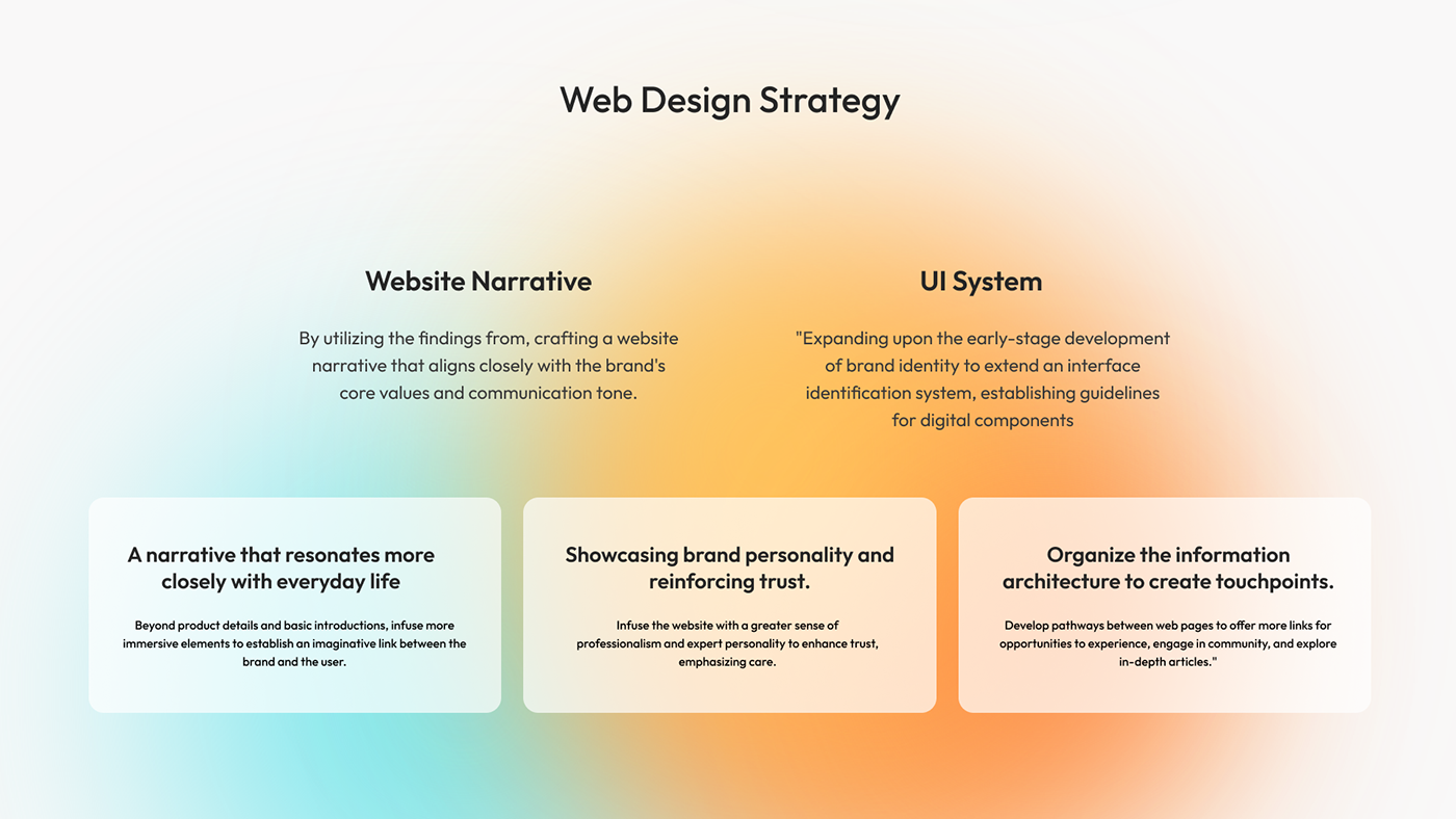
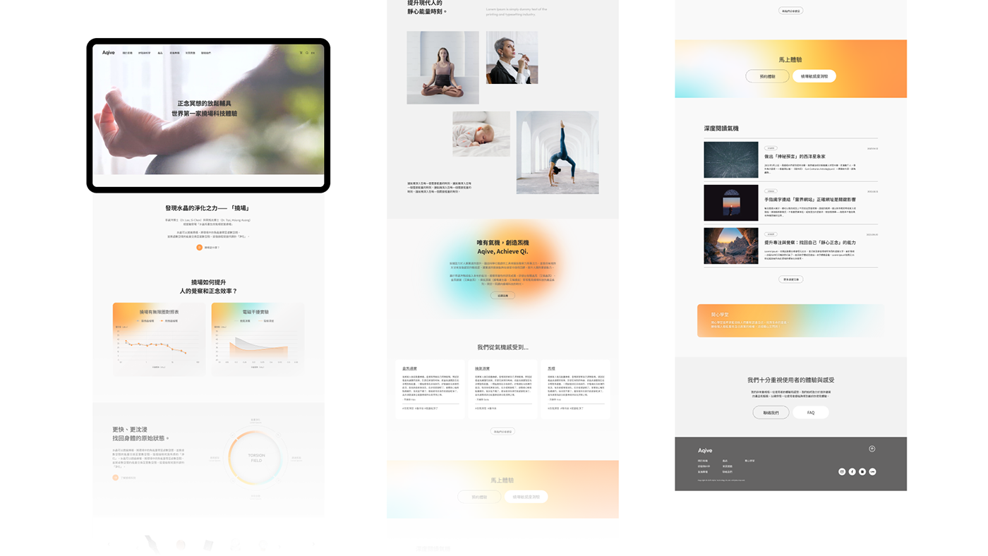
介面設計
賦予沈浸感,帶領用戶想像與認識氣機
賦予沈浸感,帶領用戶想像與認識氣機
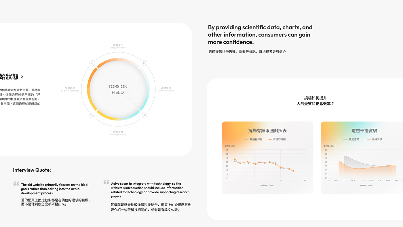
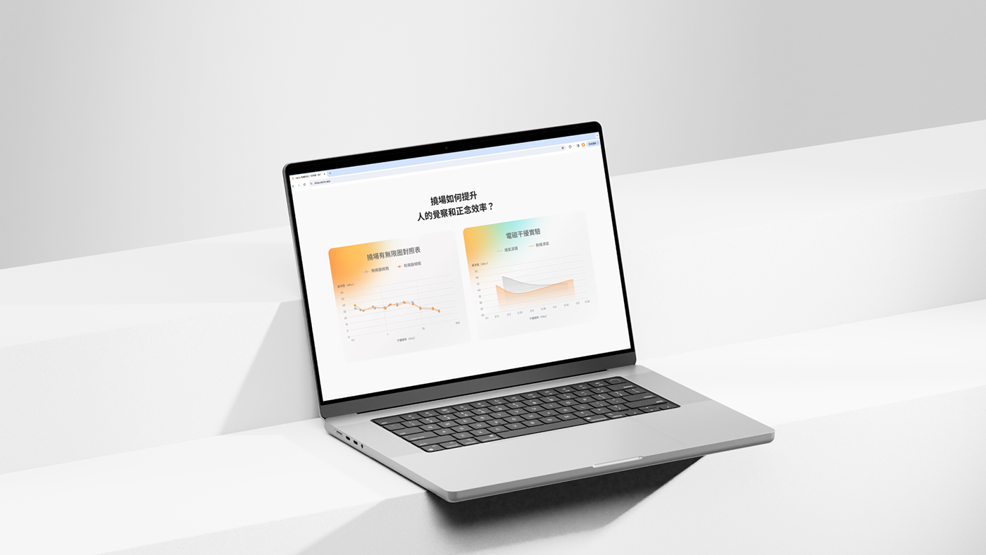
在前期的訪談中,我們同時也針對用戶對於網站的認知、資訊傳遞進行探索,將「沈浸感」與「安心信賴」作為網站策略之主軸,循序漸進為用戶創造更舒暢的瀏覽體驗,提取團隊專業性與亮點,進一步鞏固品牌形象強化導購可能性。
UI/UX Design
Infusing immersion, guiding users to imagine and understand Aqive
In the initial interviews, we also explored users' perceptions of the website and information delivery. We have identified "immersion" and "trust and reliability" as the main pillars of our website strategy. By progressively creating a more comfortable browsing experience, we aim to extract and highlight the team's expertise and strengths, further solidifying the brand image and enhancing the potential for guiding users towards a purchase.


Aqive Technology Rebrand
氣機科技品牌重塑
氣機科技品牌重塑
Design Agency | StudioPros Design
Art Director | 李宜軒 Yi-Hsuan Li
Brand Experience Director | 張文馨 Moon Chang
Brand Experience Researcher | 張文馨 Moon Chang / 吳佳璘ChiaLynn Wu
Marketing Strategy Consultant | 吳佳璘 ChiaLynn Wu
Visual Design | 李宜軒 Yi-Hsuan Li / 林祐新 Pomelo Lin
Client | 氣機科技
Year | 2023
Art Director | 李宜軒 Yi-Hsuan Li
Brand Experience Director | 張文馨 Moon Chang
Brand Experience Researcher | 張文馨 Moon Chang / 吳佳璘ChiaLynn Wu
Marketing Strategy Consultant | 吳佳璘 ChiaLynn Wu
Visual Design | 李宜軒 Yi-Hsuan Li / 林祐新 Pomelo Lin
Client | 氣機科技
Year | 2023


