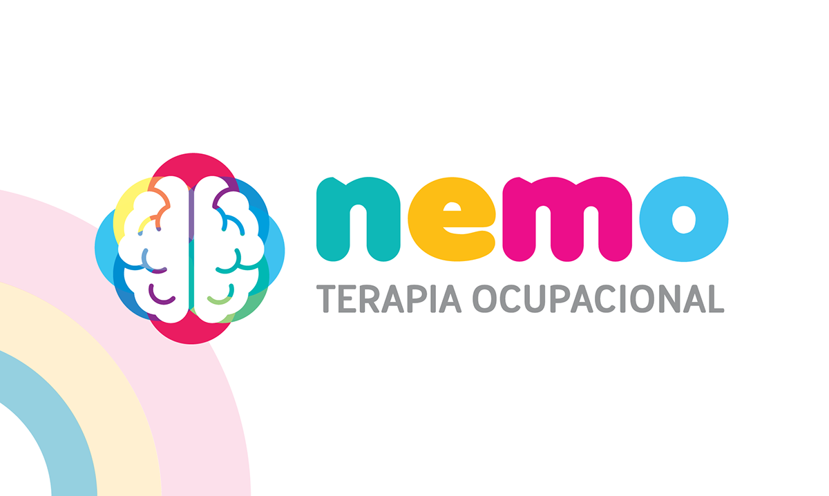
Nemo, a local occupational therapy studio specializing in assisted mobility and sensory integration therapy, needed a brand that communicated its positive, accepting environment and its embrace of neurodiversity. The studio's founder, a neurodiverse occupational therapist herself, wanted to ensure that her audience understood her point of view and philosophy.
We chose a bright rainbow palette to represent neurodiversity, bright motifs with fun characters to attract families looking for OT services for their kids, but avoiding an excessively child-like design that could alienate adult patients. The resulting brand is welcoming, inclusive, and professional, reflecting Nemo's values and commitment to providing high-quality occupational therapy services to all.
____________________________________
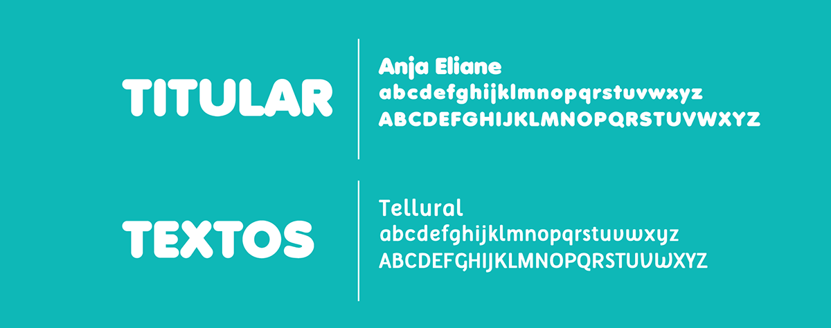
BRAND ELEMENTS
____________________________________
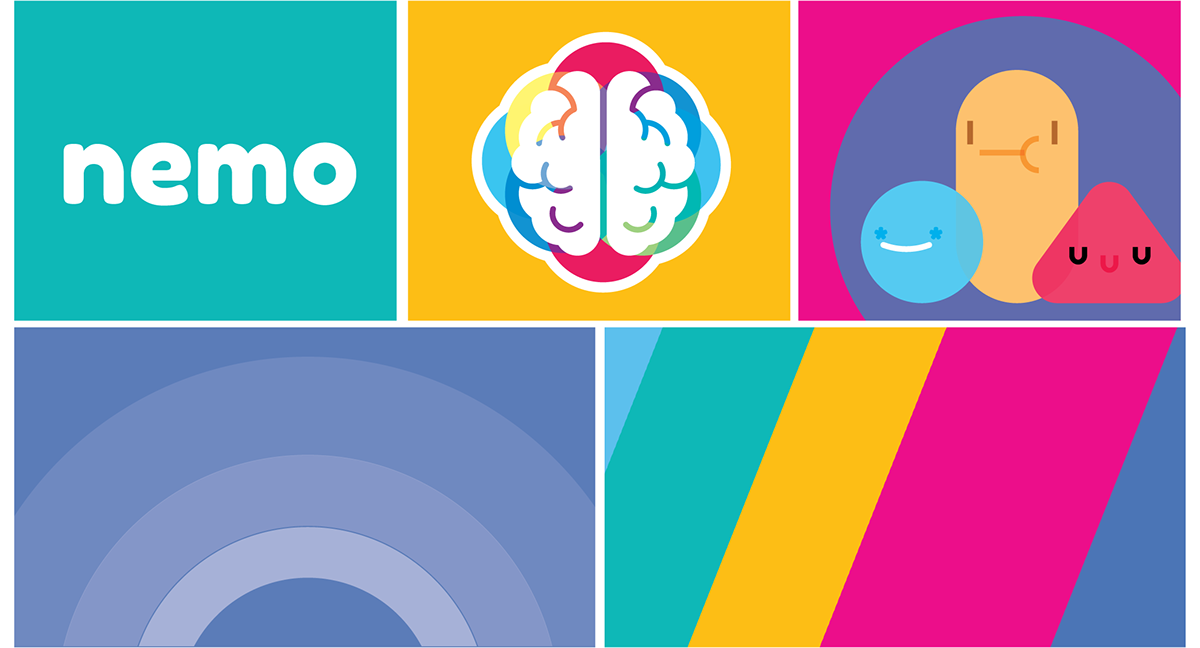
DESIGNS FOR SOCIAL MEDIA


____________________________________
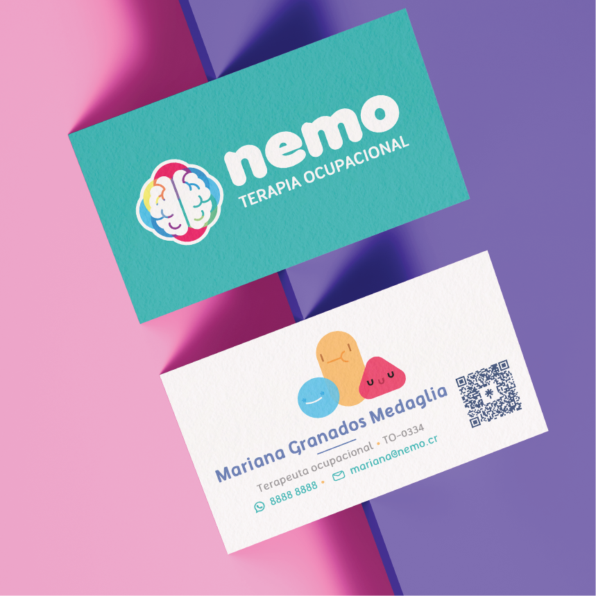
BUSINESS CARDS