La Martinuca is a café bar specialized in tortilla española and originating from Madrid. Gradually, it has become a place of great significance in Madrid and looks set to become one of the most iconic tortilla española spots in all of Spain.
We were commissioned by La Martinuca to breathe new life into its brand identity. The goal was to refresh its image while retaining the original logo and its characteristic blue and white color combination.
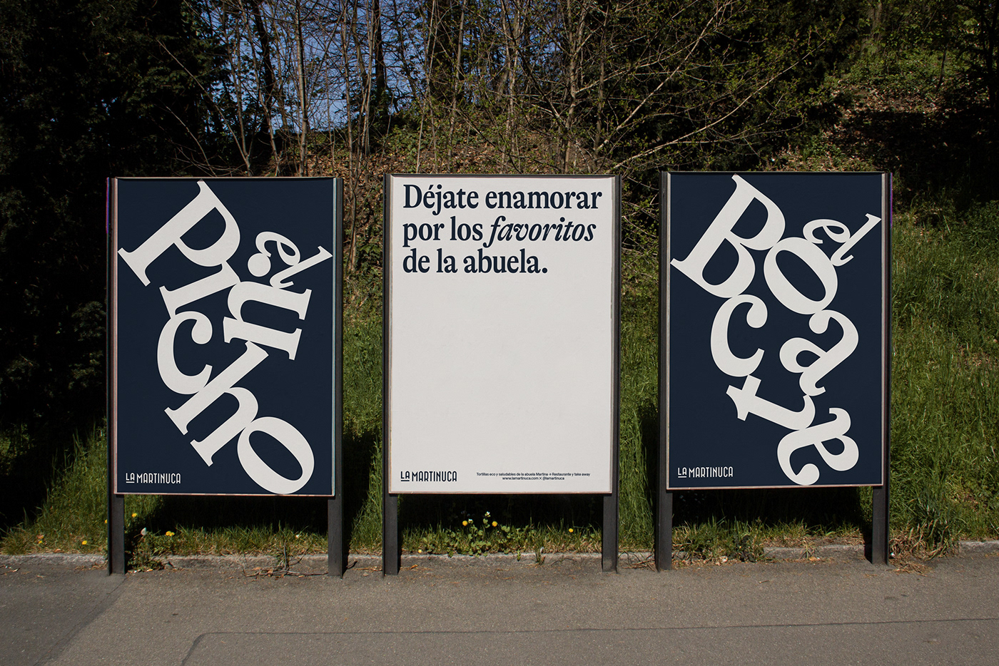
To talk about La Martinuca is to talk about a brand whose essence lies in the tradition of tortilla española and in the comforting flavor that only a grandmother can recreate and convey to the palate. However, we also speak of a contemporary brand with a modern vision that aims to bring the tradition of the tortilla española to current and future generations. For this reason, we focused on designing a refreshing image with accents of nostalgia and warmth.
Simplicity is key; the illustrations stand out, and their slightly retro style complements perfectly with the typography — a typeface that appears formal but not boring. It is expressive, distinctive, and joyful. We opted for understated and simple typographic compositions, but suddenly, we played with decomposition and emphasized certain words, creating compositions with a random appearance that add a touch of disruption, originality, and distinction to the brand.