Sowing the seeds of a better shopping
Sezamo is a new player in the e-grocery store game, following up on its mother brand Rohlík.cz and the mission to help people eat better and live healthier lives. And our mission at Cocoon was to create a new identity that would be as crisp and smooth as the brand itself.

When you say Sezamo out loud (go on, try it!), many things come to mind – a tiny seed with a big taste, delicious foods of all kinds and flavours, and even the password unlocking treasure caves from that fairy tale you used to read before bedtime. Sezamo is a brand that wants to deliver it all, and in order to do it right, it needed a design that would reflect its DNA and values to the very last crumb. At Cocoon, we had just the recipe for that and cooked it all up by proposing the brand name, creating a strong recognizable visual identity and building the visual guidelines.
It all started with finding a name which would top up the crunchy theme of the mother brand and tick a few boxes – it had to be a simple, universally acceptable “food word” triggering taste, sensorics and all the comfort that comes with it. After dozens of creative proposals, we concluded that with “Sezamo”, everything clicked perfectly – the sesame seed is a bearer of taste, it boosts both appetite and imagination, and it is a popular food ingredient in all cuisines. Also, the letters have likeable, rounded shapes and are pleasant to look at as a whole. The connotation with “Open Sesame” was an icing on the cake, adding a pinch of magic and hidden treasures waiting to be unlocked.
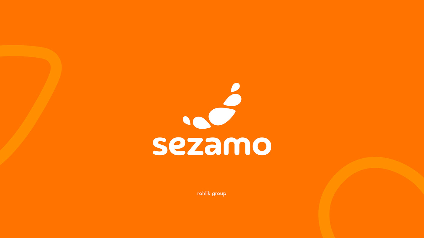
We then started designing a visual identity that would follow in its mother brand’s footsteps. The logo is a combination of the name and a refreshed brand icon which consists of 5 sesame seeds. The brand symbol’s shape hints to a smile, just like Sezamo aims to put a smile on people’s faces by making their lives more enjoyable. The typography was tailor-made, with 2 seed shapes hidden in the letters “e” and “a”.


For the signal colour of the Sezamo palette, we went with orange, a deliciously vibrant colour supported by different shades of yellow and green to boost juiciness and taste appeal. It makes the brand really stand out (especially in the streets), and is supported by secondary colours, all of which help to evoke taste, freshness and enjoyment even more.
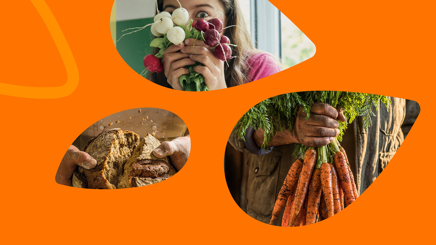
We also enhanced the identity elements and made the most of the actual seed shapes which we turned into devices for icons, images, and information, as well as photography frames and watermarks in various backgrounds. Campaign photography was created by B&T agency and the identity follows its course here, showing what real produce looks like – no make-up, no retouching, no dewdrops added in Photoshop. Genuinely natural, naturally genuine.


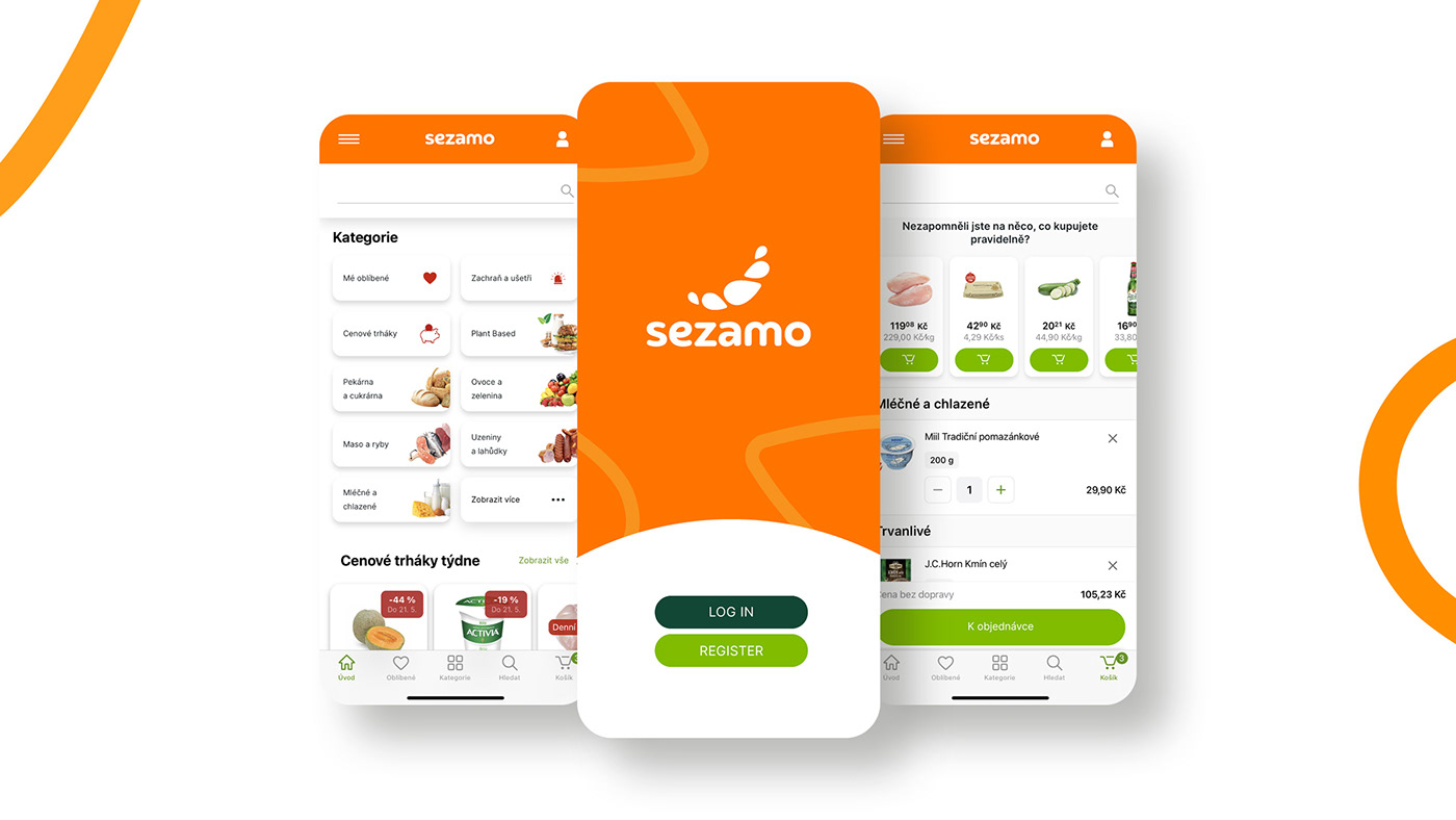
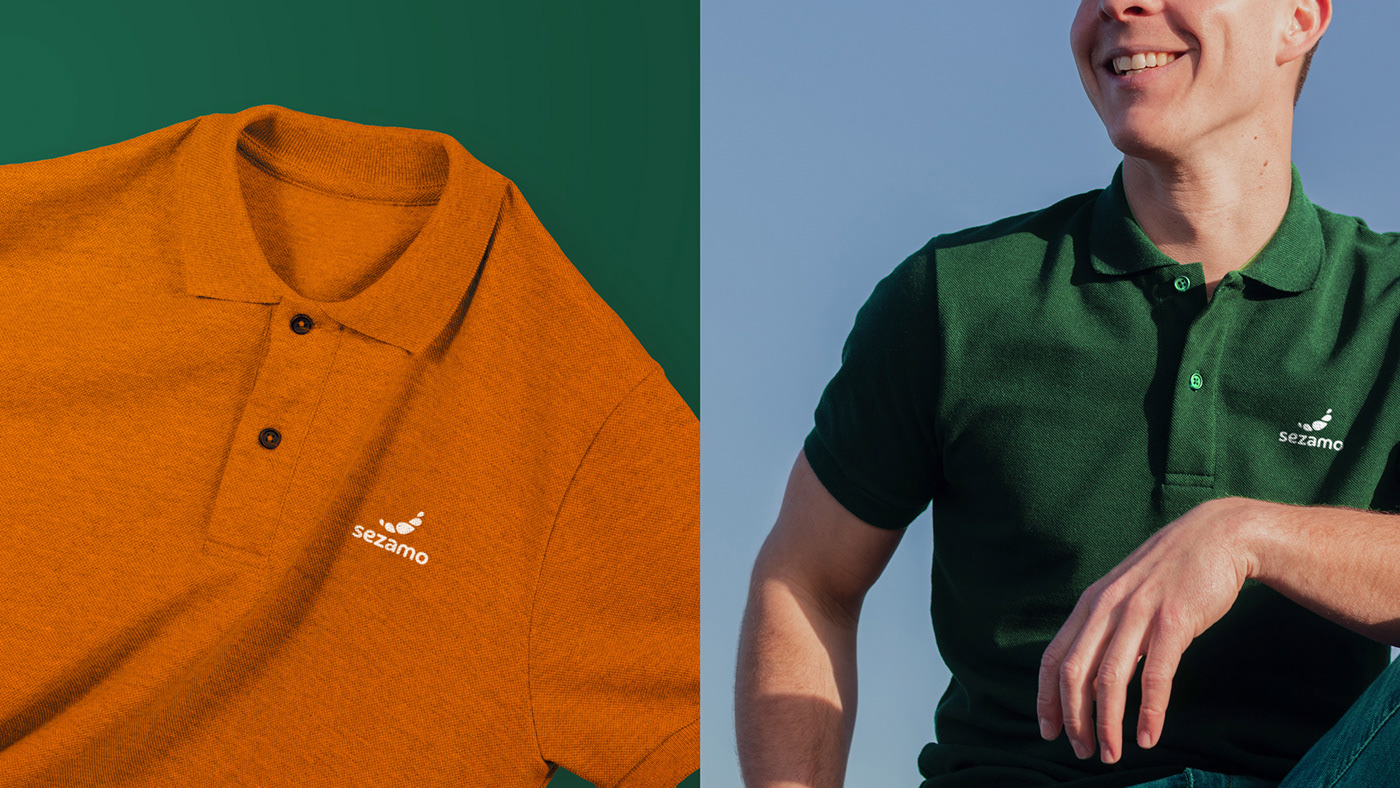
Cocoon’s visual identity for Sezamo came to life in many real-life touchpoints, starting from delivery cars, branded bags and courier outfits, all the way to the layout system for various types of visuals (both digital and outdoor), as well as mobile and web apps.
We also enhanced the identity elements and made the most of the actual seed shapes which we turned into devices for icons, images, and information, as well as photography frames and watermarks in various backgrounds. Campaign photography was created by B&T agency and the identity follows its course here, showing what real produce looks like – no make-up, no retouching, no dewdrops added in Photoshop. Genuinely natural, naturally genuine.