
I was asked to create a set of wireframes to re-invision this comparison shopping website. It offers a unique way to compare items, but that wasn't coming through in the current sites style.

The site has a very dated look, and lacks visual heiarchy. It also has trouble communicating why it is different from other comparison shopping sites.
One of the largest problems with the site, is that there is no clear call to action, and the boxes are not the most effective way of communicating the purpose of the site. The design also lacks visual hiearchy.
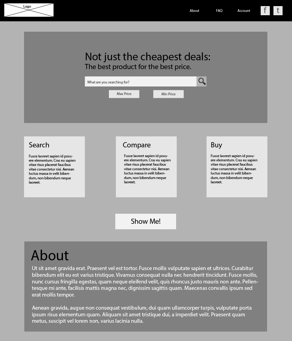
This is my first pass at the wireframe for the site. I researched other sites that offer comparison shopping options and looked at how they created hiearchy, and what things they emphasised. The call to action for this site, really needed to be that the user began searching for new products. I moved the search bar to the center of the page, and added a tagline to communicate why the site is different from other comparison shopping sites.
This was a good start, but still had some issues. I wanted to mock-up how the Show Me! feature would work, and I wanted more effective text for that button. I also decided to complete the wireframe with the rest of the elements that were a part of the long scroll of the home page, the about section, and a FAQ Section.
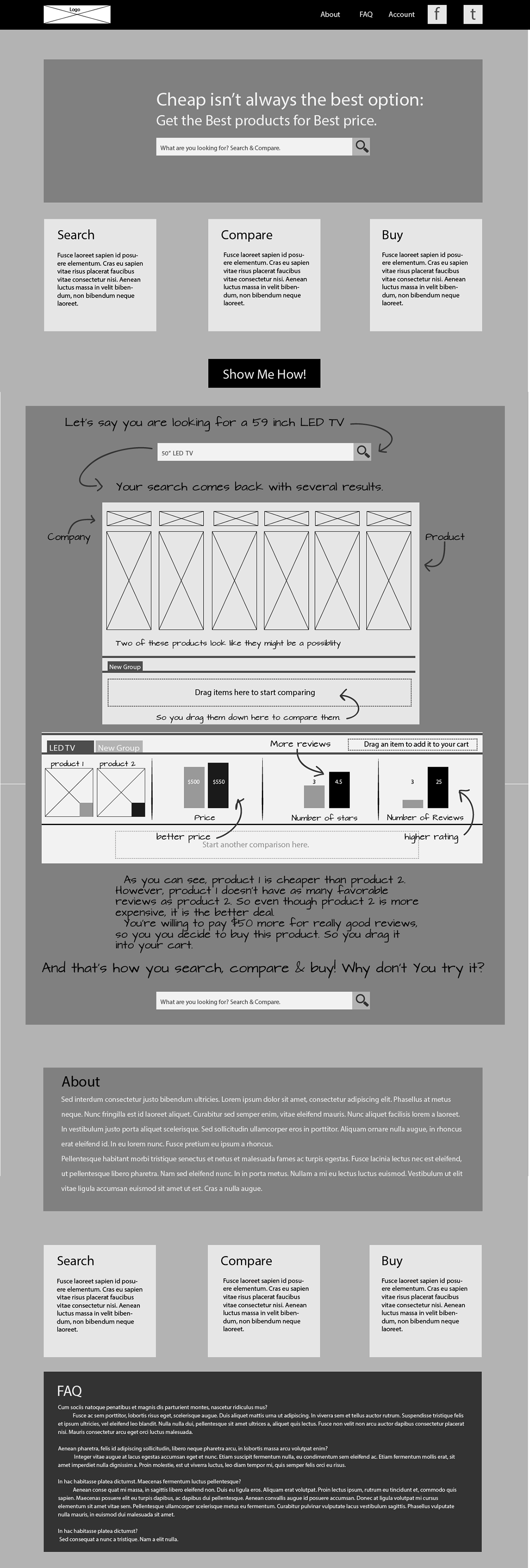
This wireframe is much closer to what I have envisioned, but it has a couple of issues still. The show me section needs more clearly demonstarte how the site functions.

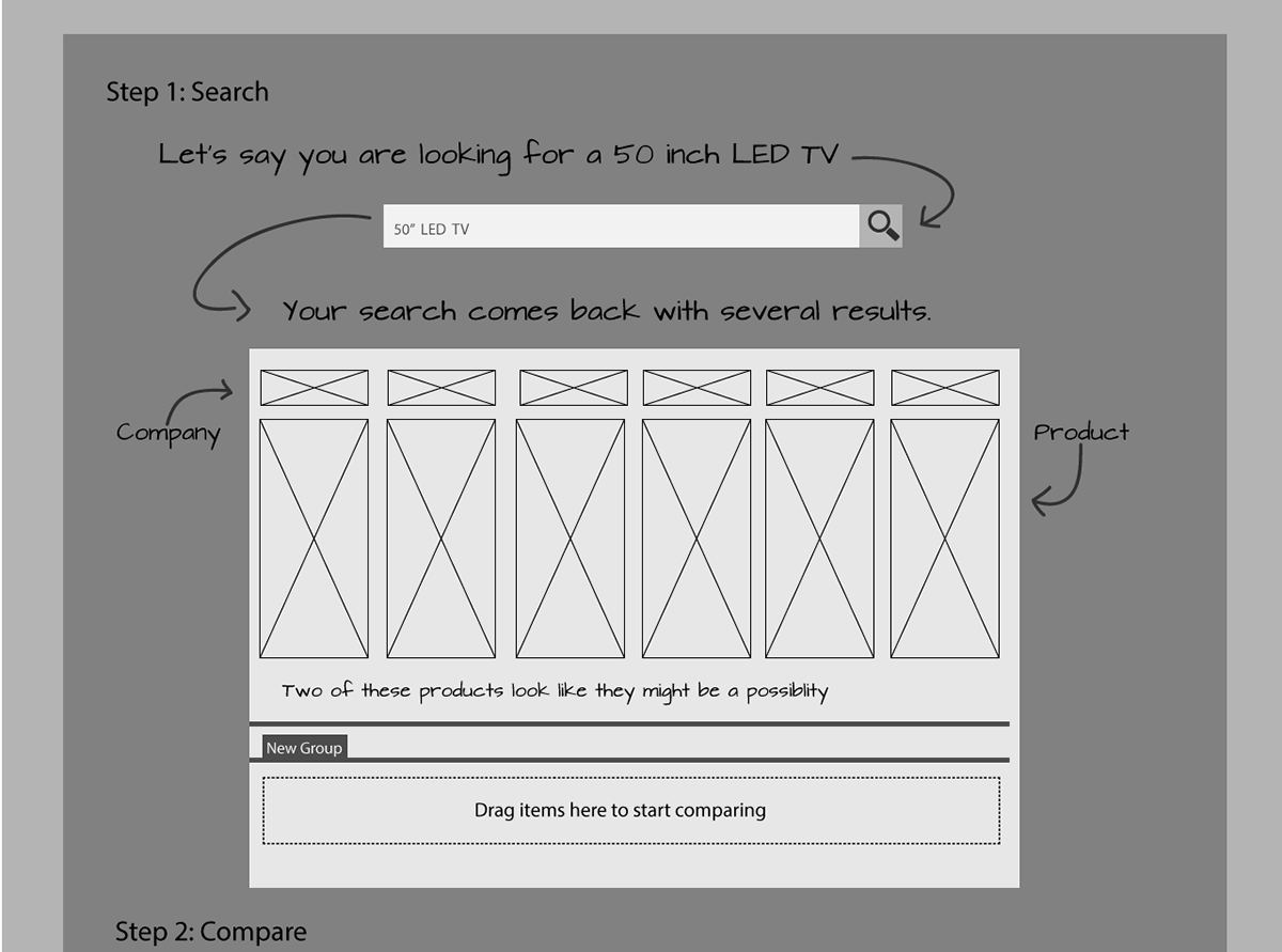


This is the final set of wireframes I created. I worked to create a clearer example that showed the user how the site would function, and invite them to use that function. It has better visual hiearchy and a clear call to action.
I also create a wireframe for the login page of the site. In order to show the functionality if you click on the account button.


