
Hudson's Bay and Zellers Design System
Hudson's Bay Company is Canada's oldest business (over 365 years old). Hudson's Bay hired me to build from scratch a design system to support the creation of two of their flagship e-commerce businesses i.e. The Bay and Zellers. Below is an outline of my approach to building out the design system.
Setting the Foundation
I recorded the video below to demonstrate to Hudson's Bay the value of running a visual UI audit of their digital product to extract the design language and craft it back into a centrally served design library.

Establishing the visual communication style for the design system.
The above screenshot displays the visual presentation style I created for Hudson's Bay design system. Consideration of the visual appeal of the design system is critical to it's success. It aids the designer and developer to navigate the system. A good style also promotes a sense of pride and ownership in the system.

Establishing the color swatch for the design system.
Colours are categorized and tokenized to make it easier for the designer and developer to reference. For example, a shade of grey categorized as a 'neutral' is called 'titanium' and is referenced using the token name 'neutrals.titanium'.
The colour system is loyal to the brand guidelines for the corporation and is categorized in a way that enables swift intuitive 'skinning' of the design system. e.g. to change the entire look and feel one needs just change the brand category of colors


The above screenshot shows the global colour palate for The Bay. Notice the categories for Brand, Semantic and Neutrals. All colours are assigned a token name and uploaded to GitHub through the Figma Token Studio plugin.

Creating a logical naming system for the swatches


Categorizing the colours and assigning token names is a deliberate and necessary step in establishing colour within the system. Above I demonstrate the categorization of the colours and the taxonomy for the colour tokens. Categorizing the colour system allows you to tackle functional changes of colour to achieve a global effect. For example, creating a category specifically for 'brand' enables our team to skin the UI to a completely new brand by updating a single set of colours.

Creating an icon library
Creating an independent library for icons is recommended especially if you have a multi-tiered design system servicing many brands.

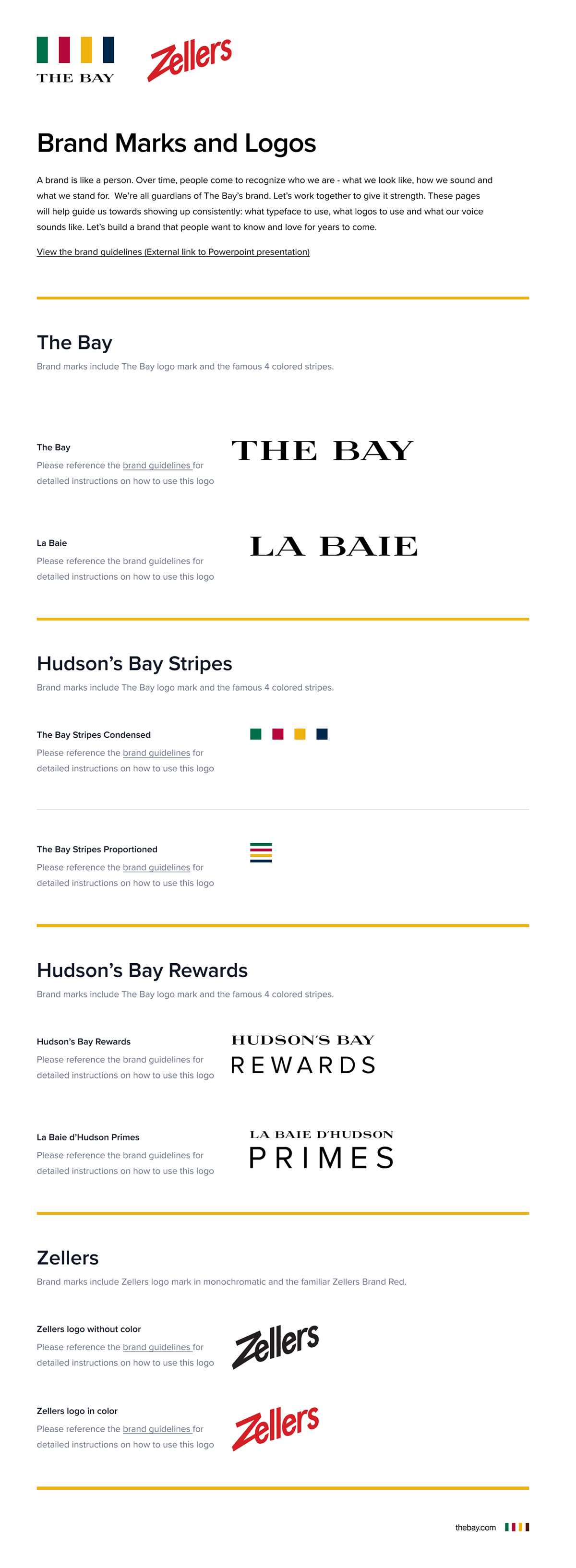
The page above shows a layout describing brand marks and logos that I created and served to our designers in a library called 'icons'. All brand marks and icons are available to the designer and developer through the assets panel in Figma.


The above screenshot shows three individual presentations of the assets panels in Figma. Each panel represents a category of assets from the Icons Library I created. The first panel shows the 'Guidelines' I loaded into Figma as 'Package' components to make the 'guidance for use' available to the designer from the assets panel. Also shown above are asset panels showing the 'common' icons repository and the 'brand marks and logos' repository.

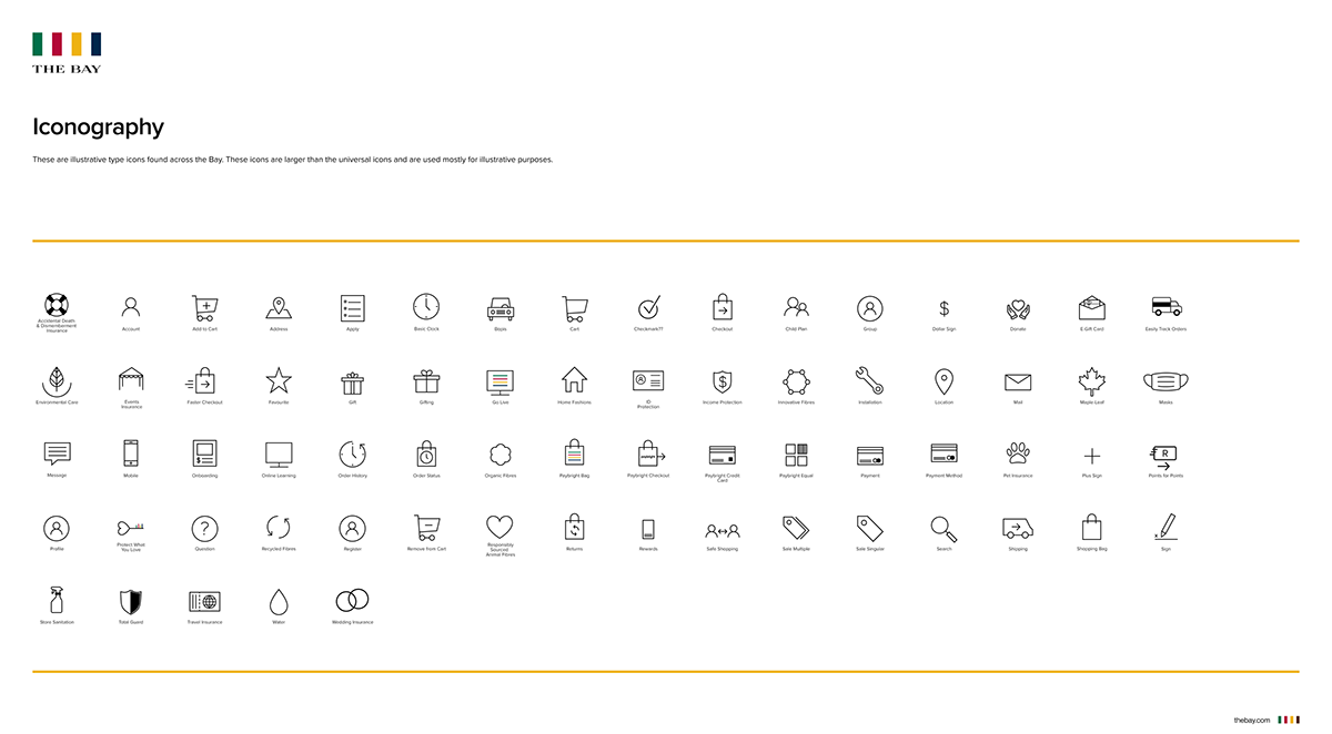
This is a screenshot of the illustrative icon asset set from Hudson's Bay icons library.

Establishing breakpoints and a layout Grid
Unless instructed, I base all my grids and dimensions on a 4 / 8-pixel grid system as used in Material Design by Google with the addition of the 4px specification for small details such as an offset between a tooltip and its triggering text.
I also base my breakpoints on established research into our visitors' profiles (device and screen size data) or established frameworks offering breakpoint references, such as bootstrap.

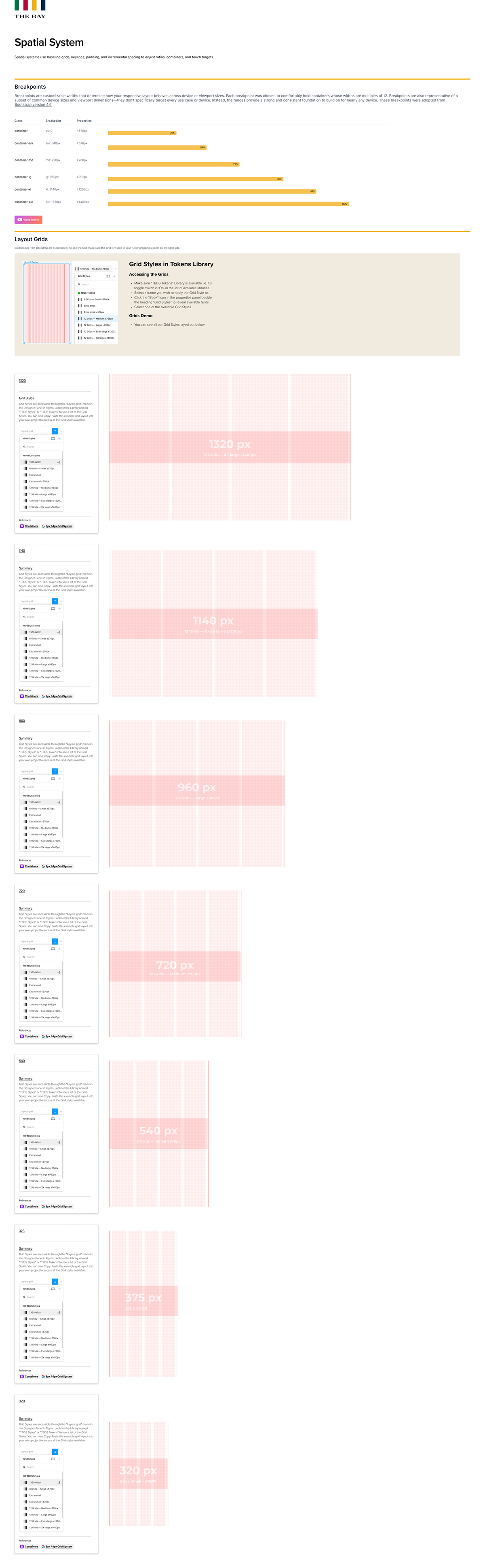
Breakpoints: The breakpoints above are based off Bootstrap 4.6 media query and breakpoint guidance. Breakpoints give the designers and engineers the possibility to reconsider the real estate a design occupies on screens of differing sizes. Establishing the breakpoints allows the designer to completely influence the presentation of information at different sizes.
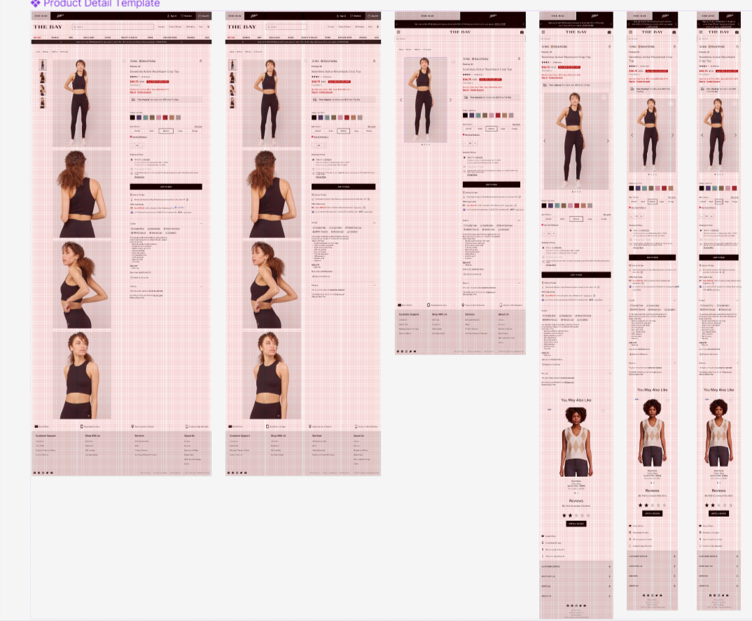
Above is an example of the spatial grid applied to various breakpoints for a particular screen of a product. In this case we are looking at the Product Display screen for The Bay shown from Desktop to Mobile. Notice how the layout changes between screen breakpoints.

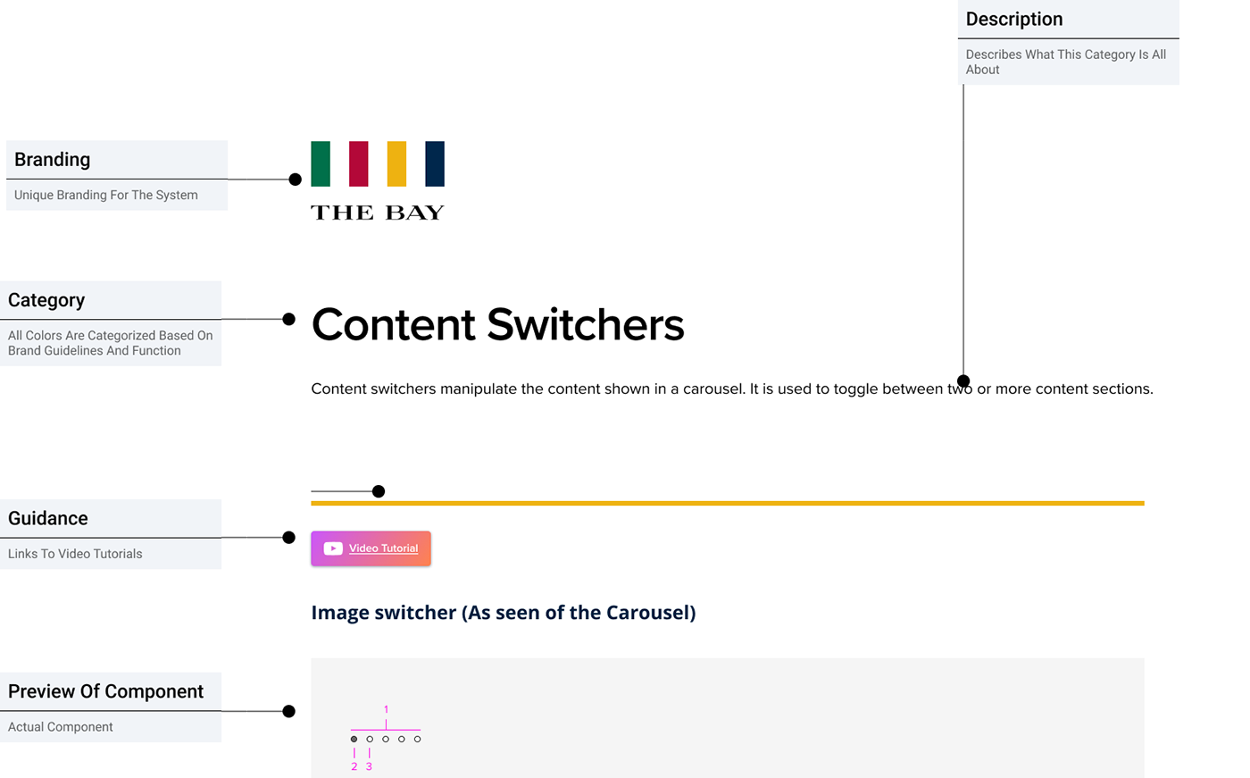
Establishing components and guidance
In this case the product designers were building a product from the ground up so there was no UI audit to run. Instead the designers fed me an original single component for each category i.e. button, badge, notification, etc and I created the states and interactions for each. I also provide al guidance around their use.

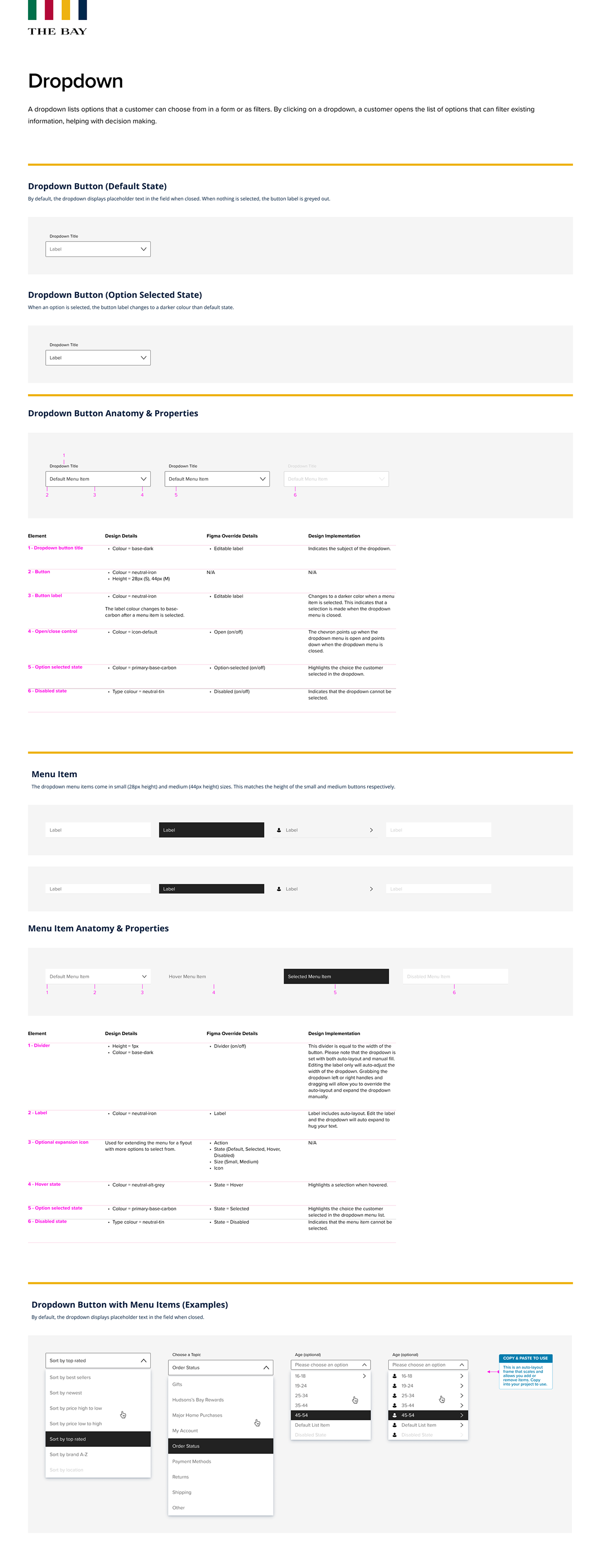
In the above screenshot you will see guidance for a single component. In this case we show the dropdown component. We present all guidelines including interactive states and anatomy to the designer. This UI guideline is also saved as a "package' component and served through Figma's Assets library where the designer can easily access within any project.

Establishing shared libraries
How you break down your system and share libraries is essential to the success of your system as a whole. Here I create two separate and independent "Teams" in figma for the "design system team" (who build and maintain the system), and shared libraries "Design System Libraries" where I serve the component libraries, style libraries, icons and UI patterns.
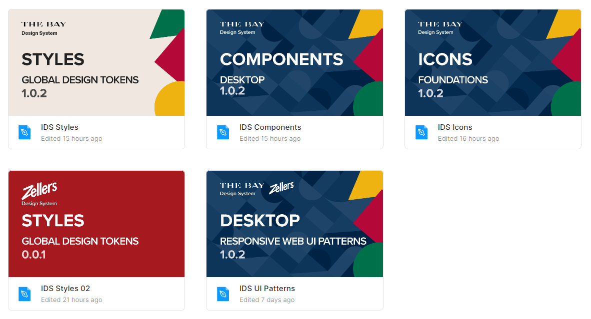
The above screenshot shows the presentation of the design system libraries in Figma. Note the separate libraries for Styles, Icons and Components which are all dependencies of the "Desktop" UI pattern library. What is not seen here is the Mobile UI library which was a work-in-progress at the time o this making.

My Video Presentation Style
Below in the youtube video you can sample my presentation style in a recorded session I made for our product designers on how to use the design system. I also go deeper into topics such s slot components and package components.
Below in the youtube video you can sample my presentation style in a recorded session I made for our product designers on how to use the design system. I also go deeper into topics such s slot components and package components.
