New Kamenitza
Redesigning the first Bulgarian beer
Since 2021, Kamenitza has presented a new visual identity. At Cocoon, we are proud to be a part of the modern face of a beer that is not only traditional, but the first of its kind as a Bulgarian beer!
Since 2021, Kamenitza has presented a new visual identity. At Cocoon, we are proud to be a part of the modern face of a beer that is not only traditional, but the first of its kind as a Bulgarian beer!
Redesigning a national core lager always brings interesting moments and challenges, especially if you have known the brand for many years. And we certainly do, as we’ve shaped its look several times in the past. The latest task was to develop an identity which would correspond with the brand’s mission – igniting a positive view on life and demonstrating tradition and craft since 1881 – and which would help Kamenitza proudly stand out on the crowded shelves.
Kamenitza’s visual presentation had not substantially changed in years. However, the most recent design conveyed quality and a top position among Bulgarian beers. Unfortunately, it was starting to be seen as a bit outdated and “monumental” - distant from the usual consumers. Celebrating the 140th anniversary in 2021 represented a great opportunity for Kamenitza to strengthen the connection with beer drinkers and introduce a new brand identity.
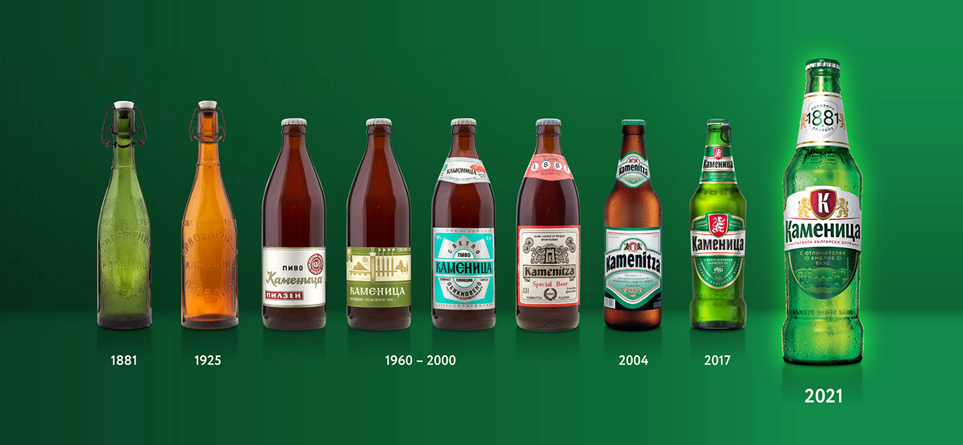

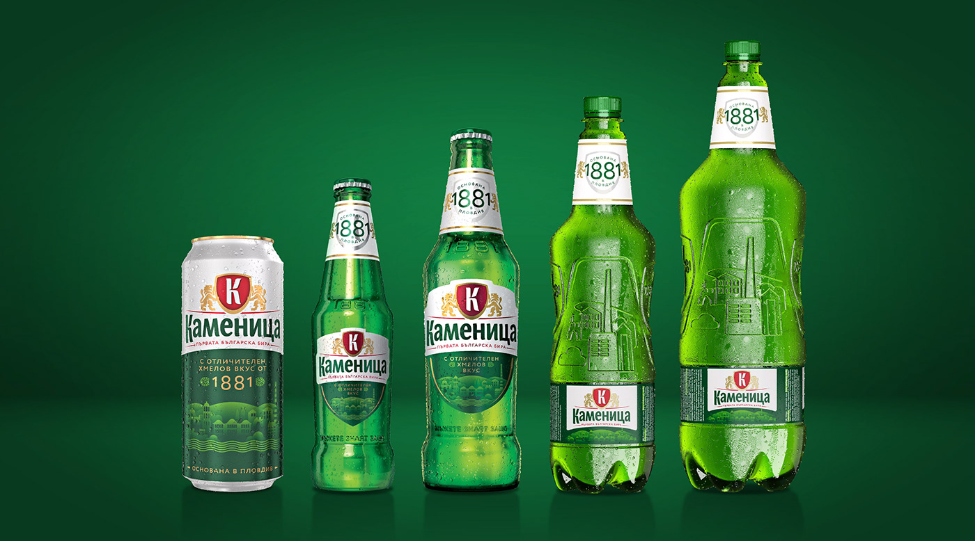
Finding the way to properly touch consumers’ hearts, we went into a broad exploration of potential directions, spanning from conservative to revolutionary. Inspiration came from the brand’s heritage, the Swiss founders, and through the famous city of Plovdiv where Kamenitza was born - from its sights, to its specific urban spirit and vibes. Other than coming up with the creative idea, one of the biggest challenges was keeping the current industrial design, meaning the bottle shape, embossing, and the etiquette’s die cut.
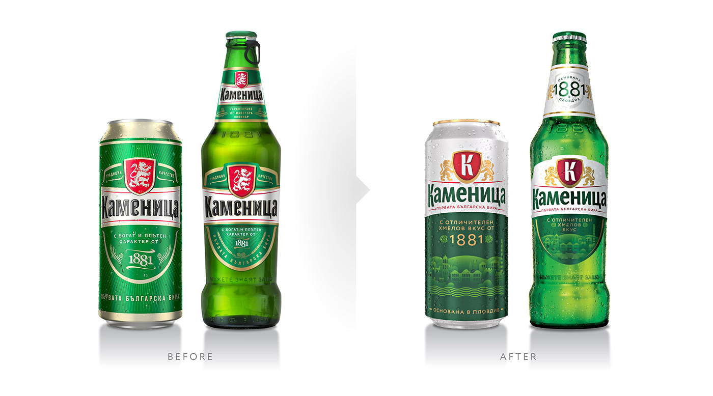
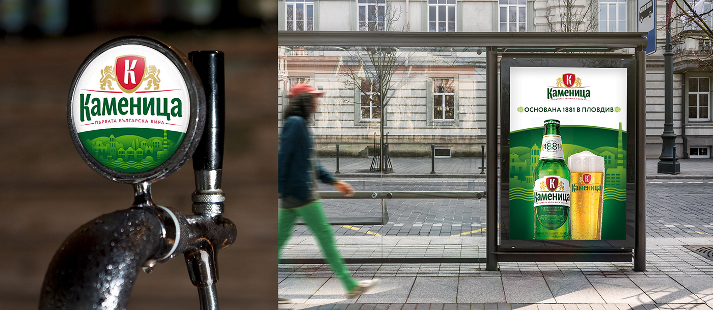
The winning design introduces a fresh visual language and helps the brand step down from the pedestal and become friendlier and less pretentious. We have lightened the entire label by significantly increasing the amount of white. We’ve kept the brand colour green, but it now has more fresh tones and shades. Even the logotype has changed to green. A white neck label showing the date helps pull Kamenitza out of the shadows and remind consumers of its famous heritage.
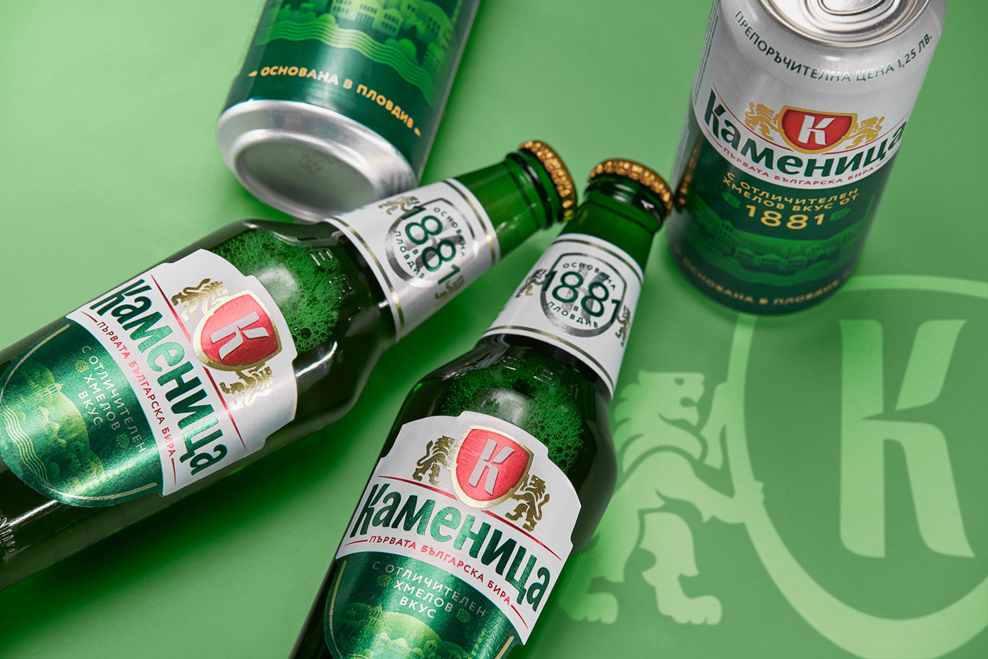

We had to rethink all of the brand elements and their role within the visual identity. We kept the colours, but we’ve changed their proportions. We kept the logo in Cyrillic, but made it lighter, less “blocky” and changed it to green. We also had to find or create a strong symbol – a signifier, which would tell and encapsulate what a brand stands for in a single powerful image. In the new signifier, we doubled the lion (the symbol of Bulgaria and national pride) and placed it outside the shield. This makes it stable and distinctive, while the initial letter "K" placed inside connects with Kamenitza’s history, old labels and emblems.

An important, yet not prominent part of the identity is the illustration of Plovdiv, which conveys both historic and symbolic meanings. Plovdiv is not only the place of Kamenitza’s first brewery, but also an ancient city and strong symbol of the Bulgarian national heritage and culture. In its streets, modern meets old. We’ve strived to transform these positive vibes and the assets of the past into a unique illustration. We believe the characteristic city landscape of Plovdiv rendered in pleasant green shades and in a simple geometric style perfectly matches the needs of contemporary visual presentation.
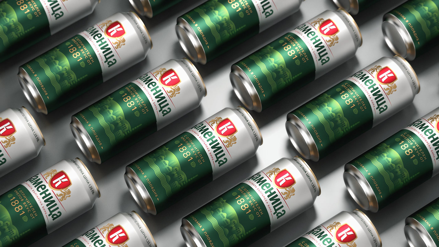
The brand’s entire visual identity system has been developed so that it can easily be rolled-out onto various POS materials and merchandising, various packaging formats (from cans to PET bottles), secondary packaging, ATL communication, websites and other forms of digital communication and social media visuals.