Sem Parar - Design System
Atomic design feat. Development
About
Sem Parar is the main Brazilian company for toll gate, parking gate, fuel at gas station and drive-thru gate free-pass. The company changed its visual identity and because of that, has decided to innovate, improve and enhance the experiences in all digital channels: mobile app, website and e-commerce.
The problem
Sem Parar is an Omni-channel digital experience, which means our users can access it in various devices at once. Since there wasn't a well developed design system that both designers and developers could leverage, all devices had inconsistent visual interfaces, compromising the seamless experience the company expected. The design team didn't have a structured methodology on how to build components and share with the dev team and this was a great part of the problem we had to face in order to develop consistent UIs regardless of the device. We had to push our boundaries and start to be in sync with the development team!
If our digital channels don't have visual consistency, our users might doubt the overall quality of the product we are offering, and we didn't want that!
So, let's get started!
The new design system implementation had to be divided into phases so we could complete and test it before deploying to production.
Phase 1: Choose a methodology
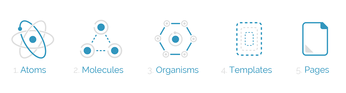
Based on what we already had designed in our component library, I discussed with my team and we decided to move forward using Atomic Design as our new methodology. By doing so, the team wouldn't have to start it from scratch but instead, organize, adjust and rename the existing components. This would save use time updating our system and we could still deliver our daily tasks.

Phase 2: create a strategy that combine design and development
In order to keep the workflow, I started updating the design system while my team kept the wheel spinning. The work never stops, right? I started having 1:1 meeting with the UI Developer Lead in order to make a system that not our team but all teams would be able to understand its logics, organization, scalability and responsiveness.
Omni-channel digital products must have a responsive and easy-to-scale system!
The objective now was finding a smart way to name and organize components in its stages so devs and designers could easily work with them, developing visually consistent pages.

Color palette and text styles

templates and components
Phase 3: Implementation
As I completed the conversion of the current system to atomic design, making sure the style guide was up to date and all rules and behaviors were working properly in all devices we supported, the dev team started the updating their repository. It was now time to coach new team mates, report to both product and IT directors so they could plan and deploy the changes to production, sprint by sprint.
It was time for devs and designers to hold hands and fly together!
Extra: Accessibility
Let's not forget to talk about accessibility. We all know that some users might have difficulty on reading or understanding something because of a visual problem like color blindness or myopia. I knew we couldn't rely only on colors to determine any component's status or behavior as well as using icons alone, assuming they are all gonna be "readable" because designers knew what they meant. Our product had a huge range of user's demographics, and we had to be prepared to offer a digital experience that everyone would like and appreciate.
We can't assume that anything is obvious or good enough only based on our own point of view!

Design documentation matching development code. Both teams were now speaking the same language.
It was clear that the results would come fast!
FOR DESIGN
The design team now had access to a collection of symbols that could be repurposed depending on the objective / problem. With standardized styles and scalable / adjustable components, the time spent on creating new screens or variations of a screen decreased considerably. The average time to design a full journey decreased up to 50%, giving the team more time to spend on discovering and researching. Also, the consistency between screens designed by different designers was spot on! All journeys in various devices were now with the same experience and UI! Finally we have achieved the best in class designs we were expected to deliver!
FOR CODING
The same outcome could apply for developers: without having to code components individually, developers were now able to leverage a "core code" repository, making it easier to develop any page. Since all components had a common style and behavior already available to be used in their repository, the time to code a screen decreased up to 50% if compared with the old way to do it. Devs also had less troubles cleaning up the code, which made it easier for testing. Making it easy to change or adjust anything globally was another positive outcome, considering that designers and product team had more time to enhance the product, rather than just develop it.
FOR USERS
Users were now able to enjoy a seamless experience, regardless of the device they were accessing it from. The cross-channel experience was now appreciated by users, and there was no more confusions or second guessing when it came to our digital experience. The more accessible system made it easy to all groups of personas and this added more value to the business and products we were offering.
Design Systems are living projects and that was just the beginning of this new era!
