Sem Parar - gate free-pass
Mobile App

About
Sem Parar is the main Brazilian company for toll gate, parking gate, fuel at gas station and drive-thru gate free-pass. The company has just changed its visual identity and because of that, has decided to innovate and improve the experiences in all digital channels: mobile app, website and e-commerce.
The problem
Company's user base is around 3,5 million people in Brazil, mostly located in Sao Paulo. Due to the huge amount of people using the services, the users personas are too distinctive from each other. Therefore we needed to review and adapt all journeys in order to make the new experience more intuitive and easier, no matter user's backgrounds. The app needed to show user's expenses, vehicles and status in a way that everyone could understand, because those are the main features available. Since Sem Parar is the first Brazilian company in this area, it started to become obsolete in terms of design and experience when compared to their start up competitors. The mobile store ratings were also decreasing. We had to take some extreme actions to create a new perspective from the users concerning the app

The discovery part 1: Immersion
First things first! We needed to know to whom we were designing the app for. The company didn't have a great view about their users relation with technologies and digital platforms. So, before we set goals and strategies, we had to launch a survey to kick off the project. It's always good to know more about our users before planning anything! Then, we had the opportunity and were encouraged to do many other interviews and researches concerning this subject. With new and better inputs about our users, we could start planning the experiences.
If you don't know your user, how can you develop an awesome experience?
After collecting more than 600 responses, we could cluster them into specific categories and start creating our fresh users personas. Not only knowing about our users personas, we started benchmarking the main apps our users were used to access. Banks and credit cards were the top on the list! That was a great reveal, because the goal of the app was to be the main channel for our users to check their balance, follow their expenses closely and manage their vehicles and tags. We could see a light in the end of the tunnel! Finally we knew what were their interests and how they connected to digital platforms. It was time to start working on improving the features our users considered most important.

The discovery part 2: Design strategy
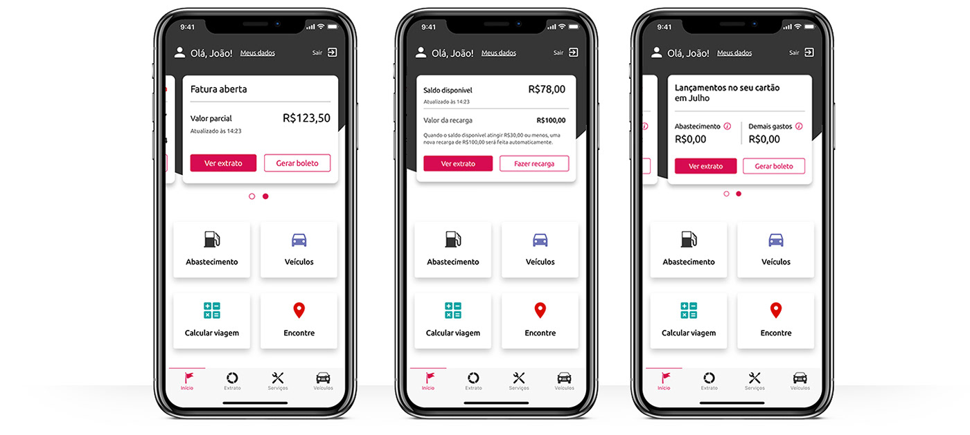
After gathering information about the users and their lifestyle, it was time to line up with stakeholders about their expectations and business goals. Everything needed to be in line with users needs in order to create a product they would actually use. We collected information concerning service plans and billing methods, and we began separating them into groups. Our challenge was to prioritize it all! There were a huge amount of service plans and also there were three different billing methods to all of them. One single question appeared: Which one was the most important for users understanding of the product: the plans or the billing methods? The answer was actually easy to get because during interviews, we discovered that the users weren't very familiar with service plan's names and the difference between them, and the billing methods were the variables that distinguished one user from another. They could be "billed per used", "pre-payed" and "pay by trigger" . That's it: we have decided to focus on billing methods! Now we needed to research about what each user felt more important to see first according to each method. Let's keep the interviews going on! This time we wanted to know what the user understood about the billing method and what was more important for them to see in their current statement. Knowing that, we could show them only required information, making their experience easier, faster and more pleasant.
User centric product
It's time to see what we already know about our users and what they need:
• To know what our users expect from the app: Done!
• To know the main features for them: Done!
• To know what kind of information they want to see and navigate: Done!
• To know how they interact with technologies: Done!
Now we were ready to start putting the ideas, discoveries and inputs on the paper! We also wanted to take new spin on the app's UI as a way to improve user's experience. It was clear to us during second part of user discovery that a "beautiful" digital platform increased users return to it. It was a differentiator when it came to developing the new app experience. Complete information accessible with less taps saved some time and made the user happier during their busy days. The cleaner the design, the better!
Give your users what the want, and everyone will be happy!

New branding, new everything!
Working side by side with marketing and ad agency, we were constantly part of branding workshops and presentations. The user should recognize the "new Sem Parar" no matter the media they were accessing: digital channels, point of sales, advertising on TV or print. All designers got together to discuss branding details in order to keep all channels cohesive.
The new experience is now young, clean, fluid and intuitive

Measuring the impact on users lives - show me the results!
By working with scrum agile we were constantly delivering improvements to our users. We started with app's performance: the time to complete a full journey got considerably smaller and without bugs. New features came along with better and more intuitive experiences and interfaces.
Our users were a key part in making decisions!
During our squad's review, we could show the stakeholders that piece by piece, the new app was gaining more grip. New clients started to use the new app and old clients became more frequent users. This new behavior reflected in our Frequent users per month: we grew our user base in 315% in seven months!
In less than one year, it was visible that the work done was adding more value to our users days. It's rewarding to know that our product is making a difference in people's lives! Now it is time to keep the improvements on the app’s experience and interface to add even more value to our users.


