We present GREEN SPICE, a new place to eat in Valencia, one you will easily recognise as the place of green. A brand created from scratch in Brandsummit; strategy, naming, branding, packaging, interior design direction and of course its digital universe; web, content and communication strategy.
As a brand concept we took the word 'spice' and with it, we were very aware of its value for all its connotations: natural, green, pleasant, homemade, healthy, flavour, exotic, aroma, color... Finally we arrived at its naming : GREEN SPICE.
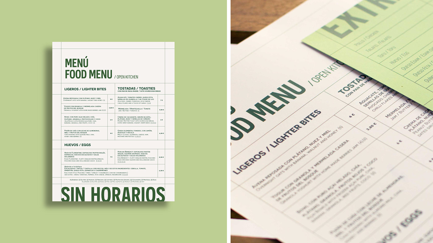
We create the logo using the slightly modified Sans Serif typeface, in order to achieve a sober, timeless and highly legible logo. It also has dynamism, moving within the hotbed, the place where spices grow, brand territory.
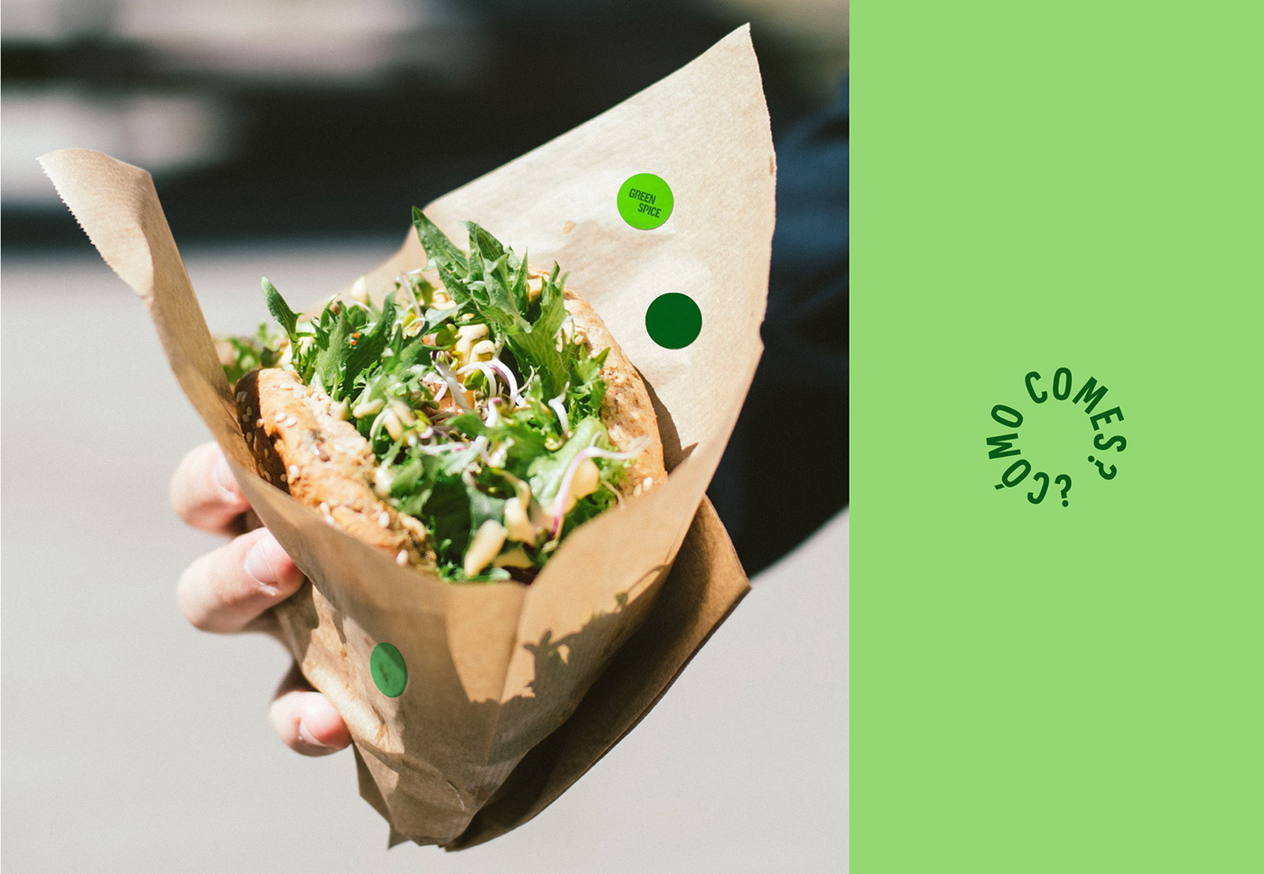
The multiple greens of GREEN SPICE symbolise nature, organic, health and youth. Thus, its graphic resources strengthen its personality and help establish its own language. Thus, we take the graphic resource of the points as protagonists that aim to represent the different varieties, spices and ingredients that you can find in GREEN SPICE.