FF Good Poster

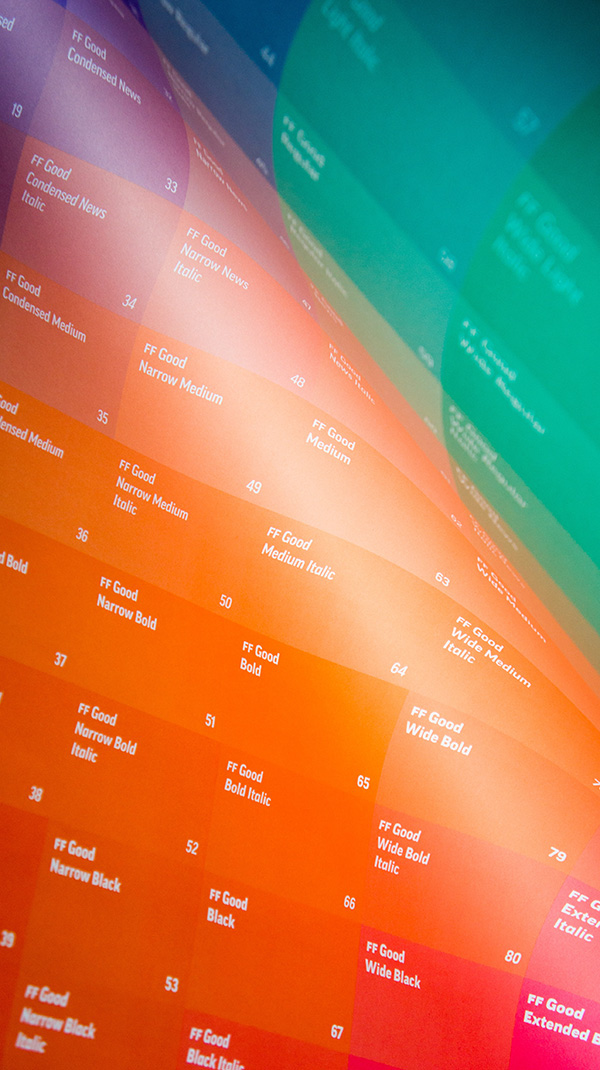
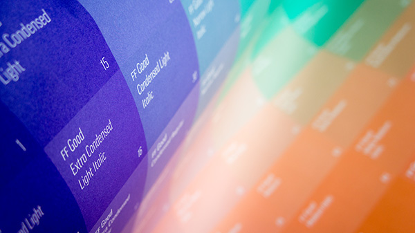
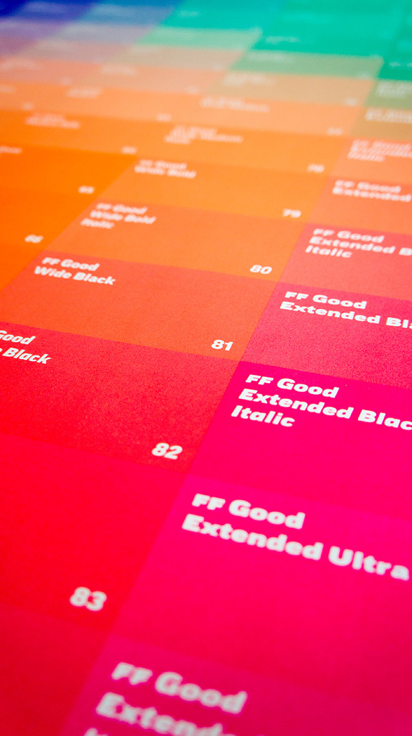
In celebration of the incredible extension of FF Good we created a A1 sized colour scale poster using four Pantone colours (Pantone Violet, Pantone Green, Pantone Orange 021 and Pantone 806) displaying all 98 styles.
The design is a nod to Erik van Blokland’s Superpolator interpolation visualization with gradients around four poles (Compressed Light,
Extended Light, Compressed Ultra, Extended Ultra).
Copies of the fantastic poster will be available at TYPO Berlin this coming May.


About FF Good
FF Good is a straight-sided sans serif in the American Gothic tradition, designed by Warsaw-based Łukasz Dziedzic. Despite having something of an “old-fashioned” heritage, FF Good feels new. Many customers agree: the sturdy, legible forms of FF Good have been put to good use in the Polish-language tech magazine ‘Komputer Swiat’, the German and Russian edition of British celebrity tabloid OK!, and AP’s (Associated Press) new corporate design.


