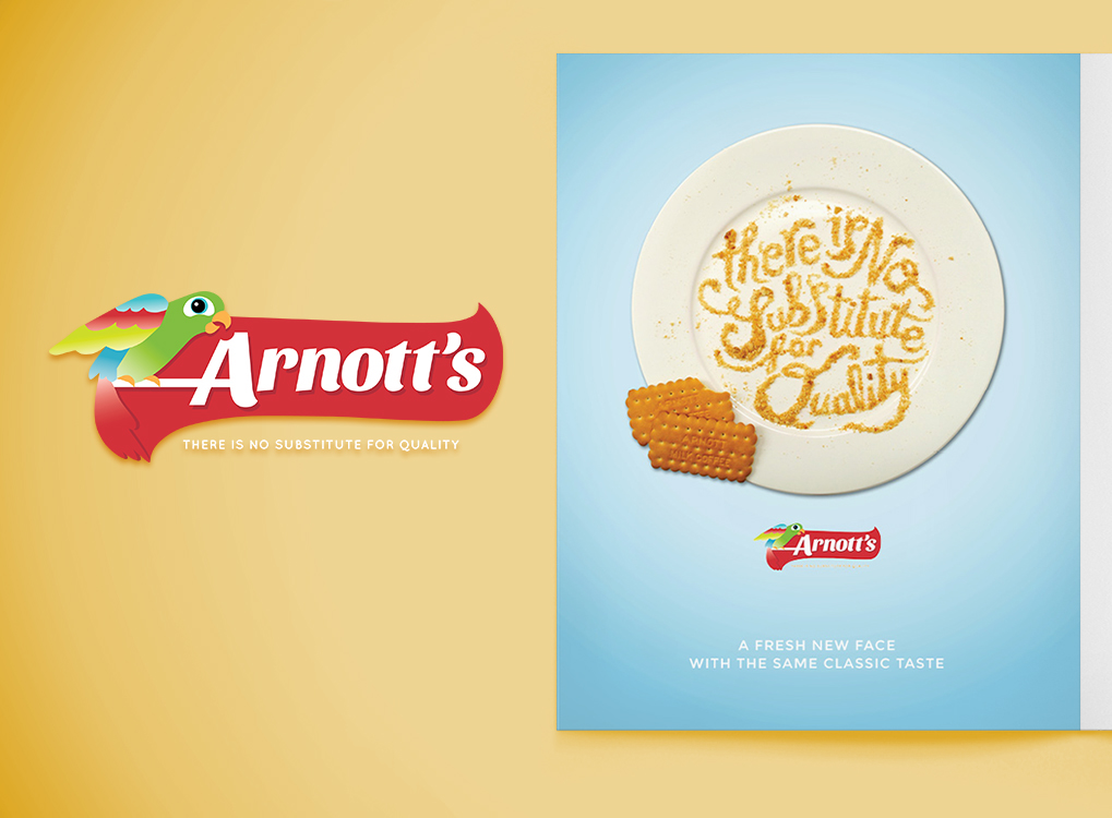
A R N O T T S B I S C U I T S
The task was to choose a well known company and rebrand their logo and identity. To promote the new face of the company, design an advertisement that will attract the main target market.
Arnotts was an easy decision because of the history and popularity of their products of tasty biscuits. It was also very challenging because of the original recognisable brand and a bigger challenge to somehow rebrand the very intricate and detailed logo.
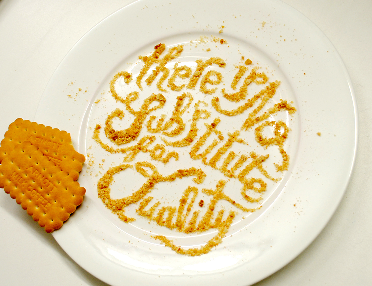
The one page magazine advert promotes the new logo and maintains the modern identity of the rebranded product by using 3D type/photography which can attract a wide audience, both new and old consumers. The ad can also be recognized by the company's original slogan used in the typography.

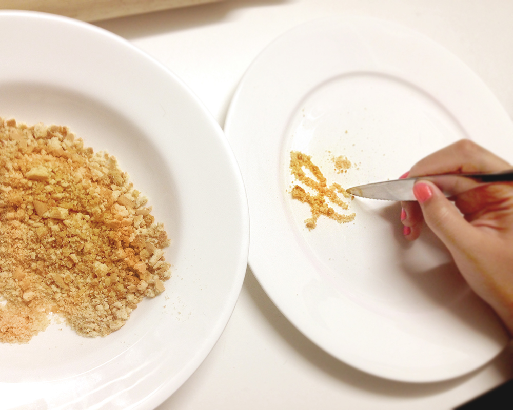
I decided to design an advert that can be found in a magazine or a poster at the supermarkets and shopping centres to promote the new identity. To create the 3D typography of the company’s slogan, I used real Arnott’s biscuits, mashed them into crumbs, used a butter knife to layout the type, and photographed it. The final piece was edited in Photoshop and Illustrator.