
Chocolate Cortés Redesign
Chocolate Cortés has been a part of Puerto Rican culture for more than 90 years, since the 1930s. Through all these years it has gone through many changes and this redesign was made to preserve the history of the brand and to celebrate Puerto Rican culture.
One of the most important aspects of this redesign is the lettering for the logo. This logo throughout the year has been changed, but I believed that in that process the logo lost the brand's legacy and history. So the goal in this redesign was to recreate the old lettering but adding modern touches to it.

Old logo for reference.

This new version of the logo preserves the feel of the old logo by conserving the wide and thinner aspects in the letters of the old lettering. It also has improved the legibility, if you compare them, the before reads corted, but in the after the weight of the letter S was redistributed so one could clearly read Cortes. The two lines that were confining this lettering were eliminated to let it breathe more and the line that was in the letter T was redesigned to make it more modern.
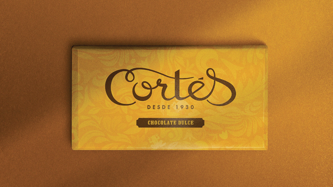
To represent the Puerto Rican culture a pattern was designed, inspired by the flora and fauna of the island. You can see the Coquí, a little frog endemic to Puerto Rico, and also ¨flor de Maga¨, the national flower.
The iconic yellow color was preserved, because every Puerto Rican knows that the yellow chocolate bar is Cortés. But to identify the different flavors two lines of colors were added to the packaging and also a capsule on the front. Red is for cinnamon chocolate and blue is for sugar free chocolate.


The typography used for the packaging is inspired by the signage used in the Old San Juan, the historical district of Puerto Rico.


Designed by: Taymara Sánchez
Tutored by: Eva Minguella
2022 | Packaging Design Máster | ELISAVA
