


Problem
Able understood that it needed a new visual identity and positioning compatible with its technical excellence. The previous identity was no longer aligned with its key audience, a logo that was misrepresenting, had some application problems and did not cover the entire context of the healthcare. It was time for some expert refinement of Able’s identity with a complete rebranding.
Challenge
My challenge was to develop a unique, modern visual identity that is coherent with its mission and that could be applied in the main contexts of the brand.
Services
Brand Strategy
Logo & Identity System
Brand Guidelines
Illustrations
Iconography,
Landing Page, Onboarding Screen
Solution
I began by organising an intensive strategic phase to create the brand foundations and identify all touchpoints.
My inception was to create an icon that holds symbolic representations and visualizes everything they do.
The color palette was inspired by tranquility that represent the brand’s core values - trust, security, loyalty.
I created an identity system capable of expanding to different communicaton channels, connecting Able to its potential customers while transmitting the brand’s value.
Complementing the charm & relevance of the name "Able" was a beautiful tagline, "We are Able". This perfectly captured the essence of their purpose & set strong foundations for the narrative used throughout the identity.
A New Star is born!


Logo Design
Able's logomark seamlessly blends the iconic medical cross, a symbol of care and healing, with a capsule, symbolizing medical advancement and innovation. To add a touch of empathy and warmth, the logomark incorporates a subtle heart shape, reflecting the brand's compassionate approach to healthcare. The intersecting elements create a sense of unity and holistic treatment. The logomark is clean, modern, and instantly recognizable.


Typography
The chosen typography for Able's brand identity is a clean and versatile sans-serif, exuding professionalism and forward-thinking attitude. This typography creates a harmonious balance between modernity and compassion.


Color Palette:
Able's color palette blends soothing medical tones with vibrant accents. The primary colors include a calming light and deep blue , reflecting trust and healing. These are complemented by vibrant colors, representing empathy and care. The color palette ensures visual coherence across all brand touchpoints
Able's color palette blends soothing medical tones with vibrant accents. The primary colors include a calming light and deep blue , reflecting trust and healing. These are complemented by vibrant colors, representing empathy and care. The color palette ensures visual coherence across all brand touchpoints

Icon Design:
Custom icons are designed to be consistent with Able's logomark and overall visual language. These icons are used to represent various medical services, treatments, and specialties on the website, brochures, and presentations, guiding users intuitively through the brand's offerings.


Flat Medical Illustrations:
Flat medical illustrations are used across various brand collaterals, such as brochures, website visuals, and social media posts. These illustrations depict medical tools, treatments, and scenarios in a simplified and approachable manner. This approach aligns with Able's commitment to transparent communication and making medical information accessible to all.


*
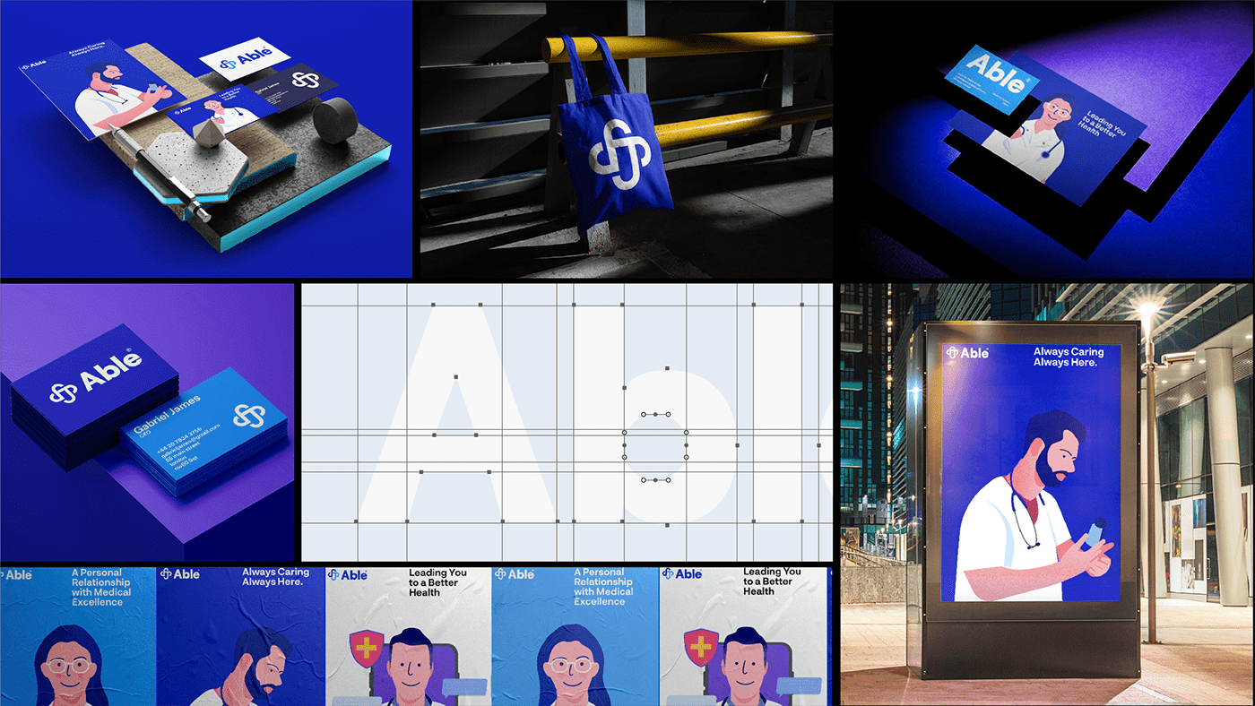
Stationery Design:
Able Medical's stationery design embodies professionalism and warmth. Clean and minimalistic layouts are paired with the brand's color palette and typography to ensure consistency across all touchpoints. The logo is prominently displayed, reminding recipients of Able Medical's commitment to holistic care.
Able Medical's stationery design embodies professionalism and warmth. Clean and minimalistic layouts are paired with the brand's color palette and typography to ensure consistency across all touchpoints. The logo is prominently displayed, reminding recipients of Able Medical's commitment to holistic care.


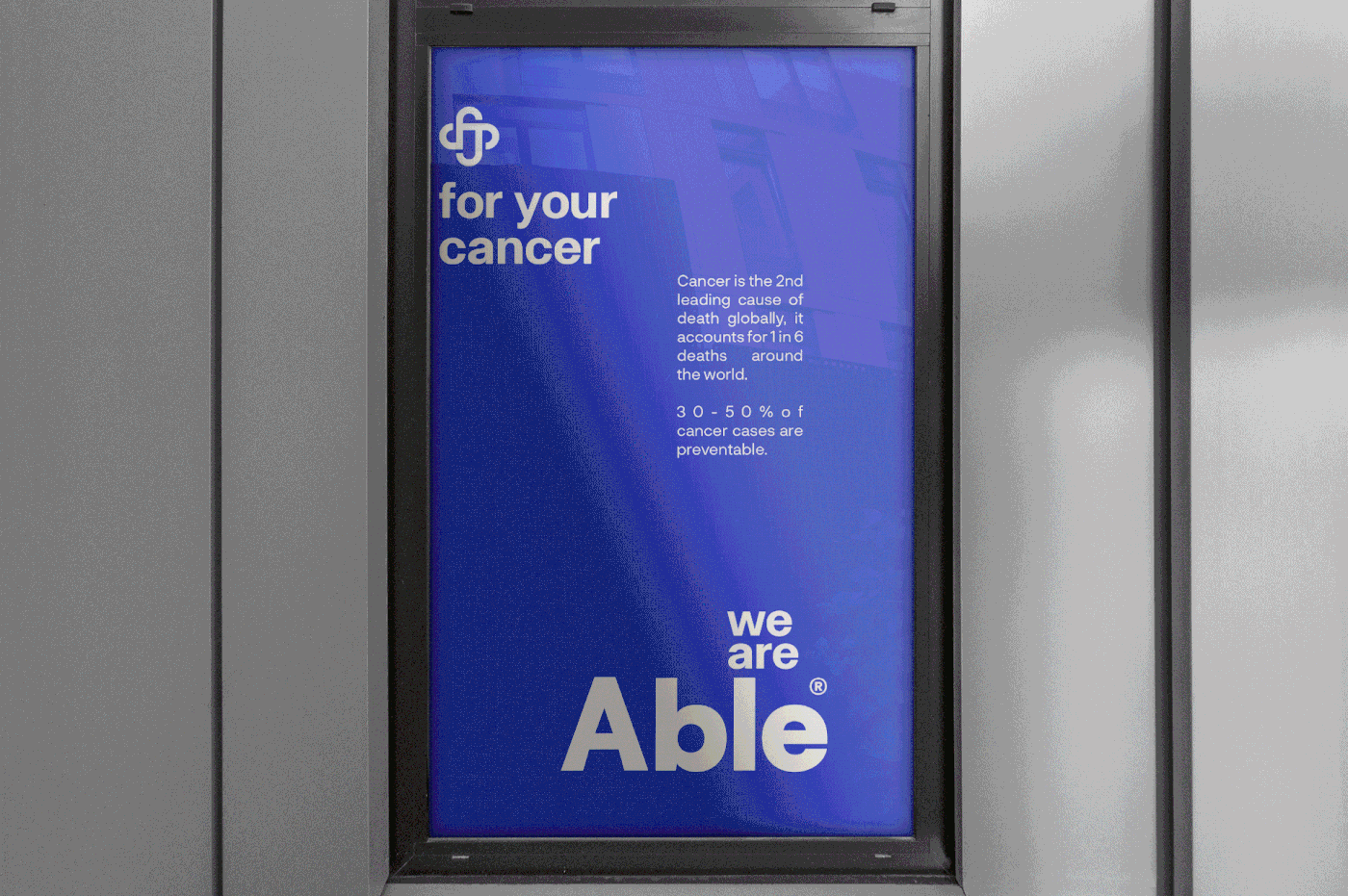
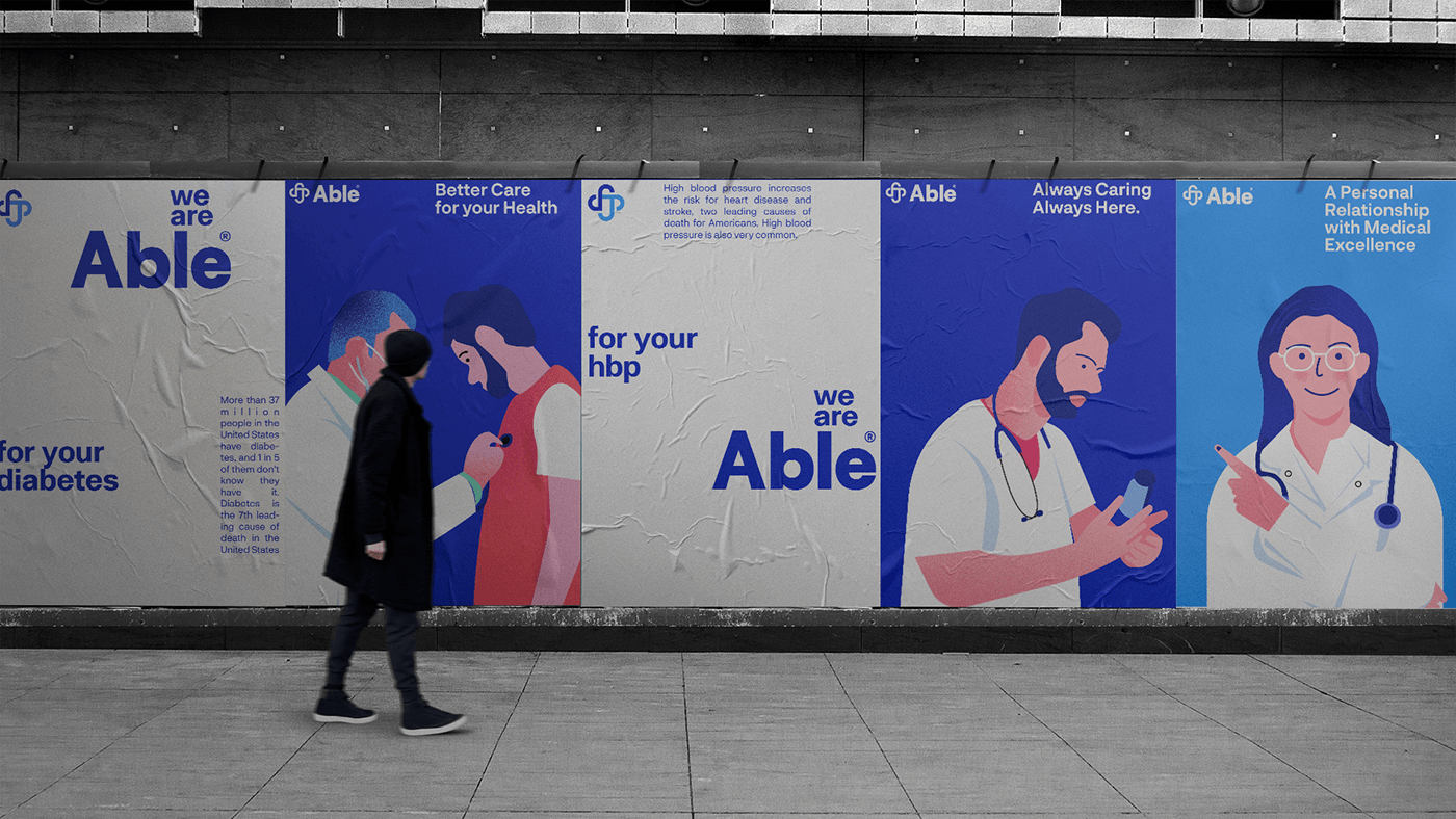
Campaign Advertising:
The tagline, "We Are Able," serves as a rallying cry, highlighting the brand's capabilities and determination to provide quality healthcare. It communicates confidence, competence, and care. The narrative emphasizes Able Medical's mission to empower patients and medical professionals alike, showcasing their ability to overcome challenges and make a positive impact on lives. The tagline "We Are Able" is strategically placed in campaign visuals, evoking emotions of strength, determination, and empathy.


Results
Able's brand identity seamlessly combines the elements of medical expertise, innovation, empathy, and empowerment. The logo's integration of a medical cross, capsule, and heart symbolizes Able's commitment to cutting-edge medical care with compassion at its core. The tagline "We are Able" becomes a driving force behind the brand's narrative, campaign advertising, and messaging. With consistent stationery, flat medical illustrations, typography, color palette, and icon design, Able presents a unified and impactful brand identity that resonates with patients, healthcare professionals, and stakeholders alike.
Able's brand identity seamlessly combines the elements of medical expertise, innovation, empathy, and empowerment. The logo's integration of a medical cross, capsule, and heart symbolizes Able's commitment to cutting-edge medical care with compassion at its core. The tagline "We are Able" becomes a driving force behind the brand's narrative, campaign advertising, and messaging. With consistent stationery, flat medical illustrations, typography, color palette, and icon design, Able presents a unified and impactful brand identity that resonates with patients, healthcare professionals, and stakeholders alike.

Please share your thoughts in the comments. All feedback highly appreciated!


