

Problem
Soluna, a forward-thinking renewable energy startup, sought to establish a distinctive brand identity that would convey their commitment to clean, sustainable energy solutions. They aimed to create a visual identity that celebrated the energy resources they harnessed, primarily wind, water, and sun.
Task
The challenge was to craft a unique and abstract logo, develop a comprehensive branding system, and create an impactful advertising campaign to raise awareness about their eco-friendly services.
Solution
To tackle Soluna's branding challenges, I followed a meticulous design process that involved several stages of research, exploration, and refinement.
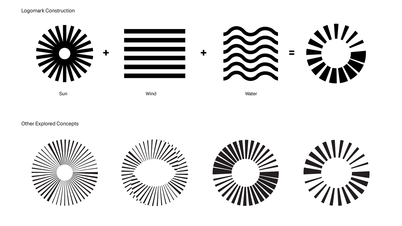
1) Memorable Logo : My first step was to create a memorable abstract logo. I drew inspiration from wind, water, and sun, and synthesized these elements into a single, harmonious design.
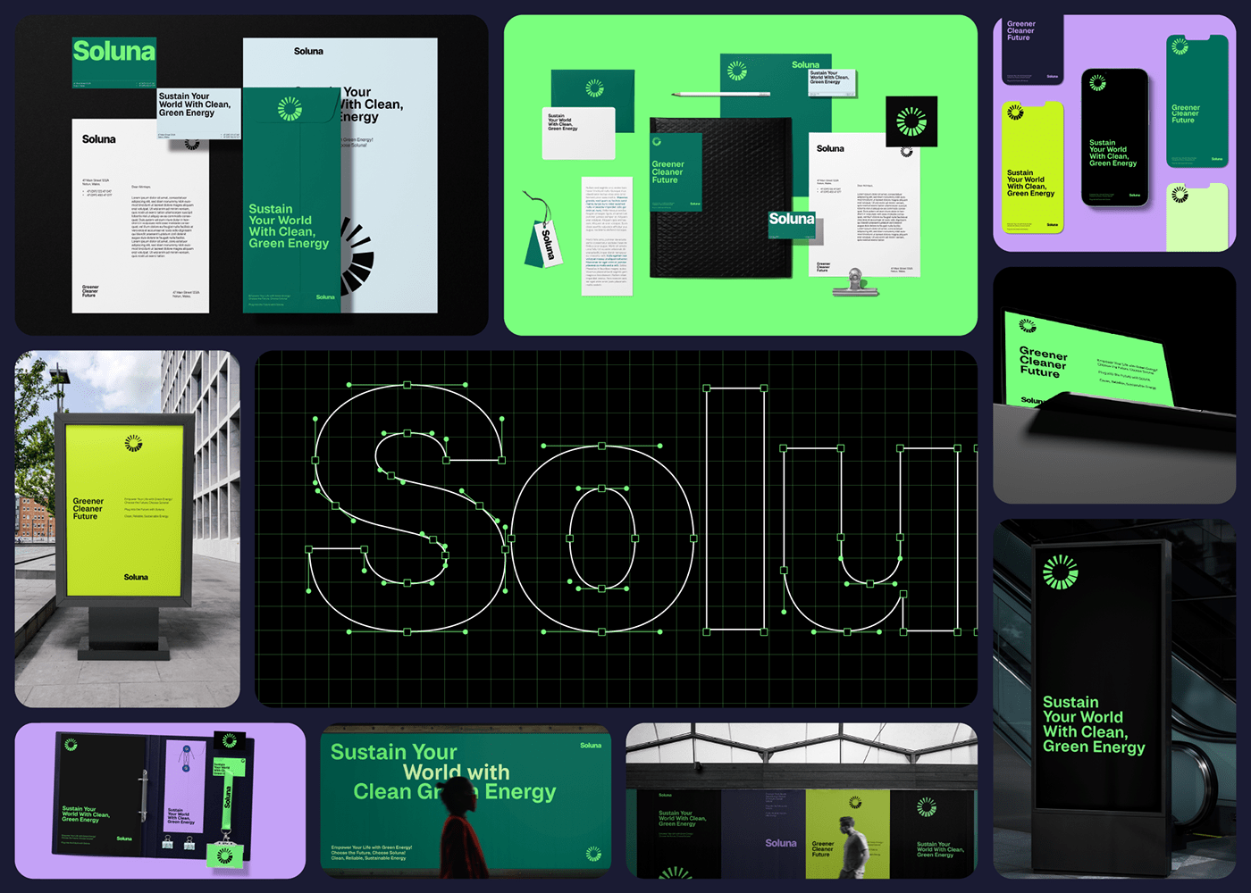
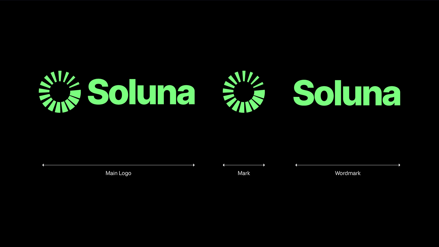
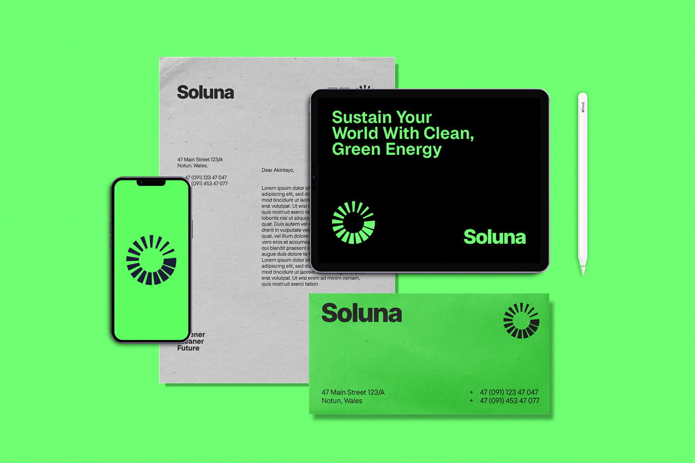
2) Consistent Visual Identity: I created a consistent visual identity that encompassed various touchpoints, from website design to brochures, social media profiles, and promotional items.The abstract logo, grids, typography, and colors were applied consistently to maintain a cohesive and recognizable brand image.
3) Identity System for Different Channels: I created a system that could be used in various ways to connect Soluna with their customers and show their brand's values.
1) Memorable Logo : My first step was to create a memorable abstract logo. I drew inspiration from wind, water, and sun, and synthesized these elements into a single, harmonious design.
2) Consistent Visual Identity: I created a consistent visual identity that encompassed various touchpoints, from website design to brochures, social media profiles, and promotional items.The abstract logo, grids, typography, and colors were applied consistently to maintain a cohesive and recognizable brand image.
3) Identity System for Different Channels: I created a system that could be used in various ways to connect Soluna with their customers and show their brand's values.
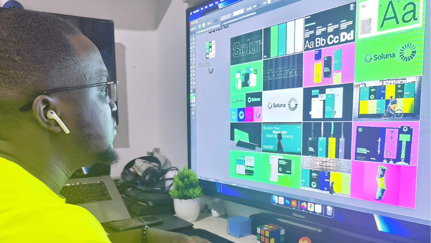
I worked closely with the Soluna team, sharing ideas, getting their thoughts, and making improvements along the way. This back-and-forth helped make sure that the final designs met their expectations and represented their brand well.

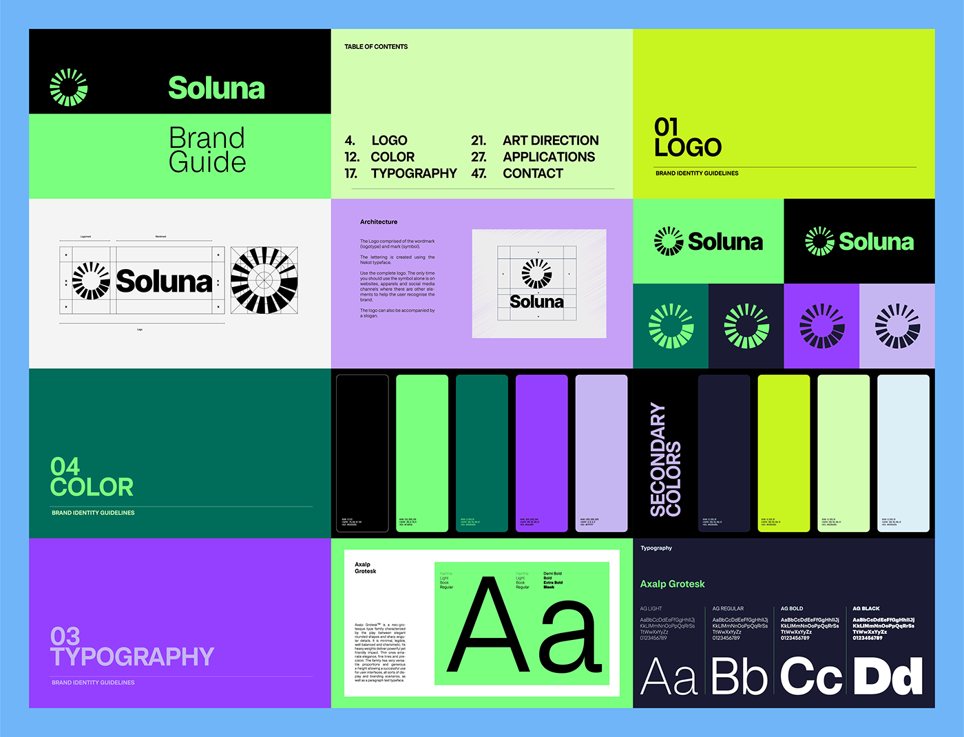
Logo Design
Taking inspiration from various energy resources such as wind, water, and sun, I embarked on creating an abstract logo for Soluna. The logo was designed to represent the harmony and synergy between these elements, signifying the company's focus on harnessing multiple renewable sources. The abstract design conveyed a sense of fluidity and motion, showcasing the continuous cycle of renewable energy generation.


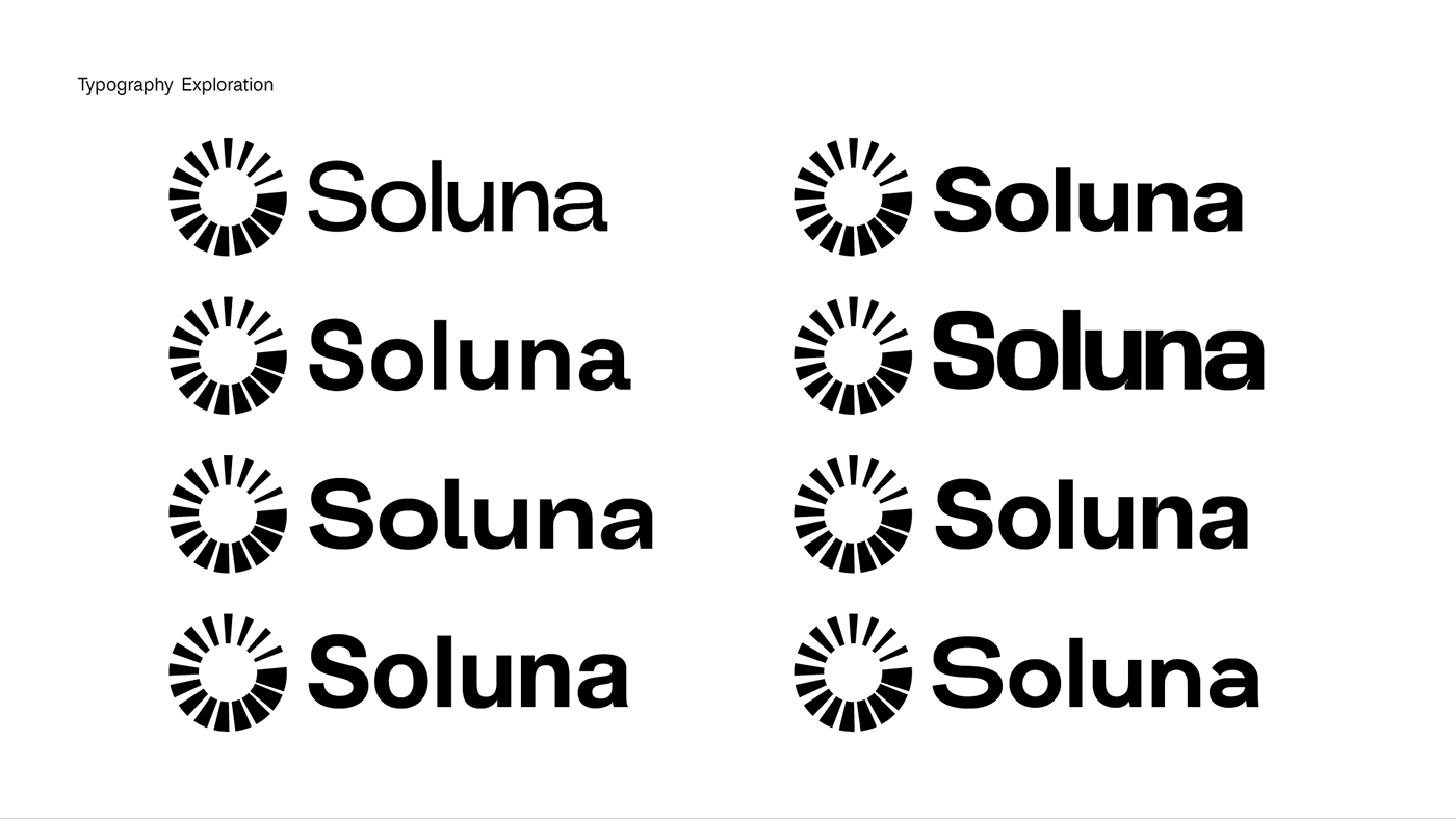
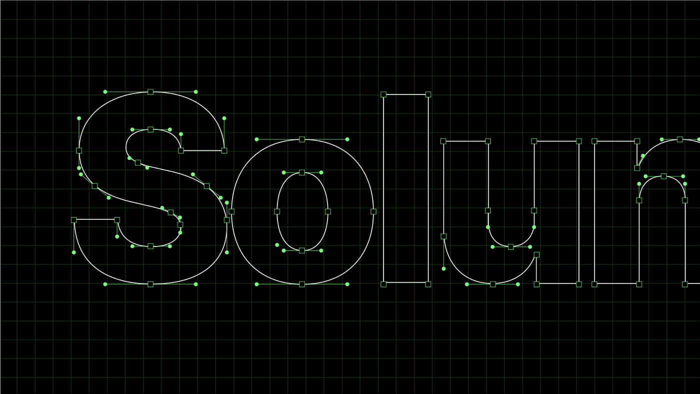
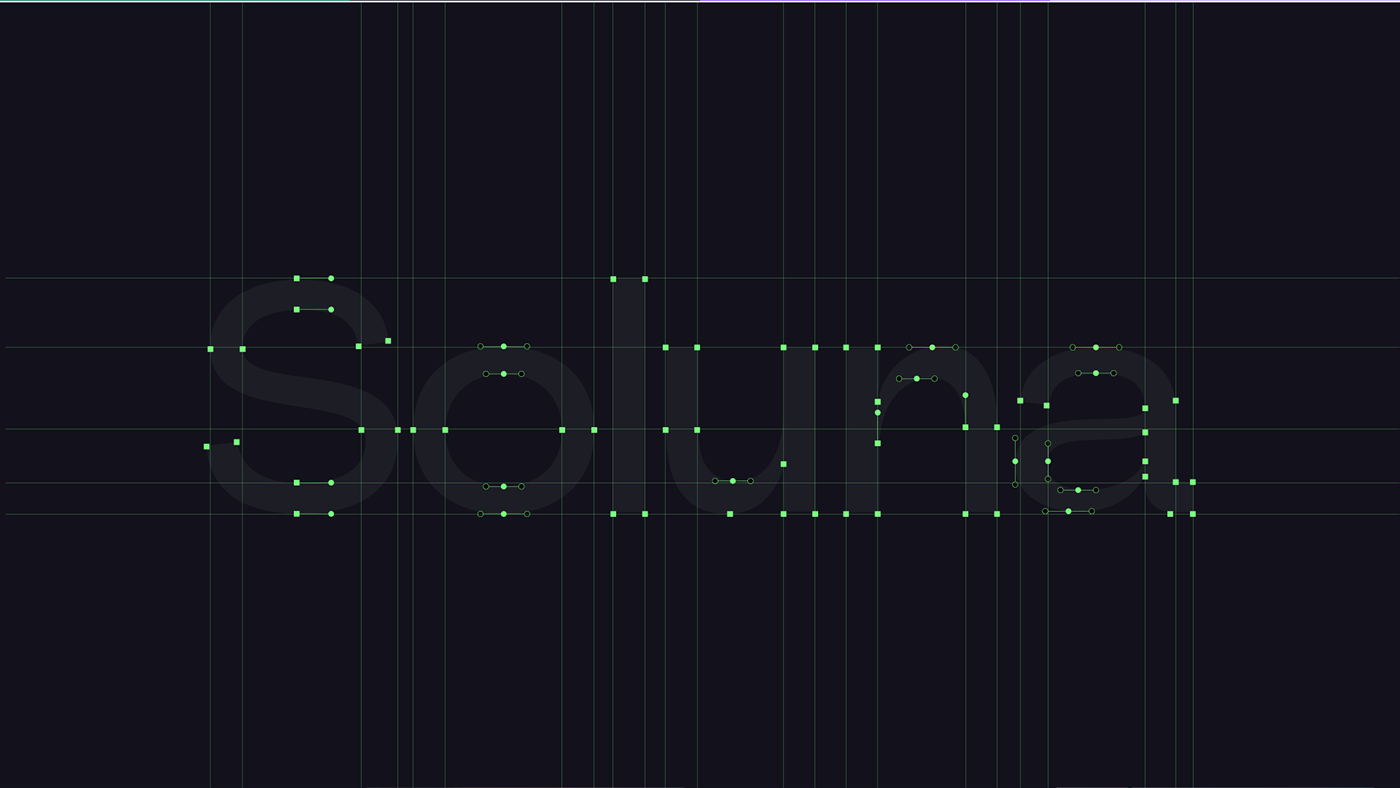
Typography Exploration
I conducted a thorough exploration of typography, seeking fonts that were modern, easy to read, and environmentally conscious. The selected fonts evoked a sense of reliability and technological advancement while maintaining a natural and organic feel, in line with the renewable energy brand's values
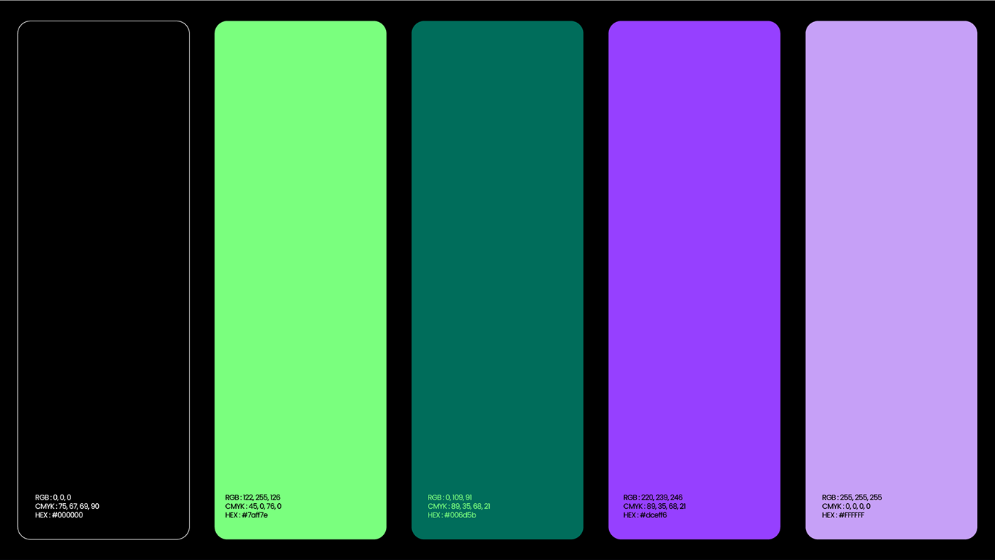
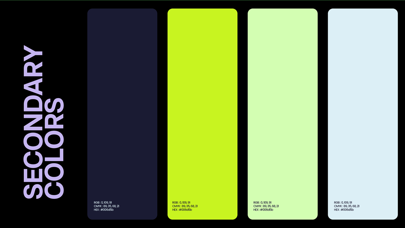
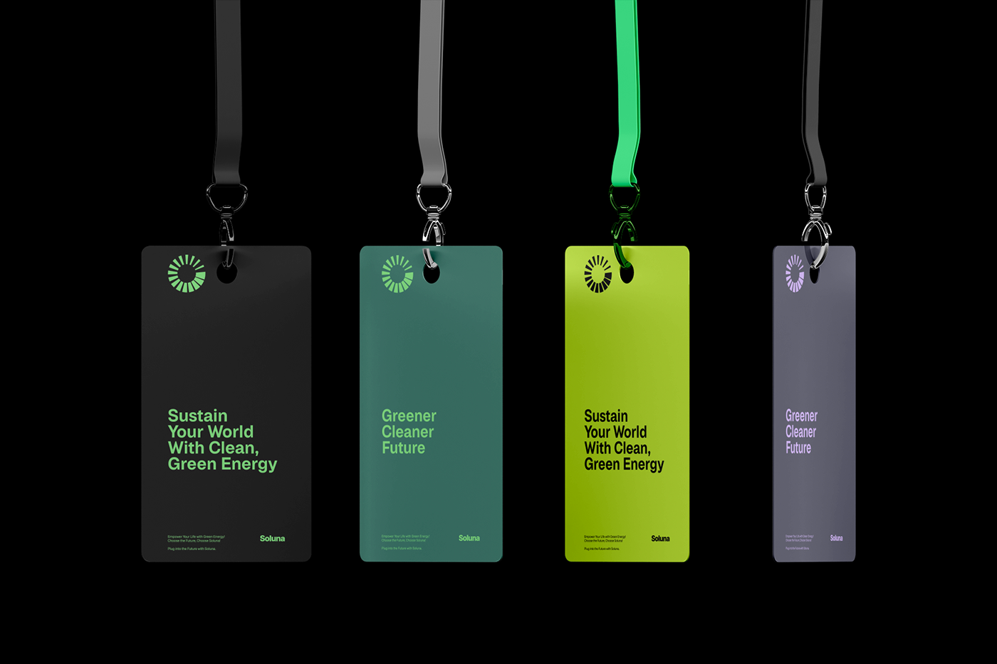
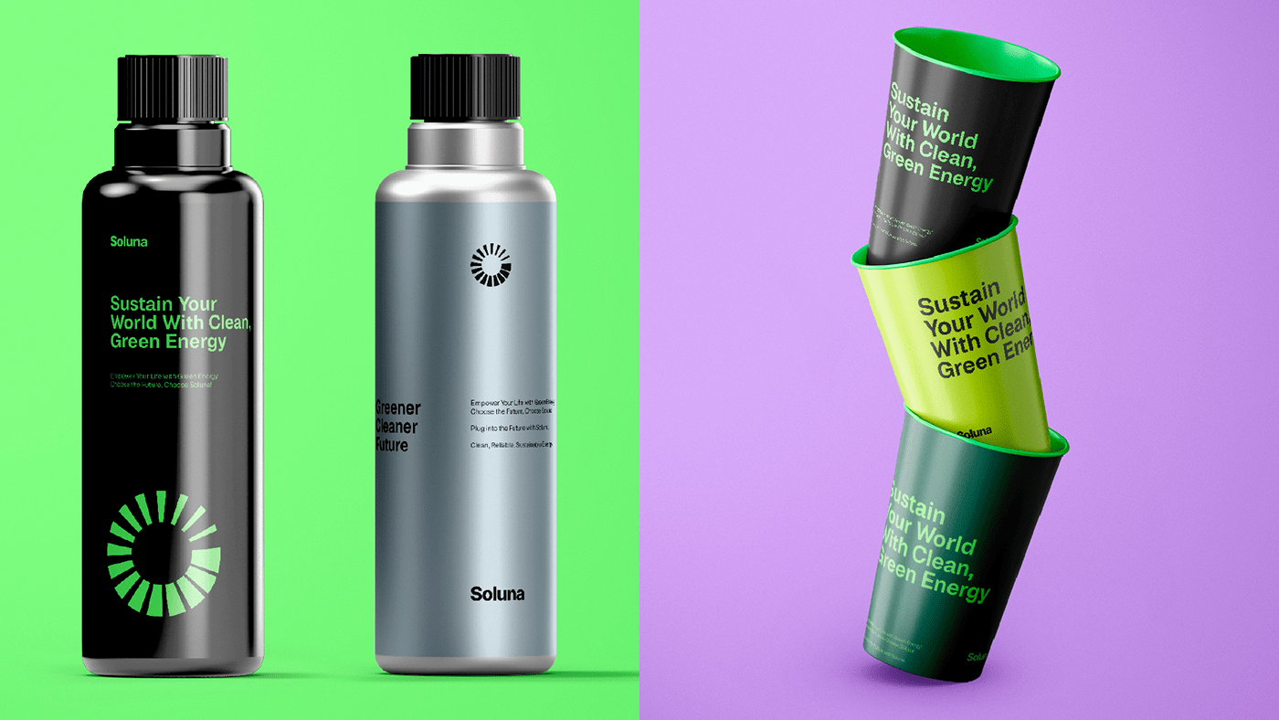
Colors
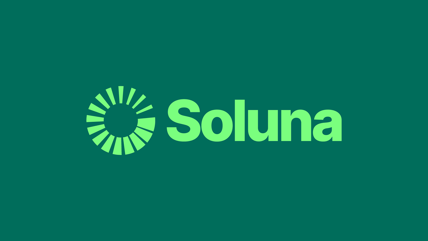
To reflect the essence of renewable energy, a palette inspired by nature was selected. Shades of green, black and calming purple reflecting the renewable energy brand's focus on nature, water, and solar power. These colors created a visually appealing and harmonious brand image.
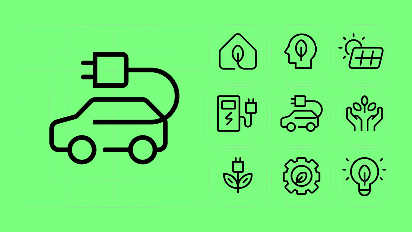
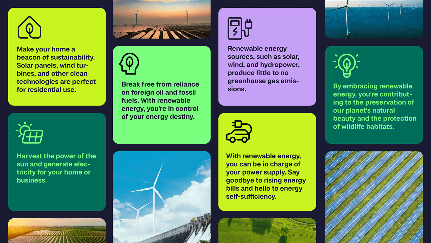
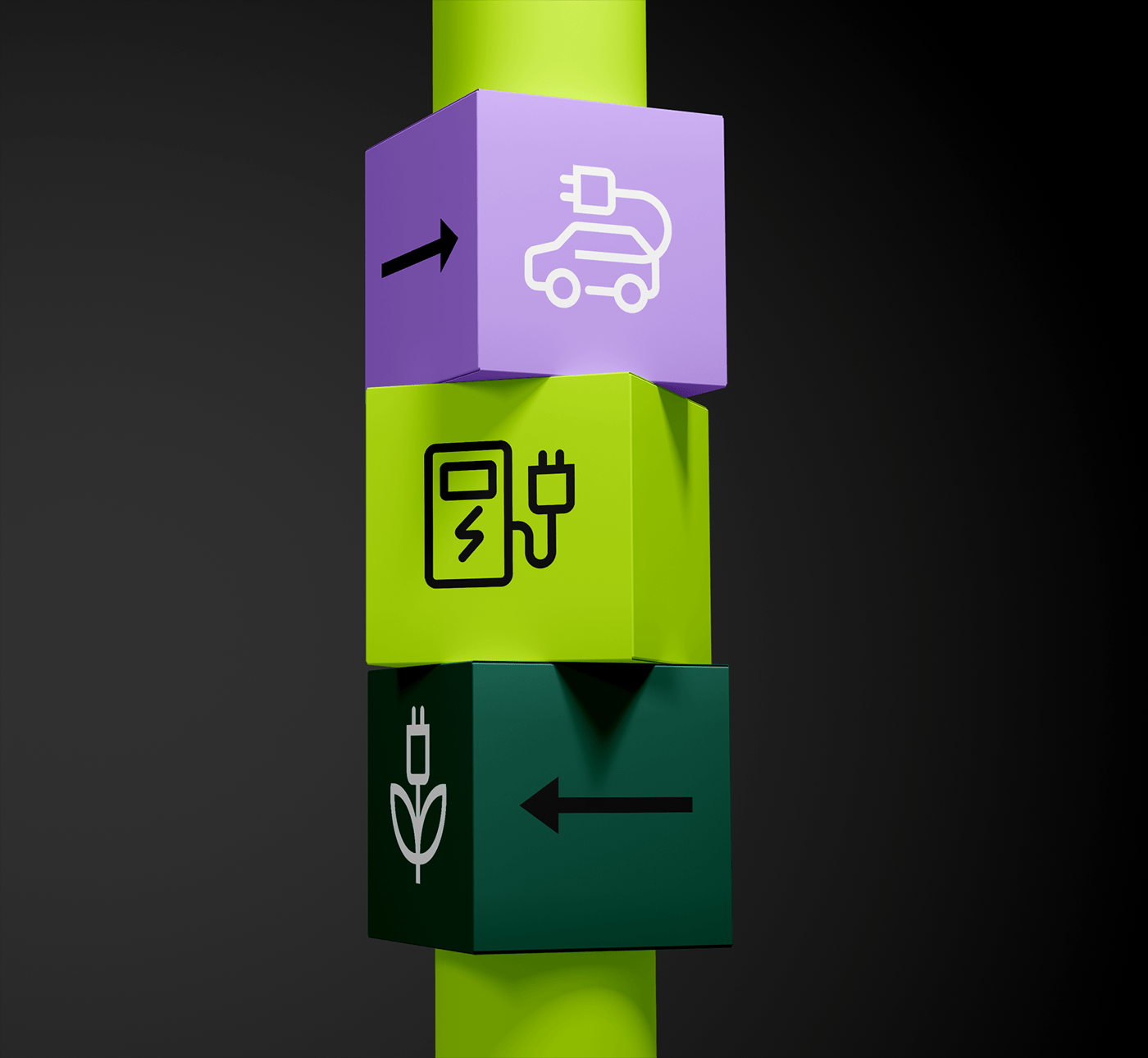
Icon Design
I crafted a set of icons that conveyed the diverse renewable energy sources Soluna harnessed. Each icon represented wind turbines, solar panels, and hydroelectric power, These icons were used across marketing materials and reinforced the brand's commitment to clean energy.
Brand Guidelines
Clear brand guidelines were established to maintain consistency. They defined logo usage, color palettes & typography. These guidelines ensured that Soluna’s brand identity remained cohesive across all touchpoints.
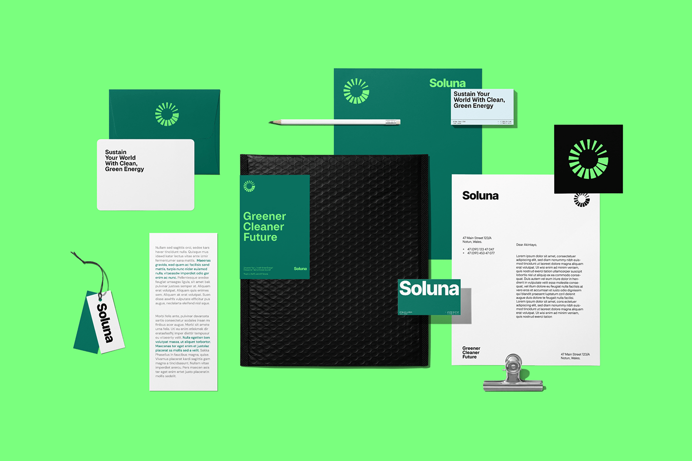
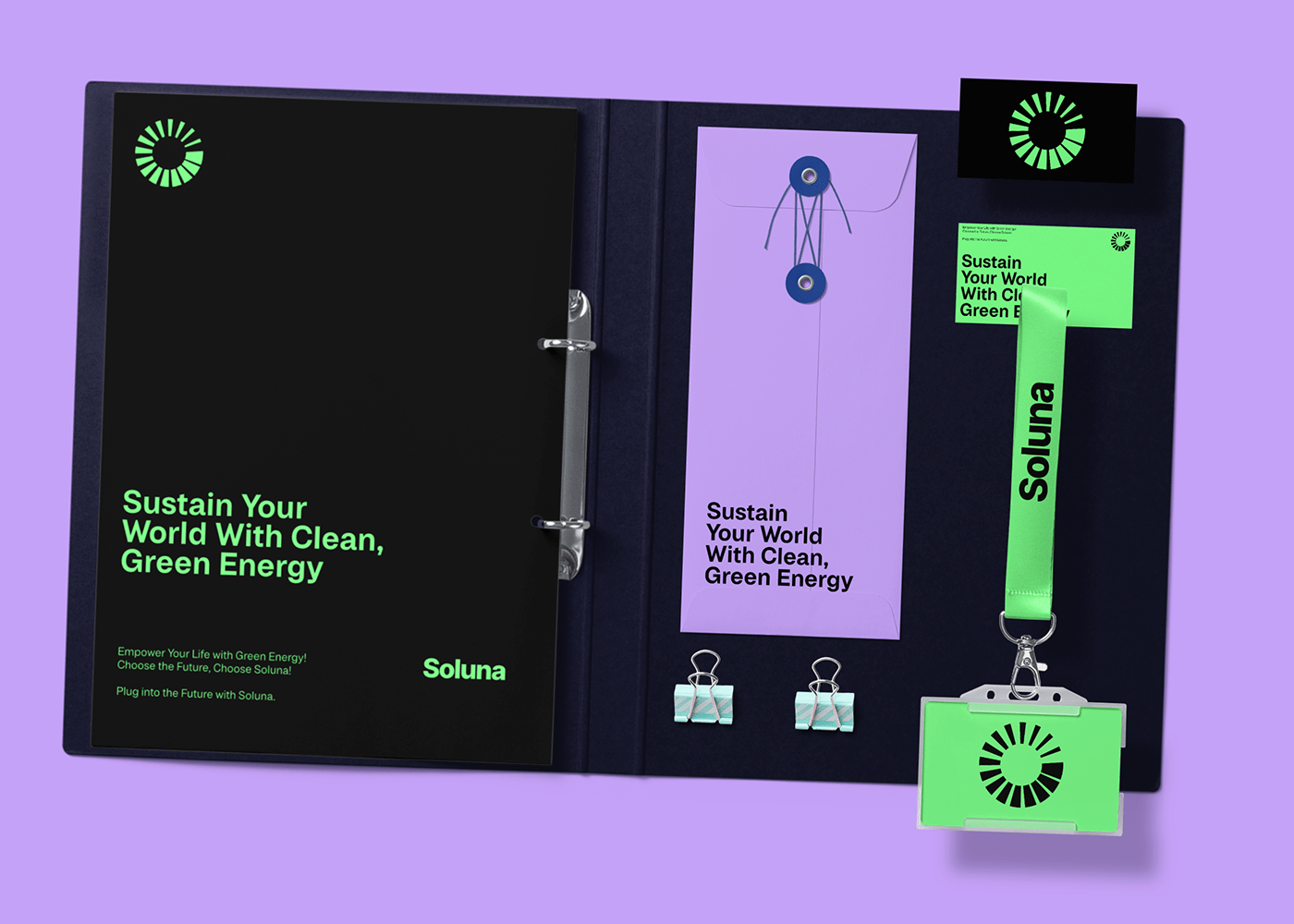
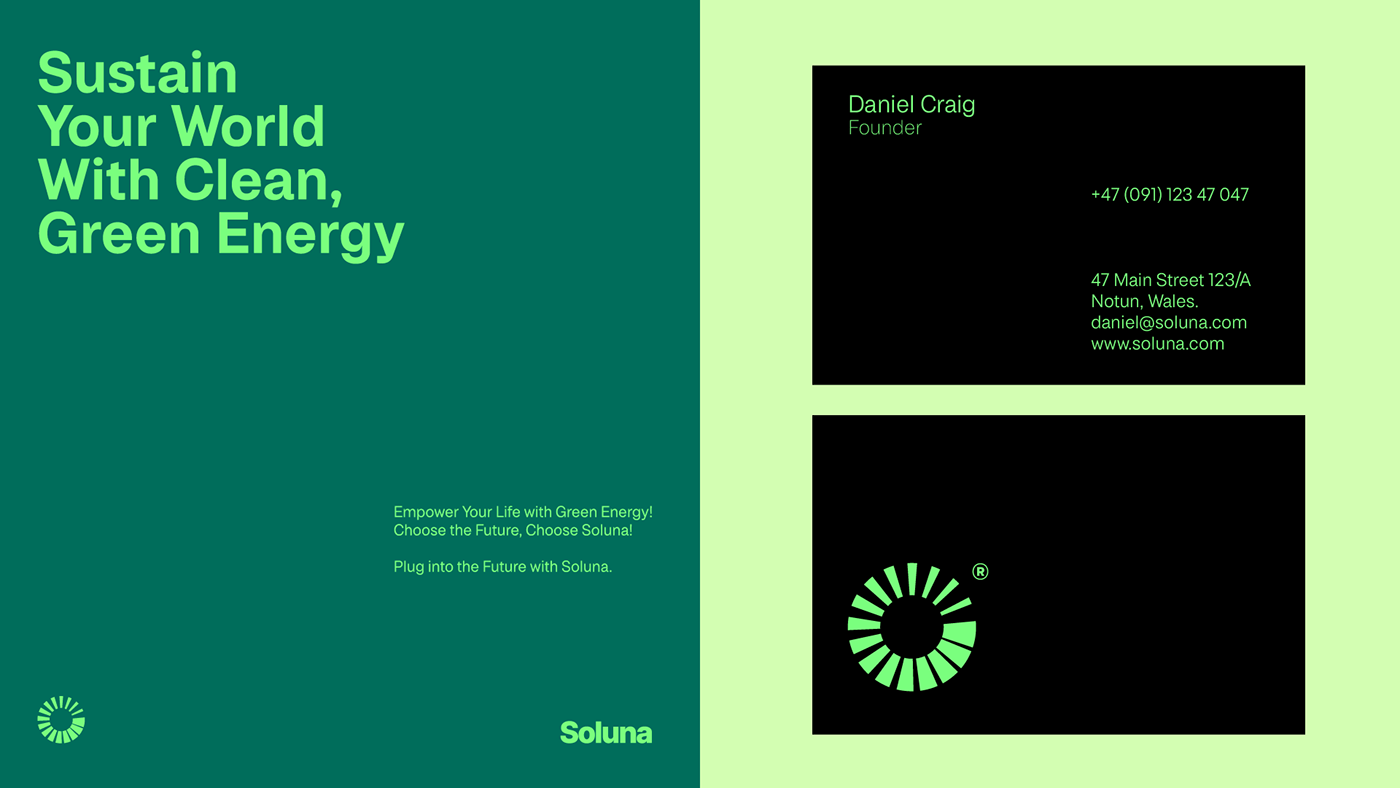
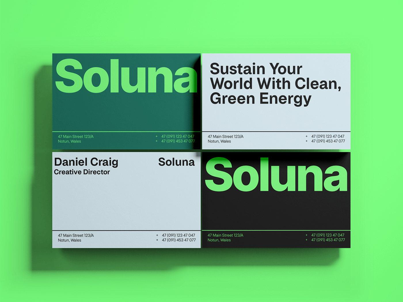
Stationery Design
I extended the brand identity to stationery design, including business cards, letterheads, and envelopes. These featured the logo prominently, and the grid layout was subtly incorporated into the design to maintain consistency. This consistent branding across physical collateral further reinforces the brand's professionalism and credibility.
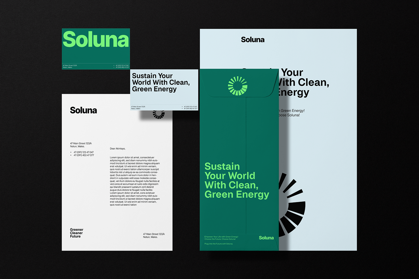
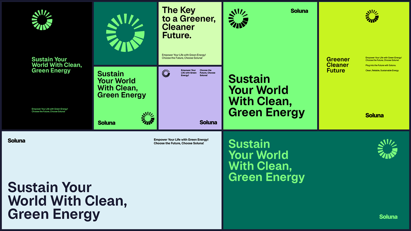
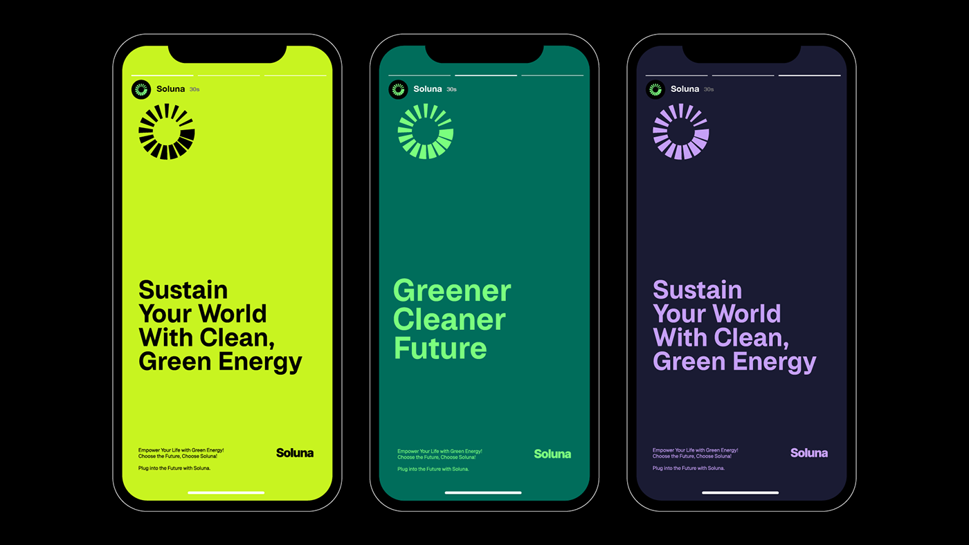

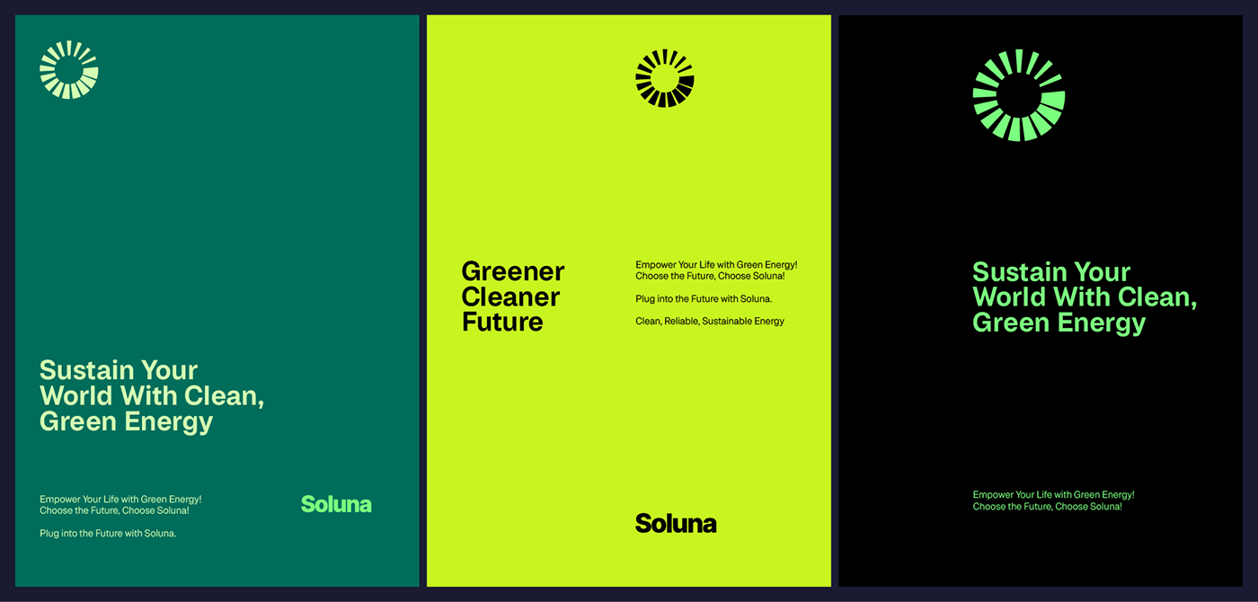
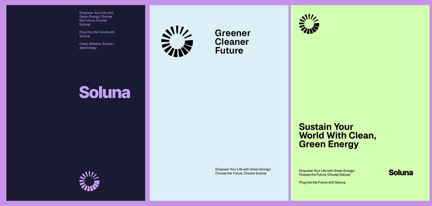
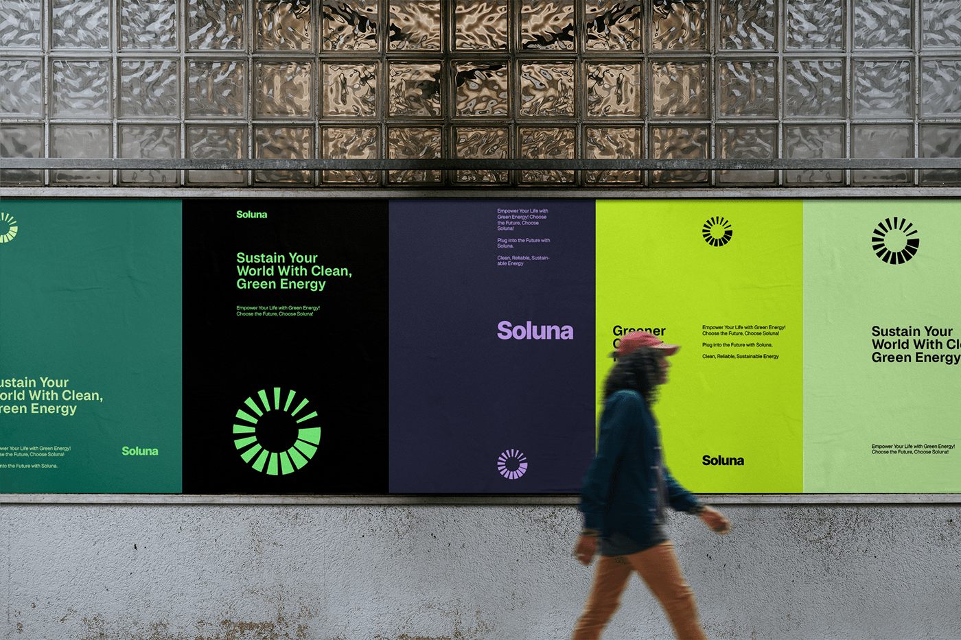
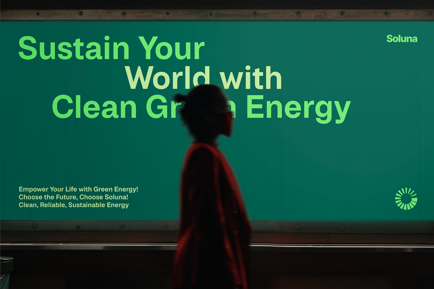
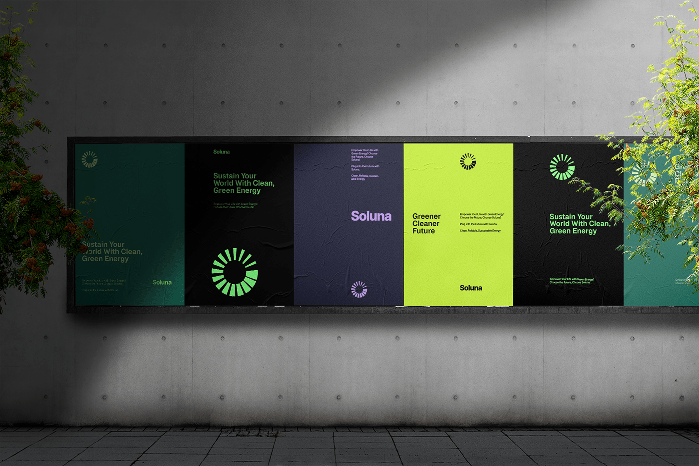
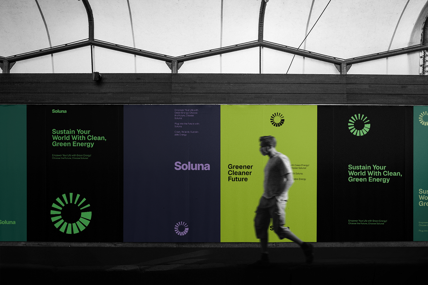
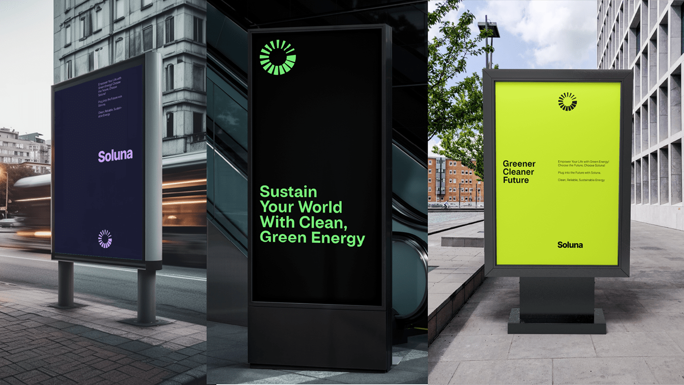
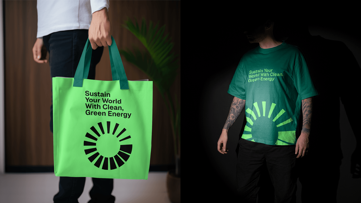
Campaign Advertising
To ensure a cohesive and visually appealing campaign, I established a grid system that allowed for flexibility in advertising materials. This system ensured that all visual elements, such as the icon and text, aligned harmoniously, providing a consistent and professional look across all marketing collateral.


Results
The new brand identity for Soluna has successfully positioned the company as a leader in the renewable energy sector. The abstract logo has become a distinctive symbol associated with clean energy solutions. The campaign advertising system using grids added a unique touch, setting them apart from competitors. Typography, colors, and icon design established a strong visual identity. Stationery design ensured that every interaction with the brand was memorable and on-brand.
Overall, Soluna’s brand identity successfully aligned with their values, strengthening their position in the renewable energy industry and inspiring trust in their services.
Motion Designer - Owodolu Opeoluwa
Please share your thoughts in the comments. All feedback highly appreciated!