


About Act2gather
Act2gether is an initiative by the Learn for Well-being Foundation that aims to create an international social movement to promote and support a partnership between generations (children and adults) and in all sectors (including education, health, welfare, justice, etc).
With this initiative, they wish to fulfill children's right to take part in decisions that affect them while enabling adults to benefit from the qualities of children's perspective.
What they brought to us
They brought to us a new project, something with no previous graphic work, except for a branding proposal from another company that they were not pleased with. So, what we had to work with was their clear vision about the initiative and an idea of what they didn’t want. I would call that a perfect starting point for the We Know You team.
The first thing we needed to consider was the fact that the initiative acts worldwide since it is an international social movement with global, regional, and national groups, gatherings, and activities.
They were planning to have three main sections for Act2gether initiative, which meant to us the creation of three sub-brands, and last, but not least, they brought us the concept behind the initiative that would lead our creative work.
"A partnership between two different parts (children and adults) based on mutual respect and mutual empowerment to reach a greater good."
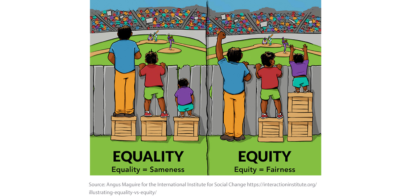
Searching for “equity”
We talked about the concept of “equity” and how the image above illustrates how the Act2gether initiative wants to equip children and young people to reach where adults already can. In this case, not to allow them to watch a baseball game, but to become a crucial part of how the world around them is built while taking their needs and voices into serious consideration.
Having that in mind, we started by exploring equity and searching for ways to represent it in an elegant and minimal way in what would later become the Act2gether wordmark.
We could play with the letter “H” or a lower case “e”, but in all of those solutions, although were arriving at the representation of equity, “collaboration” was still nowhere to be seen.

Focusing on “collaboration”
“Equity” was a good fit to represent the initiative’s end-goal, but not so much their process. Since the “how” is a crucial part of the initiative (they act “2gether”, of course), it was necessary to shift our focus to the concept of “collaboration” although equity is definitely in their aim.

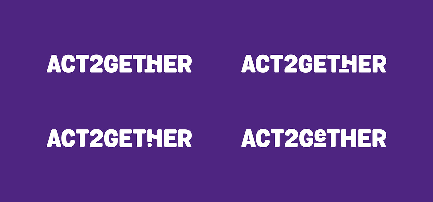
Playing with the letter “H”, the only uppercase letter in the wordmark with two sides mirroring each other, we connected both sides of the letter a bit differently.
Is it a smiley face?
Is it a union between different parts?
Well, it’s both!
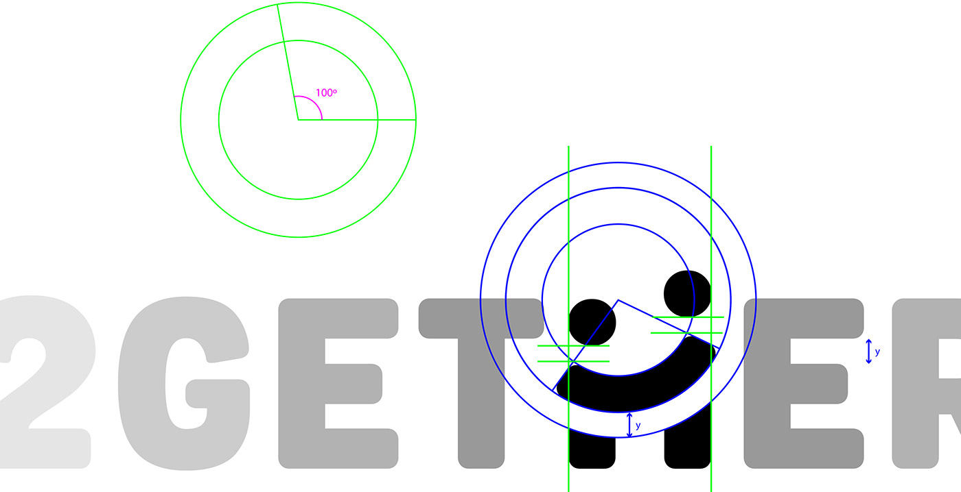
We transformed the crossbar to link the two sides of the letter with an arc to give it a more human and organic tone to what you can see as arms or a smile. The two dots on top are two heads that elongate the shape, making the “H” more perceptible and continuing the very minimal representation of two humans that is below.
Now the different heights of the two people being represented here is what makes this icon a perfect fit for the initiative. They are two different people, possibly in their age, that are connected in what looks like a smile and despite their differences.
Circling back
Although we needed to stop thinking about “equity” to reach an appropriate solution for the logo, that didn’t mean that equity wouldn’t still be present.
This visual representation of an alliance between a child and an adult reaches new depths as soon as you think about it in movement.
The tilted arc pushes one circle up while the other stays lower, but if it moves and works as a seesaw? It’s no longer clear who’s the kid or the adult. We can see this interaction as transmission of responsibility, power, and a search for equity.
Movement gives the icon playfulness and an infinite number of dynamic interactions between both sides. It transmits tone, behavior, and it helps deconstruct assumptions about this partnership.

The animation you see above was made by the motion designer Nuno Leites.
Why so loud?
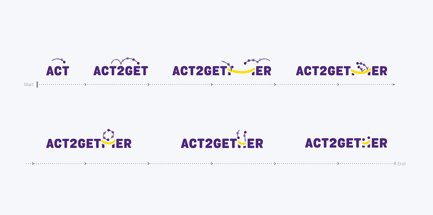
We had two main motives to guide our decision to use uppercase letters for Act2gether wordmark. One of those motives is technical, and the other is related to what the initiative does.
“Act2gether” has a numeric character practically in the middle of the wordmark substituting part of a word, and we saw that as a potential break in the reading. Emphasizing that break by having characters in different heights didn’t seem like a good idea, so we explored the all-uppercase option, hoping to increase readability.
Now the other motive…
People normally read uppercase as shouting, but that didn’t make it inappropriate for Act2gether. They are an initiative trying to create a worldwide movement with urgency and that made everyone confident that the all-uppercase option was in fact a great way to channel that feeling, although it needed to be done carefully.
Despite the urgency of the matter, Act2gether still needed some informality and a balance between child-like and adult-like characteristics so we went with the font Grota Sans to take advantage of the rounded corners to tone down the aggressiveness in the uppercase letters and bring some playfulness to complement the “H” icon.

A logo for every occasion
As I said in the beginning, they were planning to have three main sections for Act2gether project, which meant there was the need to create three sub-brands.
2getherLearn: a series of training sessions tailored for organizations and groups to support those who wish to host and manage 2getherLand events.
2getherLink: a digital platform to share stories of partnerships between generations, debunk myths about those dynamics, gather knowledge, connect people, and host a virtual community.
2getherLand: a series of gatherings happening worldwide to explore the best ways to engage in partnership, by considering the different perspectives and ways of processing and addressing challenges within different sectors (e.g. education, health, social welfare) that affect the lives of children and adults in the area.

To illustrate those three sectors, we took advantage of the three parts that compose the H icon and relate each one of them to a specific sector. We linked the “heads” in the icon to 2getherLearn, the “arms” to 2getherLink, and the “legs” to 2getherLand.This way, the H icon has now three versions just by emphasizing with color of each one of its parts.

A logo fit for everywhere
Taking into consideration that Act2gether is an international initiative and has groups, gatherings, and activities being created all over the world, there was a need to identify those places in the logos without restricting the creation of new logos for future locations.
To answer that need, we created an identifier that lives below the logo and states the location in question. It’s a simple solution that works, but even better when we accompany that with the adoption of two colors.


Colors identifying regions
We needed a flexible and vibrant color pallet. Something that would allow us to make many color combinations since they were not sure in how many countries they would be present in the future. We ended up creating a pallet of six cold colors and six warm colors to create color pairs with.

Picking a color from each side would give us a total of 36 possible combinations, but things aren’t that straightforward. Some colors don’t match well and those pairings that lack contrast could seriously jeopardize readability and legibility, so instead of having 36 options, we offered 22 tested color combinations that we know that work well.
One of those 22 combinations is reserved for the master brand, but everything else is fair game and it can be chosen by any regional group and event from around the globe. It’s a good enough start, but if more pairings are necessary in the future, it can always be revised.


When acting together
Partnerships and collaborative relationships play an integral part in what Act2gether does, so it was important to define and create rules on how their logo and the logo of any other institution would match together.
In the following image, you'll see an example of how to match the Act2gether logo with the logo of the organization stewarding the initiative. "Stewarded by" can be replaced by something like "Sponsored by", "Powered by", or any other description that would indicate the nature of the relationship between the two institutions here represented.

The visual language usage


