


Visual identity of the industrial area for Wagner
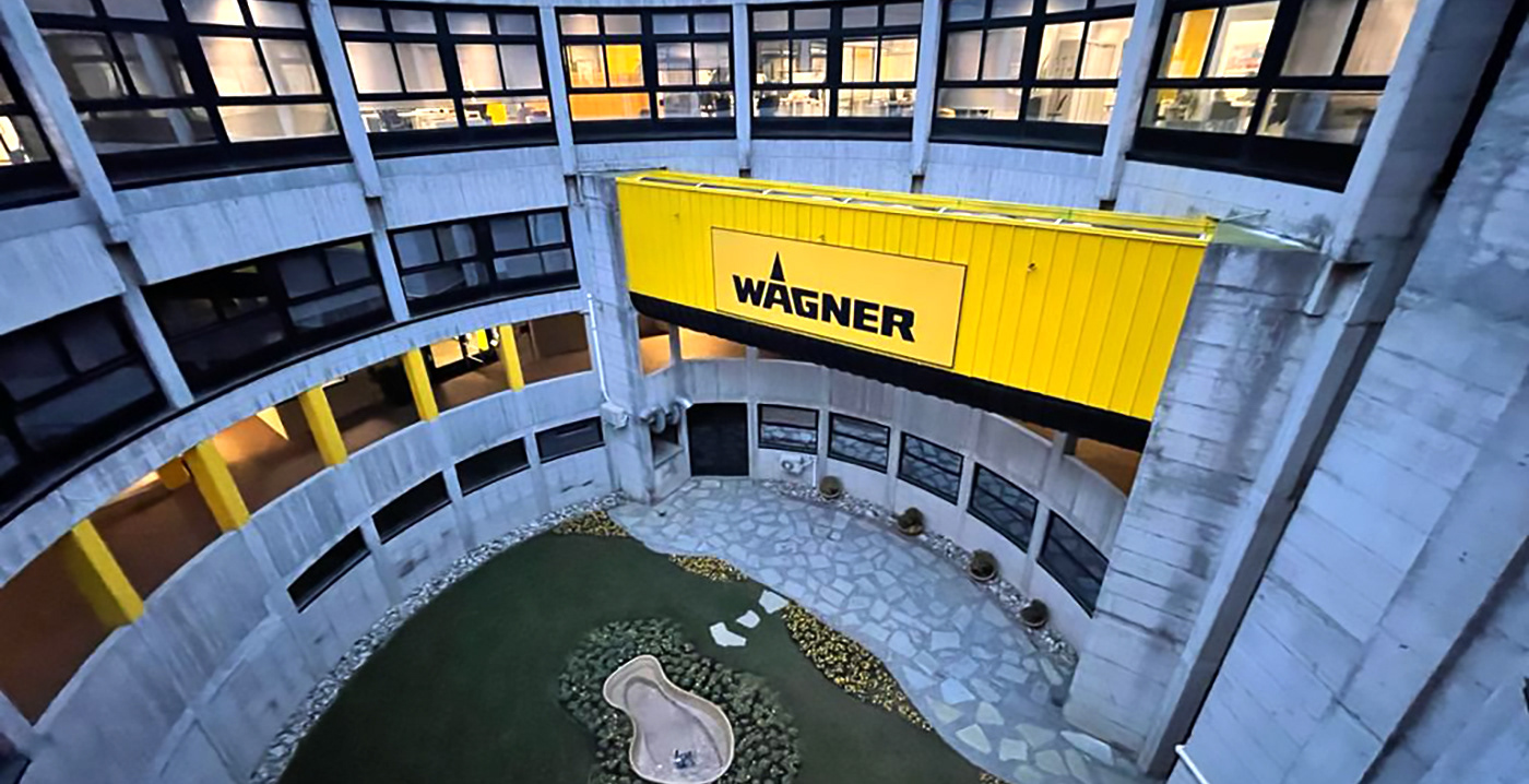
When Wagner asked me to work on their new industrial area I was more than amazed. The request was to create something deeply connected with the brand but somehow informative and who made the working area more safe and nice to be seen to those who were working in.

I've started creating some assets based upon a unique font, clear infos and a group of coherent icons who have the role to help who is inside the building understanding what happens and be safer.
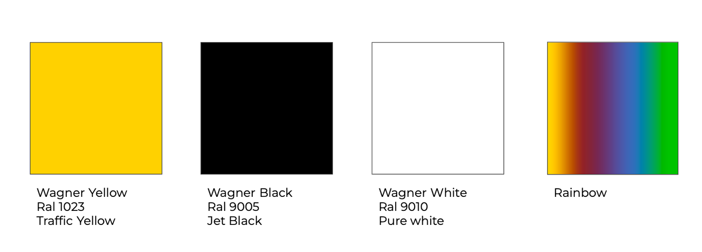
Wagner does color to cover any kind of surface, the second step was deeply connected with colors: creating a color map who works everywhere and give consistence to the brand was a key role for this work. Black, yellow and white as main colors.
The rainbow as a special color: why choose when you can use a rainbow?
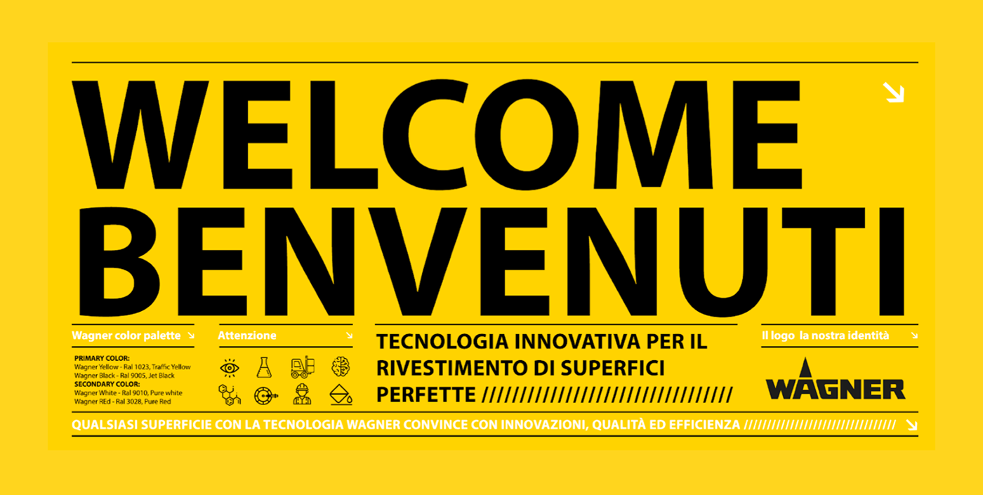
The graphics have to respect those pillars the content has to be clear, easy to understood and most of all well divided in a fast and unique user experience. I was always brand oriented and deeply connected with the idea that you have to breath it all over the place. The excess of branding when is done in a simple, useful and understandable way helps not only the visitors to find their way into the space, but even the workers feeling more comfortable and secure.


Sometimes in the panels I inserted some motivational phrase and graphics, to give to everyone a hook to be more inclusive, considered and special for who they are or how do they feel.


The work was done all with 3M adesive tapes on the walls. I followed the entire path of production till the final release on place. Since this moment all the different Division of Wagner came to Italy to see how the work was done and this was a new starting point for the entire brand industry layout.


