


If you’re a professional designer, you probably already had a project where the stars between you and your client don't seem to align no matter what you do, how hard you try, how many hours you use on the project, and meetings you have. Unfortunately, those situations happen and they leave us questioning if we could have done something differently, even years after.
The project that I’m presenting to you today is one of those cases.
About "Conservatório d’Artes de Loures"
The Art Conservatory of Loures or, in Portuguese, “Conservatório d’Artes de Loures”, contacted me shortly after I published the rebrand I did for ILGA World wanting me to do something similar for them. Being at a new job at We Know You, I decided to bring this project in so I could work on it during work hours and this way they would benefit from having access to other creative minds and people to manage the project.
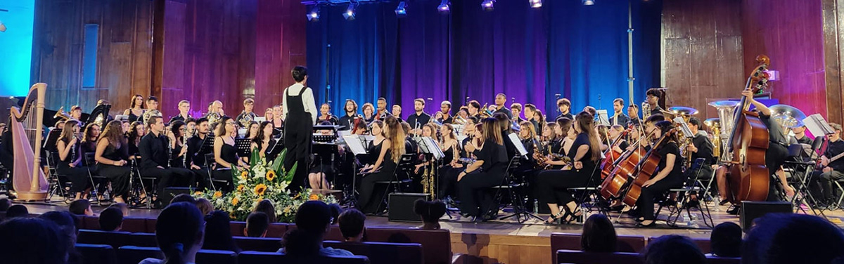
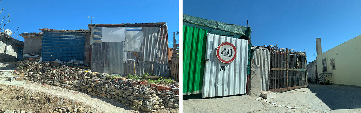
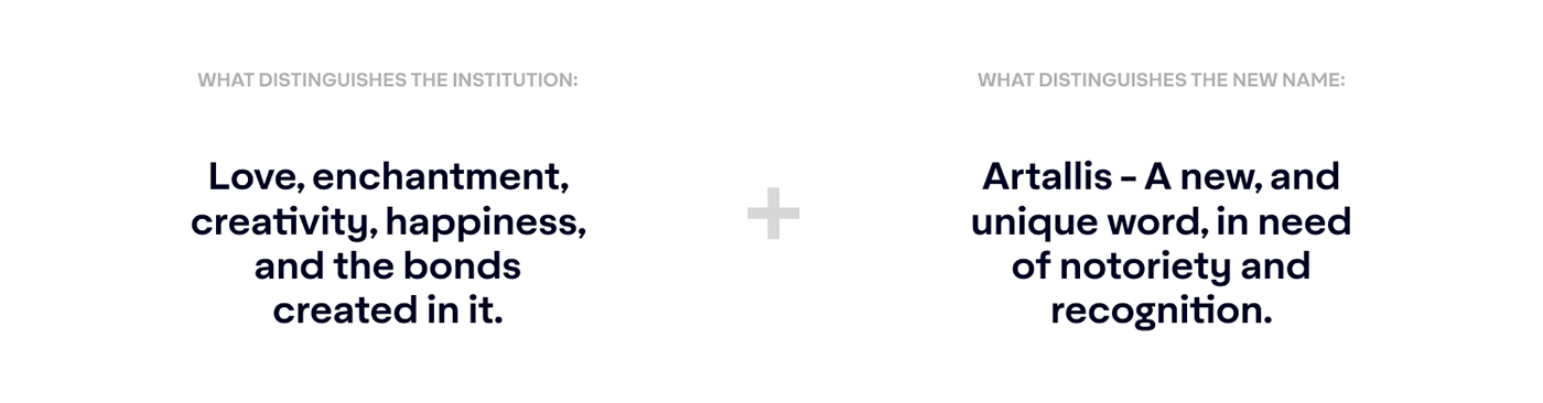
This Conservatory is a special institution. The director, who is also a conductor, manages this place with a Servant Leadership. The students have relevant roles in the Conservatory's functionality, there is no ring bell to hurry the students to class, they often play their instruments in the backyard with a view of the city of Lisbon in the distance, and the location of this institution makes it extra special. This Conservatory is a place of hope, art, and beauty in a troubled part of Loures where a lot of students come from broken homes, very poor living conditions, in close contact with drugs, alcohol, and every other terrible thing there is in life.
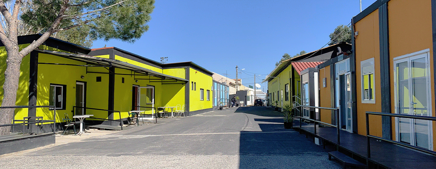
Due to this social and economic context, the Conservatory grew little by little with prefabricated modules and containers populating a road and creating a space similar to a small neighborhood that is a safe haven and a second home for the kids studying there. There, they explore and work on their interests, they support each other, rebuild their self-esteem, and create lifelong bonds. This place is known for how well its students play, how soulful their concerts are, how experimental this place is, and how it integrates the hardships of its students into their scholarship.
This project touched our hearts, so we were set on making this work no matter what, but unfortunately, it didn’t work out as we were hoping. Let's jump to the work itself.

The problems
The very obvious issue that they brought to us was a set of logos created for the many projects within the Conservatory. There is no relation between the logo of the institution and its sub-brands and that wrongfully undermines the value of the institution. There is no brand architecture. The logo of the Conservatory felt over-complicated, and they really wanted something new to convey the soul of this place.
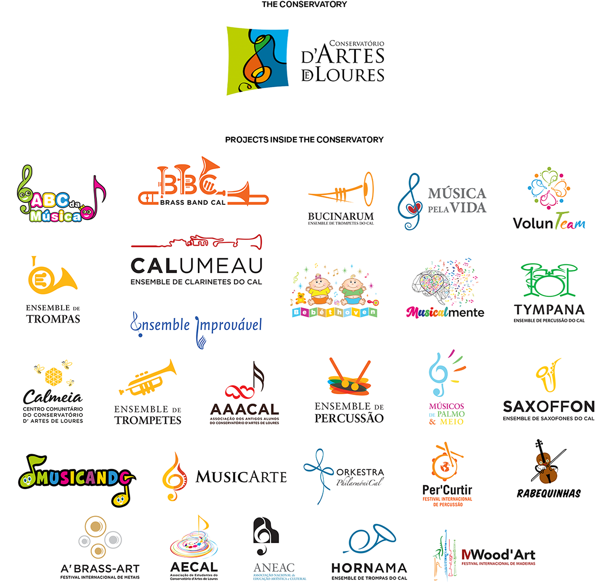
They also brought to us some not-so-obvious issues that quickly became clear on how pressing they really were.
The existence of the Conservatory heavily depends not only on public financial investment, but also on private, so being able to attract people willing to invest in innovative, artistic, and social projects is mandatory.
Having children enrolled whose parents are financially capable of paying their full tuition fees also plays an important role in the institution's capacity to continue offering scholarships to their students that don’t have that financial privilege. Those parents need to be attracted as well, but unfortunately, almost only the community and people who have close contact with the Conservatory really understand the scholarly success of their students and the real motives behind it, which is damaging.
With this, it became very clear that they didn't need just a visual change that would reflect who they are, but a more strategic change to elevate the reputation of the institution.
The challenge
We had to keep in mind that our efforts were to bring close two very financially distinct parts of the fabric of society while allowing the Conservatory to stay true to itself.
On one side, we have a world of artistic but classical studies, very stern, and known to be elitist. On the other, we have kids suffering from social and financial stigma but thriving in a very “out of the box” educational system.
Our mission was to blend “serious” with “magical” while navigating the waters of prejudice that many of these kids suffer even from their own parents. We wanted them to be taken seriously while they felt they were still being true to themselves.
Walking in the dark
It was inspiring to hear the stakeholders talk, but their constant search for words and their need to over-explain things showed us how they needed to clear their minds before we went any further. Their relation to the Conservatory was very visceral and emotional, and without spending some time to figure out things, it was hard for them to have concise answers to any simple question.
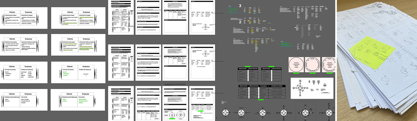
We decided to start by doing Brand Strategy and clear everyone’s minds before going through any conceptual or graphic work. It’s a complex process, but for the sake of this presentation, I'll make an overview of the result.

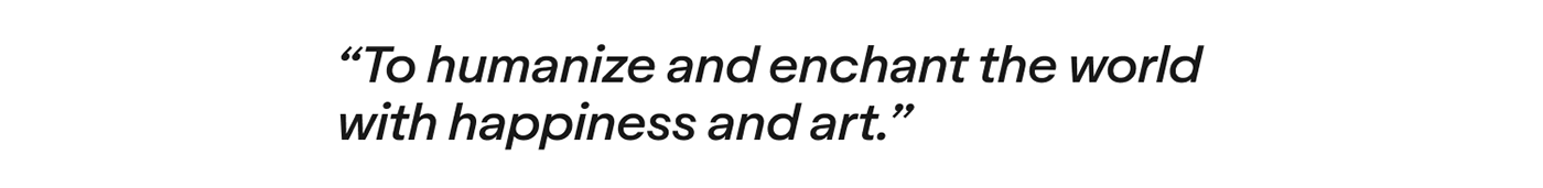
We were able to reach a conclusion on what is the bigger purpose of this institution and the people involved in it:
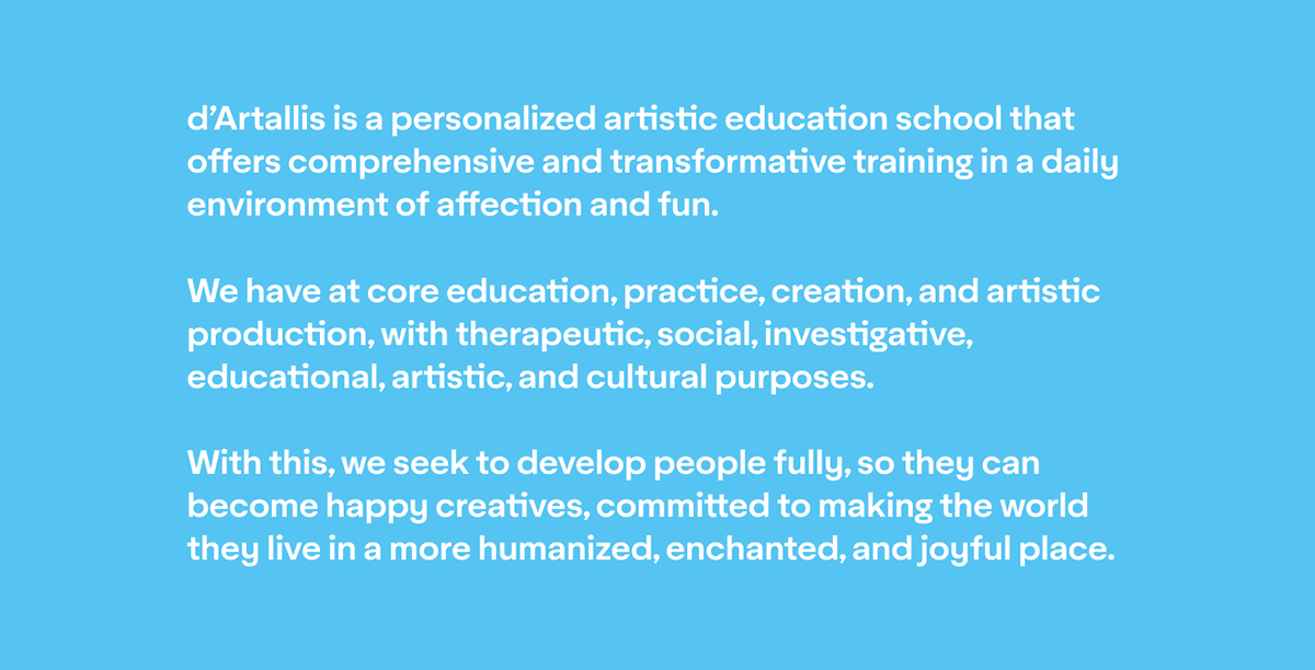
The following Brand Statement is a way to verbalize a series of core information about the institution. It includes the definition of the institution itself, what they do, why, and how they do it.
Trying to decode the tone of voice on the institution, their values, and how the students see themselves, we created a Manifesto to help them transmit who they are, incentivize similar behavior, and align the expectations of new staff members, new students, and their parents.
Unfortunately, it doesn’t rhyme anymore now that I translated it to English, but the idea was to make it as memorable as possible and even allow them to turn it into a song since they have all means to do it.
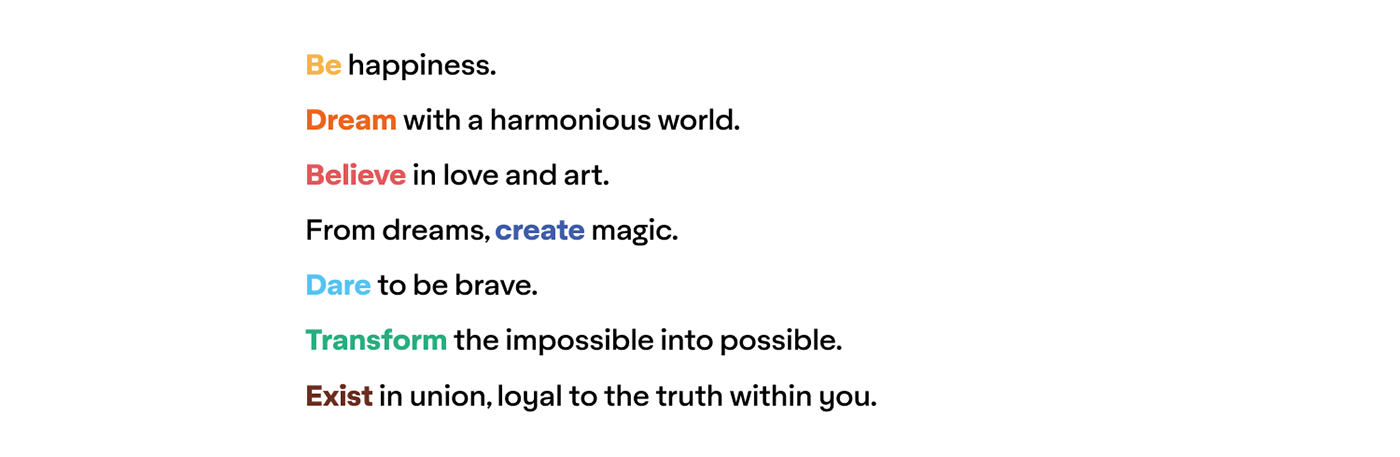
This manifesto comes from the use of 7 verbs and the relationship that each one of them has with the values of the institution, how the students identify themselves and the tone of voice that they share.

This might seem a bit too complex, which is true, but this table was meant to be used as a guide, working on the sidelines to encourage their desired behavior and propel everyone's efforts in the right direction.
Looking back, we could have made this simpler, but we didn’t get any friction from it. Instead, we were met with excitement and enthusiasm for being understood.
One of the many concepts
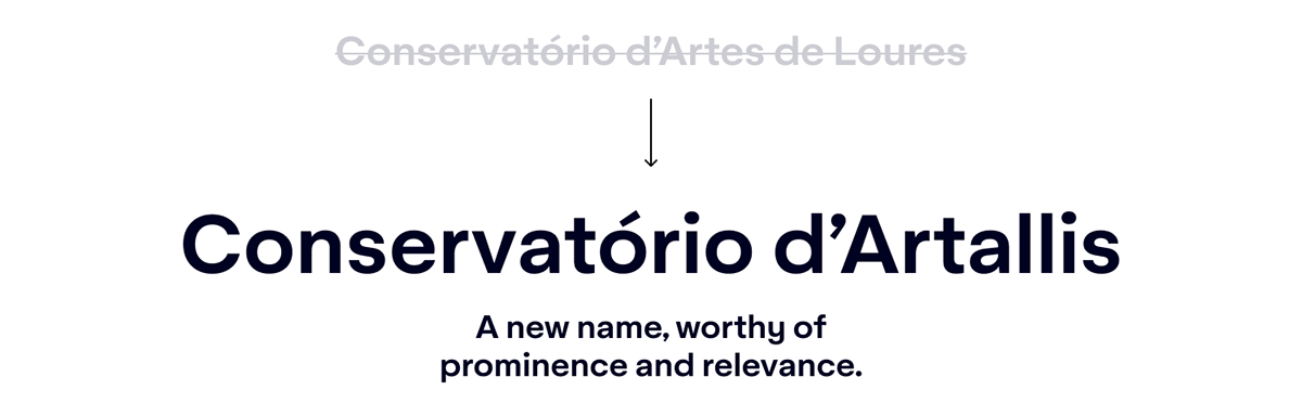
After their decision to change the name of their institution to “Conservatory d'Artallis” and conclude that butterflies are fitting to represent the experience of studying there, we created the following concept that we're still pleased with, although it was not used.

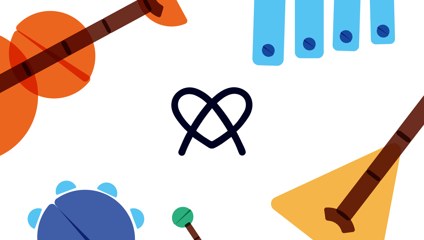
We ended up creating a symbol that brings together the letter A from their new name, the shape of a heart, and the resemblance to a butterfly in a single line that forms a knot.
This knot icon is a symbol of their union, their holistic approach to education, and a way to unify all the graphic and symbolic elements in it. It’s an icon that can be easily replicated by anyone using a pen, rope, thread, play dough, or any other material.
I have to admit that the choice of changing the name into a word that was created by them and never heard of before was a bit concerning for us. They were set on going in that direction, so we jumped in the same boat and make our best to reinforce this change by working around the word "Artallis" as much as we could.

Sub-brands
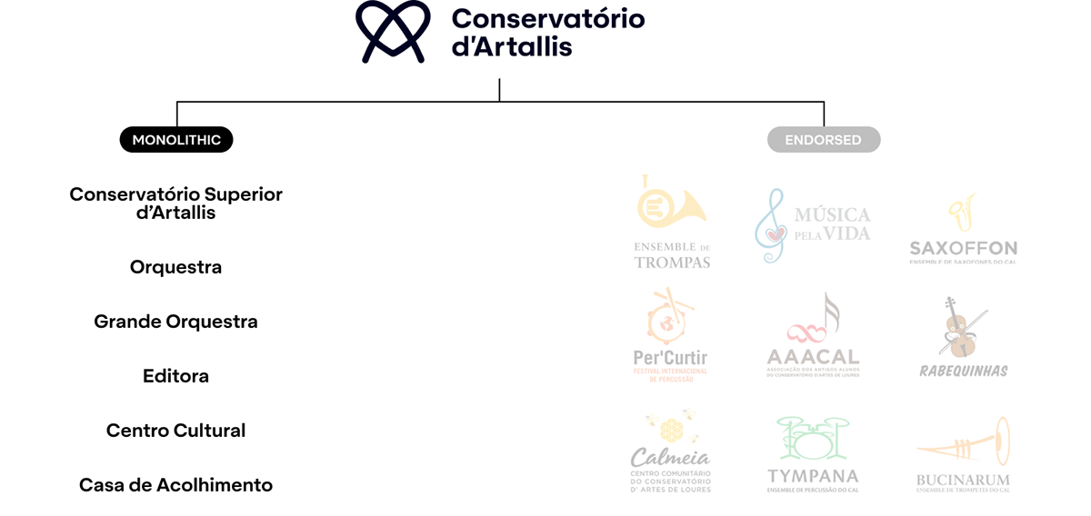
Focusing on the left side of their brand architecture, the monolithic sub-brands within the umbrella institution, we decided to preserve the brand recognition and make it very obvious that these sections of the Conservatory are different parts of the same institution.
This way, the Knot icon and the name “d’Artallis” would stay in place and only the “Conservatory” part of the wordmark would change to identify the section within the institution.

Now, focusing on the right side of their brand architecture, the endorsed sub-brands.

These are just some logo from dozens of projects that live inside the Conservatory that have little to no apparent relation to each other or the institution. Is common for them to create new projects, so we needed to offer a system that allowed them to do things internally without compromising brand recognition, and the relationship between the projects and the institution.
The challenge in this:
- Creating distinct logos for each project;
- Creating a system to allow the creating of any other logos, if they want;
- Keeping a resemblance between all of them to maintain a visual connection between each other;
- Connecting all logos to the main brand, the institution;
- Allowing the participation of the students in the process of creating new logos by motivating the use of plastic materials in its creation.
It was crucial to allow the making of new brand assets to be an opportunity where any child, no matter their age, physical or mental capabilities, would be part of this creative process. They have plastic art disciplines, the kids are deeply involved with the institution, and they all feel like they are part of it, so it made sense to find a way to include them in something that is so meaningful to them.
Creating a system with shapes

In order to create a system that allows them to generate as many logos as they wanted, we needed to find something that would link them together.
Our choice was to loosely interpret each letter of the word Artallis with very basic geometric shapes. We enjoyed the coincidence of ending up with 7 different shapes, just like we have 7 verbs, values, and so on, so we just went with it.

To continue with the same logic, we created a color pallet also with 7 colors.

Here you can see the geometric shapes in action, brought to life by the use of color and how they create figures when together. When apart, they are just loose pieces, but when together, they can be so much more.
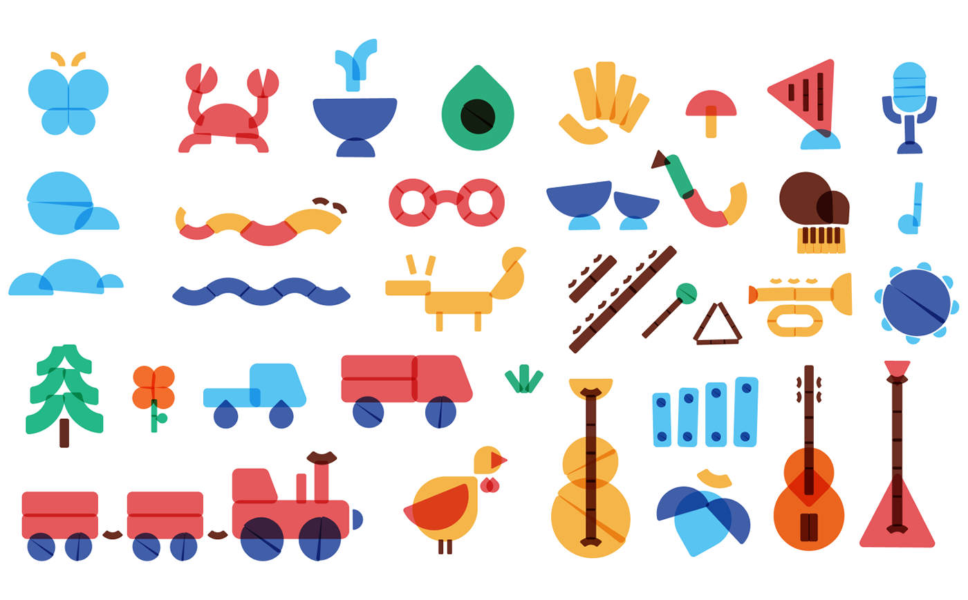
The choice of creating geometric shapes, with colors that are either primary or easy to mix with paint, the way the shapes overlap each other, and the choice of them being over a white background, was not arbitrary.
While thinking about how to include kids in creating these brand elements, we thought of potatoes and how kids can paint and create figures by using them as stamps.
This was the perfect way to include them in a creative and educational way, while being money conscious with the materials, and still maintaining visual consistency since they would be limited to 7 stamp shapes.
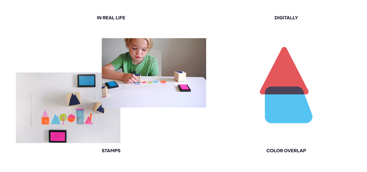
The geometric shapes are easy to create in a potato, they already had bottles of paint in the conservatory, the way the shapes overlap digitally has a similar overlapping effect that the paint does, and the choice of white background is just like a white sheet of paper where they would work on.
In the worst-case scenario, even if what the kids ended up doing was not “usable”, their artwork might still serve as inspiration to create the assets digitally and they would still have a good time playing around.

This is how the figures created with the geometric shapes would be integrated with the other parts of the endorsed sub-brand’s logos.
The name of the project on the right side, the name of the institution bellow it, and the little knot icon of the institution next to the figure illustrating the project.
The Little Knot Icon
The knot icon of the main logo was turned into a little knot icon so it could be used in the endorsed sub-brands. Similarly to a ™ or a ®, this little appendix is a discrete but still visible way to relate the institution and its projects.

Creating harmony
They would have been equipped to create as many logos as possible with everything you saw, but we still needed to create some rules. For them to create the endorsed sub-brands with consistency, we created grids that would contain the illustrations, the little knot icon, and that would help them relate the typography to the other elements harmoniously.


Here you have some examples of how we remade their project’s logos.
Playing with lines

Just in case it was needed, we decided to explore the possibility of using the geometric shapes to create characters. Restricting that exploration to the use of only black lines to draw over and around the figures was our way to create some restraint and resemblance in what can be a very creative and interpretative process made by different people.
Similarly to stick figures, each person has their own interpretation of them, but they all have some key elements in common, such as the use of lines to create a very stylized representation of a person and their human traits.

Spirit Celebration

Considering the 7 defining values of the institution, the 7 colors chosen for their pallet, and the 7 geometric shapes, we decided to make a connection between all of them by associating a color and a shape with each value and creating symbols that would represent them.
The concept of “Spirit Week” would have been an excellent opportunity for the Conservatory to celebrate the values that define their spirit, and align students and everyone working in the institution by involving them in thematic activities, participating in debates, dressing up in the color of the value that is being celebrated, and so on.
Of course, the school week has 5 days and not 7 but they could, for instance, celebrate all of them simultaneously during a week. Maybe they could dedicate a week to each value, maybe just a day per week. We ended up not defining how things would happen, but it was definitely possible to have a “Spirit Celebration” in some creative way.


The Passport
A little booklet similar to this one would be something that the students in the Conservatory would carry with them from their first day of school. It would serve as a starting point to introduce them to the soul of the school, a place where kids would gather their achievements, collect memories, and have their personal information.
This is just one more touchpoint in the attempt to create a whimsical experience for the students. The idea was to define a set of possible achievements and associate them with a series of stamps or stickers for the students to collect.

Communicating Events
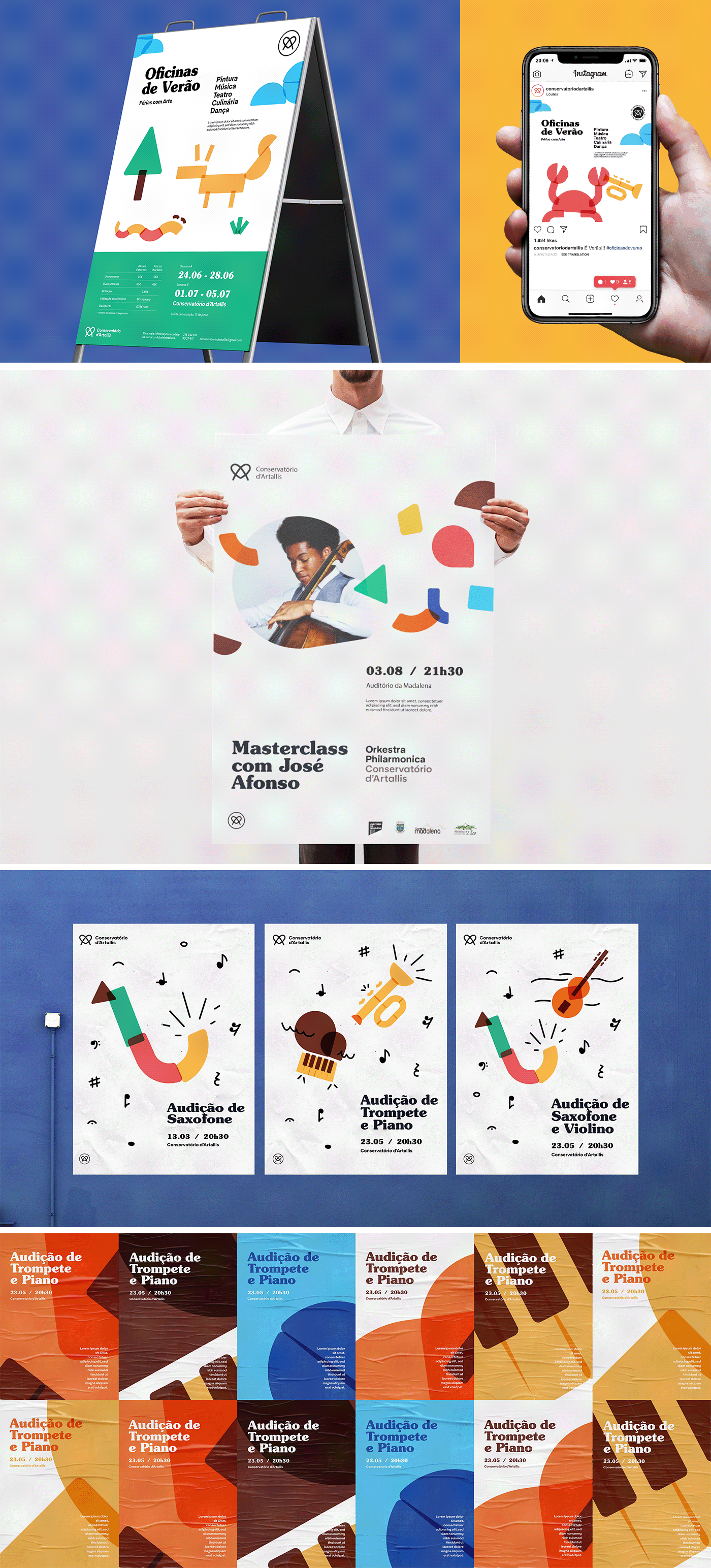
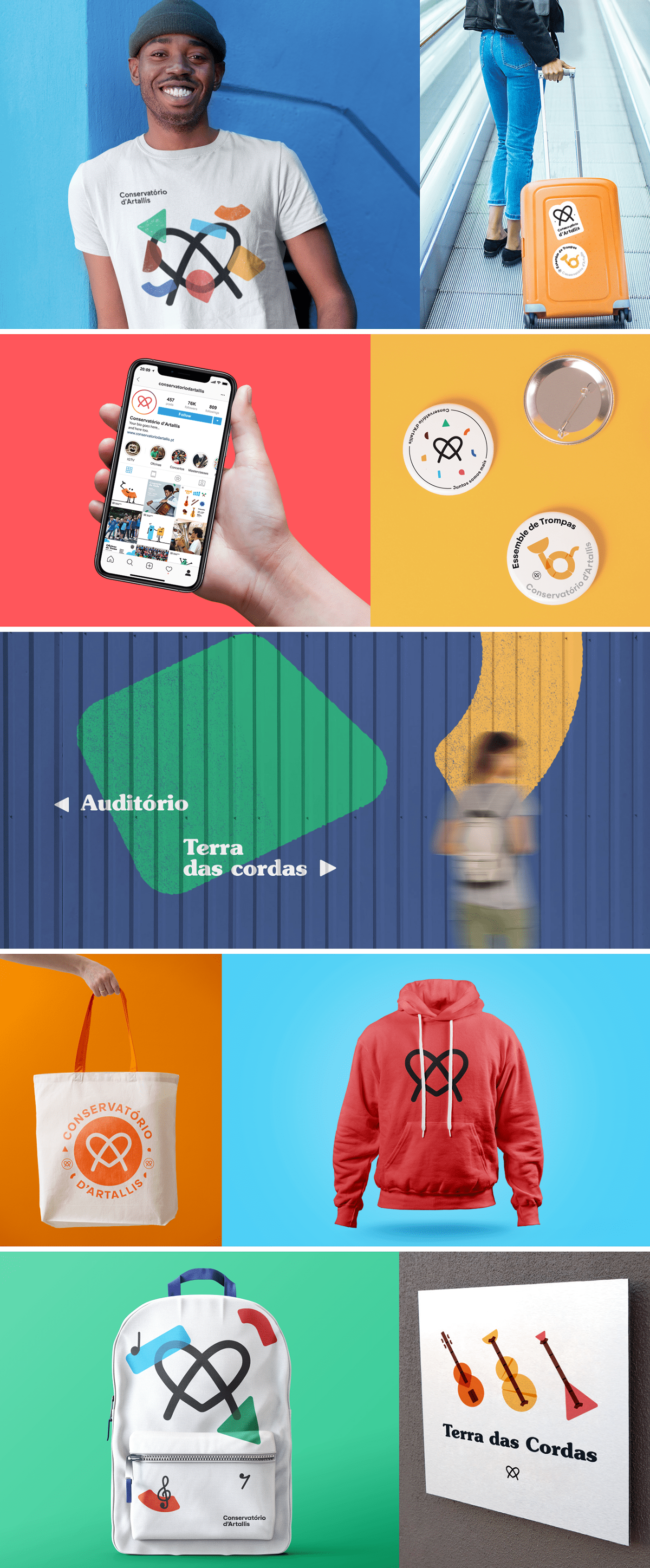
Other Uses Of The Visual Language
The butterfly concept
As you can imagine, the concept presented to you above was not the only one we created. Without wanting to extend myself much more, I’ll just present to you some images of a simpler concept that we made after this one was rejected and receive their feedback.

Sailing deep waters
The two proposals above were the last ones we made, but we tried to approach the creative brief in many different ways, trying to reach something that would make sense to them. The following images are an overview of the work produced during that process.


Closing up a chapter
I think that the proposal that we presented to you in-depth is consistent, clear, well structured, and fun, but also capable of being serious when needed. We didn’t want to limit their creative and artistic expression, quite the opposite. We wanted to give them the tools to be as creative as possible while still maintaining consistency and a sense of professionalism.
I think that that was achieved, but it saddens me to know that this is just stored in a folder on my computer. They wanted to change but, when standing face to face with change itself, they were not ready for it. This is not criticism or a judgment on my part. Sometimes, people are just not ready for a change at that moment in time, and coming to that conclusion can be a bumpy ride. We probably should have helped them come to that knowledge sooner instead of keeping trying relentlessly. Postponing things sometimes is the wisest thing to do, but I think our judgment was clouded as well by our own will to help, no matter what.
This is how things go sometimes, but the important thing is to learn something from the experience and apply that knowledge in the future.


