We Are Cafe
DESIGN Thesis
Because humans weren't meant to be alone.
Why does community matter? Experiencing a community, one where you can be your true self, provides a sense of belonging : as someone who doesn’t need to adapt for a group’s standards to be loved and appreciated.
Why does this matter to me? And my thesis? Now, more than ever, community is important... and community is hard. The pandemic has redefined how all of us, especially students, navigate independence, relationships, and our mental health. Through Covid19, students have lost the experience of community — especially during school — with not exploring who they are, meeting new people, and attending events.
Through my thesis, my goal was to:
Encourage young adults to rethink what their own community might look like for them outside of school.
Inspire the intentional pursuit of meaningful relationships as community may not come naturally.
Open a safe space for people who are struggling.
And explore this through the creation of a new cafe brand — one that is intentional about community building for young adults.
Cafe Storefront & Interior Wall


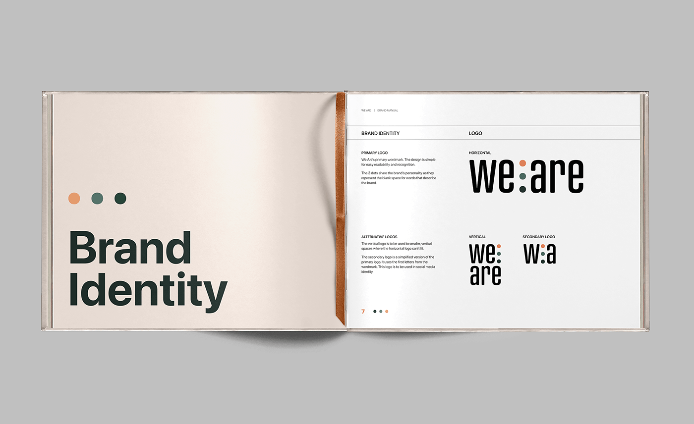
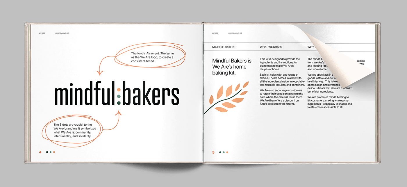
The font is Atrament. A bold and condensed font to be noticed, easy to read, and fit in all spaces. The 3 dots are crucial to the We Are branding. It symbolizes what We Are is: community, intentionality, and solidarity.
The We Are colour palette is made of three colours : orange, blue/green, and dark green. The orange tone was chosen as an engaging, playful presence for the brand to show its modern and upbeat personality. The orange is yet more of a sunset, peach tone, to be exciting yet a calming and non aggressive colour. Light blue/green is a medium colour between orange and dark green. Its friendly and calming, reflecting an earthy tone from nature. Dark green is a deep, intriguing, but peaceful colour, connecting to the tones of earth and nature. It represents deep connection, thought, and empathy in the brand.
We Are’s pattern is made from an assortment of leaves with the brand’s primary colours. This design is inspired by the brand’s playful yet calming personality and presence. The idea is to bring the outdoors in and have a space of warmth. The pattern is used through different brand applications, signage, social media, and more.
For my primary deliverable, I designed a brand manual for We Are. The manual features the various aspects of We Are’s visual identity, style, personality, and brand application.
Page from the Brand Manual


Mindful Bakers - We Are Home Baking Kit
For my secondary deliverable, I designed a packaging series for Mindful Bakers — We Are’s home baking kit. Mindful Bakers is a recipe box with the instructions and ingredients for customers to remake their favourite We Are recipes.
This kit is designed to provide the ingredients and instructions for customers to make We Are’s recipes at home. Each kit holds with one recipe of choice. The kit comes in a box with all the ingredients inside, in recyclable and reusable tins, jars, and containers. We Are also encourages customers to return their used containers to the cafe, where the cafe will reuse them. We Are then offers a discount on future boxes from the returns.


Mindful Bakers - Package Series


Thank you for viewing my work. I hoped you enjoyed the journey.
It was quite the journey for myself, and I really do love my thesis project, But sometimes, it was really, really hard to research and talk about something I am struggling with so much myself. But this also made it so real and tangible to me, something I could truly believe in myself.


