
Mr. Dee Still is the shoppable magazine dedicated to the world of beverages.
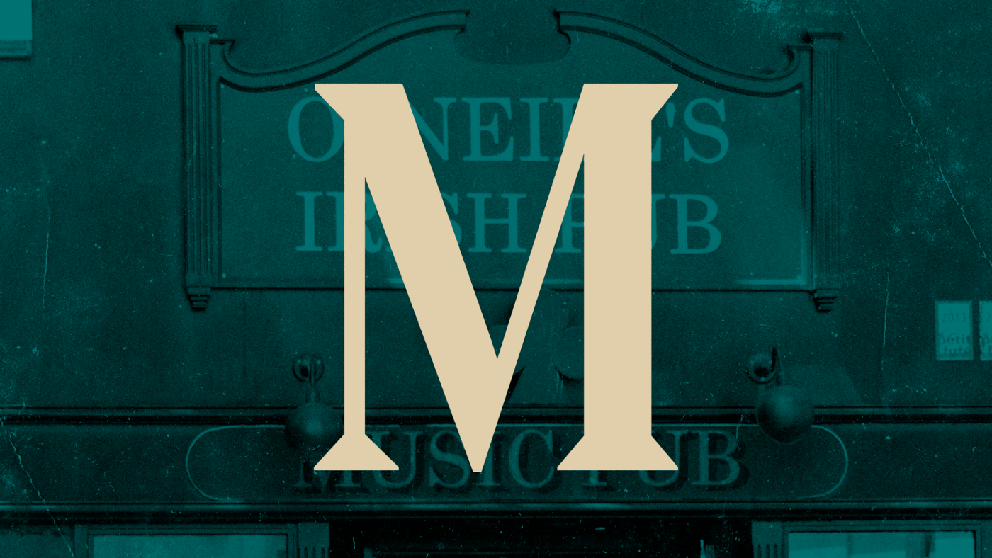
For its corporate identity, we decided to draw on the imagery related to the world of Prohibitionism.
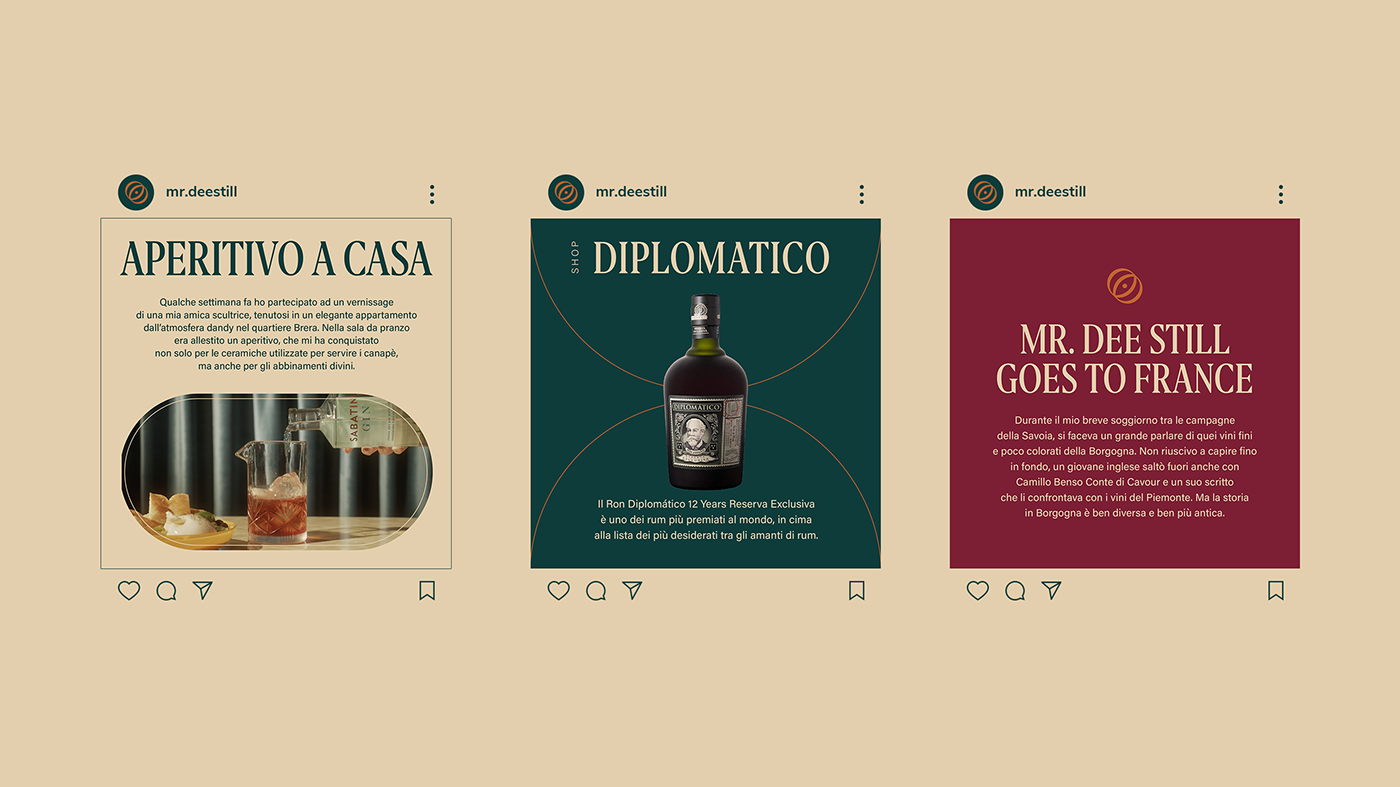
The graphic symbol that drives the identity is the mark, representing a glass seen from above, in perspective. The addition of the central dot gives a double meaning to the new symbol, which also becomes an eye, symbolizing the curiosity in the discovery of spirits.
The graphic symbol that drives the identity is the mark, representing a glass seen from above, in perspective. The addition of the central dot gives a double meaning to the new symbol, which also becomes an eye, symbolizing the curiosity in the discovery of spirits.
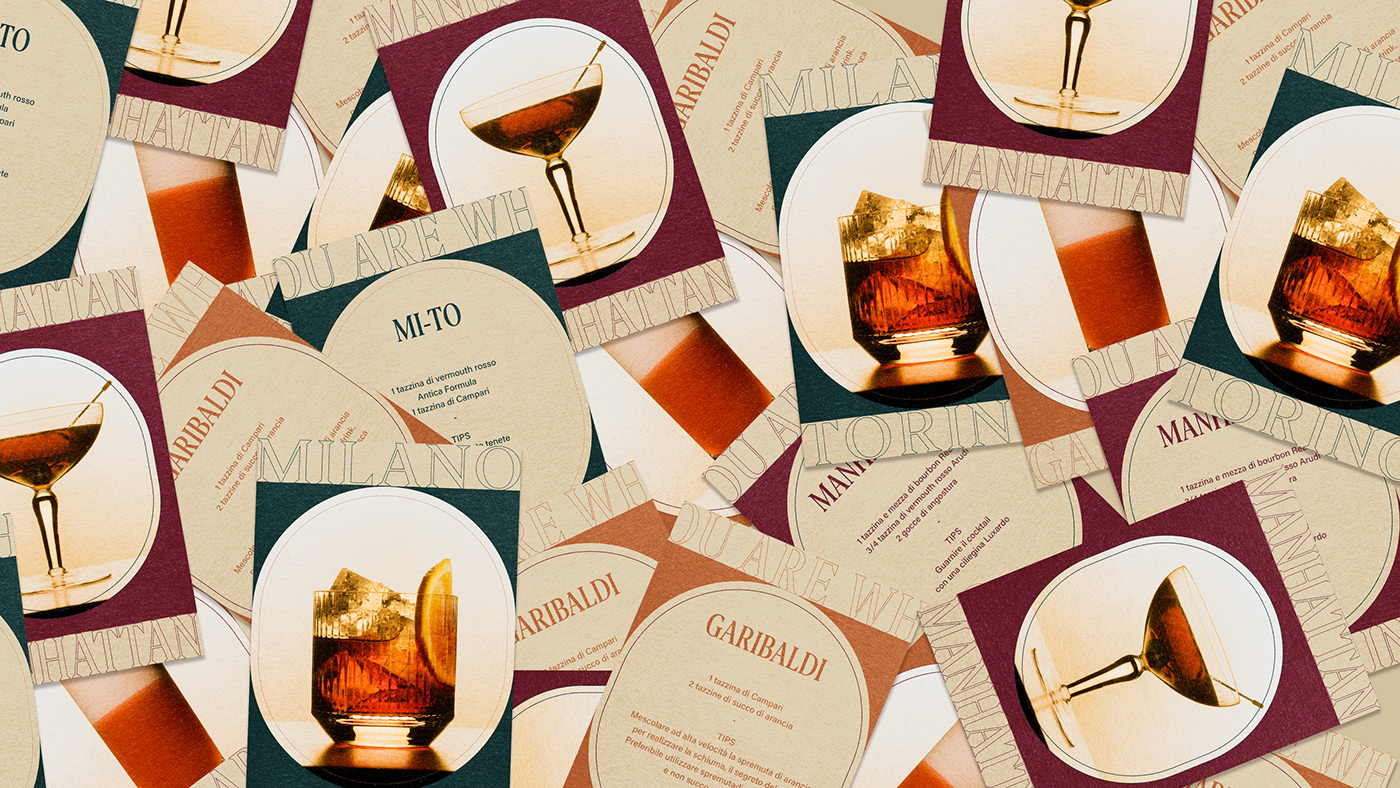
The new packaging are designed with a strong inspiration from the graphic imagery of the 1930s, revised to be current and modern. The use of typography harks back to the signs of pubs and speakeasy overseas. The new graphic is then enriched with a pattern, inspired in its lines and color palette by the wallpapers of early 20th century pubs.
Every package contains a different high-quality product. To communicate this through the package itself we decided to add ennoblements, such as embossing and hot-foil coatings.
Every package contains a different high-quality product. To communicate this through the package itself we decided to add ennoblements, such as embossing and hot-foil coatings.