


Pilot is an online healthcare platform tailored to Australian men, developed by Eucalyptus to fulfill the critical need for more accessible and convenient men’s healthcare. It makes mens’ journeys of seeking quality and professional medical
care extremely easy, efficient and judgment-free.
care extremely easy, efficient and judgment-free.
We were approached by Eucalyptus to translate Pilot's refreshed brand identity and core vision into motion, developing an exciting and sophisticated set of principles, guidelines, assets and templates. Never Sit Still interpreted Pilot's role as an online healthcare navigator and the patient journey of engaging Pilot as one of positivity, accumulative growth and momentum—i.e, an upwards journey. This concept encapsulates Pilot's
tagline of “Level up your healthcare.”
tagline of “Level up your healthcare.”
To reflect this, the defining overarching movement in the motion brand is a consistent stepping up. This is combined with offset to create a sense of ease, flow and optimism. The movement also emphasises to users that achieving health goals requires a continuous commitment to a journey with many steps, but in turn will lead to snowballing progress.
Credits
––––––––––––––––––––––––––––––
Client — Eucalyptus
Design & Art Direction — Eucalyptus
Animation Studio — Never Sit Still
Animation Studio — Never Sit Still
––––––––––
Studio Director — Mike Tosetto
Project Lead — Zoe Crocker
Animation — Zoe Crocker, Melany Webster, Mulanne Phan
Producer — Darcy Green, Sharon Lim
Illustration — Jason Solo
Photography — Tim Jones
Writing — James Aviaz
Illustration — Jason Solo
Photography — Tim Jones
Writing — James Aviaz
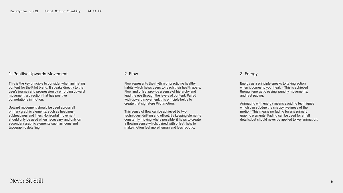
MOTION PRINCIPLES
To ensure a consistent application of motion brand across all assets, we developed a
set of defining principles that capture the overarching concept of the upward journey.
set of defining principles that capture the overarching concept of the upward journey.
LOGO
Key to the brand, the logo animates in upwards, expressing ease and flow in the journey
of healthcare, and is punctuated by an additional tittle flourish for extra energy.
of healthcare, and is punctuated by an additional tittle flourish for extra energy.
ENDFRAMES
The endframes perfectly showcase the core animation values in which all Pilot content should aim to emulate.
UI ELEMENTS
Depending on the context in which UI elements sit, motion can add an extra element
of interest and detail which works to enhance the overall design.
of interest and detail which works to enhance the overall design.
TRANSITIONS
We created five transitions for the motion brand, supplied as motion templates. These templates can be adjusted to different speeds, allowing the pacing of the transition to appropriately match the included content.
HEADLINE ANIMATION
We developed 2 additional styles of animation for headlines. This is for flexibility of usage in different contexts, e.g when there is limited space/time to apply the Upwards Journey style of animation.
SEARCH COMPONENT
The animated search bar is a graphic device that can be used in promotional Pilot content. We created this asset as a live template that can be adjusted content to content.
PERFORMANCE MARKETING ASSETS
We created performance marketing assets that come to life in motion with a unique infinite-loop scrolling effect. This is perfect for social media contexts, as well as any digital medium. These examples exist as reference to be emulated during the roll out of social media content.
By adding motion to this content, they stand out on these heavily saturated platforms
and promote higher engagement. The looping motion is satisfying and almost hypnotic,
keeping the attention of the audience.
and promote higher engagement. The looping motion is satisfying and almost hypnotic,
keeping the attention of the audience.
INFOGRAPHIC EXAMPLE
We designed the movement of an infographic asset to be used as reference for the brand's future educational content. The motion engages the eye and creates hierarchy
in dense educational content.
in dense educational content.
DOCTOR'S CHAT
We defined three sets of movement for messaging UI animation:
Building in, new message, and typing message exploration.
Building in, new message, and typing message exploration.
[Pages throughout case study are from the delivered motion brand.]
THANK YOU.


