L I C H T S P I E L E
A display typeface

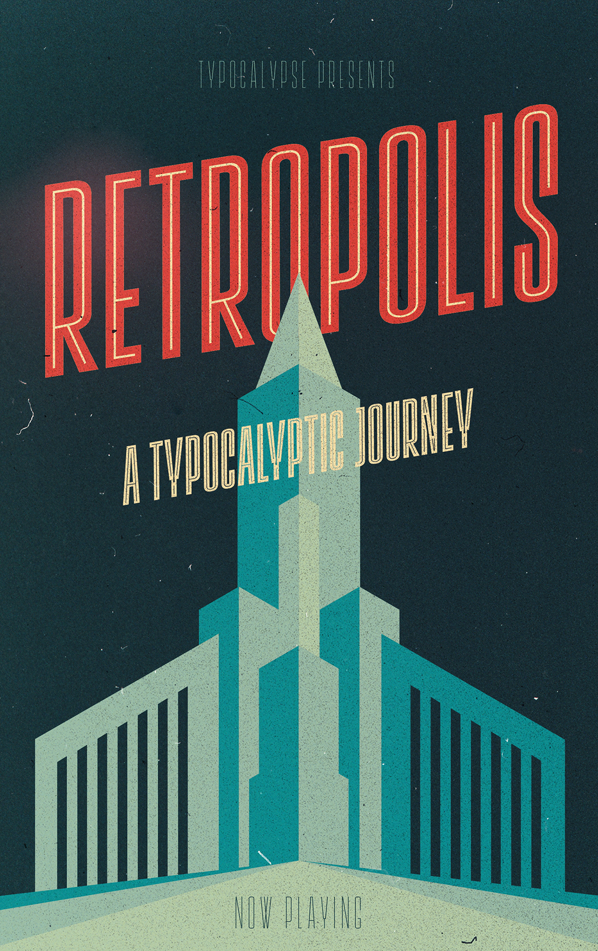
Cinemas from the early 20th Century are called "Lichtspiele" in Germany. "Lichtspiele" transports you back to a time where neon lights and marquee letters decorated cinema facades.
Of the 5 styles, three have two versions of italics - one for each perspective. Display is your basic style. Neon is inspired by the old neon letters found outside cinemas.
Add Neon Outline to Display or Neon to add another layer to your artwork.
Neon 3D is a extruded version of Neon. Screen Credits is based on the liner notes of movie posters.
Get more out of life, go out to a movie.


You can get the Lichtspiele font here:
