BACH’S BEER
—
Corporate Design and packaging for Bach’s, a small southern german brewery founded in 2009. Delivering bars and festivals with their handcrafted beers, in 2018 they decided to go the next step and bring their sustainable range of beers to the retailers together with a new design.
Bottled. For the first time.


The brief was simple. It should be classic, but not too much. Unique of course. Bold. Noticable. It should sneak a peek what’s inside. A hand-crafted premium beer.
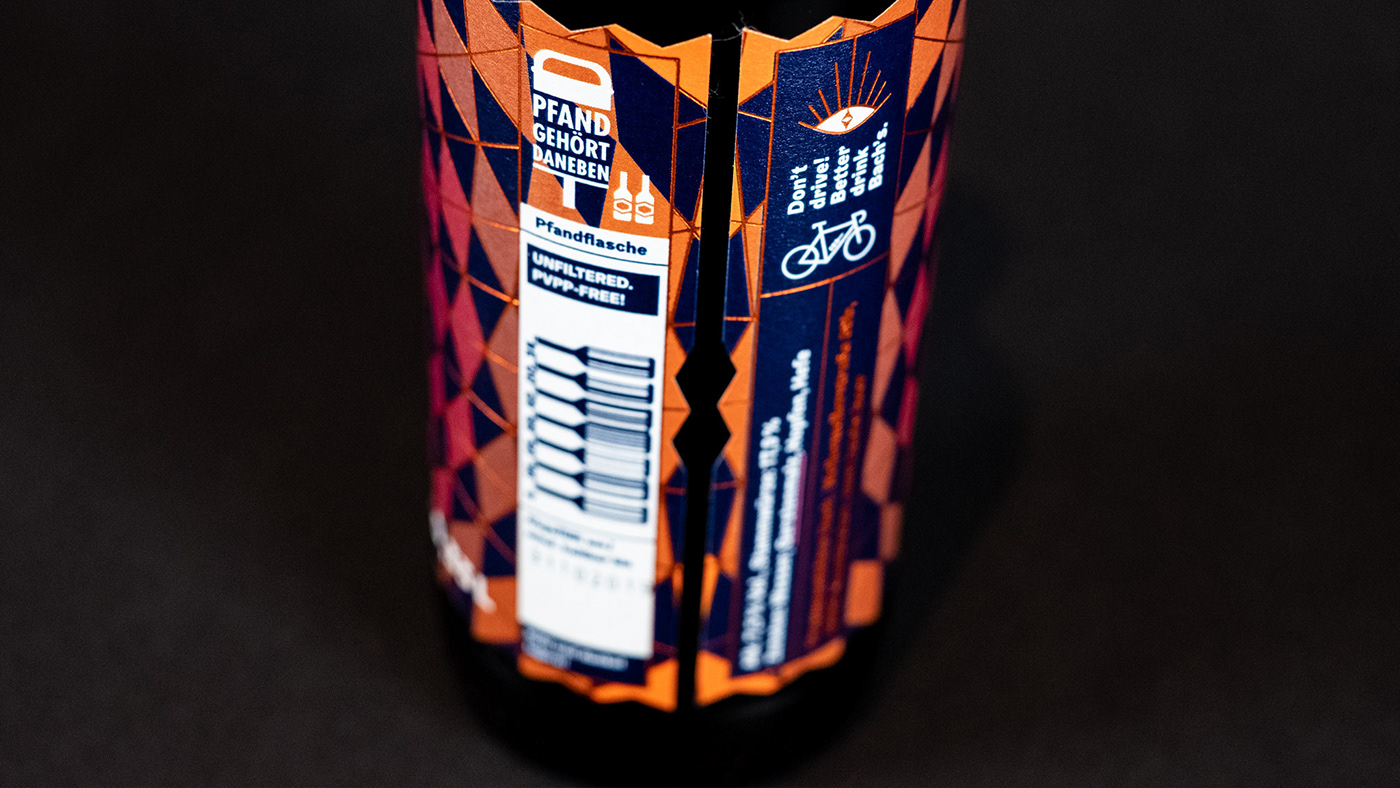
The letter »B« as the new logo is based roughly on a minimalized version of blackletters to represent the beer history with a modern touch through the impossibles shapes happening in the logo itself. The new colour range with copper and a dark blue is inspired by the old brewing copper and the history of breweries in that region. In addition to the classic beers like »Hell« and »Pils« the colour range extends for seasonal beers e.g. their autumn-coloured »Dunkler Bock«. The pattern-shape around the logo —inspired by the shape of crown caps— is mirrored in the label die-cut and appears in their printed matters as well. Hotfoil finishes complete the »classic and modern« touch of the labels.
Bottoms up! Prost!
Bottoms up! Prost!