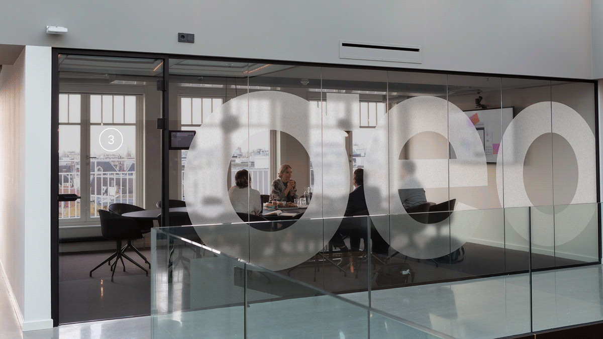
With more than 250 employees and offices in 6 Latin American countries, Geopagos was conceived during a trip by one of its partners to New York in 2012.
Delighted with the ease of completing purchases at an Apple store in Times Square, he came up with the idea of bringing payment digitization to his home country, Argentina.
The company has grown, and in 2021, we were sought after to revolutionize its global presence for years to come. To help us build this narrative, we invited Renata
Monteiro, copywriter and owner at Criatexto.
CHALLENGES
The fintech world seems to share many similar languages and clichés. It was necessary to dig deep to understand what was really unique about Geopagos.
So we carry out immersions with the founders and employees of the organization. After these meetings, we realize that, far beyond customized digital payment solutions, the company allows people and businesses to be close: to innovation, customers, experiences, and the world.
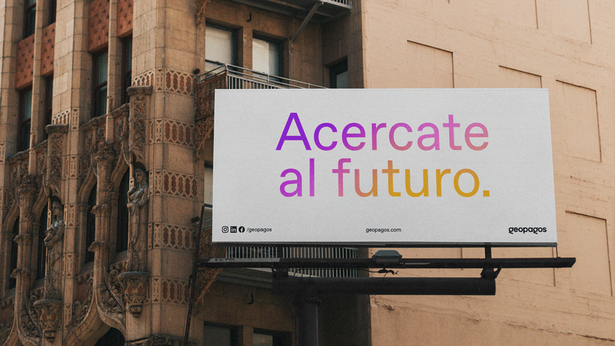
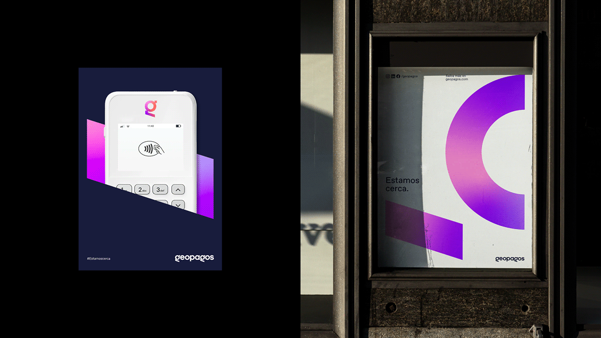
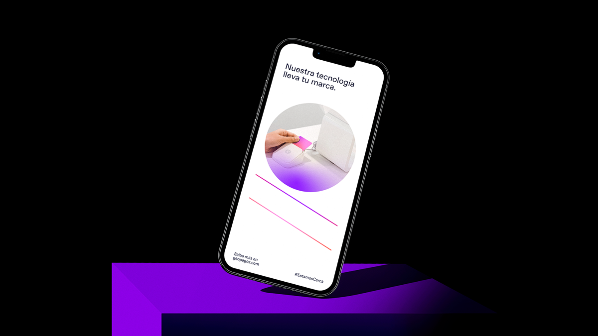
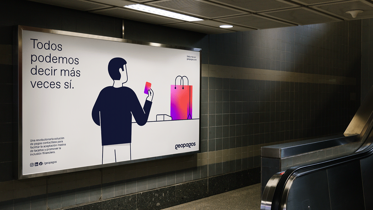
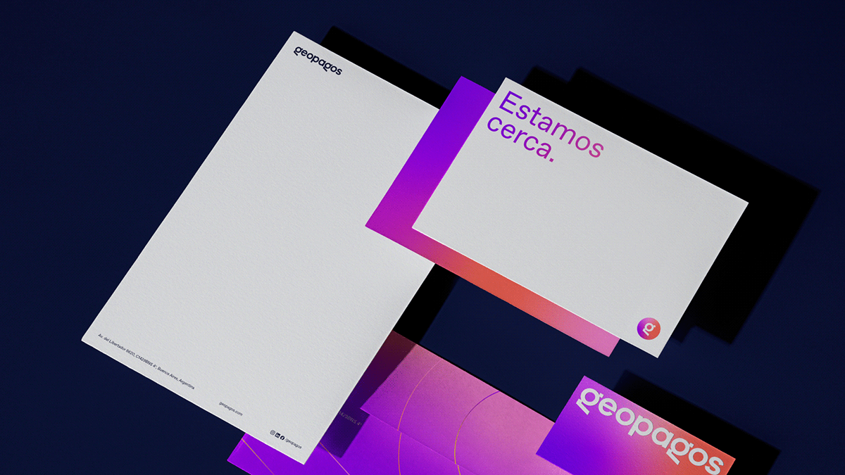
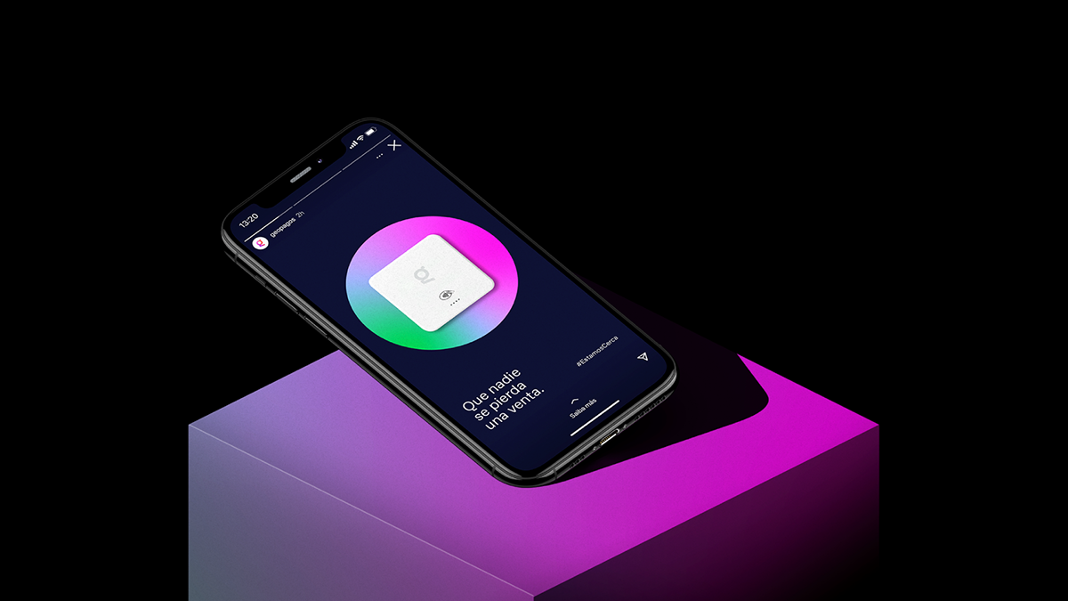
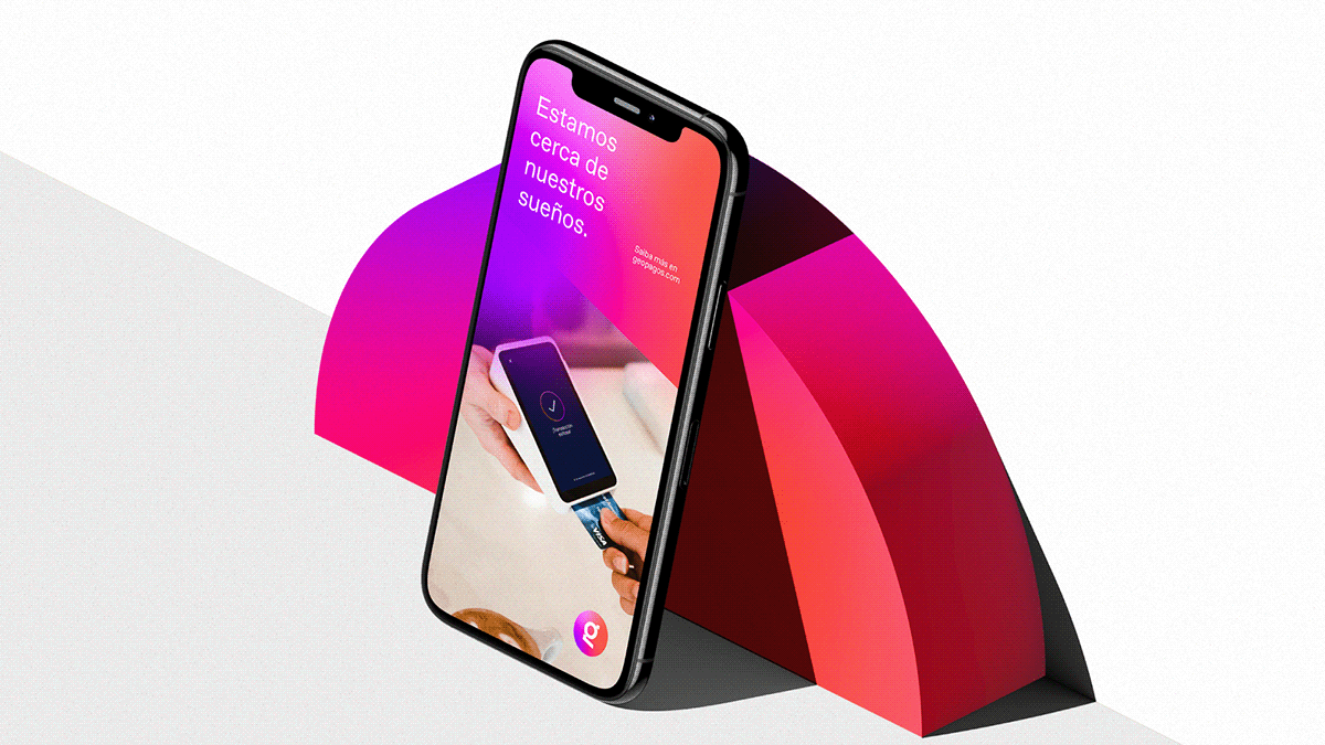
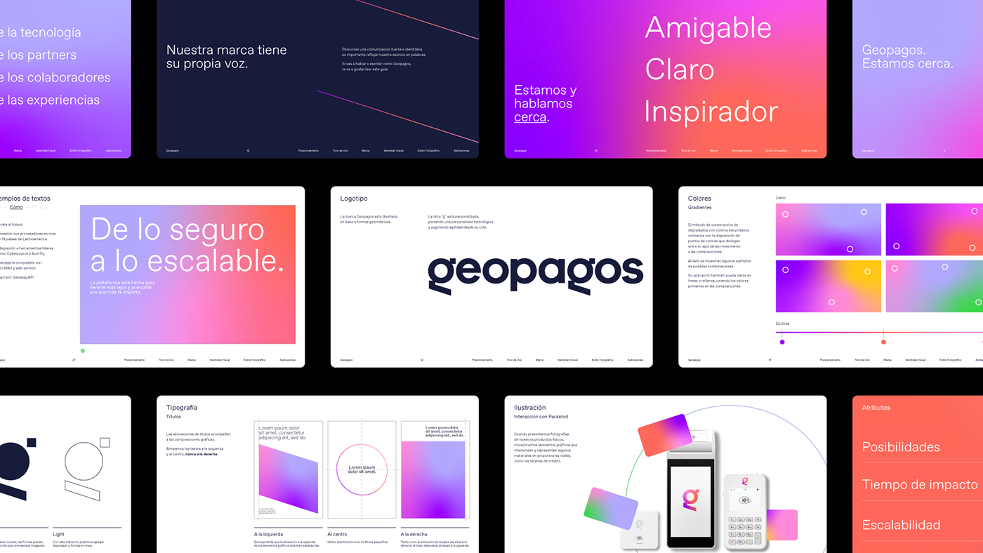
With the phrase – We are close – we positioned and expanded the possibilities of the brand narratives, allowing it to grow together with its partners and the entire community.
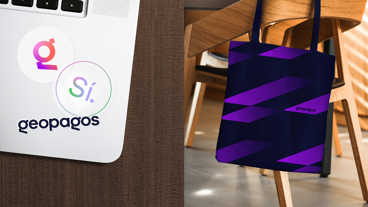
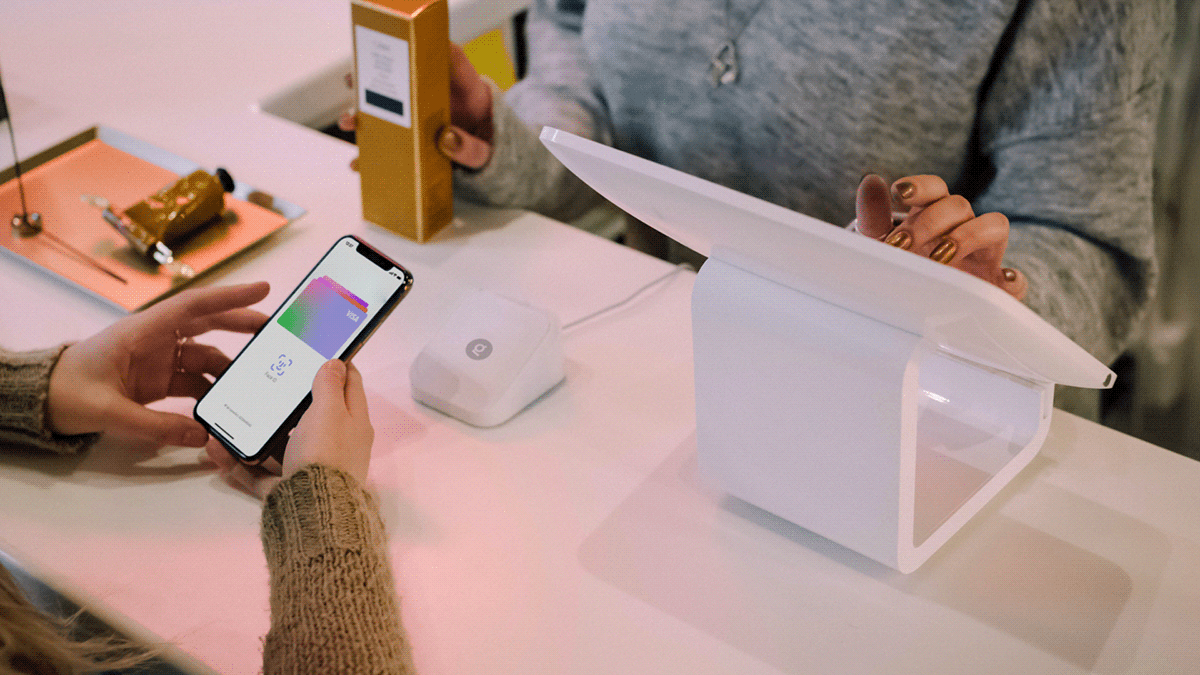
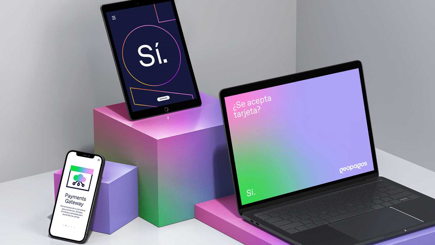
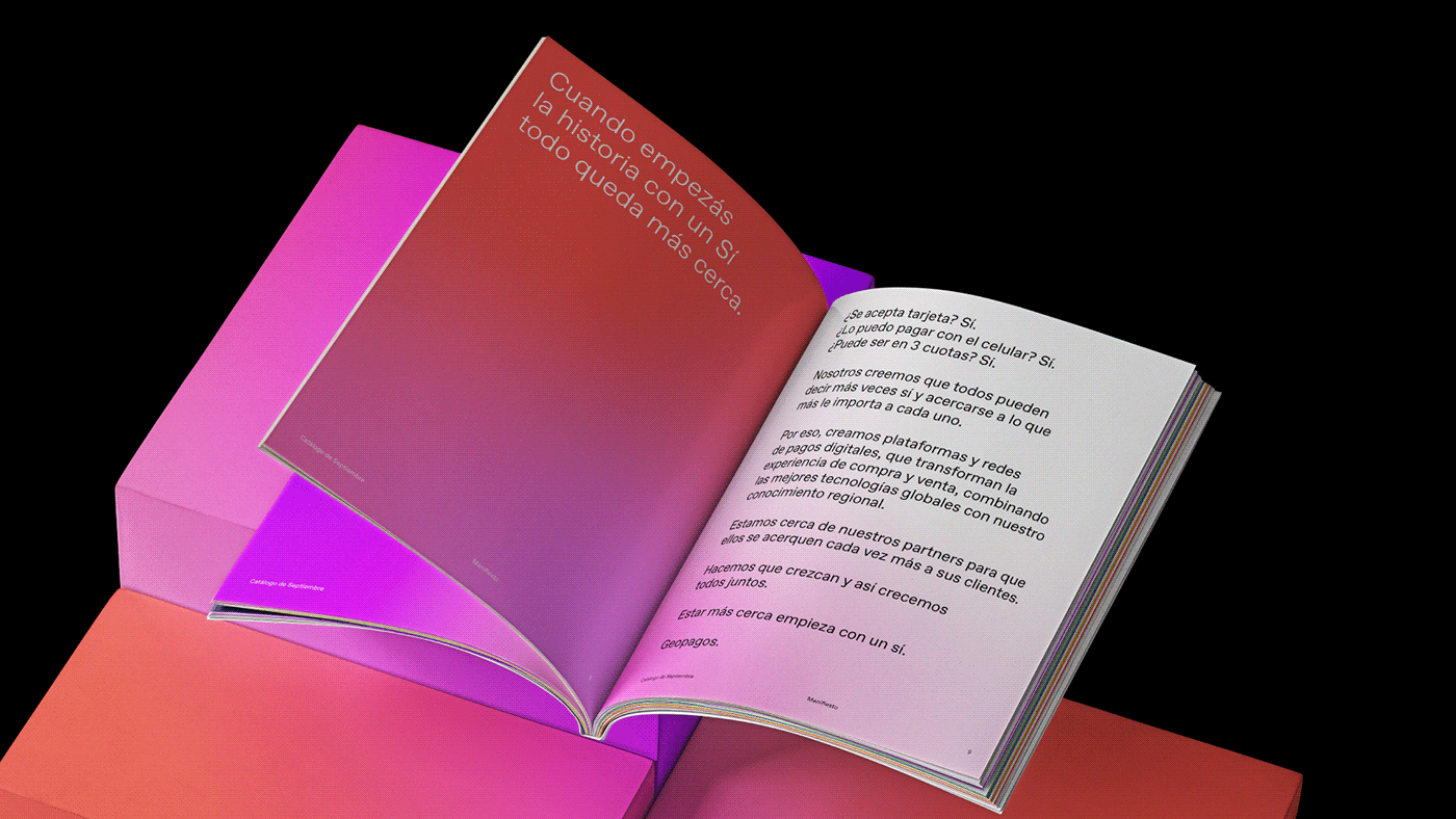
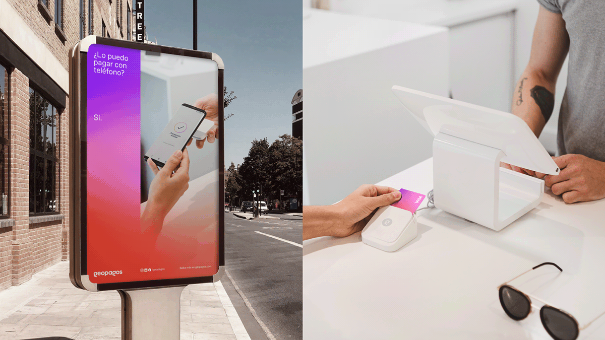
We also appropriated the word “Sí” (Yes), which is the desired answer to questions like: Do you accept cards? Can I pay in installments? Can I pay with my phone? All these ideas are then tied together in the Manifesto by concluding that being closer starts with saying: Yes!
To solidify the brand platform, we established its pillars, values, and archetype, ending on the verbal identity stage where everything settles in a friendly and optimistic communication universe.
CREDITS
-
Papanapa
Creative Direction: Gustavo Garcia
Designer: Lucas Rodrigues
Motion: Lucas Rodrigues
Positioning & Verbal Identity: Renata Monteiro (Criatexto)
IDENTITY SYSTEM
Moving on to the visual phase of Geopagos, the design solution revolutionized every aspect of it.
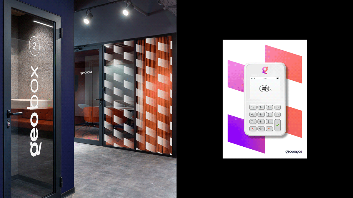
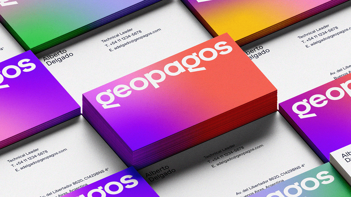
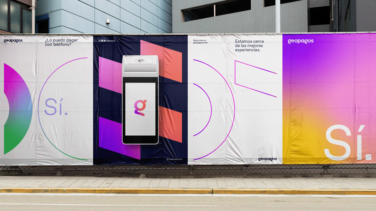
The logo now presents a structure that brings a new spelling format (all in lowercase) while balancing human and technological characteristics by combining rounded shapes and sharp angles. This mixture enlightens the feeling of agility without losing its friendly and universal essence. In the shortened version, with such distinctive attributes, the letter G becomes the symbol for the brand.
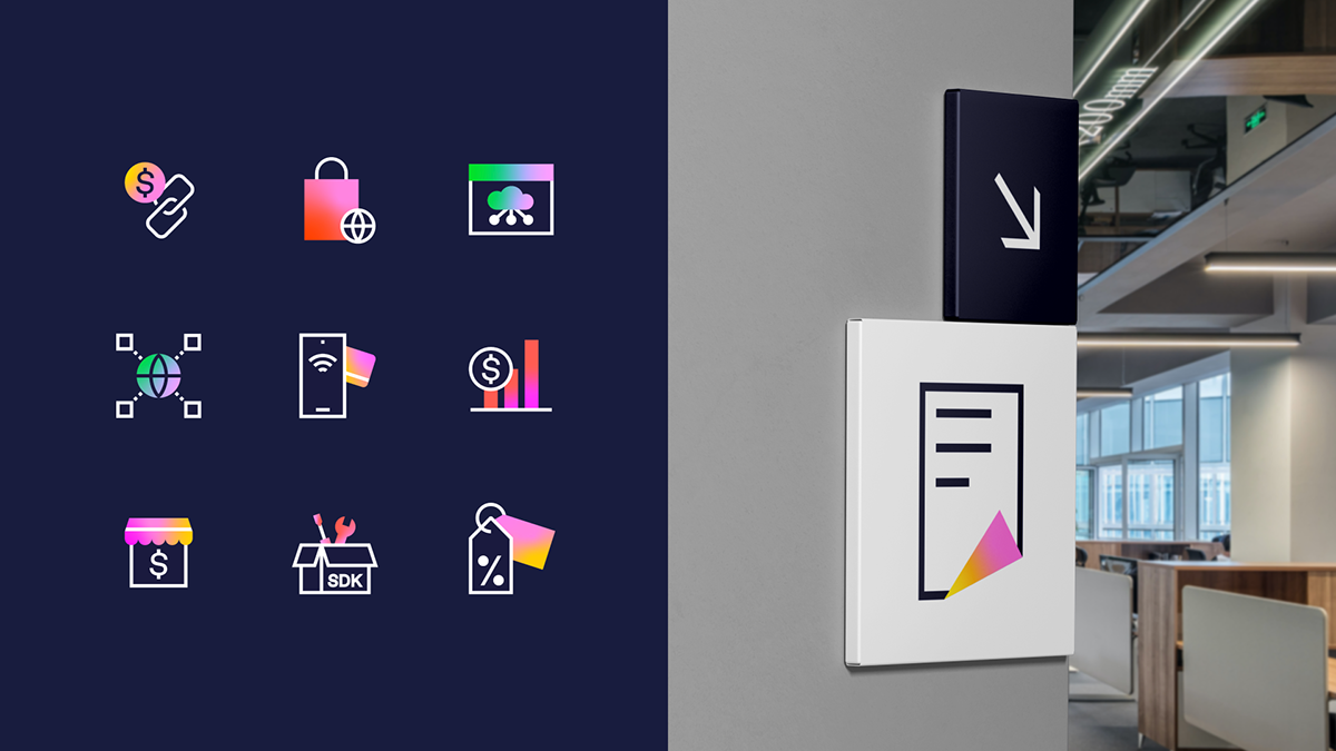
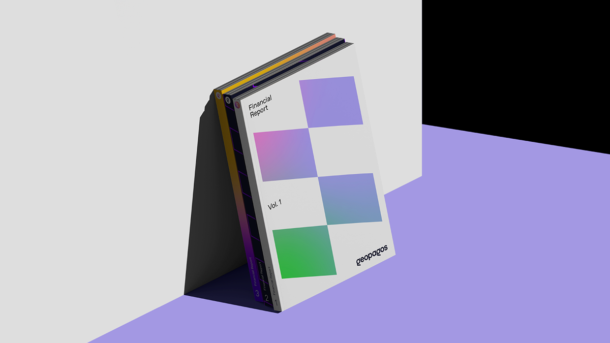
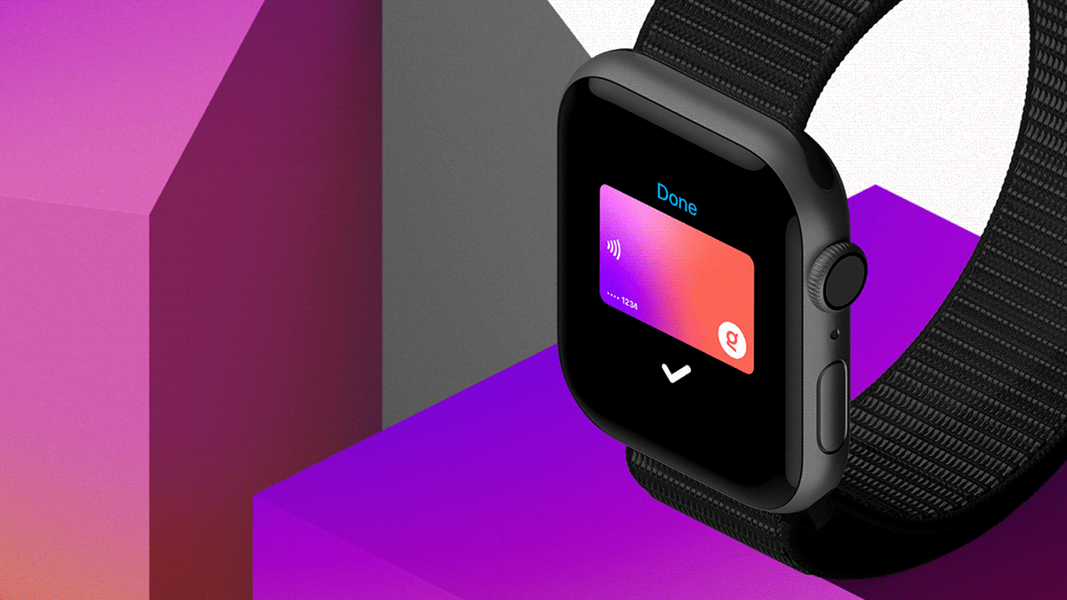
Aside from bringing movement to the communication and amplifying the experiences promoted by the company, the extensive color palette reflects the adaptability that Geopagos offers to its partners.
On top of that, the custom typographic family, ABC Favorit by Dinamo, and the geometric shapes derived from the logo appear on the identity in numerous combinations and intensities, creating a dynamic and versatile system.

RESULT
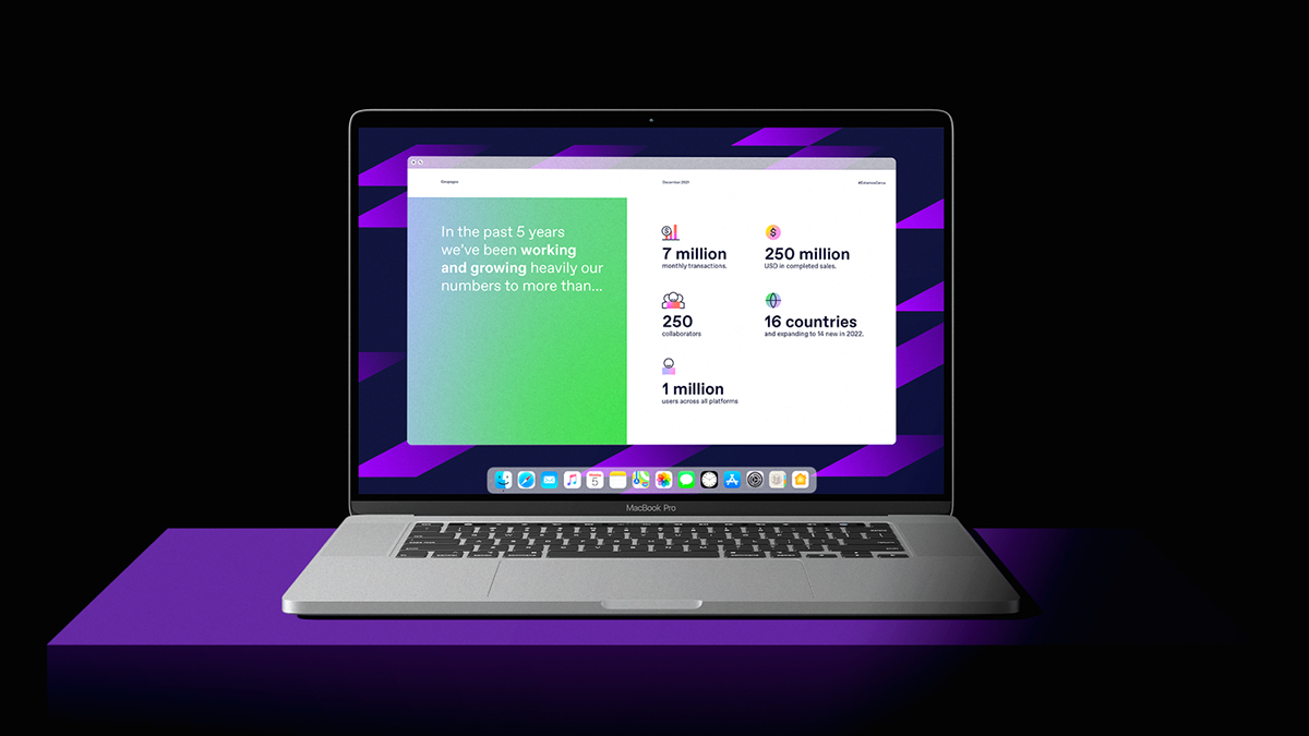
From a digital payment network developer to a solution that brings people and companies closer to experiences, dreams, and possible futures. From a fintech to a revolutionary ecosystem that facilitates routines and drives business.
Visually and verbally, Geopagos is now a brand with identity, narrative, and strengths to continue growing in numbers, impact, and transformation through the world.