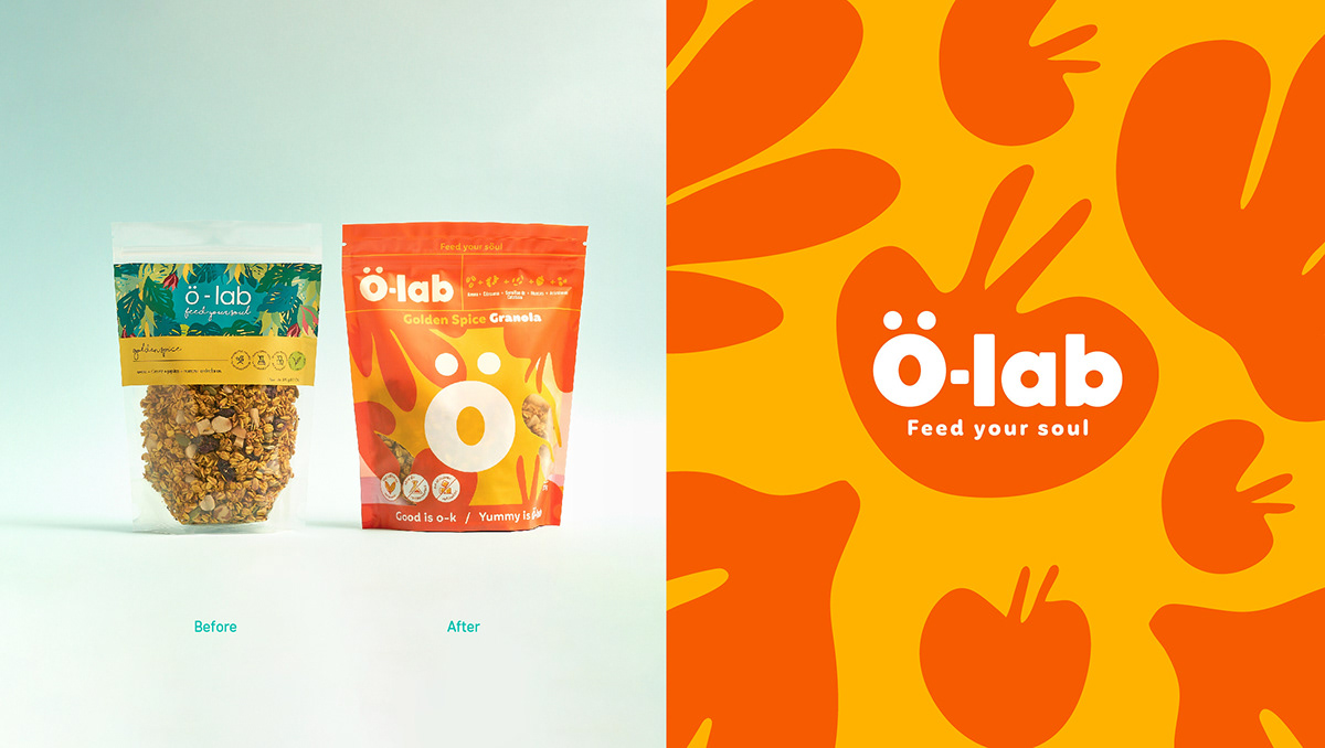
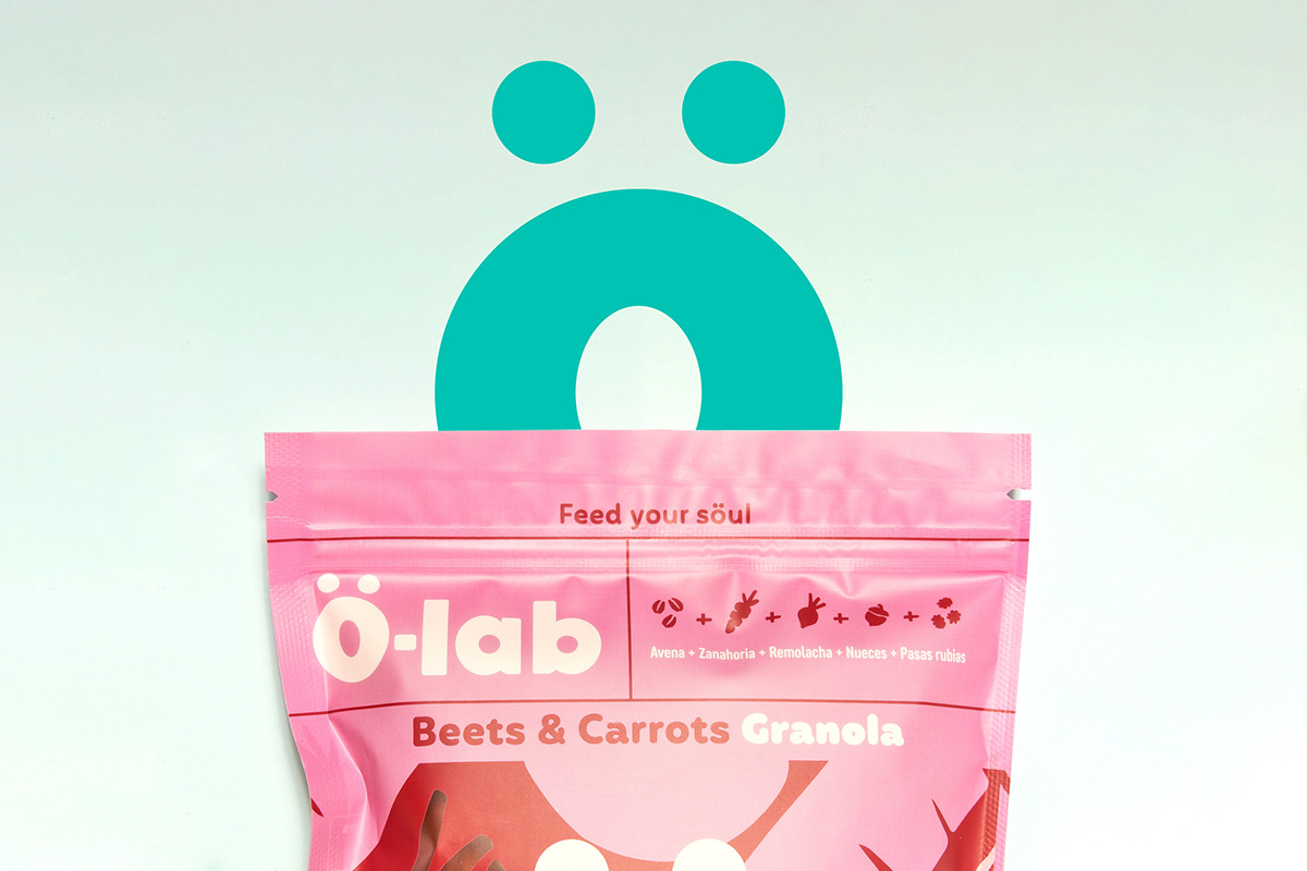
Let us introduce you to the WÖW effect. In other words, let us present Ö-lab, a healthy snack brand.
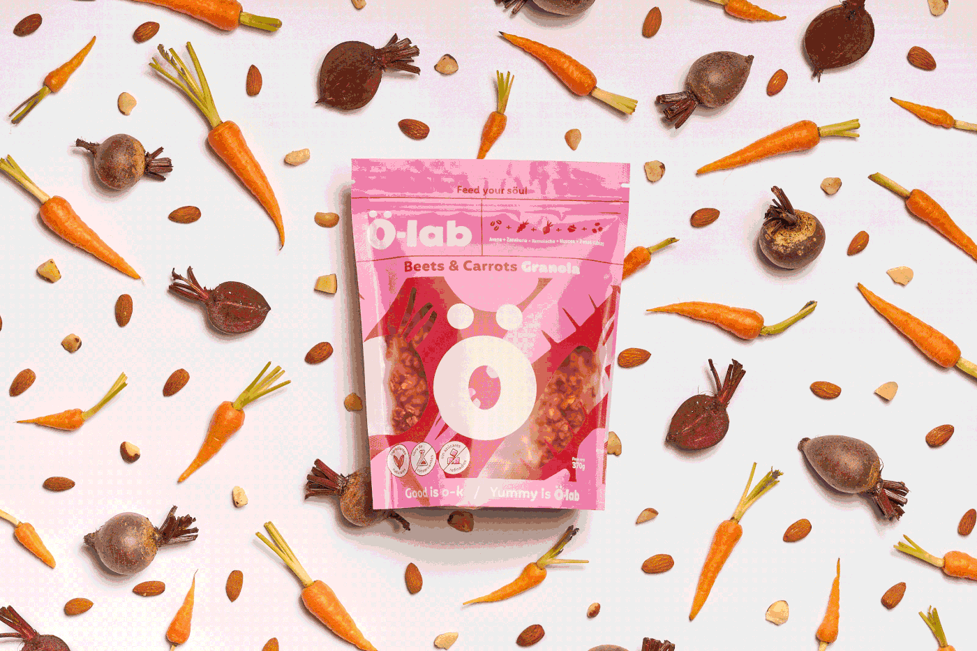
It all started when the owner of the brand came to us looking for a new brand identity and a packaging redesign. Her aim was to have an outstanding and astonishing look on the shelves of supermarkets.
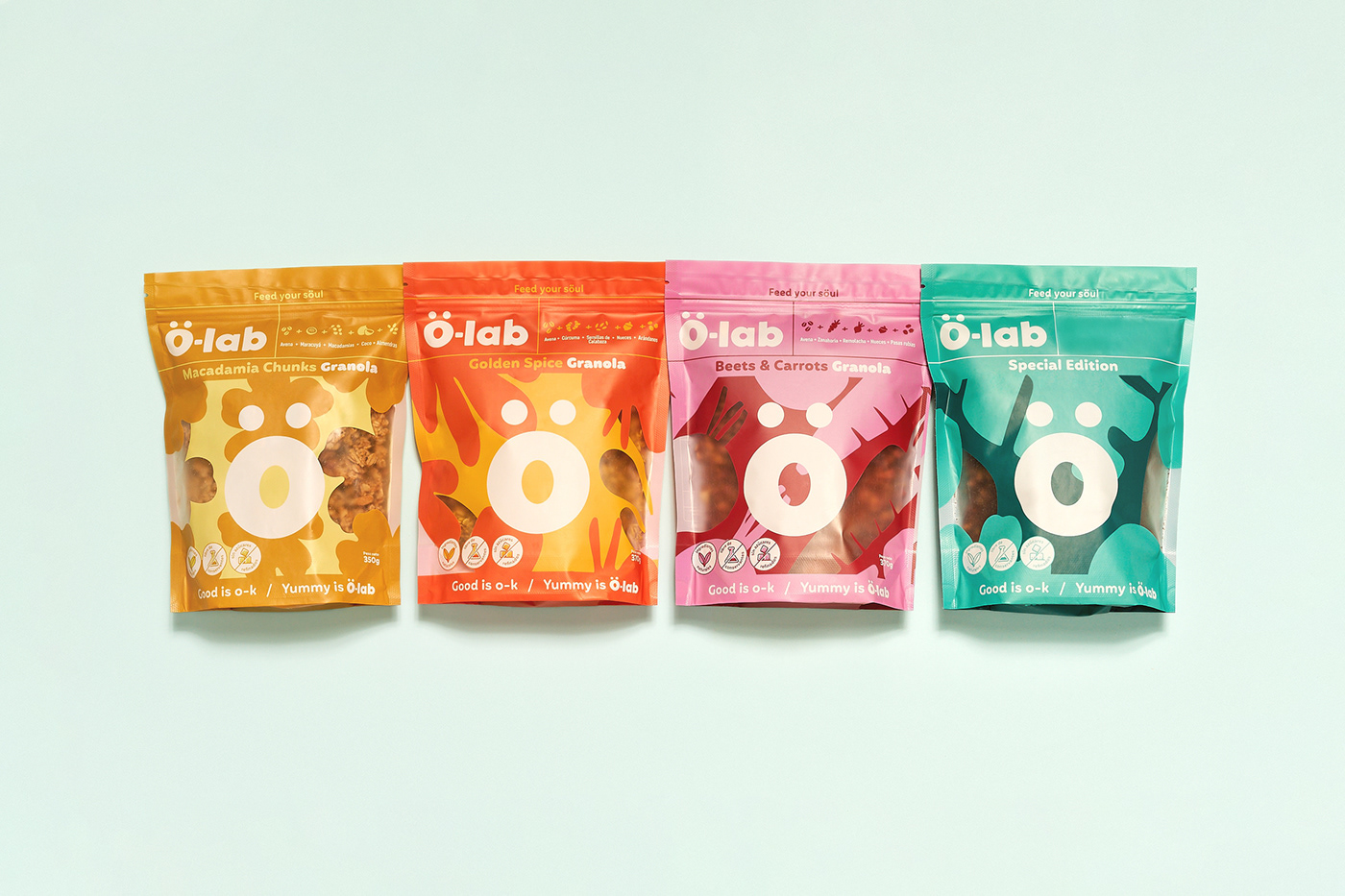
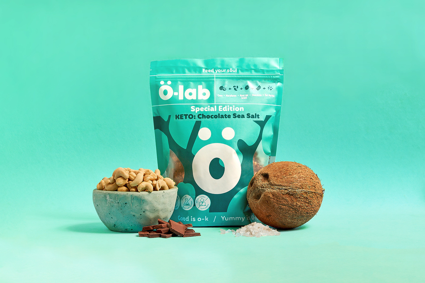
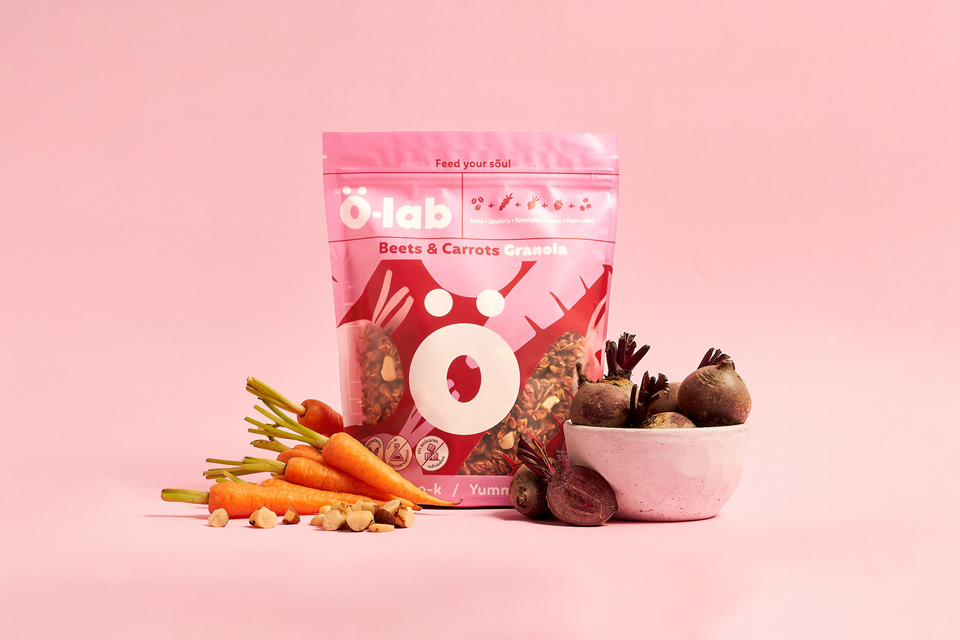
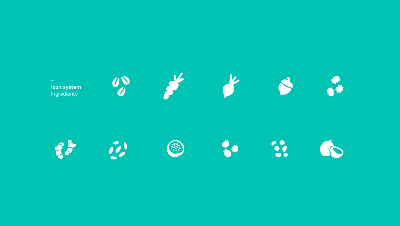
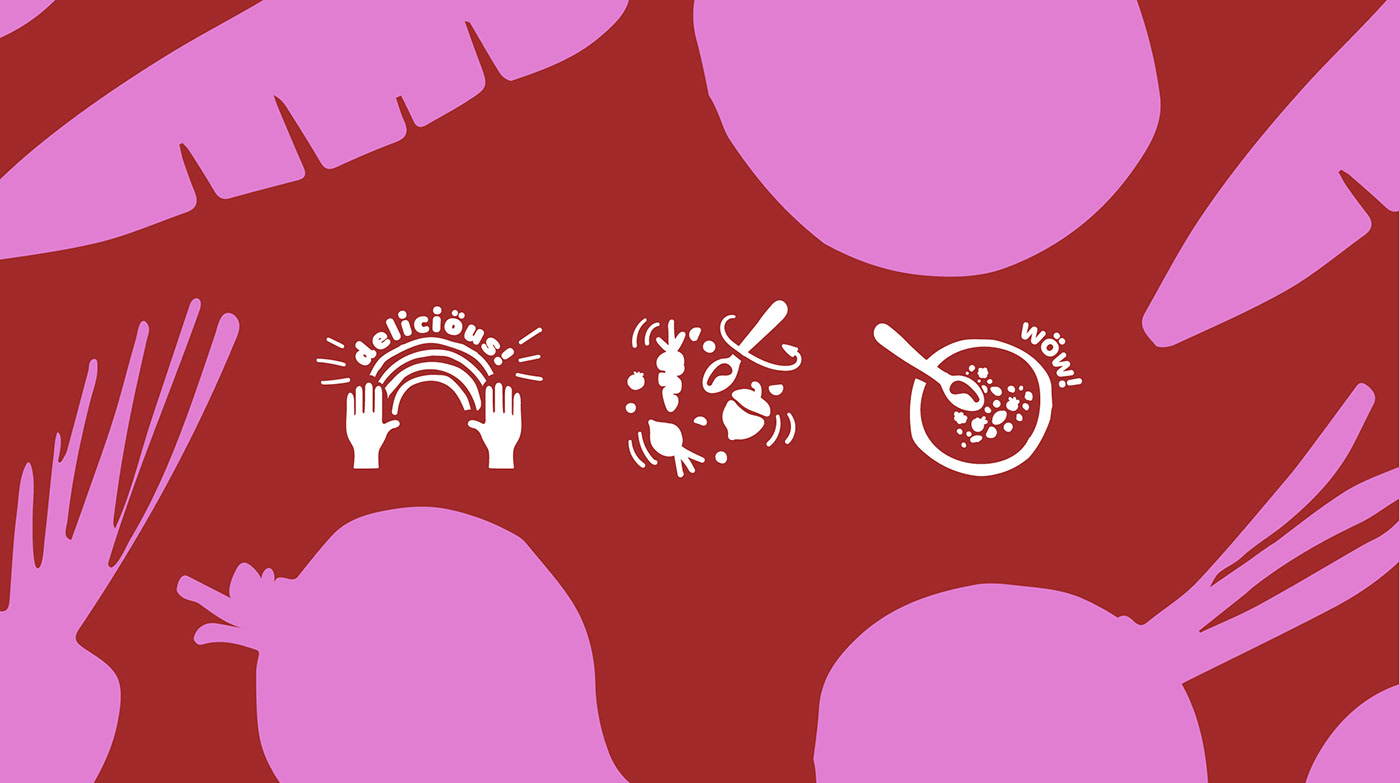
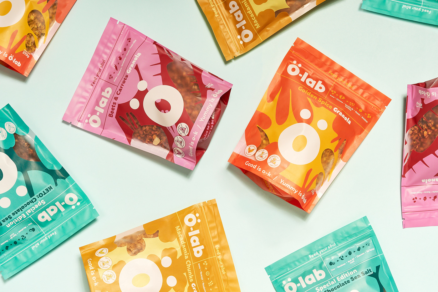
Our thought: healthy food doesn’t always have to be clean and delicate. It can also be bold, fun and colorful. That’s the reason why Ö-lab involves lots of bright colors, bold typography and a variety of cool yet healthy-appealing graphic elements.
The mix of all these creates what we called the WÖW effect.
Made by invade.