

Interpretexto letterpress logo mock up
Interpretexto is a project that tries to mix different kinds of art expressions, all aligned by the same concept, thus creating a large exhibition in which people can travel and at the same time read and live a story. It was Inspired by the lack of reading of children nowadays in Mexico and the eternal artists struggle for exhibition. This project is mainly for children but open to all ages. People can read, an appreciate and interact with paintings, sculptures, ambient sounds and scents so they can feel inside the story.
The name Interpretexto comes from playing with the spanish words "interpretar" (interpret, to understand), "texto" (text), and in between, it forms the word "pretexto" (pretext, excuse), so this project is an excuse to try to understand texts.
The logo design is based on the movement involved in this exhibition, in which a group of people would enter a specified room and try to understand and feel the story as they read it. So, it starts with italic type representing movement and then stopping and changing the attitude and style of the typeface, which in turn is partially underneath a white square but still visible representing the retoric figures inside many texts. It's simple, readable and inspires attention and a little bit of mistery.
Interpretexto event invitation mock up (outside)

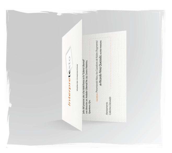
Interpretexto event invitation mock up (inside)

Interpretexto exhibition flyer mock up

