
Science and art. Since they are two concepts that seem to inhabit opposite sides, combining them can be quite a challenge, right?
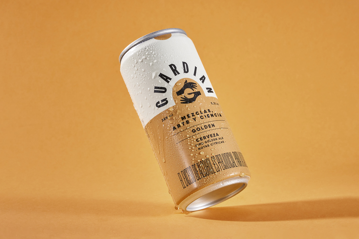
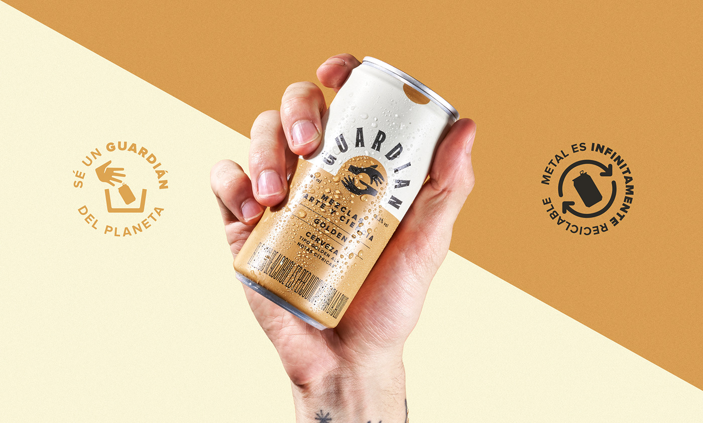
Well, it was not the case for Guardián, as their founder discovered the perfect formula to that. He blended his professional knowledge with a passion for making things from scratch, obtaining a Colombian craft beer that combines both worlds and puts them into perfect balance.
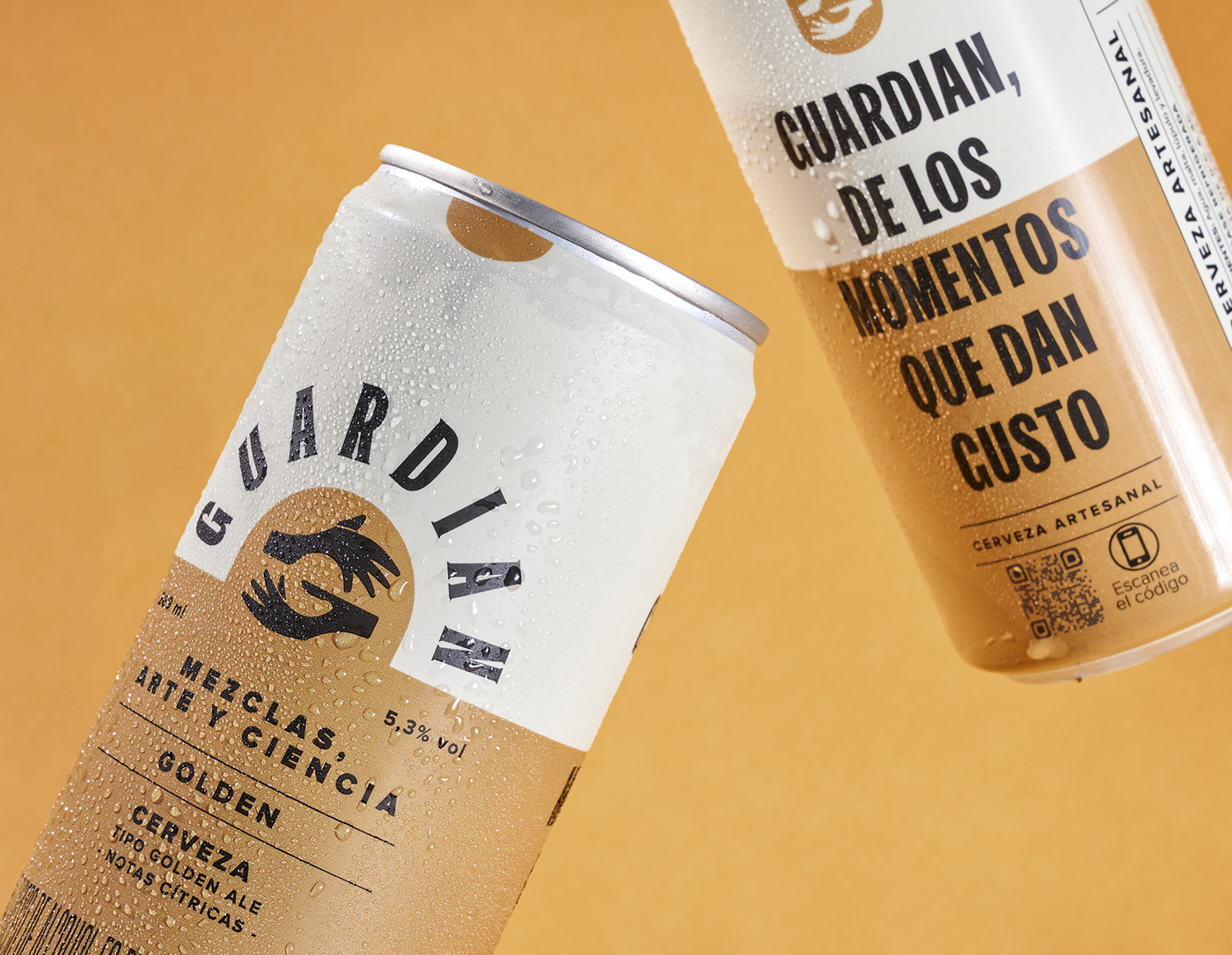
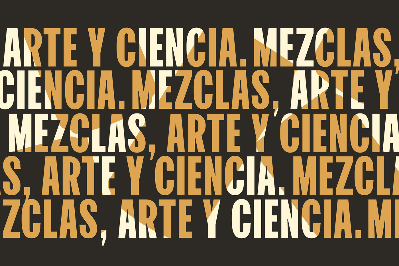
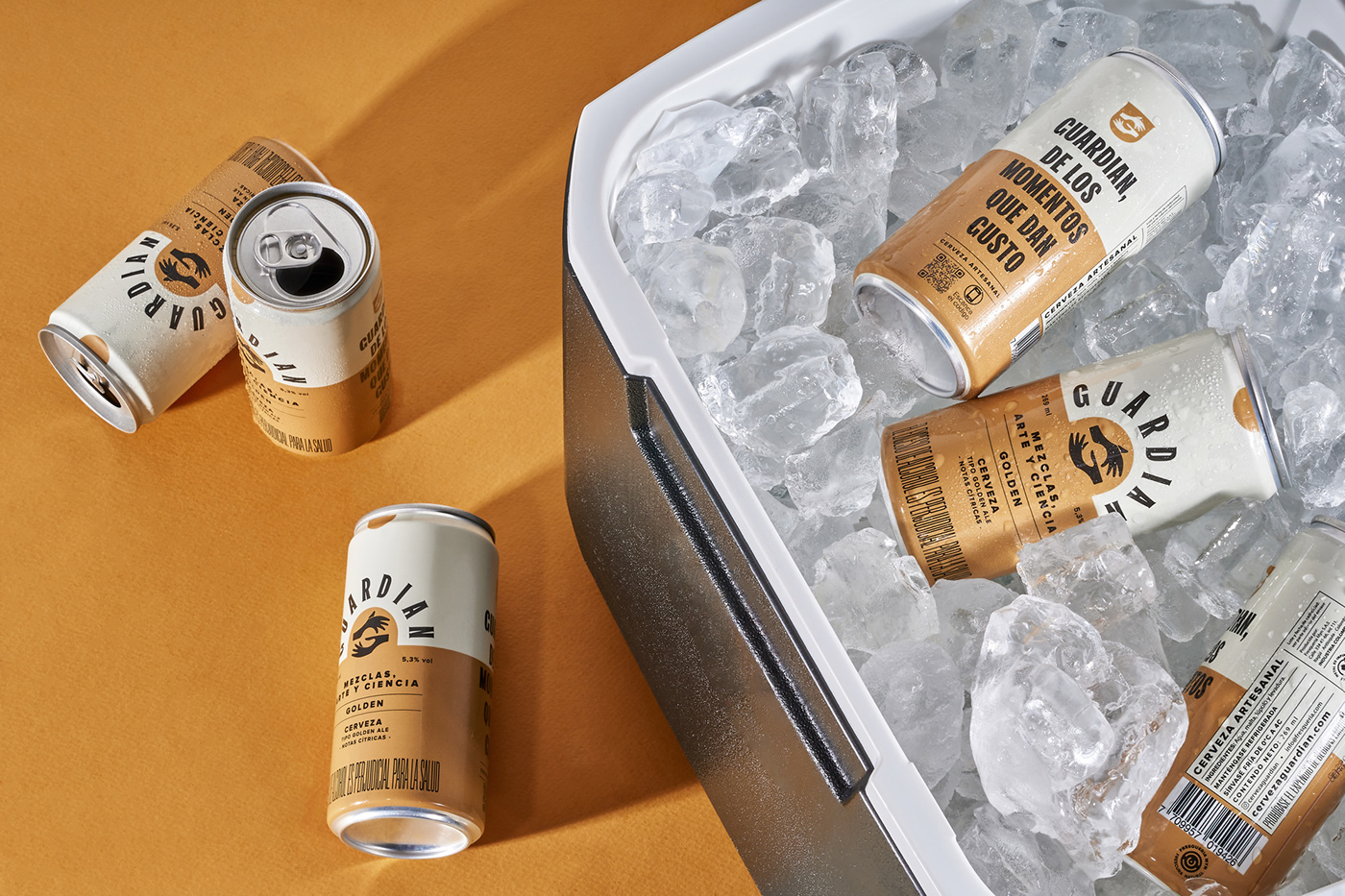
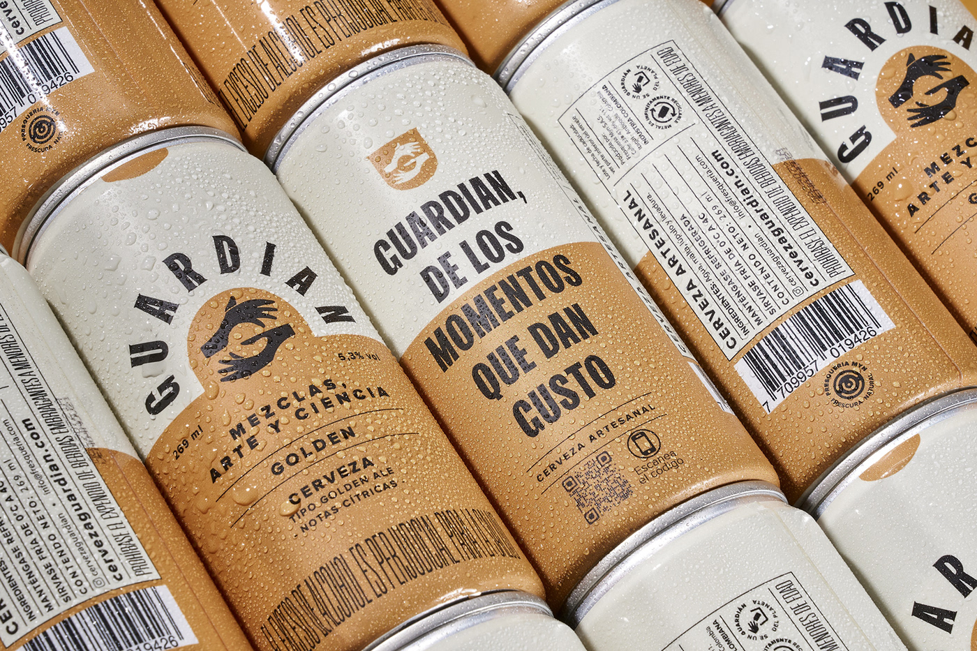
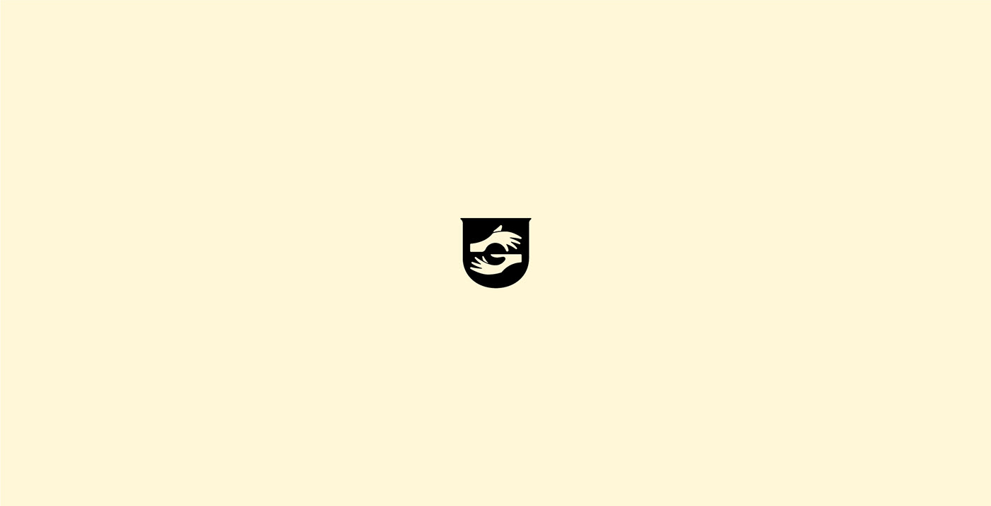
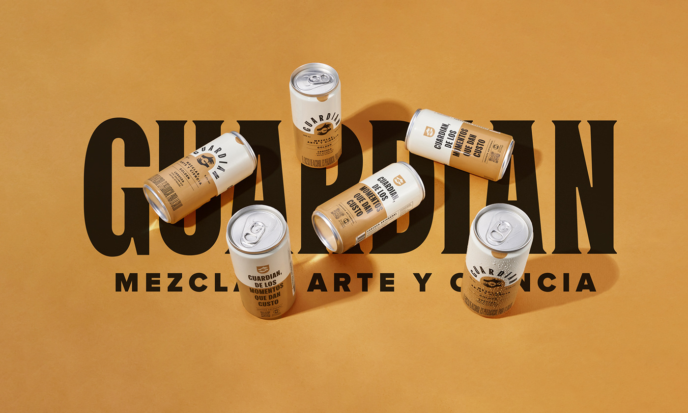
Our challenge was to materialize that insight and make it into visual art. That’s why, we designed a logo where the mark is a pair of hands that mold the initial letter of the brand and at the same time reflects the meticulous yet human elaboration of the craft. Last but not least, the color blocks used in the label of the cans represent two opposite sides that eventually meet at the center of it all.
Made by invade.