
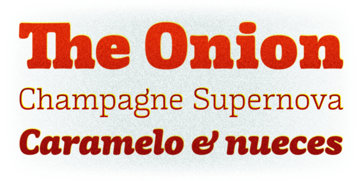
Mayonez is a typeface intended for big sizes it's specially good for commercial and editorial uses like advertising, packaging and pages with showy headlines where a warm touch want to be given.
A balance between friendliness and seriousness is achieved through the combination of opposite characteristics in the structure and contours.

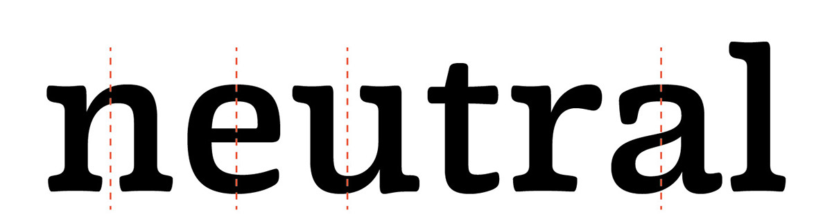
Vertical axis and rational structure for a serious character.

Cupped serifs along with rounded endings and joinings give a soft look.

The slightly curved horizontal strokes contribute to the organic look without making the type lack definition or look cheesy.

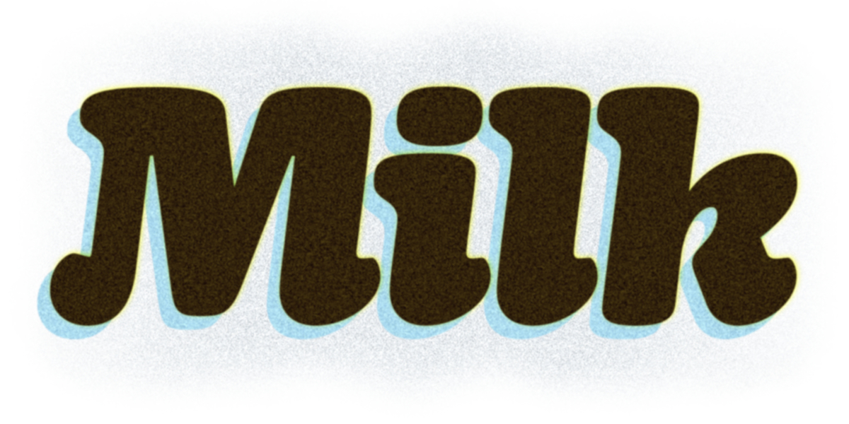
As the members of the family get bolder the terminations become shorter in order to allow the reduction of the white space between the letters getting thus darker lines.

The ascenders height matches with the caps height to allow lines to get closer and have more compact headlines.

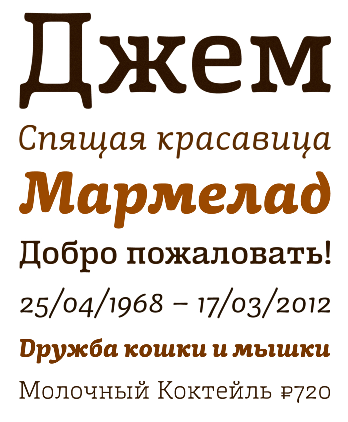
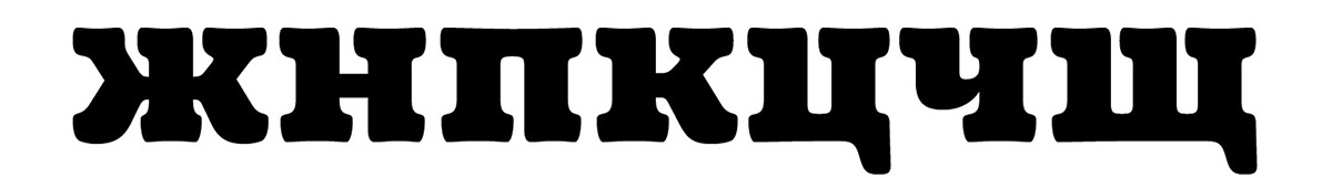
As Cyrillic has several lowercase letters whose shape is based on their uppercase pairs asymmetrical serifs are used to make the overall look of texts less cluttered.

Developing more consistent italics but differentiating them from their romans at the same time implied going beyond sloping romans. That's why this set, including the figures and uppercase letters, has a fluider and simpler structure with reduced serifs.

The character set includes a group of figures and currency symbols with standard height and another suited to match better with lowercase letters.

Mayonez is available on sardiez.com

