The purpose of this project was to develop a logo combining different concepts harmoniously and incorporate a functionalist element representing my background as Industrial Designer. The main inspiration came from the frankness and simplicity of brutalist architecture, altogether with Le Corbusierʼs ability to incorporate sophistication in his works.

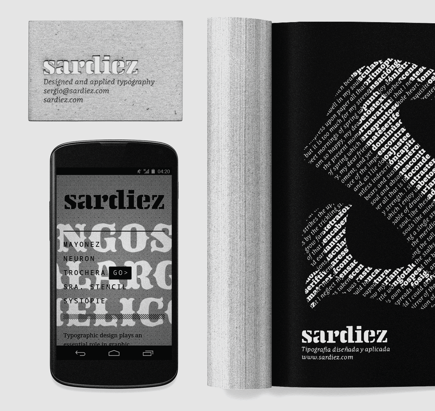
The initial idea was taken from the stencil type used by Le Corbusier in his plans and drawings. The stencil cuts, besides giving a strong and industrial character, enable it to be reproduced easily through different subtracts when needed.


Looking for a touch of sophistication, didone-style features like the solemn vertical axis and the strong contrast were incorporated. Additionally, some beaks were added on the extremes of the vertical strokes as another refining detail.

With the help of a grid the contours and details were defined to obtain a more solid result with a more architectural feel.