


Krüx Döner Kebab was born from an insatiable desire to bring authentic Berliner street food to Mexico City. We have a similar culture here: Just before a meeting or right after a party, make a pit–stop on the closest taco place available. Our standard meat is pork and we use tortillas for a wrapping. But what if we ate lamb in bread instead?
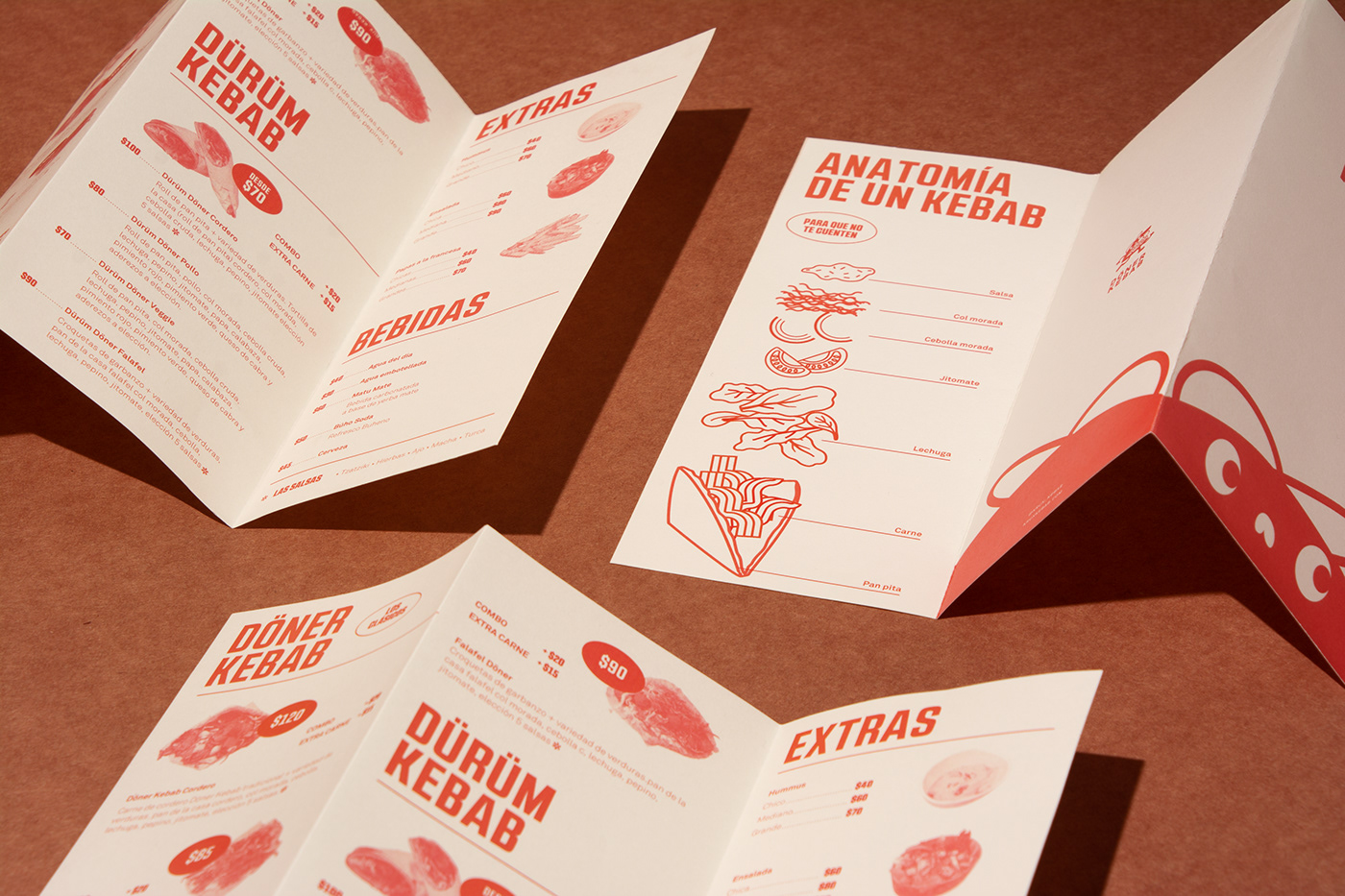
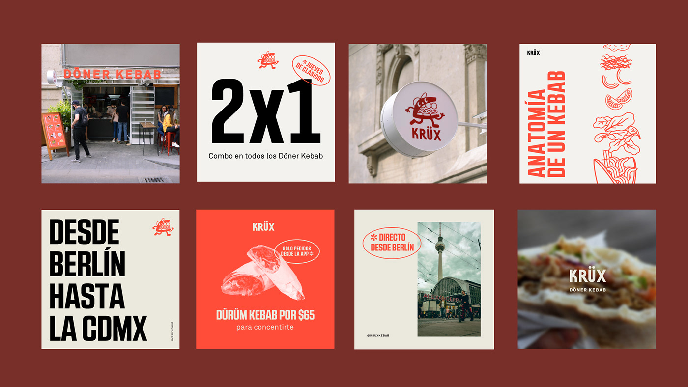
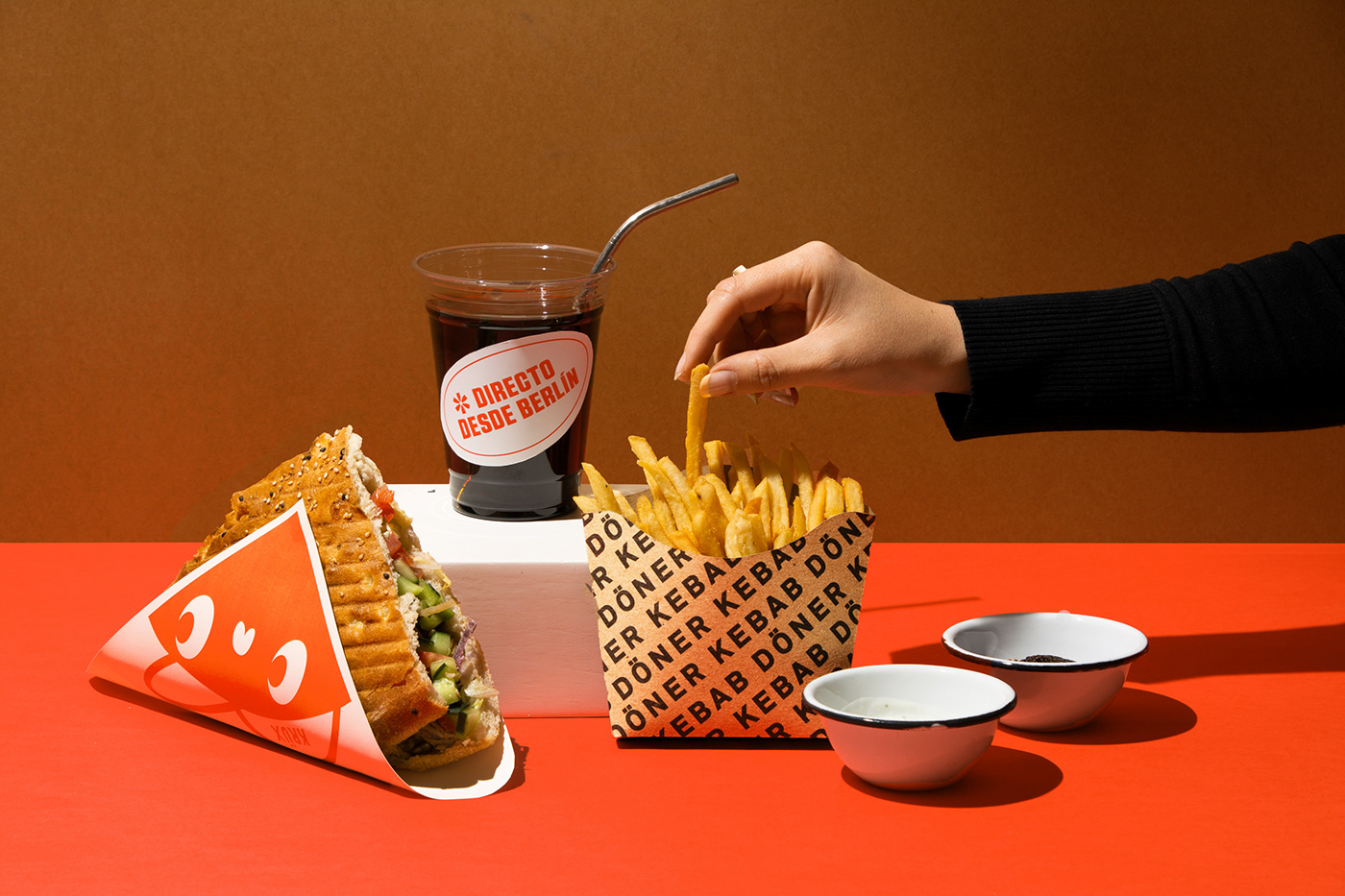
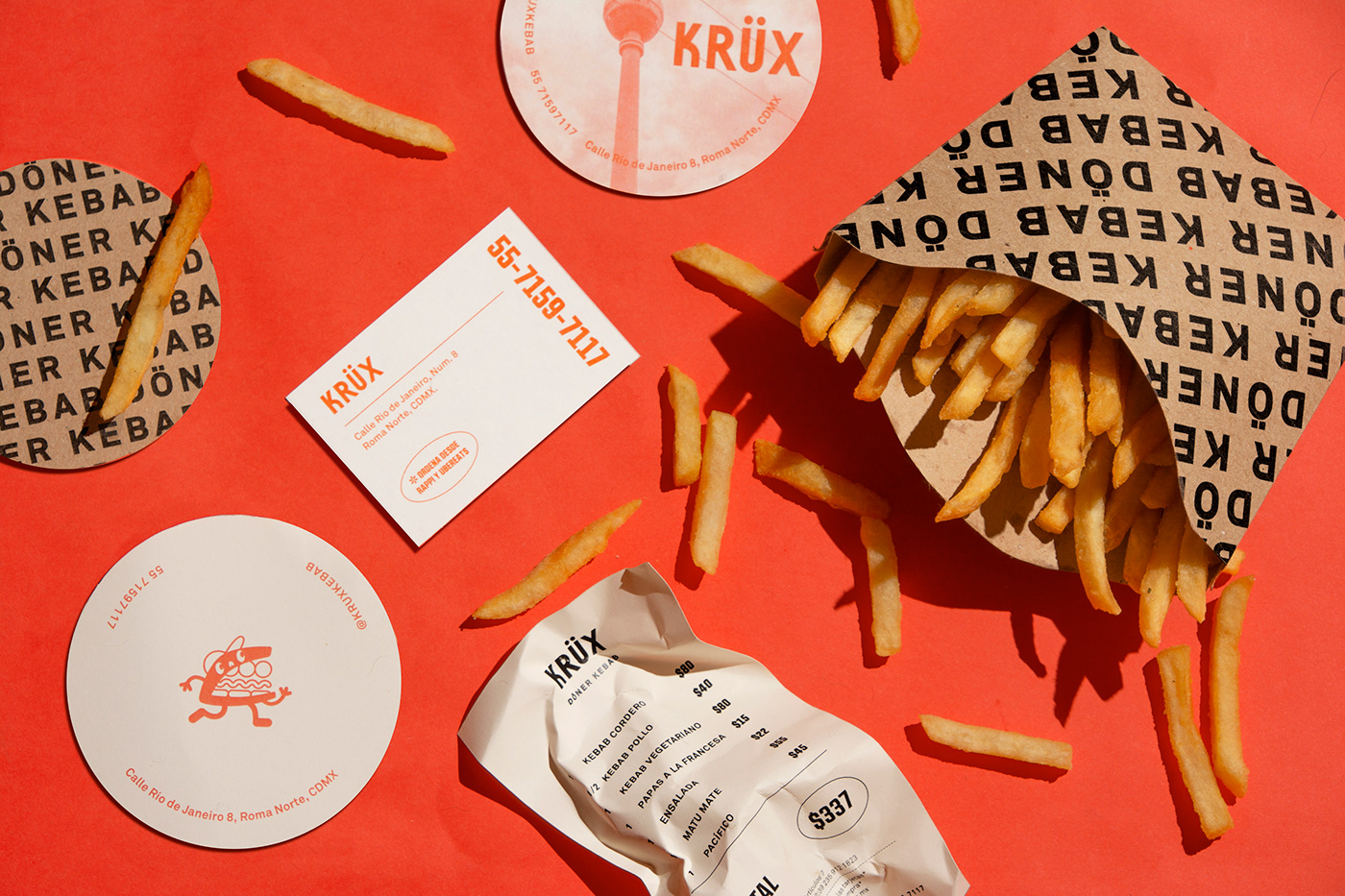
On the graphic identity, we wanted to resemble the same easy, traditional, un–anecdotic pit–stop for a döner kebab on–any–occasion from Berlin. We took inspiration from the photographic menus and the big bright signs that announce the traditional restaurants. Through reinterpreting these elements onto our designs we achieved comfort and familiarity. For the logo we made a fun character based on the döner kebab shape and reinforced this idea through the multiple brand applications for a round experience.
On the graphic identity, we wanted to resemble the same easy, traditional, un–anecdotic pit–stop for a döner kebab on–any–occasion from Berlin. We took inspiration from the photographic menus and the big bright signs that announce the traditional restaurants. Through reinterpreting these elements onto our designs we achieved comfort and familiarity. For the logo we made a fun character based on the döner kebab shape and reinforced this idea through the multiple brand applications for a round experience.
Credits: Client: Krüx Kebabs / Art Direction: Mariela Mezquita / Designers: Harumi Tanimoto, Valentina Villa /
Photography: Mariela Mezquita / Photo edition: Karen Licona, Leslie Piñón / Year: 2020–2021


