In this 40-hour project I took NASA, an institution facing budget cuts, and examined their brand as if they were a consumer product company. I quickly defined a form language that NASA could potentially use across their product family and established a strategy to connect with consumers by creating products for the aspirational market.
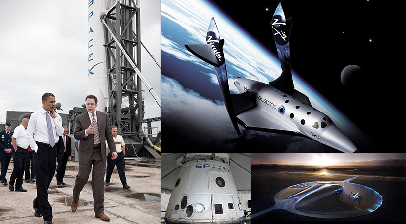
Growing up, NASA has always been an inspiration. Today is an exciting time for space, with the beginnings of the commercialization of space travel and Mars exploration. Yet NASA faces budget cuts and lukewarm media attention.
What if NASA were to brand themselves in a way that conveys more value and meaning to people? What if they created consumer products that would inspire and connect with the public?
What if NASA were to brand themselves in a way that conveys more value and meaning to people? What if they created consumer products that would inspire and connect with the public?
THE PROBLEM


RE-BRANDING NASA
What if NASA invested in itself and created NASA-branded products for consumers?

Think space pens and astronaut ice cream, but on a bigger scale, allowing NASA to generate supplemental funding through its returns.
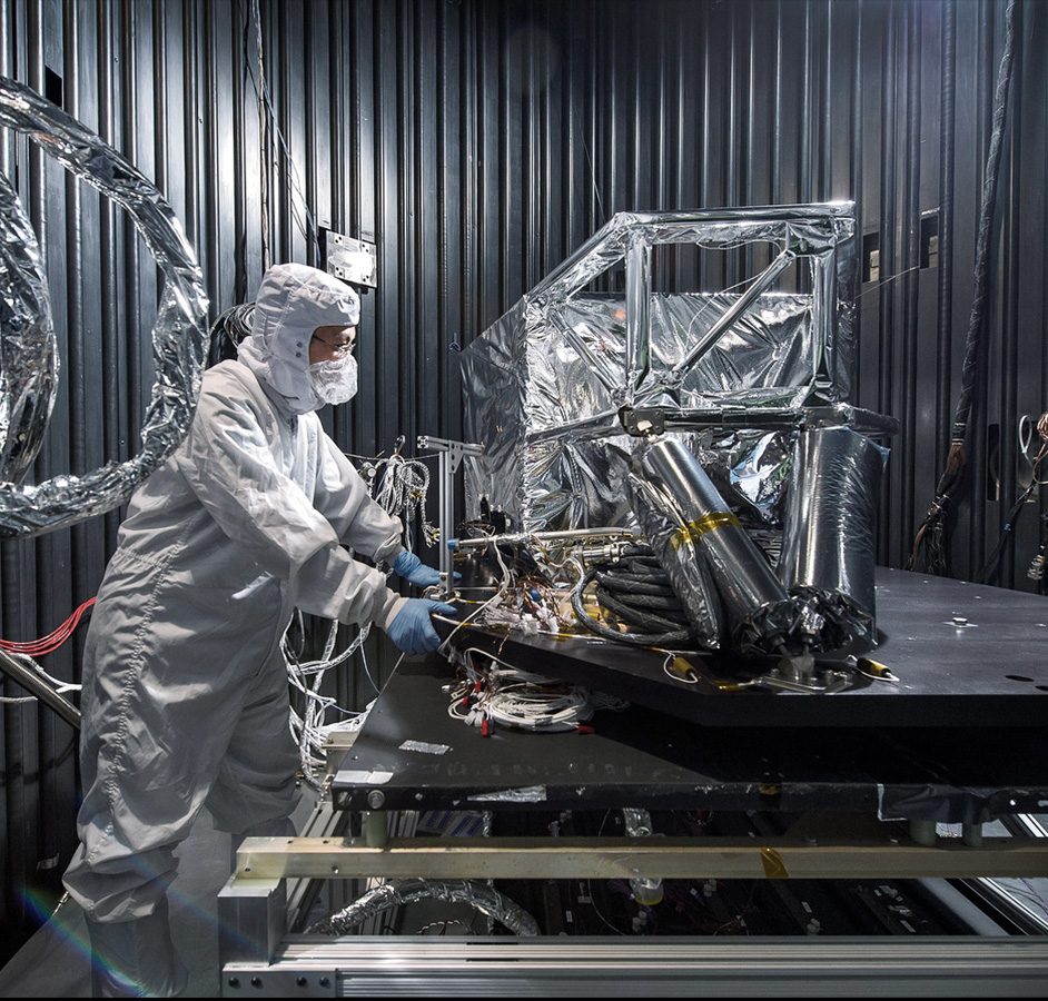
With the beginnings of the commercialization of space, creating a cohesive brand will become even more critical to NASA in the near future.
SPACE WATCHES AND FORM LANGUAGE CONSISTENCY

A space watch that would be worn by astronauts in space. It would also be sold as a high-end luxury watch for the public. The watch would be designed for the aspirational user, the astronaut. The brand appeal is when a regular consumer is proud to say they are wearing a NASA astronaut-spec watch.
VITRUVIAN FORM LANGUAGE
Creating a form language for NASA based on Leonardo Da Vinci's drawing, the Vitruvian Man. The complex form language celebrates the complexity of NASA's engineering ingenuity. It is also cohesive, basing large gestures on the angles of the Vitruvian Man.

The Vitruvian Man symbolizes the closeness between man and nature. It is a symbol worn by NASA astronauts on missions. I wished to create a form language for NASA loosely inspired by Vitruvian Man geometry.
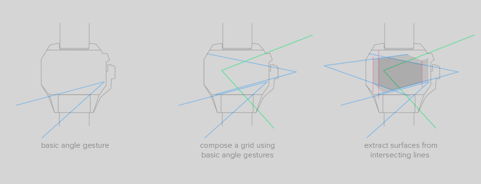
A faceted form language works well with NASA’s raw, engineered forms’ complexity.
Facets can create form cohesion while robustly embracing complex mechanical forms that may show through underneath.
SPACE SUITS AND ASPIRATIONAL BRANDING
It is important to tie in consumer products with real NASA equipment, to create a consistent and meaningful brand.

I chose to redesign the space suit, as it is iconic and an important symbol of space travel.
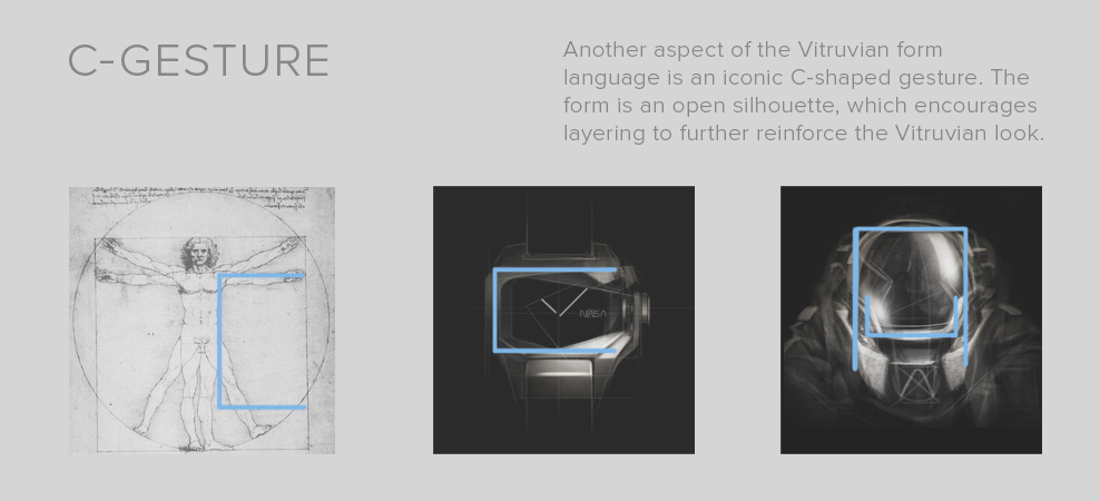
Applying the Vitruvian form language to the space suits, I again looked at angular, faceted shapes. One other significant form element I've defined for this Vitruvian form language is the C-shaped gesture. An open form can be layered over complex mechanical components to reinforce and pull together a complex look while giving it direction.
SPACE SUIT THUMBNAIL SKETCHES

Suit thumbnails. Quick thumbnail sketches to block out big form gestures and explore general ideas without having to commit to small details.
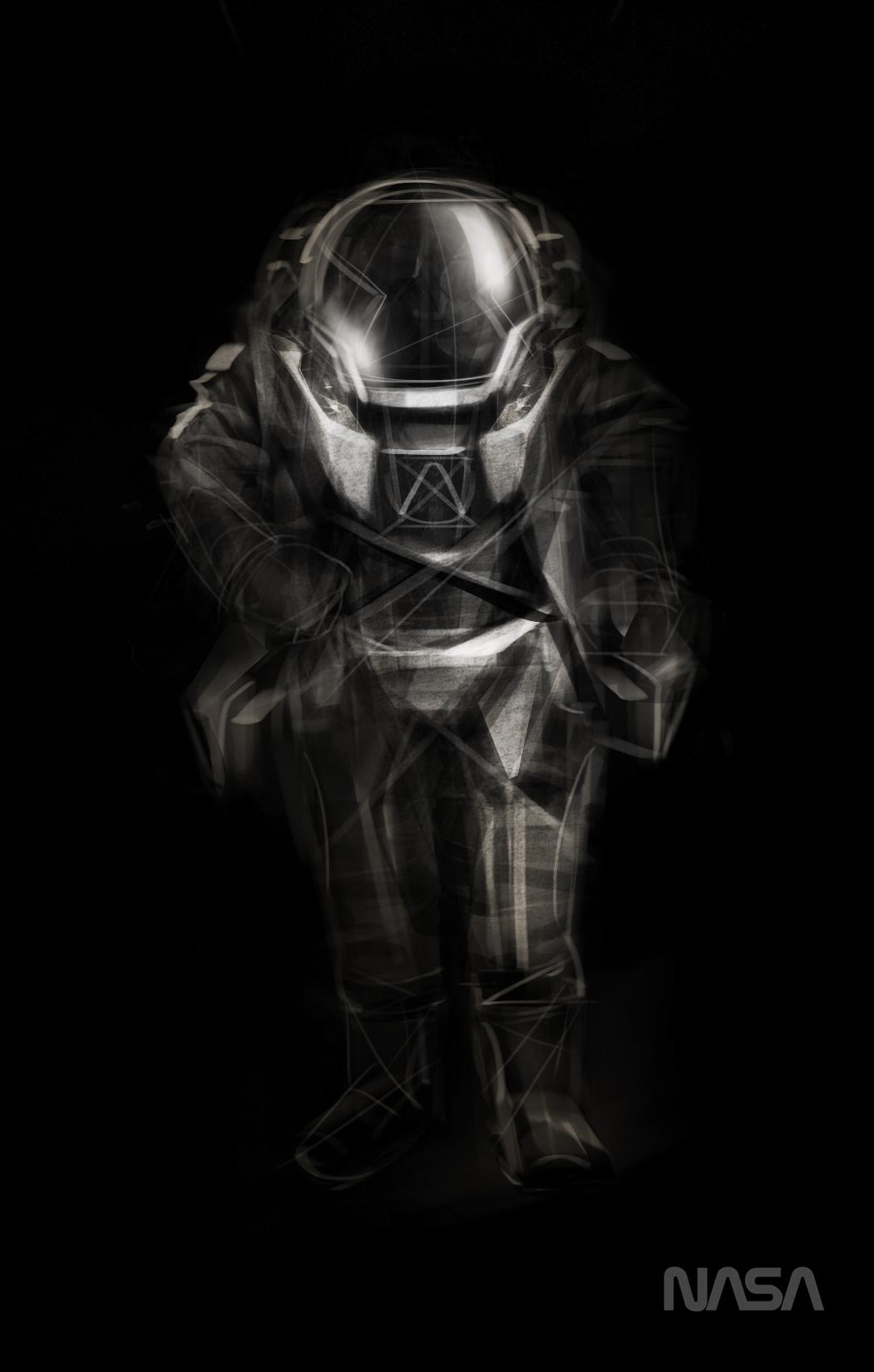

Designing NASA's space suits and equipment with the same consistent form language reinforces the brand, and thus creates a cohesive message. Like the watch, this form language conveys strong, iconic complexity.
NASA can continue to inspire if they are able to communicate their value to the world.
Create a stronger brand identity with products that convey powerful messages. When people have a tangible connection with NASA, they will fight to support the continuation of NASA's missions.
INSPIRE.
NASA can continue to inspire if they are able to communicate their value to the world.
Create a stronger brand identity with products that convey powerful messages. When people have a tangible connection with NASA, they will fight to support the continuation of NASA's missions.
INSPIRE.


