Mogotex is the biggest textile manufacturer in Belarus that has been in the market since 1973. Although the company has always had the reputation of a reliable supplier, it was not perceived as a modern innovative brand which hindered the export of its products.
Having established close relationships with foreign partners, the company decided to completely rethink its brand.


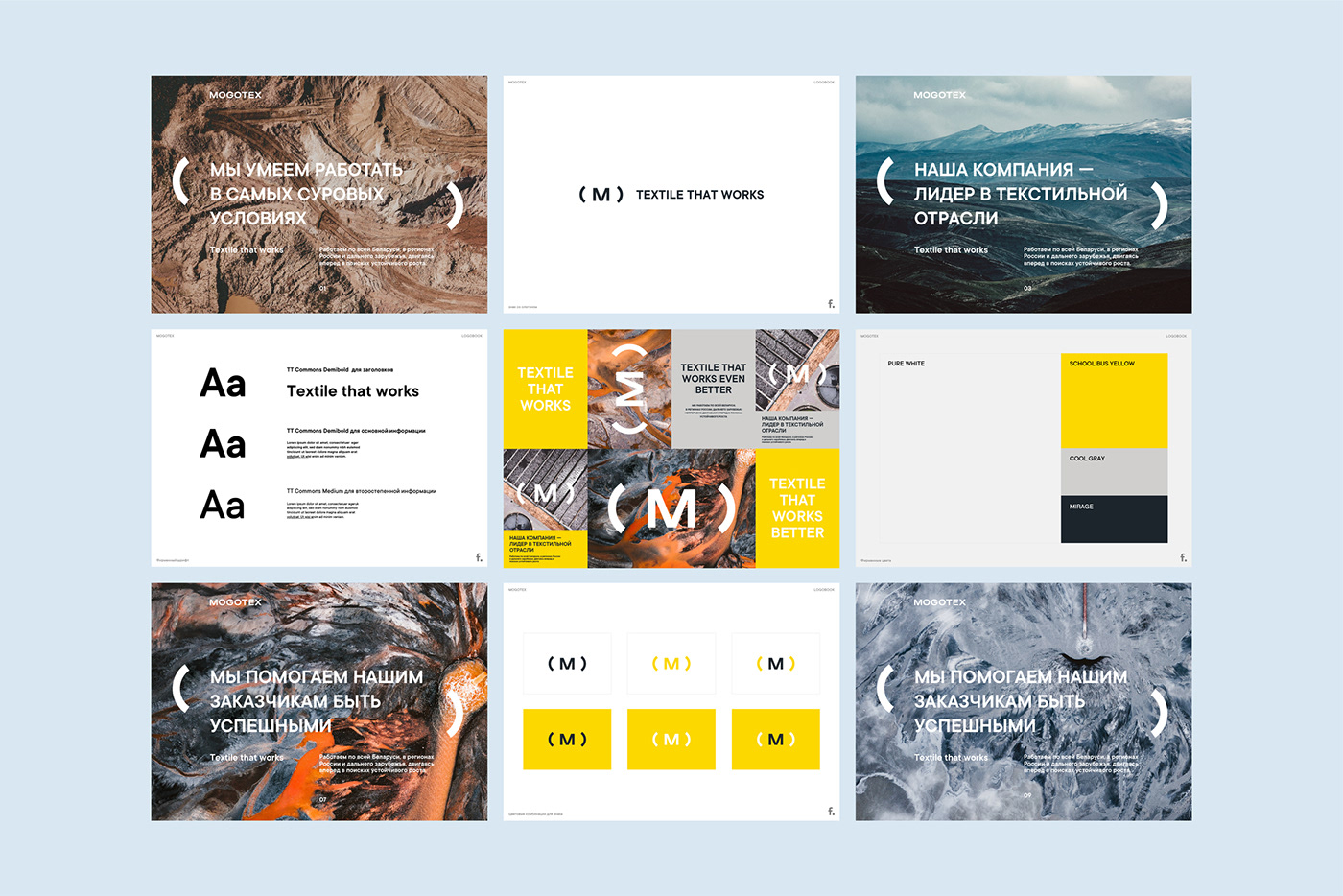
Fabula Branding carried out a brand audit and suggested new positioning: ‘Fabrics that work’. This metaphor ties together the properties of the product and the qualities of the company’s staff and serves as a basis for a dynamic image. The new solution emphasizes the main advantages of the trademark: its reliability, functionality, and operational capacities.
The old company logo contained a graphic sign that lost its relevance and recognizability with time. The team at Fabula Branding decided to let it go and developed a new logo that reflects the idea of resistance and protection typical for Mogotex fabrics through additional lettering elements.
The continuity with the previous design solution was preserved thanks to the corporate color palette that was only slightly changed. Contrasting black, white, and yellow colors create a bright brand image.